Wayfinding > wayshowing 14 Dec 3:00 PM (just now)
The first edition was sold out for a long time and was considered as the industry reference book for everything wayshowing, wayfinding and signs related.
About Per Mollerup
Wayshowing > Wayfinding is written by Per Mollerup (1942), a Danish Designer and Professor of Communication Design who has designed numerous wayshowing and branding projects for airports, transit, culture institutions and more. His design studio Designlab closed in 2009, and Mollerup currently is a professor at Swinburne University of Technology, Melbourne. Dr. Per Mollerup still works with consulting concerning branding and wayshowing— and he has defined industry standards strategies for wayfinding and wayshowing.
Design principles according to Mollerup “Research is search for knowledge. Design research, search for knowledge about design are part of all professional design work.”
Introduction to W>W
Wayshowing > Wayfinding is divided into three main parts, that describes wayfinding problems, principles and practices. The books principles have been revised and updated with digital signage principles.
The first part of the book describes the basic principles of wayfinding, Signage without signs. Finding and identifying places and the way through natural, intuitive elements. The second part of the book describes wayfinding as ‘A problem solving process’. Mollerup then explains about the principles of wayshowing. The third part of the book covers 25 new showcases including airports, rail, city, culture and more.
Wayfinding
The term wayfinding introduced by Kevin Lynch in book Image of the City (1960), where he described wayfinding as “a consistent use and organization of definite sensory cues from the external environment”. In 1992 Arthur and Passini published the book Wayfinding-People, Signs, and Architecture. Arthur & Passini extended the concept of the term wayfinding by relating it to architecture and signage— and described the essential principles for wayfinding.
In the book W>W Per Mollerup builds upon this knowledge, introducing a three step iterative wayfinding process; “Search, Decision, Motion”.
The chapters about wayshowing > wayfinding describe the research steps for planning and defining a wayfinding strategy. The nine described wayfinding strategies reflect environmental conditions, user needs, cognitive behavior and wayfinding practice.
Wayshowing
Wayshowing facilitate the wayfinding strategies as described in the first chapters of the book. Mollerup describes the characteristics of wayshowing and shows examples of its use.
For all wayshowing projects, Mollerup suggests a balance between two contrasting principles. Simplicity vs redundancy. These chapters describes the functional goals of simplicity and how redundancy can lead to less noise, errors or misunderstanding.
Sign functions, contents and form
After theoretical chapters W>W describes sign functions, contents and form. Everything you want to know related to identification, direction, description and regulation is described, these chapters will give insight on how to design for a wayshowing project. These chapters also offer many examples on legibility, color contrast, typography, pictograms, arrows and more. The content in these chapters are updated from the previous version with new content about performance, digital signage and wayfinding insights.
Interactive wayshowing
New chapters include Interactive Wayshowing. In the increasingly changing world, digital tools are used more and more for wayfinding purposes. The new chapters describe the digital spectrum and how digital tools can work efficiently in a wayshowing scheme.
Cases
About one third of the book is reserved for principles applied in practice. A showcase of best-practice design in six categories ranging from Airports, Rail, City, Knowledge, Culture and Outdoor. The cases include (traditional) static sign systems— as well as digital wayfinding examples.
The projects are by design studios from around the world— and give insight on how wayfinding strategies are applied for designing clear, concise and informative environments.
Conclusion
If you have any interest in designing and planning for the build environment/public space— this is the book for you! I believe the content of W>W is relevant for designers, EGD designer, urban planners, architects, engineers, teachers, students, clients and many more. As the physical and digital environments move close towards each other, applying a wayfinding strategy is applicable for offline/online marketing, communication and information distribution.
Overall the book is a learning book to understand how people experience and navigate in Terra Incognita. The chapters are accessible and with many steps/examples you can implement strategies in your own thinking for developing wayfinding.
If you already own Wayshowing 2005, you might want to consider updating to W>W. The new edition offers enough new content, principles and practices to learn from.
The case studies are fresh, and inspiring which, creates a visual interpretation of the wayfinding strategies as describes in the W>W book.
Availability W>W
Wayshowing > Wayfinding is limited available, see the link below to obtain a copy.
Information
- Publisher: Bis Publishers
- Language: English
- ISBN: 978-90-6369-323-7
- Hardcover, paperback, Pages: 240
Buy Wayshowing > Wayfinding
This book is simply one of the best books about wayfinding.
Buy at Amazon


Introduction to wayfinding 14 Dec 3:00 PM (just now)
Orientation and navigation
Navigation from place to place is a fundamental human activity and an integral part of everyday life. Where are you? Where are you heading to? People use their knowledge and previous experiences to find their way in the built environment. The human perception of the built environment and information in a space comes down to balance and focus. What do you see? Why did you see it? What did you do with the information.
Wayfinding principles
Wayfinding has the function to inform people of the surroundings in the (unfamiliar) built environment, it is important to show information at strategic points to guide people into the right directions. Complex structures in the built environment are interpreted and stored by the human memory. Distances, locations and time may be remembered differently than as they appear to be in reality.
An effective wayfinding system is based on human behavior and consists of the following characteristics:
- Do not make them think
Create a comprehensive, clear and consistent visual communication system with concise messaging. - Show only what is needed
Show information that is relevant to the space, location and / or navigation path. - Remove excessive information
Remove unnecessary elements to create a clear visual environment ahead.
How does wayfinding work?
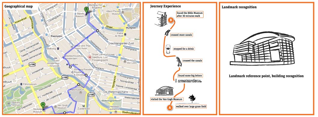
How do people orientate, navigate or remember the built environment? Why will people recognize or understand one place easier than another? As shown in the images on the left, a geographical map versus cognitive (mental) map = reality versus human mental memory. When creating a wayfinding scheme the following characteristics influences the way we interpreted the built environment.
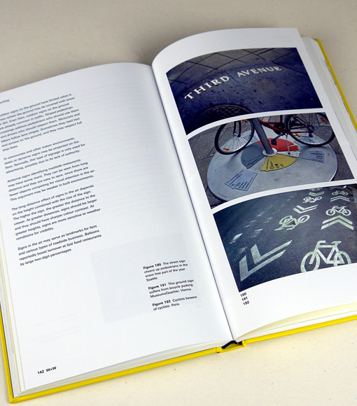
- Landmarks
To create a legible environment it is necessary to mark specific spaces and / or locations. This reinforces the recognition of places and plays a part in overseeing a larger area. With the use of landmarks and marking elements an area will become more visible and will be understand better in the human memory. Landmarks can be art-objects, buildings, streetart, wayfinding signs or striking elements in a landscape. These elements combined will shape the identity of an (unknown) area as seen from your perspective. - Orientation
In order to navigate, you need to know where you are in the built environment and where other destinations are located. Preferable it is good to know the distance in time from one place to another. If you are able to orientate yourself within the built environment, it will be easier to understand destinations and to navigate by landmarks. In wayfinding, maps are common used to indicate your location. The usage of maps is a very powerful way of expressing and overseeing the built environment. Be sure to display the maps heads-up in the direction you are facing, this way you can easy relate yourself to the built environment. - Navigation
Navigating the physical reference to a particular area, setting or destination. With the usage of directional (static) signs people will be guided along their path towards destination(s).
Strategic wayfinding design
When creating a signage system for an area, building or architectural structure it is essential to develop a strategic wayfinding scheme. With this step you are able to build up a modular wayfinding system that will adapt to the built environment and the human expectations for orientation and navigation purposes. Research is an important step to understand the built environment and where information is needed to maximize legibility of the wayfinding system.
Signage design principles
There are four important type of signs: Information signs, for instance a signpole with locate a destination and / or to orientate yourself in the built environment.
Directional signs, where information is displayed to find destinations, located on several strategic points in the built environment.
Identification signs, where information about individual locations is displayed such as buildings, locations and public facilities.
Warning signs, to indicate safety procedures such as a fire escape routes, no smoking areas and other regulations that is, or is not allowed in a specific area.
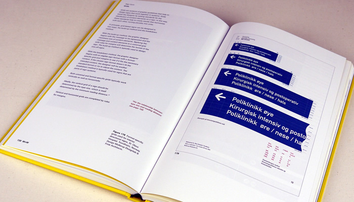
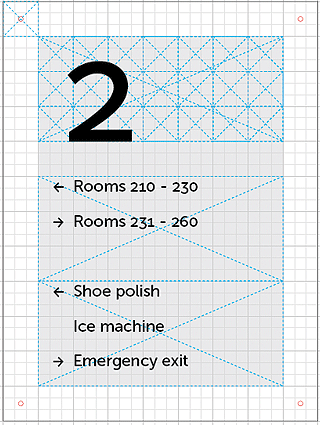
To make a signage system work together a design grid is used to order information and to scale the signs to different sizes, as part of the sign family. With the example design I have used a base grid of 30 mm (milimeters) with a subdivision of 9. All the measurements of the example are based on the 9×9 division. Be careful not to show too much information into one sign, this will be easily overlooked, instead use multiple signs to get good wayfinding results.
Signage typeface
A signage typeface is usually a sans-serif type and available in various weights with a simple easy-to-read straightforward design. They have a good legibility with a large X-Height and wide letter proportions with prominent ascenders / descenders to ensure a good readability.
When using an easy-to-read font the typeface is recognizable for many people to read and to understand the message clearly. Therefore the choice of a signage typeface is one of the keyfactors in order to make a wayfinding system work. When selecting a typeface for a signage design / wayfinding project please use the following characteristics:
- A clear and straightforward type design, sans-serif
- Easy recognizable letterforms
- Positive letter spacing to enhance the visual appearance
- The Font Family includes a package of many different weights
- The typeface has a large X-height for good readability
Signage design
Be consistent in typography, type height, icons, grid design, color and material choice. The signs needs to be straight forward designed and in a consistent order to wayfinding scheme, always use the same order of displaying the information. Remember to make samples of the different sign types and check them in the built environment to ensure it becomes a best-practice design.
Frequently Asked Questions (FAQ)
What is wayfinding?
Signs and color contrast 14 Dec 3:00 PM (just now)
Color contrast
The article will explore the meaning of color and how to differentiate color in information layers.
Contrast between the foreground and background is one of the most important factors for the ease of reading. If coloured text is used on a bright background the contrast will be weak, for optimal contrast results is white text against dark colored backgrounds. In signage & wayfinding design color is the combining factor to harmonize the sign with the environment. Color programs will distinguish signs from each other and can offer an indication of the message without having to be able to understand the language of the sign.
Basics of color groups: Color wheel
Swiss painter and designer Johannes Itten created a color wheel that is a organization of 12 color hues around in a circle showing relationships between the colors. The colors are presented in the following way:
- Primary colors: Blue, red & yellow
- Secondary colors: Green, orange & violet
- Complementary colors: Red–orange, red–violet, yellow–orange, yellow–green, blue–violet & blue–green.
Goethe’s Theory of Colours provided the first systematic study of the physiological effects of color (1810). His observations on the effect of opposed colors led him to a symmetric arrangement of his color wheel, “for the colours diametrically opposed to each other… are those which reciprocally evoke each other in the eye.” (Goethe, Theory of Colours, 1810)
Wikipedia
A Color Wheel is an abstract illustrative organization of color hues around a circle that shows relationships between primary colors, secondary colors and complementary colors. Knowing the relationship between colors is the first step in developing a color scheme for signage and wayfinding systems.
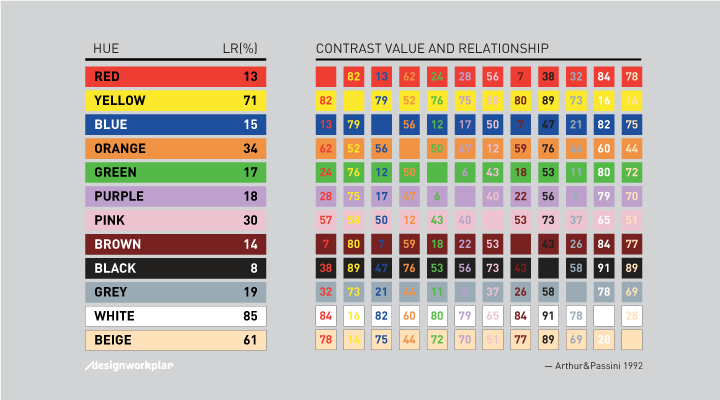
Color contrast by science
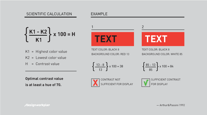
Arthur & Passini described in their book Wayfinding from 1992 a reliable calculating method to calculate the contrast difference between two colors. The formula is based on the light reflectancy (LR) readings in percentages for each of the two colors involved. By substracting the darker color from the lighter color, divided by the difference by the lighter, and multiplying by 100, we get brightness differential. When the brightness differential is 70 percent or higher the legibility is assured. When it is less, the legibility cannot be assured and those colors should not be using in that combination.
Color examples and meaning
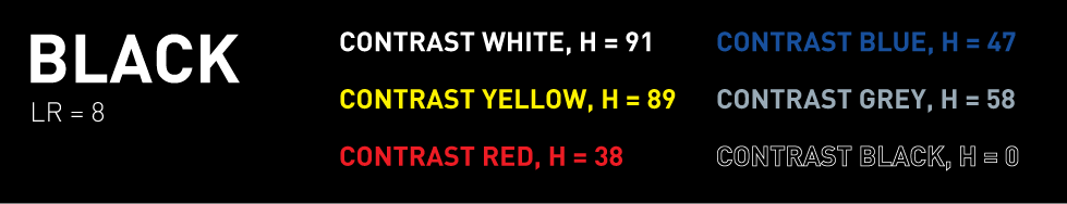
With a black background the lettering tends to stand out more onto to background than with other colored backgrounds. Black is one of the few surfaces that lets other colored text work great together. Beware of too small lettering with too high contrast (white lettering), these will lead to less legibility of the text because of overwhelming background. With large lettering white on black works great. Also yellow on black is a good combination.
Advisable work areas: Airport signage, office building signs, visual overwhelming environments, hotel signage, indoor usage.
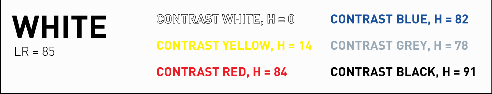
White background surface gives the most workable combinations, but beware of that white can absorb its environment. Black lettering tends to be squeezed into the background making it hard to read. Lower contrast lettering gives better results like blue, orange and red.
White backgrounds can be used specific sign projects where design plays a bigger part than the actual wayfinding. For instance using silver lettering on a white background can give fabulous results, due the shadow of the silver lettering the text becomes readable on the white surface.
Advisable work areas: Museum signage, office building signs, pylon signage, retail signage, hospital signage, indoor & outdoor usage.
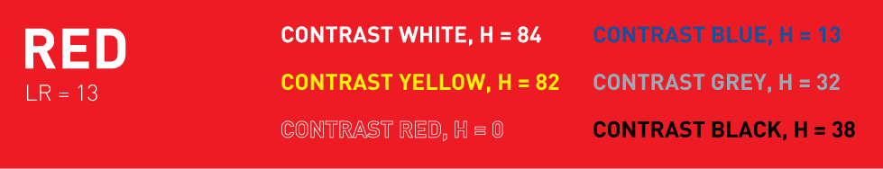
Red is often used for warning signs, red sends out a signal of warning, danger. Many of the warning signs consist of a red background with yellow or white lettering, by using pictograms as warning the signs are multi-language and don’t need explanation, even if you cannot read the text.
Red is a very powerful color which stands out in a visual crowded environment. I have seen various other signs produced with red but in my opinion red is a signal color. Works great with black, white and yellow lettering.
Advisable work areas: Warning signs, public spaces, indoor & outdoor usage.
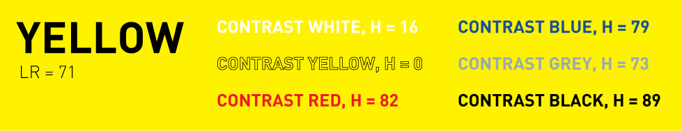
Yellow background works best in visual crowded environments, for architectural and psychological factors yellow is often used. Yellow with black lettering sends out a clear information message which is needed in such an environment. Using yellow also makes in easy to use orange, red and green which all work great together in a signage system.
Also for traffic signs yellow works good as background color in combination with black lettering. In a outdoor situation, yellow stands out from its background giving a clear message. In many European countries yellow is chosen as background color.
Advisable work areas: Airport signage, road signs, public spaces, indoor & outdoor usage.
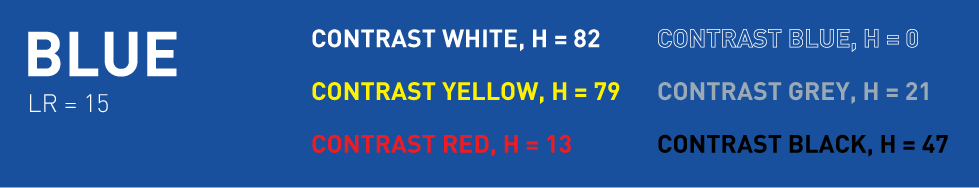
Blue is one of mankind favorite color, as is represents sky, heaven, trust and faith. The color blue is good recognized with white lettering as information sign. In the Netherlands all highway signs are with blue background as well as the railway signs.
To use blue in sign systems beware of create enough contrast in order to make the signs work best. For instance with light blue a higher contrast lettering will be needed such as black and for dark blue white lettering will work best.
Advisable work areas: Highway signs, railway signs, hotel signage, retail signage, public spaces, indoor & outdoor usage.
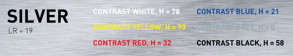
On a silver background almost all colors work well, even white. In future articles I will go deeper into using silver as background. Metal signs are frequently used in office signage, with black lettering it will create a very stylish look and feel.
Advisable work areas: Office signage, nameplate design, public spaces, indoor & outdoor usage.
Typography & color contrast
Not only is the contrast important also the chosen typeface will make the difference in a good or bad sign. When using too bold weighted typefaces the text will look like its expanding of the sign, when using too light weighted typefaces the text will fall back into its background. Medium or Regular weights are usually the best options to choose for a good and readable sign.
The hidden costs of getting lost in a Hospital 4 Dec 3:00 PM (just now)
Why people get lost
Navigating through hospitals can be a challenging task and stressful experience for patients, visitors, and even staff. With the increasing complexity of hospital layouts and diverse user needs, there is a growing demand for effective and accessible wayfinding solutions.
Misinformation and not up-to-date information are among the most common issues why people get lost. The lack of quality information across platforms allows for disorientation, a feeling of getting lost, and not knowing which source to trust. Some of the issues include:
- Getting lost, high stress levels
- Not on time for an appointment
- Unable to orientate/navigate
- Information not correct/up-to-date
- No holistic wayfinding approach
Costs of Getting Lost
Wayfinding issues lead to significant costs due to staff time spent on assisting lost individuals, delays in patient care, and missed appointments.
A Deloitte report showed that medical staff spends on average 4,500 hours in giving directions every year. That is a considerable amount of time wasted just on giving directions.
Lost patients and visitors disrupt hospital schedules and workflows, leading to inefficiencies and increased workload.
Navigational difficulties heighten stress and dissatisfaction among patients. Efficient wayfinding is crucial for patient safety, especially in emergency situations.
Three Main Reasons Why People Get Lost in Hospitals
-
Complex Hospital Layouts: Hospitals often have intricate, sometimes maze-like structures with long corridors which look similar and multiple wings, making navigation challenging for patients, visitors, and even staff.
-
Inadequate Signage and Wayfinding Systems: Traditional signage and wayfinding tools are frequently insufficient, leading to confusion and difficulty in locating destinations within the hospital.
-
Lack of Pre-Visit Information and Real-Time Guidance: The absence of effective pre-visit directions and real-time navigational assistance exacerbates the confusion, especially for first-time visitors.
Assessment of the Costs of Getting Lost in Hospitals
-
Financial Impact: Wayfinding issues can cost hospitals significantly, with studies showing expenses up to $500,000 annually at due to staff assisting lost individuals and other related inefficiencies. Missed appointments due to navigational difficulties add to this burden, with the NHS losing almost £1 billion annually.
-
Operational and Staff Impact: Staff spend substantial time assisting lost patients, leading to lost productivity and increased workload. This can result in staff burnout and compromised patient care.
-
Patient Experience and Safety: Patients experiencing stress and confusion due to poor navigation can have longer hospital stays and increased health risks.
In summary, inefficient hospital wayfinding systems lead to significant financial costs, operational challenges, and negative impacts on patient experience and safety.
Case for wayfinding
Wayfinding is a multidisciplinary design profession, combining cognitive behavior, information design, and user experience. It enhances the process of finding your way to a destination in a familiar or unfamiliar setting by using cues from the environment.
The goal of wayfinding is to create a unique and seamless journey by showing the right information at the right time. A comprehensive and bespoke wayfinding system where patients and visitors can orientate, navigate, and locate destinations in a building or environment.
Holistic wayfinding approach
A holistic wayfinding approach that reduces stress and costs while creating a seamless journey experience in hospitals should include:
- Integrated Digital and Physical Signage: Combining clear, large physical signs with digital solutions (like interactive maps and mobile apps) ensures accessibility and real-time guidance for all users.
- Personalized Navigation Assistance: Utilizing technology such as QR codes, WiFi triangulation, or beacons for real-time, personalized navigation can cater to individual needs and reduce the likelihood of getting lost.
- Pre-visit and On-site Information: Providing detailed pre-visit directions and on-site information desks or volunteers can help orient visitors upon arrival and throughout their visit, addressing wayfinding issues effectively.
This approach combines technology, human assistance, and clear physical markers to create an environment where patients and visitors can navigate hospital spaces more confidently and efficiently.
Design for today and plan for the Future
Our vision for Wayfinding is an integrated information platform that creates an on-demand and personalized user experience. Our approach seeks to improve people’s understanding of the built environment by implementing identity, urban design, and wayfinding strategies.
Key takeaways
- People first — User-centered information tools
- Integrated — Holistic design approach
- Vision and research — Solving wayfinding problems
- From the place for the place — A unique experience
- Seamless — Extendable and flexible
- Digital — Personalized experiences
- Build design resources — Ensure legacy
- Invest once and wisely — High quality delivers a ROI
Let's work together
More on hospital wayfinding, contact us →
Every day, our work helps thousands of people navigate hospitals. We are experts in placemaking and wayfinding.
Arrow Pro Collection 15 Aug 4:00 PM (just now)
We’ve been working on professional wayfinding tools and services to add to our website for months and finally are about to release our first toolkit. This is an update on the upcoming launch of a new digital wayfinding product.
Arrow Pro
Our new digital release will be a huge collection of arrows. Yes, you read it. This will be only about wayfinding arrows! We love arrows and arrows are a crucial part of any wayfinding design. The toolkit includes arrows in 4 styles, in any given direction and 4 weights from light to bold.
Designing toolkit as the The Arrow Pro is a huge amount of work. And the best part of the toolkit is the manual on how to use arrows in wayfinding design.
Our free arrow collection have been on our website for many years and have been downloaded over 1 million(!) times to date. This toolkit is a follow-up on that success.
Over the years we have designed many arrows icons and this toolkit combined this all in one design solution.
The Arrow Pro is the first in a line of professional wayfinding products and servies to be added over the coming months.
Arrow Pro
The Arrow Pro is a toolkit that contains over 448 arrow icons, divided into 4 types each style contains all directions needed. All comes in 4 different styles from light to bold. The icons are supplied as Symbol Sign files to directly work in Adobe Illustrator. Just drag and drop and you’re good to go. Our main goal with the toolkit is professional design, consistency and ease of use.
The included manual is where the magic shines. A complete guide on how to use and implement arrows into wayfinding design.
So when is it coming out?
We are working hard to finalize all the details and get it ready for launch in the next couple of weeks.
Will it be free?
This will be part of a line of professional wayfinding products and services and is not free. Pricing for this toolkit is yet to be determined but the current arrow collection will be free forever on our website.
Thanks for following along on this journey. As soon as the toolkit is ready for launch we will let you know.
We can’t wait to share the toolkit with you.
—Sander
Download the Arrow Pro Asset Toolkit today!
![]()
Information design: Research and Practice 6 Aug 4:00 PM (just now)
Information design is used in many applications, forms and means of expression. Often in relationship with multidisciplinary design aspects to communicate information to people and environments.
Information design
The book Information Design: Research and Practice by Alison Black, Paul Luna, Ole Lund, and Sue Walker is one of the most complete works around information design.
The book covers everything related to information design from wayfinding, map reading, form design, layouts to instructions. This book combines design theories and methods with professional practical case studies from leading information designers around the world.
The book has 4 main parts each with sub-chapters on topics related to the main part. Each chapter is well written and illustrated to research, explain the topic.
Part 1: Historical perspectives
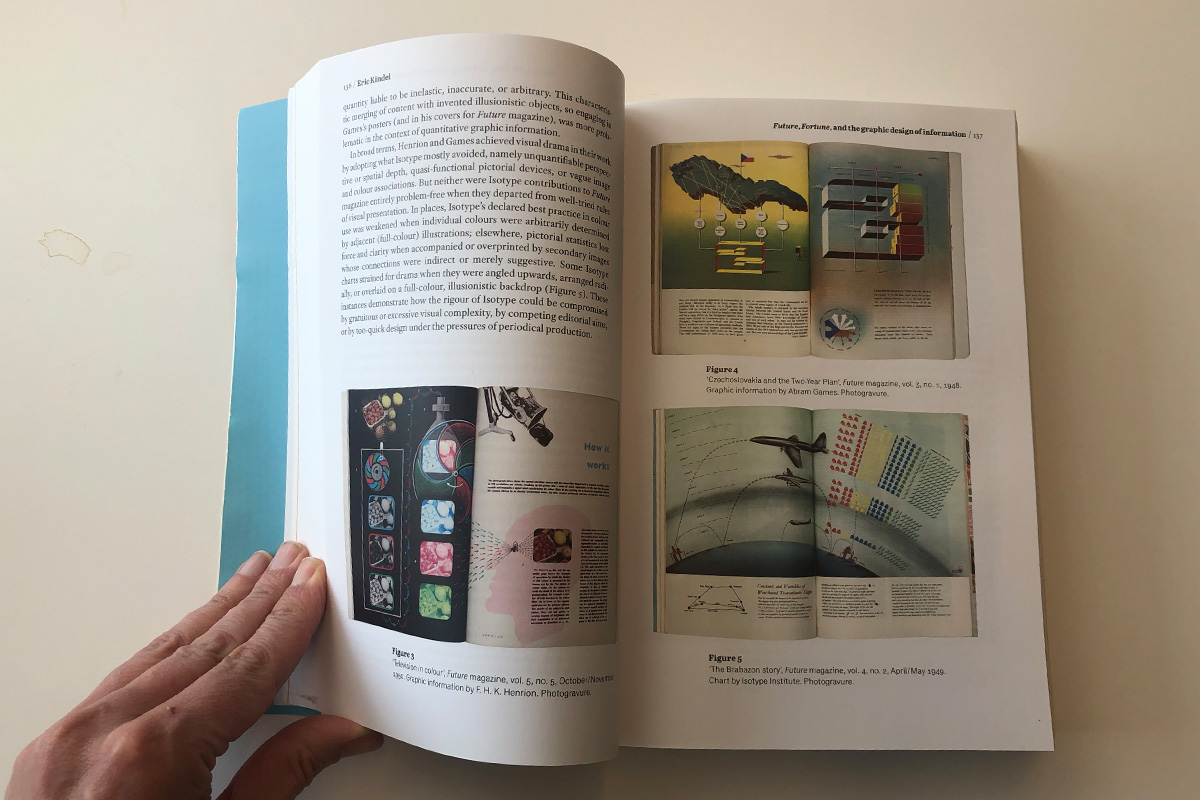
A brief overview of early visualizations of historical time. The invention of statistical graphs. Ship navigation and the history of technical and scientific illustrations. The history part continues with Isotype for information design. And Marie Neurath about designing information books for young people. This part closes off with documents, graphics and text about the history of information design.
Part 2: Theoretical approaches
This part shapes the mind for graphic literacies for a digital age. With a visual rhetoric in information design for multimodality and genre. Interesting chapters in this part are about Interactive information graphics and Social and cultural aspects of visual conventions in information.This part closes off with in-dept research about Textual reading on paper and screens. And how to apply science to design.
Part 3: Cognitive principles
This part goes deeper into understanding information design. Whereas chapters cover topics such as:
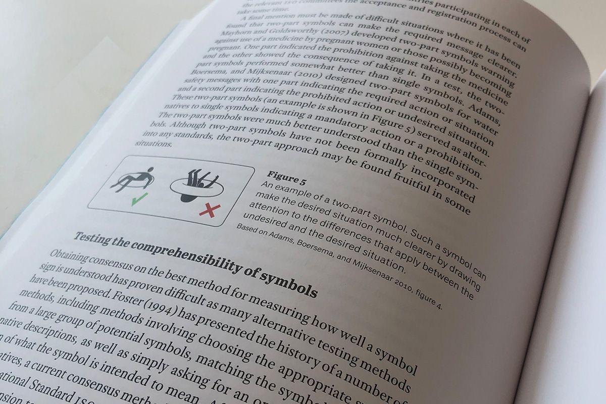
- Does my symbol sign work?
- Icons as carriers of information
- Warning design
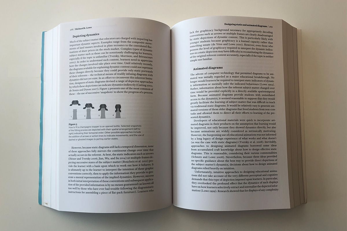
- Diagrams Chapter
- Designing static and animated diagrams for modern learning materials
- Designing auditory alarms
- Design challenges in helping older adults use digital tablets
- On-screen colour contrast for visually impaired readers
- Contrast set labelling
- Gestalt principles
- Information design research methods
- Methods for evaluating information design
- Public information documents
Part 4: Practical applications
The last part of this extensive work focusses more on design elements and sorting of information. All of the following chapters are interested if you are into wayfinding, urban design and information design in general.
The topics include: Choosing type for information design and how to design Indexing and information design. Interesting research about when to use numeric tables and why covers on how to communicate the information in a effective way for complex and large data sets.
For wayfinding the next chapters give insights on the following topics:
- Wayfinding perspectives
- Designing for wayfinding
- The problem of ‘straight ahead’ signage
- Park at your peril
- Indoor digital wayfinding
- Visualizing storyworlds
- Exhibitions for learning
- Form follows user follows form
The final part resumes on information design & values which explains the LUNAtic approach to information design.
The importance of information design in healthcare and medical information is explained and researched in the following chapters:
- Information design as a (r)evolutionary educational tool and
- Design + medical collaboration
- Developing persuasive health campaign messages
- Information design in medicine package leaflets
- Using animation to help communication in e-PILs in Brazil
- Medical information design and its legislation
For who is this book?
This is such an excellent resource. Covering the complete field of information design and its multidisciplinary aspects of it. Also referred as the Bible for Information Design.
This book is for everybody who wants to learn more about concise and comprehensive information design. How to design for complex applications, how to sort information, what to show and what not to show, and at what time.
From graphic design students to experienced designers, there are things to learn from the book.
Key take-aways include history of information design, understanding the theories behind information design and how to improve the way to communicate from simple to complex topics in a visual way.
Conclusion
The book is carefully researched and put together, a true bible for information design. A recommended buy if you are into learning more about information design, graphic design, wayfinding and structural layouts and design strategy.
There could be somethings said about the consistency of writing throughout the book, although it didn’t bother me while reading topics. From my person experience, I am reading topics upon required to learn something about a topic in information design.
Information
- Publisher: Routledge
- Language: English
- ISBN: 9780415786324
- Softcover, 766 pages
Information Design: Research and Practice
Learn more about information design with the bible and buy the book at Amazon.
Buy bij Amazon
Book Review: Airport Wayfinding 28 Jul 4:00 PM (just now)
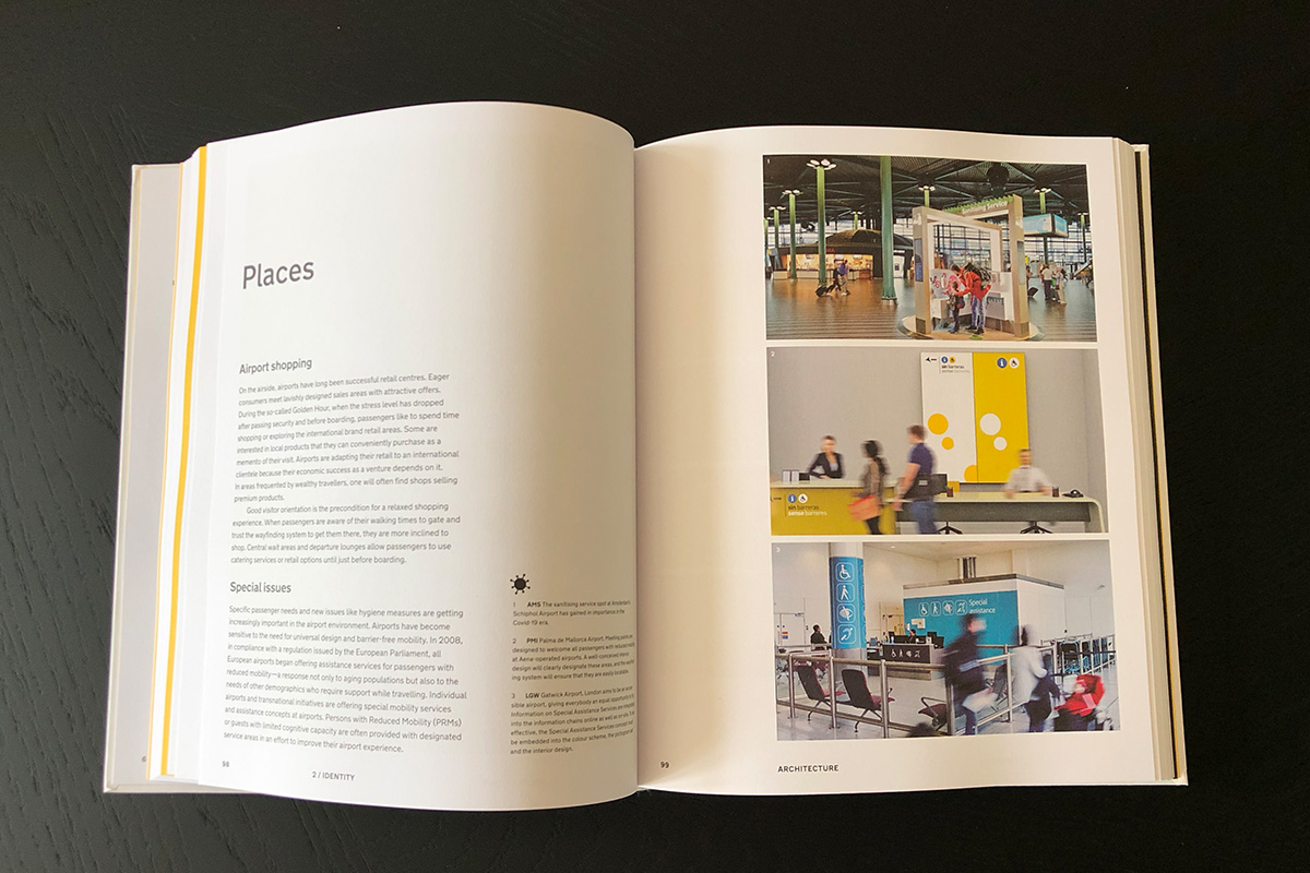
Over the years airports have been increasingly becoming larger spaces. Often also integrated with rail, metro and other means of transportation. In general(before COVID) people tend to take flights as a fast means on transportation from place to place.
The layout and structure of airports are different from city to city, therefore wayfinding is needed to navigate quickly and safely. Although wayfinding should be clear in airport, often the navigational information has interference with increasingly more advertising.
Airports have become multi-functional environments processes are internationally standardized and maximally efficient, with a strong emphasis on entertainment and consumption.
The book “Aiport Wayfinding” by Heike Nehl and Sibylle Schlaich is a complete overview what it takes to develop a wayfinding scheme for airports.
In some cases the wayfinding becomes part of the identity of an airport. Good example cases is for instance at Schiphol. The yellow signs stand out in the environment making it easy to navigate around. In the case of Schiphol, yellow has become the identity driver, recognizable and to stand out of advertising.
The book in a extensive overview on airport wayfinding, and explores the following;
- Evolving, a constant state of evolution
- Identity, architecture, flow and integrated design
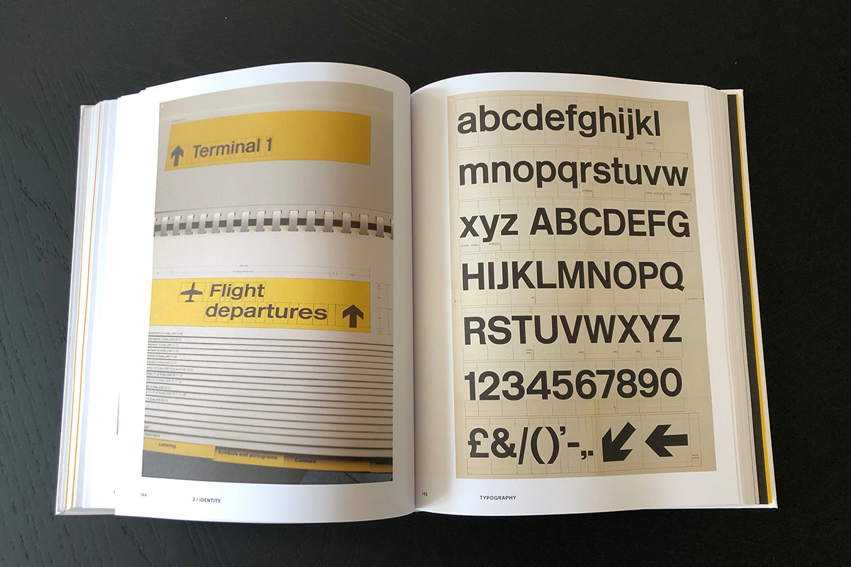
- Design, color, typography and pictograms
- Digital, pre-journey experience, at the airport and onward travel
- Beyond, how airports connect, mobility and the city
Airport wayfinding
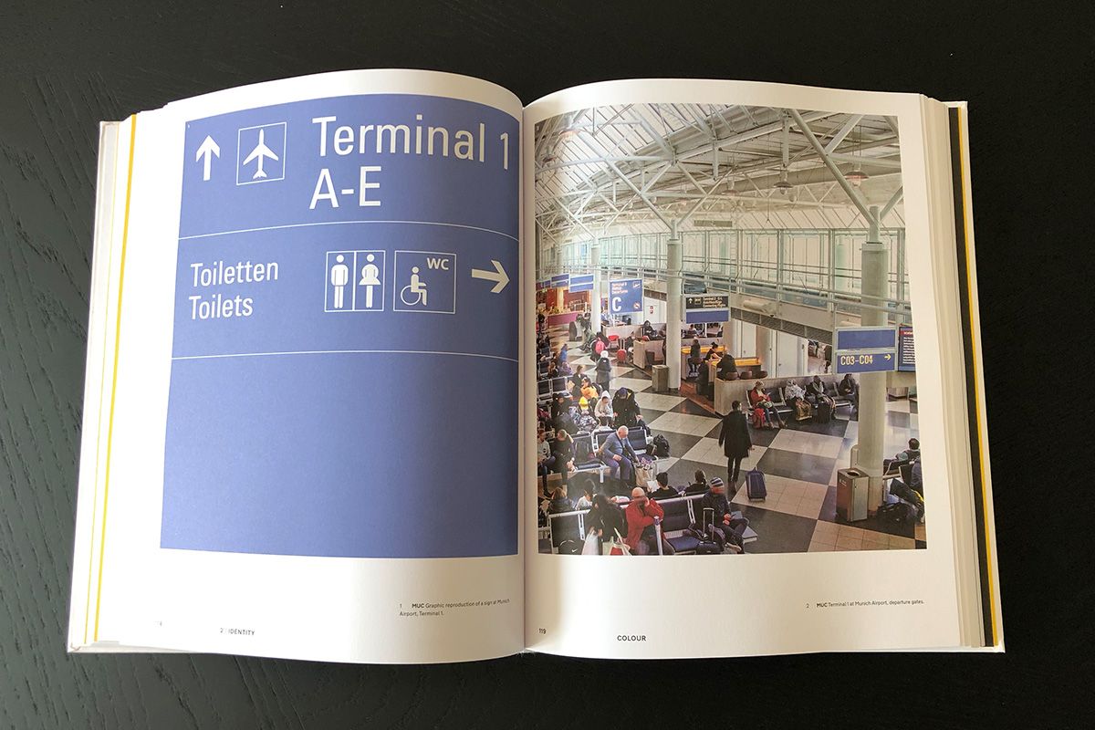
As there a many ‘standards’ in wayfinding, airport wayfinding tends to differ and creating a unique identity to the airport. Usually the background color of the signs are part of the identity. For example; Schiphol Yellow, Frankfurt Blue, Switserland Black, Heathtrow yellow, Berlin Red/Brown, etc.
Airport Wayfinding Strategy
Apart from color, typography and pictograms the wayfinding systems are also vary from letters to numbers.
The book explains the passengers flow land side and air side. A complete overview of the customer journey throughout an airport. Included examples for spatial layout and visions on how to improve passengers flow in airports.
From interviews, explanations and examples, the book analyzes wayfinding systems of approximately 70 airports by aligning their identities and functions.
Conclusion
The book “Airport Wayfinding” is a must read for urban planners, wayfinding information designers and working in the field of (air) transportation and mobility.
The countless examples, comparisons, standards and interviews makes this book on of our favorites in airport wayfinding.
If you want to learn about the authors, visit their website Moniteurs.
Information
- Publisher: Niggli Verlag
- Language: English
- ISBN: 978-3721210149
- Hardcover, 240 pages
%20people%20tend%20to%20take%20flights%20as%20a%20fast%20means%20on%20transportation%20from%20place%20to%20place.%20%3C/p%3E%0A%3Cp%3EThe%20layout%20and%20structure%20of%20airports%20are%20different%20from%20city%20to%20city,%20therefore%20wayfinding%20is%20needed%20to%20navigate%20quickly%20and%20safely.%20Although%20wayfinding%20should%20be%20clear%20in%20airport,%20often%20the%20navigational%20information%20has%20interference%20with%20increasingly%20more%20advertising.%20%3C/p%3E%0A%3Cp%3EAirports%20have%20become%20multi-functional%20environments%20processes%20are%20internationally%20standardized%20and%20maximally%20efficient,%20with%20a%20strong%20emphasis%20on%20entertainment%20and%20consumption.%20%20%3C/p%3E%0A%3Cfigure%3E%3Cimg%20alt%3D%22%22%20src%3D%22https://www.designworkplan.com/media/pages/read/book-review-airport-wayfinding/5caca60fb3-1722357483/airport-wayfinding-02.jpg%22%20/%3E%3C/figure%3E%0A%3Cp%3EThe%20book%20%E2%80%9CAiport%20Wayfinding%E2%80%9D%20by%20Heike%20Nehl%20and%20Sibylle%20Schlaich%20is%20a%20complete%20overview%20what%20it%20takes%20to%20develop%20a%20wayfinding%20scheme%20for%20airports.%20%3C/p%3E%0A%3Cp%3EIn%20some%20cases%20the%20wayfinding%20becomes%20part%20of%20the%20identity%20of%20an%20airport.%20Good%20example%20cases%20is%20for%20instance%20at%20Schiphol.%20The%20yellow%20signs%20stand%20out%20in%20the%20environment%20making%20it%20easy%20to%20navigate%20around.%20In%20the%20case%20of%20Schiphol,%20yellow%20has%20become%20the%20identity%20driver,%20recognizable%20and%20to%20stand%20out%20of%20advertising.%20%3C/p%3E%0A%3Cfigure%3E%3Cimg%20alt%3D%22%22%20src%3D%22https://www.designworkplan.com/media/pages/read/book-review-airport-wayfinding/e60d348bc7-1722357484/airport-wayfinding-03.jpg%22%20/%3E%3C/figure%3E%0A%3Cfigure%3E%3Cimg%20alt%3D%22%22%20src%3D%22https://www.designworkplan.com/media/pages/read/book-review-airport-wayfinding/7a7888d835-1722357485/airport-wayfinding-04.jpg%22%20/%3E%3C/figure%3E%0A%3Cp%3EThe%20book%20in%20a%20extensive%20overview%20on%20airport%20wayfinding,%20and%20explores%20the%20following;%3C/p%3E%0A%3Cul%3E%0A%3Cli%3EEvolving,%20a%20constant%20state%20of%20evolution%3C/li%3E%0A%3Cli%3EIdentity,%20architecture,%20flow%20and%20integrated%20design%3C/li%3E%0A%3Cli%3EDesign,%20color,%20typography%20and%20pictograms%3C/li%3E%0A%3Cli%3EDigital,%20pre-journey%20experience,%20at%20the%20airport%20and%20onward%20travel%3C/li%3E%0A%3Cli%3EBeyond,%20how%20airports%20connect,%20mobility%20and%20the%20city%3C/li%3E%0A%3C/ul%3E%0A%3Ch2%3EAirport%20wayfinding%3C/h2%3E%0A%3Cp%3EAs%20there%20a%20many%20%E2%80%98standards%E2%80%99%20in%20wayfinding,%20airport%20wayfinding%20tends%20to%20differ%20and%20creating%20a%20unique%20identity%20to%20the%20airport.%20Usually%20the%20background%20color%20of%20the%20signs%20are%20part%20of%20the%20identity.%20For%20example;%20Schiphol%20Yellow,%20Frankfurt%20Blue,%20Switserland%20Black,%20Heathtrow%20yellow,%20Berlin%20Red/Brown,%20etc.%20%3C/p%3E%0A%3Cdiv%3E%3Cdiv%3E%3Cfigure%3E%3Cimg%20alt%3D%22%22%20src%3D%22https://www.designworkplan.com/media/pages/read/book-review-airport-wayfinding/44a5926b2b-1722357481/airport-wayfinding-stand-01.jpg%22%20/%3E%3C/figure%3E%3C/div%3E%3Cdiv%3E%3Cfigure%3E%3Cimg%20alt%3D%22%22%20src%3D%22https://www.designworkplan.com/media/pages/read/book-review-airport-wayfinding/65ef7f09d9-1722357482/airport-wayfinding-stand-02.jpg%22%20/%3E%3C/figure%3E%3C/div%3E%3C/div%3E%0A%3Ch2%3EAirport%20Wayfinding%20Strategy%3C/h2%3E%0A%3Cp%3EApart%20from%20color,%20typography%20and%20pictograms%20the%20wayfinding%20systems%20are%20also%20vary%20from%20letters%20to%20numbers.%3C/p%3E%0A%3Cp%3EThe%20book%20explains%20the%20passengers%20flow%20land%20side%20and%20air%20side.%20A%20complete%20overview%20of%20the%20customer%20journey%20throughout%20an%20airport.%20Included%20examples%20for%20spatial%20layout%20and%20visions%20on%20how%20to%20improve%20passengers%20flow%20in%20airports.%3C/p%3E%0A%3Cp%3EFrom%20interviews,%20explanations%20and%20examples,%20the%20book%20analyzes%20wayfinding%20systems%20of%20approximately%2070%20airports%20by%20aligning%20their%20identities%20and%20functions.%3C/p%3E%0A%3Cfigure%3E%3C/figure%3E%0A%3Ch2%3EConclusion%3C/h2%3E%0A%3Cp%3EThe%20book%20%E2%80%9CAirport%20Wayfinding%E2%80%9D%20is%20a%20must%20read%20for%20urban%20planners,%20wayfinding%20information%20designers%20and%20working%20in%20the%20field%20of%20(air)%20transportation%20and%20mobility.%20%3C/p%3E%0A%3Cp%3EThe%20countless%20examples,%20comparisons,%20standards%20and%20interviews%20makes%20this%20book%20on%20of%20our%20favorites%20in%20airport%20wayfinding.%3C/p%3E%0A%3Cp%3EIf%20you%20want%20to%20learn%20about%20the%20authors,%20visit%20their%20website%20%3Ca%20href%3D%22http://www.moniteurs.de/en/%22%3EMoniteurs%3C/a%3E.%3C/p%3E%0A%3Csection%3E%0A%20%20%20%20%20%20%20%20%3Cdiv%3E%0A%20%20%20%20%20%20%20%20%3Cdiv%3E%3Ch3%3EInformation%3C/h3%3E%3Cul%3E%3Cli%3EPublisher:%20Niggli%20Verlag%3C/li%3E%3Cli%3ELanguage:%20English%3C/li%3E%3Cli%3EISBN:%20978-3721210149%3C/li%3E%3Cli%3EHardcover,%20240%20pages%3C/li%3E%3C/ul%3E%3C/div%3E%0A%20%20%20%20%20%20%20%20%3Cdiv%3E%0A%20%20%20%20%20%20%20%20%20%3Ch3%3EAirport%20Wayfinding%3C/h3%3E%0A%20%20%20%20%20%20%20%20%20%3Cp%3EGet%20knowledge%20on%20Airport%20Wayfinding%20and%20buy%20the%20book%20at%20Amazon.%3C/p%3E%0A%20%20%20%20%20%20%20%20%20%3Ca%20href%3D%22https://amzn.to/3iRIpZx%22%20role%3D%22button%22%3EBuy%20at%20Amazon%3C/a%3E%0A%20%20%20%20%20%20%20%20%20%3C/div%3E%3C/div%3E%0A%20%20%20%20%20%20%20%20%20%3C/section%3E)
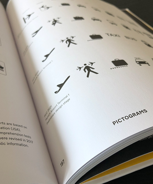
Piktogramme und Icons 22 Jul 4:00 PM (just now)
What is the difference between pictograms and icons?
- Icons are used in a broader sense that can have a free artistic look and feel. For example UI Material Icons represent the various functionalities of an App.
- Pictograms are usually a more simplified version of an icon, which represents for instance a common sense such as toilets, airplane, arrows etc.
The book Piktogramme und Icons is written in German. Don’t let this stop you, because this book is a full on guide on how to design pictograms and icons. Filled with countless examples the book represents everything to learn about pictograms and icons.
Visual language
A single pictogram or icon could represent a single form of communication. A set of pictograms and icons could represent a cross-cultural form of communication. Pictograms and icons are increasingly taking the place of national language communication or supplementing it.
As seen during Covid-19 pandemic, the use of pictograms have been critical to quickly understand what is required and how to navigate.
Design
The book explains on how to get started in pictogram design. Every step of the proces is described:
- Sketching, the rough outline of the pictogram/icon
- What are the characteristics and intention
- How to use a grid design
- About reading distance, line-width
- Positive and negative lines and shapes
- How to design meaningful visual elements universally understood
Examples
The books is filled with countless examples and inspiration designs.
- Vehicle, transport and road pictograms
- Airport pictograms, icons
- Healthcare pictograms
- Olympic games icons
- Universal used pictograms and icons
- and many more
The clear explanation on how to design a pictogram, combined with the many examples makes this book a must-have for any pictogram designer.
Availability
Rayan Abdullah and Roger Hübner lay the foundations for designing unambiguous and simple but not banal sign languages with their standard work, which competently illuminates and consequently explores theory and practice, development and commercialization, the multifaceted nature and future of a language without words: from the toilet sign to the escape route, Prohibition sign to the guidance system, from waste separation to the Olympics. 2D, 3D and on the web.
Unfortunately the book is mostly out of stock. You can search Amazon and the secondary market to get your hands on this amazing book.
Information
- Publisher: Schmidt Hermann Verlag
- Language: German
- ISBN: 3874396495
- Hardcover, paperback
![]()
Dutch government corporate identity 9 May 4:00 PM (just now)
Typeface: Rijksoverheid Sans / Serif
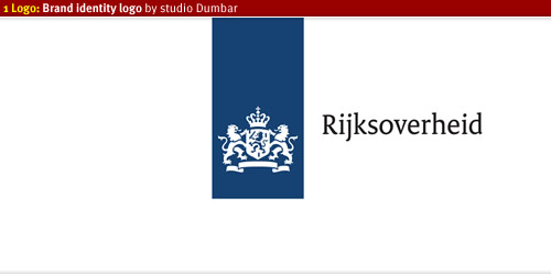
Currently there are over 200 departments and ministries which all have different logos and uses different typefaces as their brand identity. In a pitch held by the Dutch government studio Dumbar won this competition and introduced a new logo and 1 brand identity: 1 Logo.
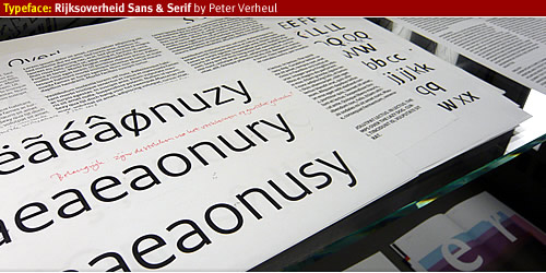
From the beginning of 2008 Peter Verheul was asked by studio Dumbar to take his typeface Versa and transform the typeface usable for a larger audience. He changed the look and feel of the Serif version of Versa Serif and created a complete new set of letters for the Sans version. The fonts are named Rijksoverheid Sans and Rijksoverheid Serif. The name of the typeface is recognizable as “government” and will be used in every way of visual communication.
The Rijksoverheid Sans will be used mainly for headings of text and in signage or wayfinding systems. The Rijksoverheid Serif is used as bread letter for reading text. In just under nine months Peter Verheul managed to finalize the fonts and released them in four different variations, from Regular, Italic to Bold.
Designing the Rijksoverheid typeface
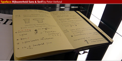
Letterijk book
During the time of creation Peter Verheul did not have much time to take pictures (as said in his introduction speech) but he kept a note book full of drawings and notes of creating and designing the typefaces. After finishing the typefaces he donated them to Bijzondere Collecties, a Dutch important collection of valuable work from Dutch graphical, typographical- artists. The Bijzondere Collections hosts the booklet, first printouts and everything that is related in creating the typeface Rijksoverheid.
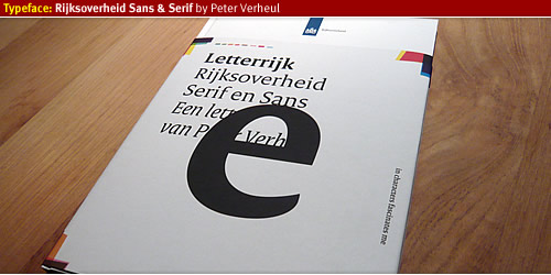
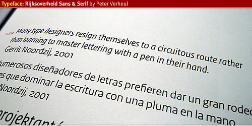
Letterrijk Book is a story about the birth and why of creation the typeface Rijksoverheid written by Mathieu Lommen, published by De Buitenkant Publishers. The booklet covers everything from the start of the project and the combination with project 1 Logo, a story about how the typography started working together, with many drawn examples of early stages of letter design. It also covers the complete glyphs of the typeface variations, with over 700 glyphs each this typeface is multi-language proof. With the design of the typeface several key factors of demands where given to Peter Verheul and Studio Dumbar.
The typeface should be easy to read, should not be too wide in order to reduce printing costs, it could be used for all forms of visual communication of the Dutch Government and every department will use it therefore it will reduce the costs of different typeface licenses. The typeface will function as a bridge between society and government, a typeface that everybody will feel comfortable with.
Rijksoverheids typeface
The Rijksoverheid Sans, an easy to read typeface with a large x-height. This allows maximum legibility for heading text, signage, wayfinding and other forms of visual identity. In the introduction speech Peter Verheul mentioned that he was impressed by the way the Sans version would be used for bread letter. He is interested to see the further development of Rijksoverheid Sans in this field.
Rijksoverheid Serif is the bread letter for reading text, I have read the booklet a couple of times and it seems to be a very legible typeface. Which will form the basis of the whole brand identity of the Dutch Government.
Project 1 Logo
The Dutch government brand identity was not concise or consistent, with over 200 departments and ministries costs were rising of each department havigd their own logo, typeface, print materials, signage and everything that involves the visual communication of that department. There was not a direct link to society and confusion about the identity the government wants to presents themselves. Project 1 Logo was born to bring back all brand identity of the Dutch government and give one signal to society about what the government stands for. In a pitch several design studios participated in order to create 1 Logo, 1 brand, 1 identity, 1 way of communicating between society and government, coming all together as 1 government.
From 2009 until 2011 every department should use the new logo and typeface in all forms of visual communication, a huge operation which involves many parties. I believe there will be a brand guideline from studio Dumbar to lead everything into the correct, concise and consistent use of the brand identity.
Read more
- Studio Dumbar, the designer of 1 Logo identity.
- Dutch government website about project 1 Logo, Rijkshuisstijl.
- Website of designer Peter Verheul
%20but%20he%20kept%20a%20note%20book%20full%20of%20drawings%20and%20notes%20of%20creating%20and%20designing%20the%20typefaces.%20After%20finishing%20the%20typefaces%20he%20donated%20them%20to%20Bijzondere%20Collecties,%20a%20Dutch%20important%20collection%20of%20valuable%20work%20from%20Dutch%20graphical,%20typographical-%20artists.%20The%20Bijzondere%20Collections%20hosts%20the%20booklet,%20first%20printouts%20and%20everything%20that%20is%20related%20in%20creating%20the%20typeface%20Rijksoverheid.%3C/p%3E%0A%3Cdiv%3E%3Cdiv%3E%3Cfigure%3E%3Cimg%20alt%3D%22%22%20src%3D%22http://www.designworkplan.com/wp-content/rijksoverheidsans-serif-typeface-005.jpg%22%20/%3E%3C/figure%3E%3C/div%3E%3Cdiv%3E%3Cfigure%3E%3Cimg%20alt%3D%22%22%20src%3D%22http://www.designworkplan.com/wp-content/rijksoverheidsans-serif-typeface-008.jpg%22%20/%3E%3C/figure%3E%3C/div%3E%3C/div%3E%0A%3Cp%3ELetterrijk%20Book%20is%20a%20story%20about%20the%20birth%20and%20why%20of%20creation%20the%20typeface%20Rijksoverheid%20written%20by%20Mathieu%20Lommen,%20published%20by%20De%20Buitenkant%20Publishers.%20The%20booklet%20covers%20everything%20from%20the%20start%20of%20the%20project%20and%20the%20combination%20with%20project%201%20Logo,%20a%20story%20about%20how%20the%20typography%20started%20working%20together,%20with%20many%20drawn%20examples%20of%20early%20stages%20of%20letter%20design.%20It%20also%20covers%20the%20complete%20glyphs%20of%20the%20typeface%20variations,%20with%20over%20700%20glyphs%20each%20this%20typeface%20is%20multi-language%20proof.%20With%20the%20design%20of%20the%20typeface%20several%20key%20factors%20of%20demands%20where%20given%20to%20Peter%20Verheul%20and%20Studio%20Dumbar.%20%3C/p%3E%0A%3Cp%3EThe%20typeface%20should%20be%20easy%20to%20read,%20should%20not%20be%20too%20wide%20in%20order%20to%20reduce%20printing%20costs,%20it%20could%20be%20used%20for%20all%20forms%20of%20visual%20communication%20of%20the%20Dutch%20Government%20and%20every%20department%20will%20use%20it%20therefore%20it%20will%20reduce%20the%20costs%20of%20different%20typeface%20licenses.%20The%20typeface%20will%20function%20as%20a%20bridge%20between%20society%20and%20government,%20a%20typeface%20that%20everybody%20will%20feel%20comfortable%20with.%3C/p%3E%0A%3Ch3%3ERijksoverheids%20typeface%3C/h3%3E%0A%3Cp%3EThe%20Rijksoverheid%20Sans,%20an%20easy%20to%20read%20typeface%20with%20a%20large%20x-height.%20This%20allows%20maximum%20legibility%20for%20heading%20text,%20signage,%20wayfinding%20and%20other%20forms%20of%20visual%20identity.%20In%20the%20introduction%20speech%20Peter%20Verheul%20mentioned%20that%20he%20was%20impressed%20by%20the%20way%20the%20Sans%20version%20would%20be%20used%20for%20bread%20letter.%20He%20is%20interested%20to%20see%20the%20further%20development%20of%20Rijksoverheid%20Sans%20in%20this%20field.%3C/p%3E%0A%3Cp%3ERijksoverheid%20Serif%20is%20the%20bread%20letter%20for%20reading%20text,%20I%20have%20read%20the%20booklet%20a%20couple%20of%20times%20and%20it%20seems%20to%20be%20a%20very%20legible%20typeface.%20Which%20will%20form%20the%20basis%20of%20the%20whole%20brand%20identity%20of%20the%20Dutch%20Government.%3C/p%3E%0A%3Cfigure%3E%3Cimg%20alt%3D%22%22%20src%3D%22http://www.designworkplan.com/wp-content/rijksoverheidsans-serif-typeface-010.jpg%22%20/%3E%3C/figure%3E%0A%3Ch2%3EProject%201%20Logo%3C/h2%3E%0A%3Cp%3EThe%20Dutch%20government%20brand%20identity%20was%20not%20concise%20or%20consistent,%20with%20over%20200%20departments%20and%20ministries%20costs%20were%20rising%20of%20each%20department%20havigd%20their%20own%20logo,%20typeface,%20print%20materials,%20signage%20and%20everything%20that%20involves%20the%20visual%20communication%20of%20that%20department.%20There%20was%20not%20a%20direct%20link%20to%20society%20and%20confusion%20about%20the%20identity%20the%20government%20wants%20to%20presents%20themselves.%20Project%201%20Logo%20was%20born%20to%20bring%20back%20all%20brand%20identity%20of%20the%20Dutch%20government%20and%20give%20one%20signal%20to%20society%20about%20what%20the%20government%20stands%20for.%20In%20a%20pitch%20several%20design%20studios%20participated%20in%20order%20to%20create%201%20Logo,%201%20brand,%201%20identity,%201%20way%20of%20communicating%20between%20society%20and%20government,%20coming%20all%20together%20as%201%20government.%20%3C/p%3E%0A%3Cp%3EFrom%202009%20until%202011%20every%20department%20should%20use%20the%20new%20logo%20and%20typeface%20in%20all%20forms%20of%20visual%20communication,%20a%20huge%20operation%20which%20involves%20many%20parties.%20I%20believe%20there%20will%20be%20a%20brand%20guideline%20from%20studio%20Dumbar%20to%20lead%20everything%20into%20the%20correct,%20concise%20and%20consistent%20use%20of%20the%20brand%20identity.%3C/p%3E%0A%3Ch3%3ERead%20more%3C/h3%3E%0A%3Cul%3E%0A%3Cli%3E%3Ca%20href%3D%22http://www.studiodumbar.com/main.php%22%3EStudio%20Dumbar%3C/a%3E,%20the%20designer%20of%201%20Logo%20identity.%3C/li%3E%0A%3Cli%3EDutch%20government%20website%20about%20project%201%20Logo,%20%3Ca%20href%3D%22http://www.rijkshuisstijl.nl/%22%3ERijkshuisstijl%3C/a%3E.%3C/li%3E%0A%3Cli%3EWebsite%20of%20designer%20%3Ca%20href%3D%22http://www.farhill.nl/%22%3EPeter%20Verheul%3C/a%3E%3C/li%3E%0A%3C/ul%3E)
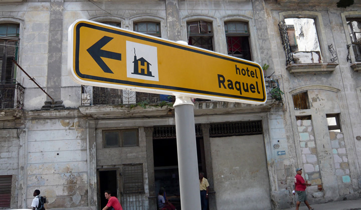
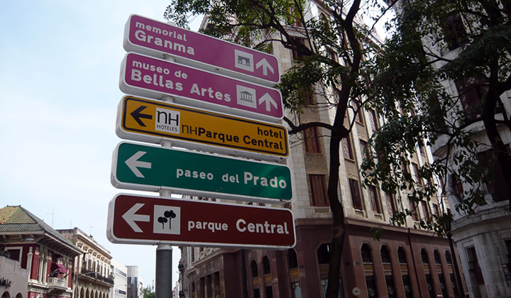
City Wayfinding Havana 9 May 4:00 PM (just now)
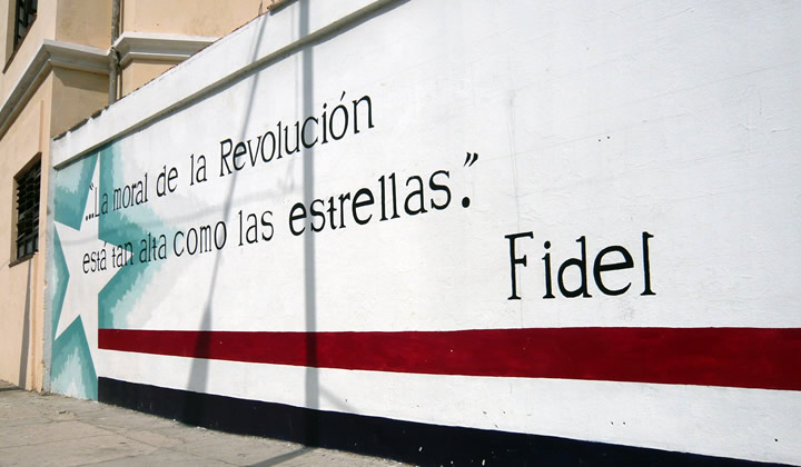
The Cuba that we know is a very restricted, communism country. Yet was striking to see that environmental graphic design and wayfinding are thought well through. From a propaganda point of reference, it is understandable to communicate on a physical street level to interact with the local community. Everywhere in the city slogans from the Fidel regime are painted on the walls.
But, what was noticeable was the city wayfinding. A comprehensive wayfinding system is implemented throughout Havana. This article will feature the characteristics of the Havana city wayfinding system.
Streets and signs of Cuba
The street life in Cuba is a great contrast to the Western world. The atmosphere is authentic and feels like a movie from the fifties. The streets of Havana, the small way of living and the local customs puts our every day life (what we take for granted) in perspective.
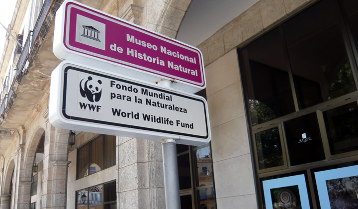
Typography, color and symbol signs
The consistency in placement, readability of text, arrows usage and symbol signs are balanced and it seems there is a graphic standard in place. We tried to determine who designed the wayfinding system and we would be interested knowing which agency or authority designed this. If you know who designed the Havana city wayfinding please let us know (see contact details below).
Overall the city wayfinding system in Havana gave a good experience of the city and was a guidance along the tourist attractions.
With the help of typographic tools we discovered the typeface used in the signs; Traffic Type Spain. The font has an authentic look and feel and fits well into the Cuban environment. The arrow design seems to originating from the Aiga Symbol Sign collection. The symbol signs referring to museums, parks and memorials seems to a familiarity with standardized symbol signs collections.
Traffic Type Spain Standard (D)
Originally, the font “Traffic Type Spain” designed in the pre-digital area around eighties. Then there were no ready to use outline fonts and to manufacture traffic signs they had to cut letterings by hand or manually compose them from single stamp letters.
URW developed sign-making software called SIGNUS, the first of its kind used to cut letters and logo in vinyl. Due the popular demand of SIGNUS, URW designed the digital outline fonts for road signs for European countries.
Under the technical direction of Peter Karow, URW led the world in developing digital font technology. Its IKARUS suite of font digitization tools and file format standards handles fonts as bitmaps, as grey scale (anti-aliased bitmaps), as vector outlines, and as curved outlines.
The fonts are designed specific to country regulations. The artwork for the fonts was mostly provided the sign-making companies who would produce the traffic letterings for the corresponding governmental traffic offices. The digital production and completion of the character set was done at URW.
The name “Traffic Type Spain” was given by URW. They named them all “Traffic Type” plus the country, like Traffic Type Sweden, Traffic Type Luxembourg, etc. This meant that the font was officially used to produce the traffic signs in for instance Spain.
We can only imagine why the Spanish variant is chosen for the sign system, it could have been an accidental choice or something to do with the Cuba history or Spanish influence. We estimate the wayfinding system was implemented about ten years ago and have regular updates.
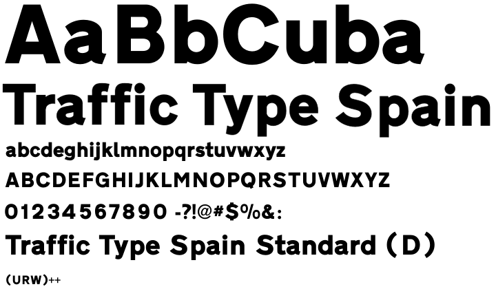
More about the font
The font “Traffic Type Spain” and other country related fonts are available via URW++ website. Below you will also find a reference to Ikarus Typography Software used to digitize paper fonts for digital use.
Special thanks to Peter Rosenfeld of URW++ Design & Development GmbH for contributing to this article with background details and information about the font Traffic Type Spain.
%20in%20perspective.%3C/p%3E%0A%3Cdiv%3E%3Cdiv%3E%3Cfigure%3E%3Cimg%20alt%3D%22%22%20src%3D%22http://designworkplan.com/wp-content/cuba-wayfinding-signage-720-10.jpg%22%20/%3E%3C/figure%3E%3C/div%3E%3Cdiv%3E%3Cfigure%3E%3Cimg%20alt%3D%22%22%20src%3D%22http://designworkplan.com/wp-content/cuba-wayfinding-signage-720-03.jpg%22%20/%3E%3C/figure%3E%3C/div%3E%3C/div%3E%0A%3Ch3%3ETypography,%20color%20and%20symbol%20signs%3C/h3%3E%0A%3Cp%3EThe%20consistency%20in%20placement,%20readability%20of%20text,%20arrows%20usage%20and%20symbol%20signs%20are%20balanced%20and%20it%20seems%20there%20is%20a%20graphic%20standard%20in%20place.%20We%20tried%20to%20determine%20who%20designed%20the%20wayfinding%20system%20and%20we%20would%20be%20interested%20knowing%20which%20agency%20or%20authority%20designed%20this.%20If%20you%20know%20who%20designed%20the%20Havana%20city%20wayfinding%20please%20let%20us%20know%20(see%20contact%20details%20below).%3C/p%3E%0A%3Cp%3EOverall%20the%20city%20wayfinding%20system%20in%20Havana%20gave%20a%20good%20experience%20of%20the%20city%20and%20was%20a%20guidance%20along%20the%20tourist%20attractions.%3C/p%3E%0A%3Cp%3EWith%20the%20help%20of%20typographic%20tools%20we%20discovered%20the%20typeface%20used%20in%20the%20signs;%20Traffic%20Type%20Spain.%20The%20font%20has%20an%20authentic%20look%20and%20feel%20and%20fits%20well%20into%20the%20Cuban%20environment.%20The%20arrow%20design%20seems%20to%20originating%20from%20the%20Aiga%20Symbol%20Sign%20collection.%20The%20symbol%20signs%20referring%20to%20museums,%20parks%20and%20memorials%20seems%20to%20a%20familiarity%20with%20standardized%20symbol%20signs%20collections.%3C/p%3E%0A%3Cdiv%3E%3Cdiv%3E%3Cfigure%3E%3Cimg%20alt%3D%22%22%20src%3D%22http://designworkplan.com/wp-content/cuba-wayfinding-signage-720-02.jpg%22%20/%3E%3C/figure%3E%3C/div%3E%3Cdiv%3E%3Cfigure%3E%3Cimg%20alt%3D%22%22%20src%3D%22http://designworkplan.com/wp-content/cuba-wayfinding-signage-720-01.jpg%22%20/%3E%3C/figure%3E%3C/div%3E%3C/div%3E%0A%3Ch2%3ETraffic%20Type%20Spain%20Standard%20(D)%3C/h2%3E%0A%3Cp%3EOriginally,%20the%20font%20%E2%80%9CTraffic%20Type%20Spain%E2%80%9D%20designed%20in%20the%20pre-digital%20area%20around%20eighties.%20Then%20there%20were%20no%20ready%20to%20use%20outline%20fonts%20and%20to%20manufacture%20traffic%20signs%20they%20had%20to%20cut%20letterings%20by%20hand%20or%20manually%20compose%20them%20from%20single%20stamp%20letters.%3Cbr%20/%3E%0AURW%20developed%20sign-making%20software%20called%20SIGNUS,%20the%20first%20of%20its%20kind%20used%20to%20cut%20letters%20and%20logo%20in%20vinyl.%20Due%20the%20popular%20demand%20of%20SIGNUS,%20URW%20designed%20the%20digital%20outline%20fonts%20for%20road%20signs%20for%20European%20countries.%3C/p%3E%0A%3Cp%3EUnder%20the%20technical%20direction%20of%20Peter%20Karow,%20URW%20led%20the%20world%20in%20developing%20digital%20font%20technology.%20Its%20IKARUS%20suite%20of%20font%20digitization%20tools%20and%20file%20format%20standards%20handles%20fonts%20as%20bitmaps,%20as%20grey%20scale%20(anti-aliased%20bitmaps),%20as%20vector%20outlines,%20and%20as%20curved%20outlines.%3Cbr%20/%3E%0AThe%20fonts%20are%20designed%20specific%20to%20country%20regulations.%20The%20artwork%20for%20the%20fonts%20was%20mostly%20provided%20the%20sign-making%20companies%20who%20would%20produce%20the%20traffic%20letterings%20for%20the%20corresponding%20governmental%20traffic%20offices.%20The%20digital%20production%20and%20completion%20of%20the%20character%20set%20was%20done%20at%20URW.%3C/p%3E%0A%3Cp%3EThe%20name%20%E2%80%9CTraffic%20Type%20Spain%E2%80%9D%20was%20given%20by%20URW.%20They%20named%20them%20all%20%E2%80%9CTraffic%20Type%E2%80%9D%20plus%20the%20country,%20like%20Traffic%20Type%20Sweden,%20Traffic%20Type%20Luxembourg,%20etc.%20This%20meant%20that%20the%20font%20was%20officially%20used%20to%20produce%20the%20traffic%20signs%20in%20for%20instance%20Spain.%3C/p%3E%0A%3Cp%3EWe%20can%20only%20imagine%20why%20the%20Spanish%20variant%20is%20chosen%20for%20the%20sign%20system,%20it%20could%20have%20been%20an%20accidental%20choice%20or%20something%20to%20do%20with%20the%20Cuba%20history%20or%20Spanish%20influence.%20We%20estimate%20the%20wayfinding%20system%20was%20implemented%20about%20ten%20years%20ago%20and%20have%20regular%20updates.%3C/p%3E%0A%3Cfigure%3E%3Cimg%20alt%3D%22%22%20src%3D%22http://designworkplan.com/wp-content/cuba-wayfinding-signage-720-07.png%22%20/%3E%3C/figure%3E%0A%3Ch3%3EMore%20about%20the%20font%3C/h3%3E%0A%3Cp%3EThe%20font%20%E2%80%9CTraffic%20Type%20Spain%E2%80%9D%20and%20other%20country%20related%20fonts%20are%20available%20via%20URW++%20website.%20Below%20you%20will%20also%20find%20a%20reference%20to%20Ikarus%20Typography%20Software%20used%20to%20digitize%20paper%20fonts%20for%20digital%20use.%3C/p%3E%0A%3Cul%3E%0A%3Cli%3E%3Ca%20href%3D%22http://www.urwpp.de/english/home.html%22%3EFoundry%20URW++%3C/a%3E%3C/li%3E%0A%3C/ul%3E%0A%3Cp%3ESpecial%20thanks%20to%20Peter%20Rosenfeld%20of%20URW++%20Design%20%26amp;%20Development%20GmbH%20for%20contributing%20to%20this%20article%20with%20background%20details%20and%20information%20about%20the%20font%20Traffic%20Type%20Spain.%3C/p%3E)
Architectural signage 9 May 4:00 PM (just now)
This article is a show case of the relationship between architecture and graphic design. In fact, surprisingly few architects use typographical elements in their design. For this overview of projects that do make good use of lettering, I’ve probably browsed through more than thousand Architectural Designs. Below you’ll find ten buildings on integrated architectural lettering and signage
I can only guess about the reason why architects make so little use of typhographical elements on their buildings. The main reason will be that the building design doesn’t need it. Most buildings can make their function clear without the use of signage on the façade. As you will find on the buildings listed below, architects used the signage to show the name of the building to the world; there is no building to be found with its function printed on it. The function is supposed to be clear.
A famous architect once stated: ‘form follows function’. That’s why you know what the particular function of a building is. Architects follow their mantra.
Café de Unie (The Union), Rotterdam, The Netherlands
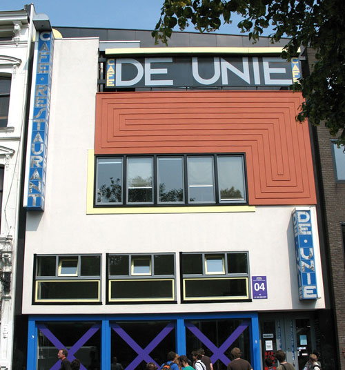
You can find this building near Rotterdam central station. It was destroyed during the second world war and has been rebuild in 1985, 500 meters from its original place.
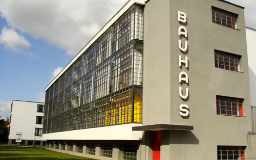
Bauhaus, Dessau, Germany
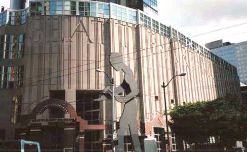
Seattle Art Museum, U.S.A.
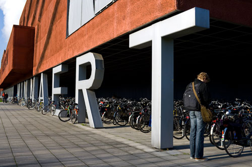
Minnaert building
Terror Háza múzeum / House of Terror museum
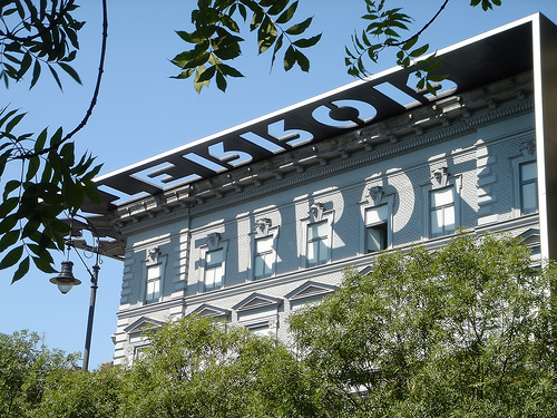
The reconstruction turned the exterior of the building into somewhat of a monument; the black exterior structure (consisting of the decorative entablature, the blade walls, and the granite sidewalk) provides a frame for the museum, making it stand out in sharp contrast to the other buildings on Andrássy Avenue. Wikipedia.
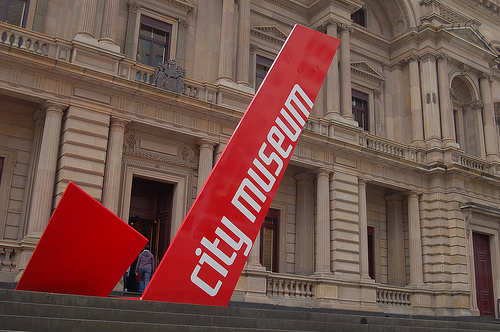
City Museum Melbourne, Australia
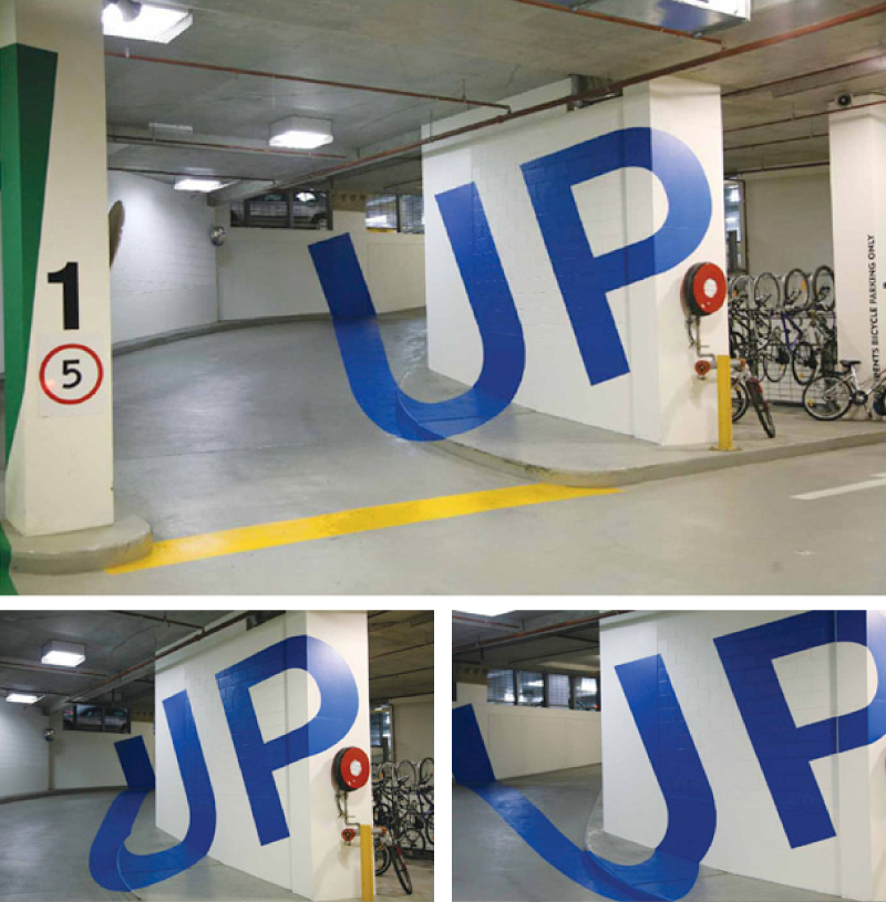
Eureka Tower Carpark
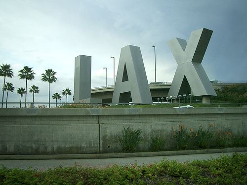
LAX
Art school made me do this
Library of Alexandria, Egypt
This is a guest post by Frank van Leersum, a Dutch student architecture who likes to write about architecture and books. Visit his Dutch weblog Aureon.
SDS Defining City Event 9 May 4:00 PM (just now)
On Wednesday 31st March Ivan Bennett, Design Manger for London Buses, delivered a presentation on the design and development of Bus infrastructure furniture and products at Transport for London’s offices in Southwark. This article gives and overview of the evening and highlights some of the key topics discussed.
Background Information
As part of Transport for London (TfL), London Buses is responsible for securing the provision of bus services throughout Greater London in a safe, efficient manner, while encouraging the use of buses and public transport. Surface Transport Infrastructure Development are responsible for the design and development, specification, installation and maintenance of the supporting infrastructure within Greater London. As the main point of contact with passengers, bus stops in London currently total over 19,000.
Introduction
Mike Wolff, Chairman of the SDS, introduced Ivan and highlighted that the society often discuss the graphic design and strategy of wayfinding systems, but talk less about the design of products. That in mind he was very keen to get the event underway.
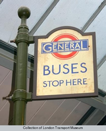
Ivan began his presentation by putting the scale of the London Bus project into perspective. Every weekday over 6,500 scheduled buses carry around 6.25 million passengers on over 700 different routes, amounting to over 1.7 billion journeys a year. He was also keen to point out that the first use of the iconic roundel was the 19th-century symbol of the London General Omnibus Company; its usage on the Underground came later.
History of London Buses
Illustrations of old shelters showed how little the identity had changed over the years and demonstrated how forward thinking London were in a period hung up on embellishment. Ivan emphasised the importance and influence of Frank Pick, head of the London Underground in the 1910s and 1920s and of the newly merged London Transport in the 1930s. Frank was instrumental in establishing the world’s most progressive public transport system and an exemplar of design management. Ivan went on to explain how Frank’s vision influenced the design of London bus products, including those we see on the streets today.
Creating Successful Products
TfL are a well known brand and the legacy of their products has a huge impact on defining the city. Their products and use of materials also help define the values of the system. Ivan identified his three intrinsic factors for creating successful products:
- Aesthetics
- Appropriateness
- Economics
- Even in the early 19th century, London Transport realised the importance of these values.
(quote: “The test of the goodness of a thing is its fitness for use. If it fails on this first test, no amount of ornamentation or finish will make it better; it will only become more expensive and more foolish.” – Frank Pick)
It was clear that Ivan and his team design products with a clear focus on ‘Appropriateness’. They adopt a cradle to grave approach to design and Ivan listed key considerations in their design process:
- Who will use the product?
- What will the product be used for?
- How long does the product need to last?
- What possible impact does the product need to withstand? (vehicles, pedestrians, weather)
- How often will the product need to be updated?
- How will the product be maintained?
-In particular when looking at materials:
Do the individual materials proposed work together?
- Are the materials used sustainable?
- Do the materials work within the surrounding environment?
- What is the life span of individual materials?
- How will materials be disposed of at the end of the products life?
Current Product
Using a full scale replica of a bus stand located at the front of the room, Ivan described in detail the design of the current product used at bus stops.

Many of the components are easily switchable. Ivan demonstrated how using a tiling system, bus stop numbers could be changed and moved almost like pieces of a jigsaw puzzle.
Examples of timetables, route maps and network maps helped show how London Buses have simplified information to make it easier for bus stop users to answer three key questions:
- Where am I now?
- How do I get from A to B
- How will I know when I get there?
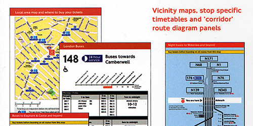
A good example of this simplification of information is the timetable, where individual times have been omitted and instead only first and last buses are listed along with the general frequency of buses throughout the day.
Example: Transport for London Journey Planner.
Where other systems fail
One reason other systems have failed is the lack of continuity. London bus stops extend beyond central areas and cover all routes in Greater London. Ivan indicated that passengers do not just want information about where they are travelling from, but when they get there, they need the same consistently presented information. People need information near their homes and local areas, not just in the centre of the city.
Ivan also pointed out that many systems fail because they do not own their products. London Buses design and build their products and own the intellectual property rights. This allows TfL the freedom to change manufacturers without having to reinvent their products. Continuity of the brand is maintained and London Buses can continually work on evolving their products.
Questions and Answers
The session concluded with a questions and answers forum. Unsurprisingly many of the questions focussed on manufacturing methods and material choices, but several of the questions were centred around brand identity and the roundel. A debate began on the use of the roundel and whether overuse was diluting its visual impact, a subject I am sure we all could have continued discussing at length, but time was pushing on and Mike sadly had to draw the session to a close.
Conclusion
I have been to several events organised by the SDS, but this was one of my favourites. The presentation was filled with facts, history, illustrations and physical examples. Ivan is obviously very knowledgeable on the subject and passionate about his job and this came through in his presentation.
I would like to thank Ivan, Mike, Michelle and the SDS for another great event.
For more information on the SDS visit: The Sign Design Society
Author Bio:
Hayley graduated in 2007 with a first class degree in Visual Communication. She now lives and works in London as a Wayfinding Designer for a large architectural practice. Her key projects to date include developing signage and information graphics for both Dublin and Rome Airport. Hayley’s thoughts and inspirations can be found in her regular tweets as Wayfinding_UK.
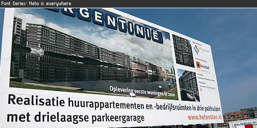
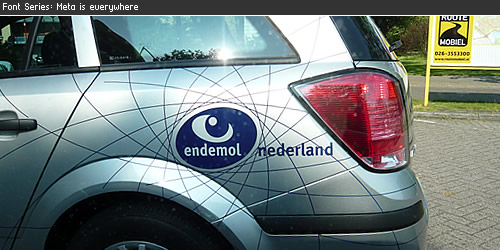
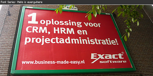
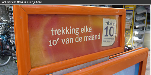
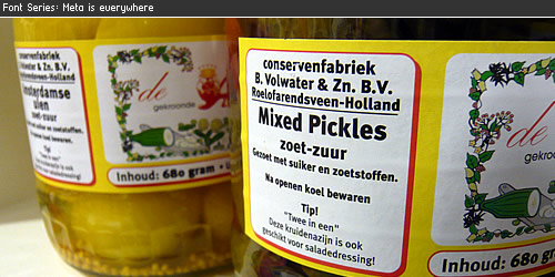
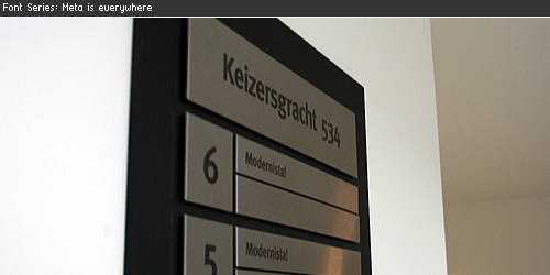
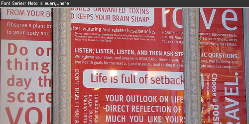
FF Meta is everywhere 9 May 4:00 PM (just now)
You can find FF Meta all around you, this is a collection of designs where we found the use of typeface FF Meta.
FF Meta® is a wonderful typeface designed by Erik Spiekermann, the font family was released between 1991 and 1998. A very readable typeface in smaller point sizes but also with enough detail to display in large point sizes. FF Meta is a sans-serif typeface which can be found all around you. The last several months where every I came (The Netherlands) I saw typeface Meta, in this font series you can see the many different faces of the FF Meta®.
Construction Billboard
Vehicle logo Endemol
Big billboard
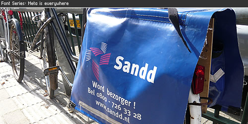
Bike Bag
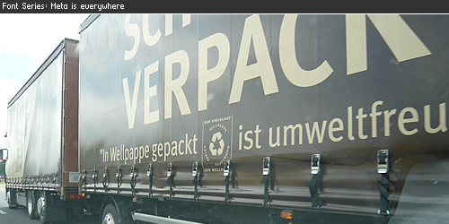
Truck on the highway
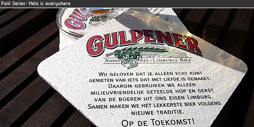
Gulpener Beer
Supermarket Coop
Staatsloterij / Lottery
Meta Pickles
Lekker bij Rosé

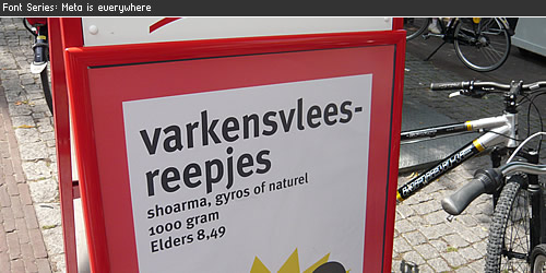
Signage
Shopping Window
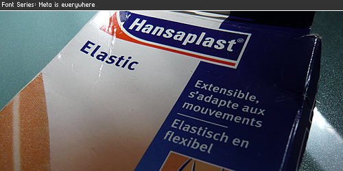
Elastic Bandage
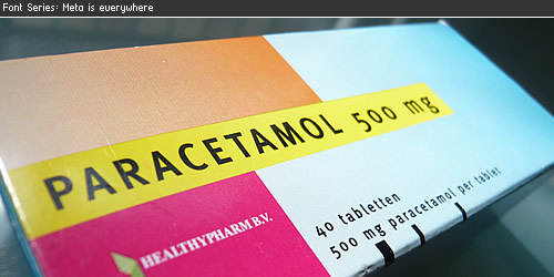
No more headache
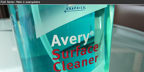
Avery Surface Cleaner
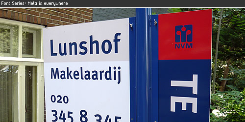
Real Estate Sign
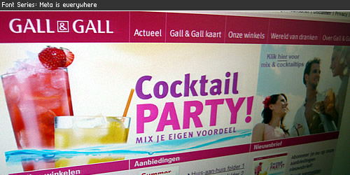
Gall & Gall
FF Meta
The Complete Font Family contains a package of 24 variations (via FontShop) and was published by FontFont (see their website for lots of Meta usage), is available in the following formats Mac PostScript, PC PostScript, PC TrueType. All styles Book, Caps, Bold and Bold Caps are also available in Italic. Starting from a set of 3 fonts at € 40,- to the complete font family for € 229,-. When bought at FontShop you can download the fonts after the purchase and start using them right away. Although FF Meta® is not in the top 10 bestsellers at FontShop I believe this is a very popular font.
- Visit FontShop for a complete overview of the Meta Font Family 1
- The complete overview of 55 variants of Meta Font Family.
- The Meta 3 Font package which contains Meta Hairline, Meta Thin & Meta Light. (Thank you Stephen Coles for adding the links)
- Wikipedia information page about the font Meta
Designer iPhone Apps 9 May 4:00 PM (just now)
iPhone apps are a huge extension to the workflow of every professional designer. This list is a large collection of work apps for your iPhone to manage your online files, create a mindmap, record messages, send business cards, pick a color and convert it into another, make calculations and much more. This list provides over 20+ iPhone applications, some are paid, some are free, let me know what iPhone App you use.
Rulerplus

- Price FREE
- iTunes link
OMNI Focus

- Price PAID
- iTunes link
AIR Sharing
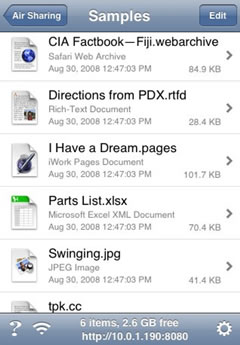
- Price PAID
- iTunes link
OpticsCalc
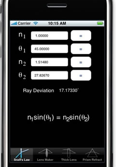
- Price PAID
- iTunes link
10base-t interactive
- Price FREE
-iTunes link
Airdesign Chair
- Price PAID
- iTunes link
Palettes

- Price PAID
- iTunes link
ZeptoPad
- Price PAID
- iTunes link
Things
- Price FREE
-iTunes link
BeamCalc
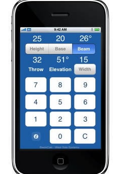
- Price PAID
- iTunes link
ColorExpert
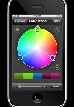
- Price PAID
-iTunes link
Files
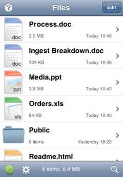
- Price PAID
- iTunes link
BeamMe
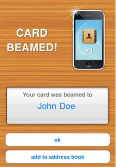
- Price FREE
- iTunes link
i41CX+
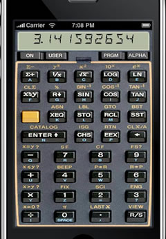
- Price PAID
- iTunes link
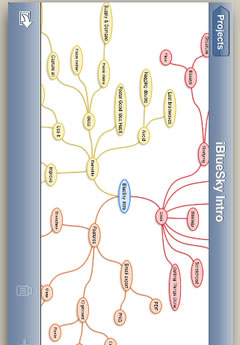
iBlueSky
- Price PAID
- iTunes link
Equivalence
- Price PAID
- iTunes link
Units
- Price PAID
- iTunes link
Scale Rule
- Price PAID
- iTunes link
Caliper
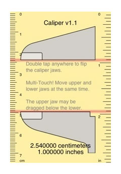
- Price PAID
-iTunes link
Google Calender
- Price FREE
- iTunes link
Dexigner News & Events

- Price FREE
- iTunes link
Wayfinding Tools 11 Apr 4:00 PM (just now)
In this article I’ve compiled a list of most important tools that I use to design, create and produce signage, wayfinding and other related design products.
Top 10 of most important tools
- The Fundamentals of Typography – A great book full of examples about designing with type.
- Stanley Tape Rule – Made of steel, one of the most important hand tools I use to quickly measure something.
- Stainless steel ruler – Excellent for measuring narrow size items, exact to the millimeter.
- Steel caliper – To measure the distance between two symmetrically opposing sides and to measure the thickness of materials.
- AcrySign color samples – Material color may differ from standard color systems like Pantone, therefore I use a sample chain to check the color.
- PANTONE Color Bridge Coated – Pantone Color Matching System (PMS) is the worlds standard color usage system, can’t live without it. Most design studios (graphic) work with PMS.
- Sikkens RAL – A color system mainly used used for paint colors. On of the most popular color is RAL 9010 (white).
- Black permanent Fineliner – Using it all day for writing, designing, quick scketches and more. Using dozens of them.
- Srewdriver – The small srewdriver represents a variety of machinery used to develop & create signage systems.
- Calculator – To use for design calculations, mathematic relations, finance and more.
More items on the list
To complete the manufacturing part at the company we use various machinery like: Vinyl cutter & plotter, laser engraving, laser cutting and CNC engraving machinery. The design elements are developed with the Adobe Design Suite CS3, we especially work with Adobe Illustrator which is the probably best professional drawing program (in my opinion) for creating vector based design & signage systems. Other programs like Autocad and specific engraving software are used to manufacture the products. We make use of 3rd parties for painting jobs and creating metal structures.
More tools and assets
- Wayfinding Tools and Assets
- Learning content
- Online courses
- Used by design professionals
Learn more about our tools
Our wayfinding design tools and assets will elevate your life as wayfinding designer.
Wayfinding Tools →
Dutch Design Magazines 11 Apr 4:00 PM (just now)
In this roundup of some of the Magazines & Blogs are in Dutch others are written in English. Below each of the screenshot there is language information, please enjoy this list of Dutch Graphic Design Magazines & Blogs, share your favorite Dutch Design blog in the comments below. Thank you and enjoy reading!
Fontanel : Online Design Magazine
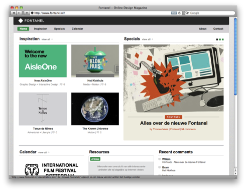
(quote: Love the simple presentation styles on Fontanel. Exactly what a publication can be; opportunities for design. – Jason Santa Maria at Twitter about Fontanel)
Fontanel focuses on design, typography, graphic design, art and will show you inspiration from other design magazines. They also host a calendar with up-to-date Dutch Design Information.
- Language Dutch
- Visit website Fontanel
Design Blog: Rietveld Academie
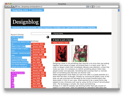
- Language English
- Enjoy the posts at the Design Blog Rietveld Academie
Design.nl
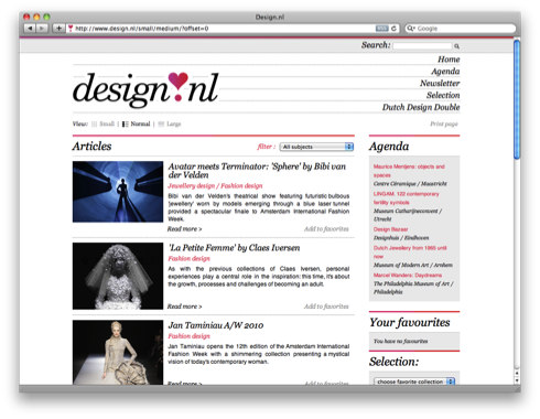
- Language: English
- Find the posts at the design.nl
Graphic Design Museum blog

The Graphic Design Museum is the first museum in the world for graphic design. The museum is in the centre of Breda and exhibits the broad and dynamic area of graphic design. Really worth the visit when you are in The Netherlands, Breda.
- Language: English
- Find the blog at Graphic Design Museum Blog
- Information about the Graphic Design Museum, Breda
NAGO: Nederlands Archief Grafisch Ontwerpers

- Language: Dutch
- Find the website at NAGO
Dutch Design History
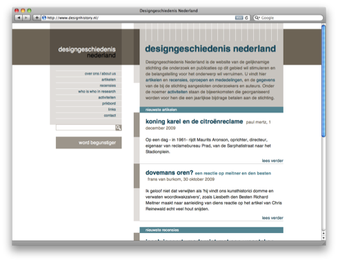
- Language: Dutch
- Find the website at Dutch Design History
Online/Offline magazine: Bright
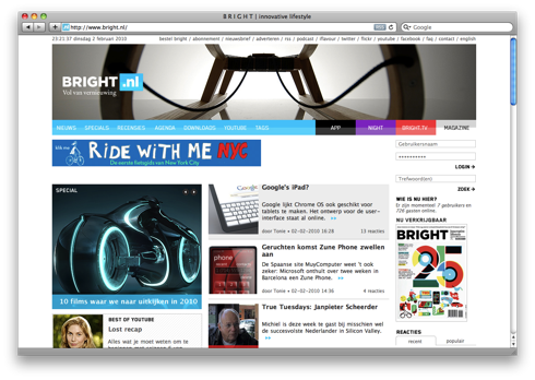
- Language: Dutch
- Find the website at Bright
Architectenweb
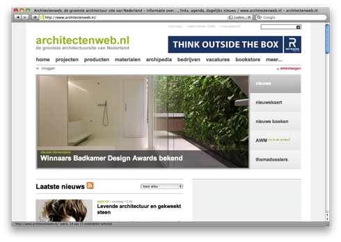
- Language: Dutch
- Find the website at Architectenweb
Web Designer Magazine
- Language: Dutch
- Find the website at Web Designer Magazine
Type Media
- Language: English
- Find the blog at Type Media
Symbol Sign collection 11 Apr 4:00 PM (just now)
Symbol sign collection
All the symbols have been designed & created by Sander Baumann and set to the proportions of a regular typeface, so you no longer need to copy/paste the symbols into your designs.
In this free collection I have added common used symbol signs for public services such as Toilets, Telephone, First Aid, Elevator, Information, Restaurant, Coffee Shop, Smoking, Baby, Recycle Icon, Shower, Reception desk, Arrows collection and much, much more.
The symbol signs can be used for signage & wayfinding projects. The complete symbol collection is optimized for reproduction methods such as engraving, laser engraving/cutting, screen printing and self adhesive film to manufacture the signs you need.
Details
The symbol signs have been designed for good readability and functionality, when installing the typeface into your computer the typeface symbol signs is added to your system, I have set the icons to match the most common letters for the symbols, for example F = female, M = male, d = disabled, L = arrow left, R = arrow right, U = arrow up, D = arrow down, and so on. This allows you to quickly add the symbol sign you need.
Free to download
- 50 symbol signs
- For personal and/or commercial use
- Creative Commons Attribution
- When using chrome browser, click right to save as 3.0
Download Symbol Signs Collection
The download file contains one file, an open-type typeface, with a total file size of 16kb.
Download Symbol Signs
Inspiration: Annual Report Designs 11 Apr 4:00 PM (just now)
An annual report is a document a company presents at Annual General Meeting for approval by its shareholders, or a charitable organization presents its trustees.
1. Featured showcase: IMC Annual Report

For IMC, Fitzroy designed a unique annual report. IMC – a renowned derivative trading house with over 500 employees worldwide – is an active trader in almost every stock market in the world. They constantly have to deal with stock exhanges’ information and its ever changing highs and lows.
In the annual report, this information is translated in a unique way by showing in 24 pages the 24 hours of a trading day. Which stock exhange opens and which one closes; what information is relevant. By using the green (increase) and red (decline) filters, the data of a hectic trading day are pushed to the background, so that only IMC’s active fields (the stock markets and the arrows) remain visible.
A final detail: based on GMT the stock exchanges trading at night are displayed in blue, while the ones trading during the day are displayed in yellow.
- Visit Fitzroy popup: yes for more information.
Out of the box designs
The following design examples are great inspiration for out of the box thinking.
2. Agency: Kuhlmann Leavitt
3. Agency: Bruketa Zinic
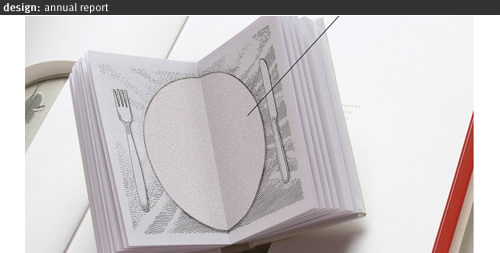
4. Agency: Migreyes
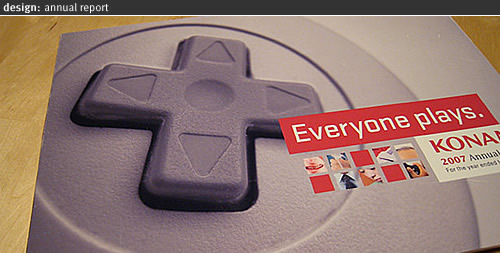
5. Feltron
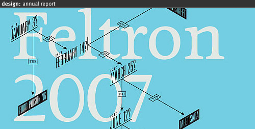
Simply beautiful Annual Report Design
Just beautiful annual report design with great color usage, typography and photo use.
6. British Council Annual Report
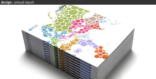
7. Airtricity Annual Report

8. Catalyst Recruitment
9. Agency Methodologie
10. Fred Hutchinson Cancer Research Center Annual Report
11. Stedelijk Museum Jaarverslag
12. Geest Annual Report
13. Agency Hirshorn Zuckerman Design Group
14. Agency SamataMason
15. Agency Sibley/Peteet Design Austin
16. BNP Paribas Annual Report
17. The Equality Authority
18. Annual Report Transparency International 2006
19. Overall design tips for Annual Report Design
Worth mentioning
_20. Delta Lloyd Jaarverslag, the complete annual report viewable as a website or to download from the website.
_21. Unilever Jaarverslag, download the complete PDF version from the website.
_22.Koninklijke Ahold Jaarverslag, download the complete PDF version from the Ahold website.
_23.IBM Annual reporting, available from 1994 to 2007, download the complete PDF versions from the website.
_24. IMF Annual report, available from 1996 to 2007, download the complete PDF versions from the website.
_25. A complete huide for annual reports, visit the website AnnualReport.com for additional information.
_26. StepInside, a design related website with top 100 company’s and annual reporting, see the website for additional information.
56 Free Arrow Symbols & Icons 11 Apr 4:00 PM (just now)
Vector Arrow
Arrows originate from pointing with the human finger towards a direction. In todays graphic design arrows are widely used in all kinds of forms and shapes.
This collection of arrows are designed for environmental graphic design, signage and wayfinding. The arrows are designed from a legibility perspective and should instantly be recognized as showing a direction. The collection is designed by graphic designer Sander Baumann and now released for you to use in your designs.
When you start a design for wayfinding or signage it is important to choose a arrow that fits your overall design scheme. Use the arrow on a high contrast for maximum exposure and readability. This collection had 56 different arrow designs, experiment with the arrows in your artwork/design scheme. Below you will find a few examples of the arrows at work.
Download
The 56 free vector Arrow Symbols & Icons are created under Creative Commons Attribution 3.0, meaning the vector images can be used either for personal or commercial purposes and may be changed to your own ideas, if you will credit my work or the website it will be highly appreciated.
Free to download
- 56 vector arrows
- For personal and/or commercial use
- Creative Commons Attribution 3.0
- When using chrome browser, click right mouse to save zip file as
Download Vector Arrows
The download zip-file contains two files, a Adobe Illustrator 8.0 file and PDF file, with a total filesize of 28kb.
Download Symbol SignsArrow Pro Asset Toolkit
We have developed a professional paid arrow toolkit with over 448+ arrow symbol signs and a 44+ pages manual. Download at our tools section today.
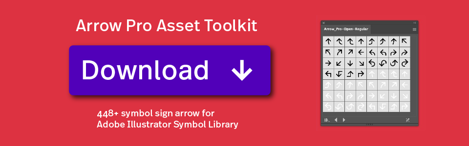
![]()
Arial is everywhere 11 Apr 4:00 PM (just now)
Arial, a contemporary sans serif typeface by Robin Nicholas and Patricia Saunders designed for Monotype in 1982. If you are familiar with a computer you must know Arial, one the most used “standard” typefaces for “normal” computer usage.
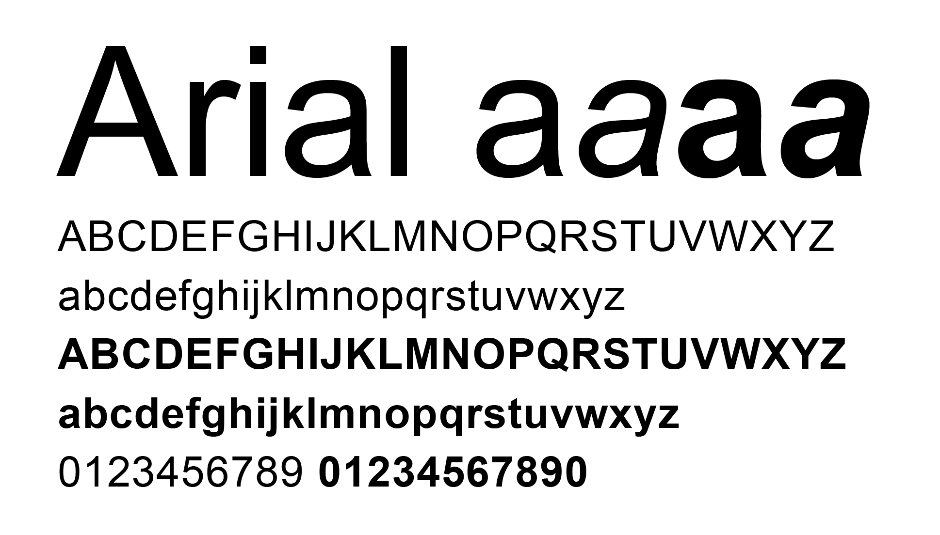
Arial
Most professional designers and typophiles think of Arial as a copied typeface from Helvetica and while reading the The Scourge of Arial by Mark Simonson Studio I have realized this is in fact a true story.
The typeface became free with the release of Windows 3.1, which was a sales hit and Arial quickly gained spread around the globe. The main reason why Microsoft chose Arial as standard typeface is because of the license fee from the original Helvectia typeface by the Haas Foundry was too high. Missed change to educate the world about the wonderful Grotesk family.
Arial vs Helvetica

- Visit Arial vs Helvetica on iLoveTypography
Today Arial belongs to Monotype:
Arial is an extremely versatile family of typefaces which can be used with equal success for text setting in reports, presentations, magazines etc, and for display use in newspapers, advertising and promotions.
Arial is everywhere!
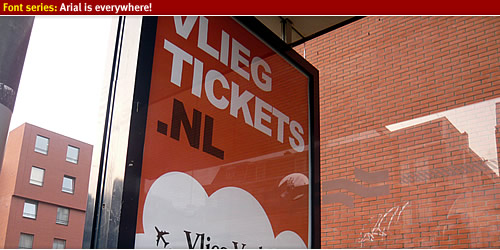
Advertisement sign
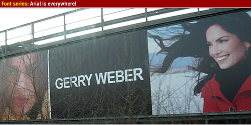
Thai cuisine
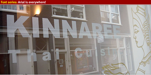
Highway truck
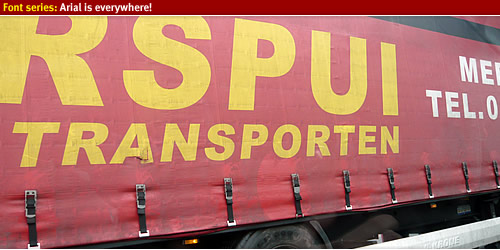
Mirabeau*
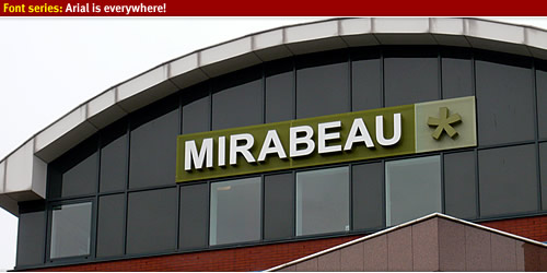
Clearing out the garage
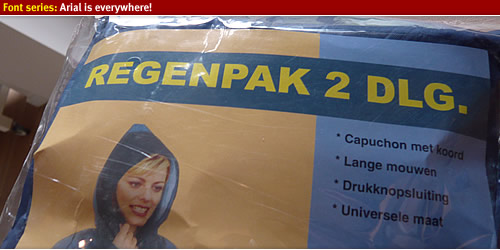
Swarzkopf
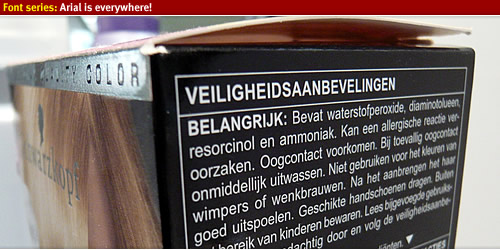
Tommy Hillfiger
Kaldi Koffie
Vehicle signage
Hotel signs
Getting up the mountains

Sun terras
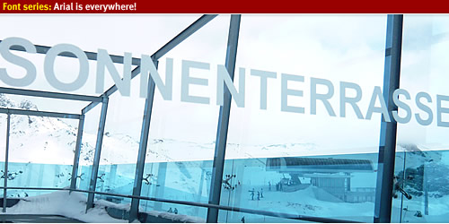
Ski rental
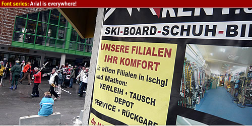
DigiD
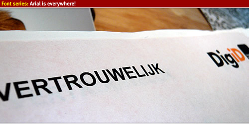
UPS
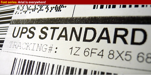
For sale sign
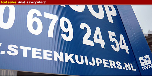
Design shop
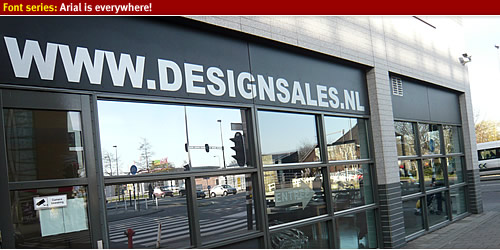
Plummer company
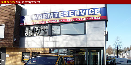
Bike bag
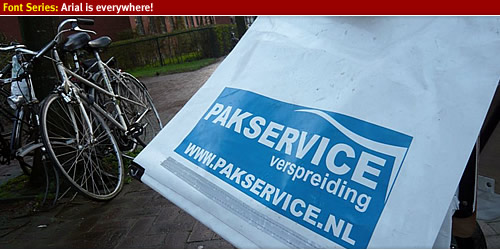
License plate holder
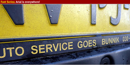
Vehicle signs
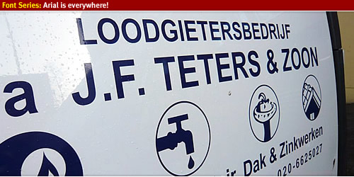
Local coffee bar
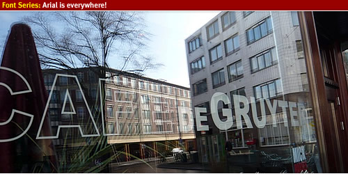
Arial is everywhere
Look around and you'll spot Arial around you! Arial is everyyyyyyywhere!!
Signage & Information graphics 11 Apr 4:00 PM (just now)
There are several books about signage systems and environmental graphic design available. Andreas Uebele wrote the book Signage systems & Information graphics and this is one of the best and most extensive books about signage available
Signage systems & Information Graphics
The 336 counting pages book has a hard cover and is 28,5 x 24 cm. The pages read well and quickly you can find what you are looking for by the index. The text layout and choose of typography fits well and reads great, designed in a grid way (similar to how signage is designed).
Andreas Uebele is a well known designer with the design identity agency in Germany “Büro Uebele”. They have managed to design many signage & information graphics projects in the last years, from airports, offices, library and more. The author describes the following elements of signage design:
- Signage design, typography and how to choose a typeface
- Production, planning and sign management
- Projects from sign designs from all over the world
- Extensive drawings and photos from sign projects
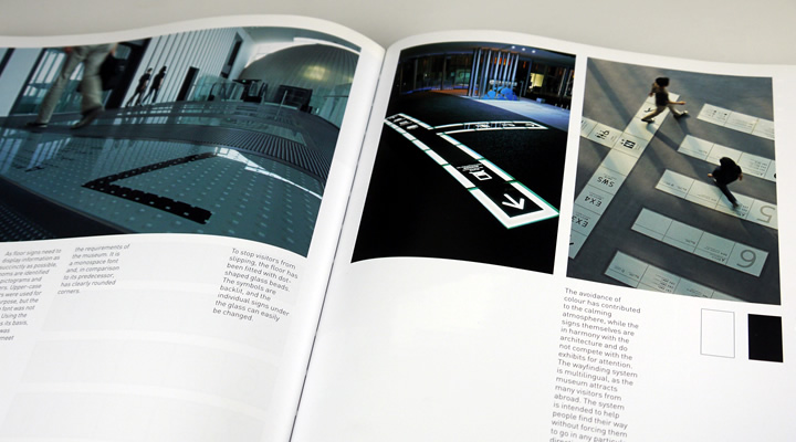
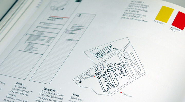
Typography & Signage
A key factor in signage design & information graphics is the choose of typography, with the choose of typeface you are able to make or break a design and its functionality. In the book is explained how to choose a typeface and what characteristics a certain typeface needs to have in order to be used in signage systems.
Uebele mentions different typefaces that they used in projects and explains the differences between the mentioned typefaces. A good introduction into choosing a typeface for signage & information graphics. Further on in the introduction the book goes deeper into designing for signage and which methods to use in order to achieve an effective signage & wayfinding system. With various examples and drawings you quickly read how and what to design.
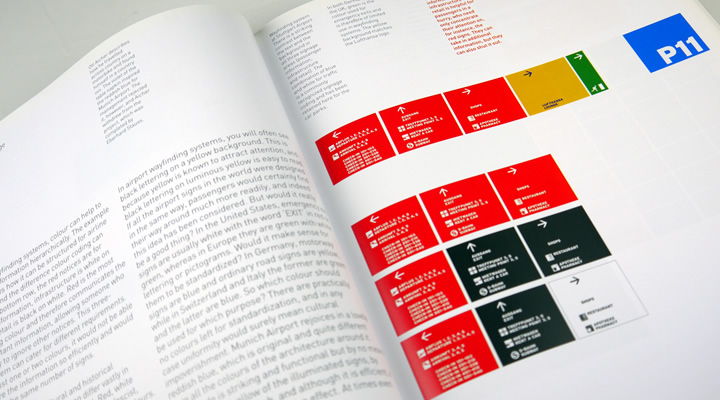
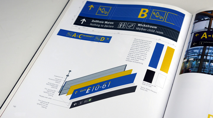
Sign Design
The book explains how to use proper color systems and how to place them into a environment to create a good working signage system. The author explains why they have chosen the color combination, typography and size of the airport signage project described in the book.
A great insight in learning more about signage design. Further on there are more projects described and explained with extensive photo material and the actual production drawings. By the drawings you can get a good view of how the signage systems are designed and produced.
Signage projects from other designers
In the book are also described many other projects from different designers and design agencies than Buro Uebele, for instance Schiphol designed by Bureau Mijksenaar. There are various images and concept drawings aswel as the detailed information about typography, color use and more. By adding more information from other designers makes this book a must have reference guide into graphic design and signage systems. You get a clear insight of signage projects which control people in various fields of visual communication and showing them the way.
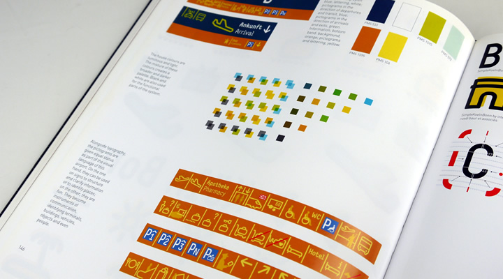
Information
- Publisher: Thames & Hudson (October 29, 2007)
- Language: English
- ISBN-10: 0500513791 and ISBN-13: 978-0500513798
- Hardcover: 336 pages
Buy Signage Systems and Information Graphics
This extensive signage graphics book is available at amazon.
Buy at Amazon
.%3C/p%3E%0A%3Cp%3EAndreas%20Uebele%20is%20a%20well%20known%20designer%20with%20the%20design%20identity%20agency%20in%20Germany%20%E2%80%9CB%C3%BCro%20Uebele%E2%80%9D.%20They%20have%20managed%20to%20design%20many%20signage%20%26amp;%20information%20graphics%20projects%20in%20the%20last%20years,%20from%20airports,%20offices,%20library%20and%20more.%20The%20author%20describes%20the%20following%20elements%20of%20signage%20design:%3C/p%3E%0A%3Cul%3E%0A%3Cli%3ESignage%20design,%20typography%20and%20how%20to%20choose%20a%20typeface%3C/li%3E%0A%3Cli%3EProduction,%20planning%20and%20sign%20management%3C/li%3E%0A%3Cli%3EProjects%20from%20sign%20designs%20from%20all%20over%20the%20world%3C/li%3E%0A%3Cli%3EExtensive%20drawings%20and%20photos%20from%20sign%20projects%3C/li%3E%0A%3C/ul%3E%0A%3Cdiv%3E%3Cdiv%3E%3Cfigure%3E%3Cimg%20alt%3D%22%22%20src%3D%22http://www.designworkplan.com/wp-content/bookreview-signage-uebele-001.jpg%22%20/%3E%3C/figure%3E%3C/div%3E%3Cdiv%3E%3Cfigure%3E%3Cimg%20alt%3D%22%22%20src%3D%22http://www.designworkplan.com/wp-content/bookreview-signage-uebele-002.jpg%22%20/%3E%3C/figure%3E%3C/div%3E%3C/div%3E%0A%3Ch3%3ETypography%20%26amp;%20Signage%3C/h3%3E%0A%3Cp%3EA%20key%20factor%20in%20signage%20design%20%26amp;%20information%20graphics%20is%20the%20choose%20of%20typography,%20with%20the%20choose%20of%20typeface%20you%20are%20able%20to%20make%20or%20break%20a%20design%20and%20its%20functionality.%20In%20the%20book%20is%20explained%20how%20to%20choose%20a%20typeface%20and%20what%20characteristics%20a%20certain%20typeface%20needs%20to%20have%20in%20order%20to%20be%20used%20in%20signage%20systems.%3C/p%3E%0A%3Cp%3EUebele%20mentions%20different%20typefaces%20that%20they%20used%20in%20projects%20and%20explains%20the%20differences%20between%20the%20mentioned%20typefaces.%20A%20good%20introduction%20into%20choosing%20a%20typeface%20for%20signage%20%26amp;%20information%20graphics.%20Further%20on%20in%20the%20introduction%20the%20book%20goes%20deeper%20into%20designing%20for%20signage%20and%20which%20methods%20to%20use%20in%20order%20to%20achieve%20an%20effective%20signage%20%26amp;%20wayfinding%20system.%20With%20various%20examples%20and%20drawings%20you%20quickly%20read%20how%20and%20what%20to%20design.%3C/p%3E%0A%3Cdiv%3E%3Cdiv%3E%3Cfigure%3E%3Cimg%20alt%3D%22%22%20src%3D%22http://www.designworkplan.com/wp-content/bookreview-signage-uebele-004.jpg%22%20/%3E%3C/figure%3E%3C/div%3E%3Cdiv%3E%3Cfigure%3E%3Cimg%20alt%3D%22%22%20src%3D%22http://www.designworkplan.com/wp-content/bookreview-signage-uebele-003.jpg%22%20/%3E%3C/figure%3E%3C/div%3E%3C/div%3E%0A%3Ch2%3ESign%20Design%3C/h2%3E%0A%3Cp%3EThe%20book%20explains%20how%20to%20use%20proper%20color%20systems%20and%20how%20to%20place%20them%20into%20a%20environment%20to%20create%20a%20good%20working%20signage%20system.%20The%20author%20explains%20why%20they%20have%20chosen%20the%20color%20combination,%20typography%20and%20size%20of%20the%20airport%20signage%20project%20described%20in%20the%20book.%3C/p%3E%0A%3Cp%3EA%20great%20insight%20in%20learning%20more%20about%20signage%20design.%20Further%20on%20there%20are%20more%20projects%20described%20and%20explained%20with%20extensive%20photo%20material%20and%20the%20actual%20production%20drawings.%20By%20the%20drawings%20you%20can%20get%20a%20good%20view%20of%20how%20the%20signage%20systems%20are%20designed%20and%20produced.%3C/p%3E%0A%3Ch3%3ESignage%20projects%20from%20other%20designers%3C/h3%3E%0A%3Cp%3EIn%20the%20book%20are%20also%20described%20many%20other%20projects%20from%20different%20designers%20and%20design%20agencies%20than%20Buro%20Uebele,%20for%20instance%20Schiphol%20designed%20by%20Bureau%20Mijksenaar.%20There%20are%20various%20images%20and%20concept%20drawings%20aswel%20as%20the%20detailed%20information%20about%20typography,%20color%20use%20and%20more.%20By%20adding%20more%20information%20from%20other%20designers%20makes%20this%20book%20a%20must%20have%20reference%20guide%20into%20graphic%20design%20and%20signage%20systems.%20You%20get%20a%20clear%20insight%20of%20signage%20projects%20which%20control%20people%20in%20various%20fields%20of%20visual%20communication%20and%20showing%20them%20the%20way.%3C/p%3E%0A%3Cfigure%3E%3Cimg%20alt%3D%22%22%20src%3D%22http://www.designworkplan.com/wp-content/bookreview-signage-uebele-005.jpg%22%20/%3E%3C/figure%3E%0A%3Csection%3E%0A%20%20%20%20%20%20%20%20%3Cdiv%3E%0A%20%20%20%20%20%20%20%20%3Cdiv%3E%3Ch3%3EInformation%3C/h3%3E%3Cul%3E%3Cli%3EPublisher:%20Thames%20%26%20Hudson%20(October%2029,%202007)%3C/li%3E%3Cli%3ELanguage:%20English%3C/li%3E%3Cli%3EISBN-10:%200500513791%20and%20ISBN-13:%20978-0500513798%3C/li%3E%3Cli%3EHardcover:%20336%20pages%3C/li%3E%3C/ul%3E%3C/div%3E%0A%20%20%20%20%20%20%20%20%3Cdiv%3E%0A%20%20%20%20%20%20%20%20%20%3Ch3%3EBuy%20Signage%20Systems%20and%20Information%20Graphics%3C/h3%3E%0A%20%20%20%20%20%20%20%20%20%3Cp%3EThis%20extensive%20signage%20graphics%20book%20is%20available%20at%20amazon.%3C/p%3E%0A%20%20%20%20%20%20%20%20%20%3Ca%20href%3D%22https://amzn.to/34dx6EE%22%20role%3D%22button%22%3EBuy%20at%20Amazon%3C/a%3E%0A%20%20%20%20%20%20%20%20%20%3C/div%3E%3C/div%3E%0A%20%20%20%20%20%20%20%20%20%3C/section%3E)
Apps for City Wayfinding 11 Apr 4:00 PM (just now)
Orientation and navigation in a unknown city can be hard, can these wayfinding apps help you along?
Exploring unknown cities for business or pleasure, for me, is always a joyful experience, walking around and getting into the city will enlighten your vision and makes you connect to the culture. Visiting the beautiful and exciting elements a city has to offer makes your trip an unforgettable visit. Getting information on how to get around in a city is essential for easy orientation and navigation.
Actually one of the most important factors that you will remember after visiting a city is how did you get around.
What items did you use to navigate through a city? How did public transport interacts with the navigation possibilities that you have? What was your feeling and with the items you used to navigate and did you find your way? Where did you get your information from and was it sufficient enough?
All of these questions make or break a your vision on city exploration.
Exploring a unknown city
When visiting a city there are different ways you can get there and after arriving you need to know where you are in the spatial environment in order to locate yourself and make decisions on where to go next. The provided information at that point of entry is critical for easy city exploration, if the provided information is insufficient, you might turn the wrong way and not finding the locations you want or need to visit. Going the wrong way increases feelings of disorientation, distraction and anxiety. The feeling that you are loosing time on exploring a city trip is one of the worst psychological emotions you experience.
City information
When visiting a new city is can be useful to check the cities website and obtain information about:
- Public transport and available connections between the various transportation services
- Getting a map of the city and locate your hotel, maybe even plan a trip from your city point to entry to the hotel
- Maybe plan your trip via google maps and mark all the points your want to visit
- Opening hours of the facilities you want to visit
- I’m that kind of guy that doesn’t do any of the suggested items as described above… I just try to explore the city using my senses and trying to find where I need to go next. Sometimes this is a great and joyful experience, sometimes it causes disorientation and arguments with the people I travel with at that time.
Orientation and navigation in an unknown city
When using your senses to guide yourself in a unknown environment you need eye-level directional information and possibly a map to locate and navigate through the city. City often uses directional signs on streets to point you in the right direction and sometimes information panels are providing you with an orientation overview. In future posts I will go deeper into pedestrian navigation and city wayfinding. Other forms of navigation is through a mobile phone powered with for instance Google Maps or specific applications enhanced to bring you information about the city you want to visit.
City marketing and visitors information
As city marketing is the nr. 1 way of promoting your city, providing information to the visitors is also part of the branding strategy. Currently many cities worldwide are producing mobile applications to improve the visitors experience and this will make it easier to navigate through a city. I have compiled a list of iPhone applications which will let you navigation through a city using your own personal map.
Airport signage 10 Apr 4:00 PM (just now)
Show the way
Airport signage design is not a easy task and creating a wayfinding system in a airport which will have to guide thousands of visitors takes a in-dept case study of the visual environment, travellers stream, detailed prints of the building and much more. In this photo showcase I’ve collected images of Airport Signage from cities all over the world, using the photo website flickr.
Airport Signage Design
When designing signage for a Airport or a other public building you have to take a good notice of the visual surroundings the signage will be placed in. The backgound colors of walls and windows, the amount daylight let in the building, the lighting and more environmental elements are important when designing signage for a aiport.
In a visual crowed environment it is important that signage design stands out to its background, for a maximum effect. Use a color system with not to many variations and be consistant with the color usage. Think about using illumnated signs to enhanche the readability of the signage and always use mockups of the signs to test if the signage is working in the visual surroundings.
Color, typography design and use of pictograms
Design high contrast signs to ensure good readability and legibilty of the signage. Colors that work well are a dark background with a light colored text and pictograms. For example a black background with white illuminated lettering will ensure a high contrast which has a good readability from a distance. Other commen color combinations are a yellow background with black lettering.
For typography use a sans type like FF Info by Erik Spiekermann or Frutiger by Adrian Frutiger. Use a font that have a high x-height which will increase the legibility of the signs. Use only one font in all visual communication levels of the airport signage. For international airports it is vital to use symbols to indicate the facilities in and around the airport, always strengthen the symbol with written text in the native language and perforably in English language. This will ensure that most of the visitors can read the signs.
Arrow design
Arrows are one of the most important design features of a wayfinding system for airports, with a pointing arrow you will be able to guide visitors to their destination. Choosing a arrow within a design can make or break the design, don’t over due the arrow but gently incorporate the arrow into the sign in balance with type. Recently I’ve released a arrow collection to use in a design.
Sign design using a grid
Always use a grid to design signage & wayfinding systems in order to maintain balance and flexibility in the design. In a future article I will go in dept by explaining how to design signage using a grid.
Inspiration: Personal favourites
Below you will find a showcase of my personal 5 favourite airport signage designs. High contrast illuminated signs, using clear lettering.
Seattle Airport Signage
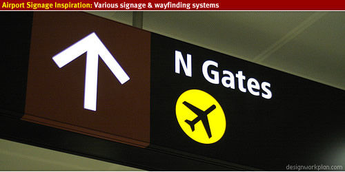
Singapore Terminal 3 airport
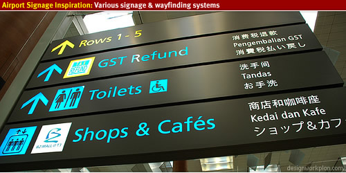
Schiphol Amsterdam
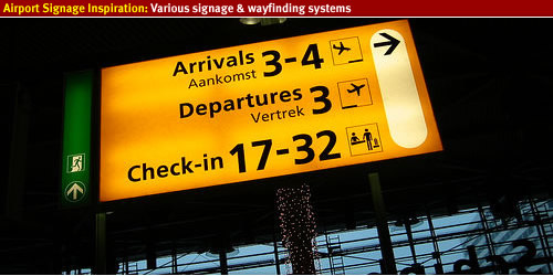
Melbourne Australia, Airport Signage
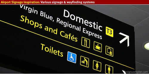
Portland International Airport Signage
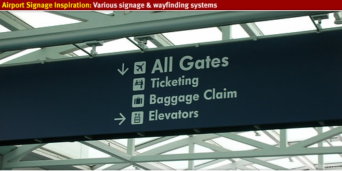
Ataturk Airport
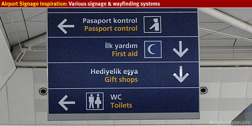
Munich Airport Signage
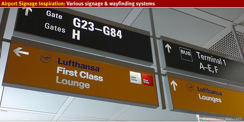
Zürich airport signage
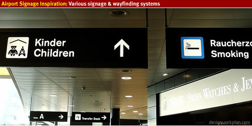
Warsaw Airport Signage
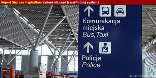
Singapore airport signage
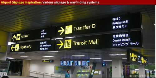
Oporto’s new airport signage
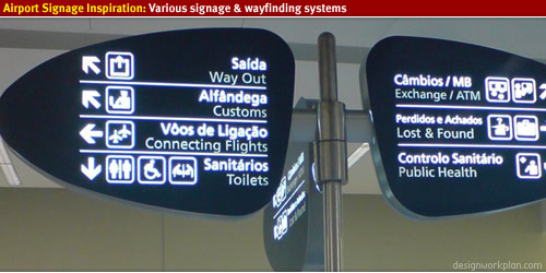
Zürich basic signage
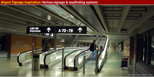
Berlin, Schönefeld Airport
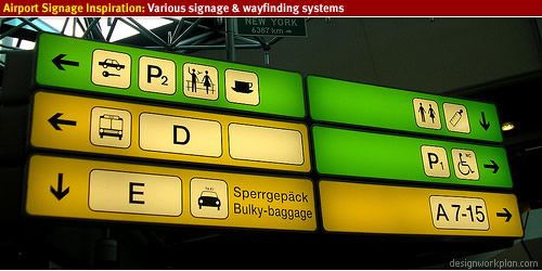
Paris – CDG Airport Terminal 2
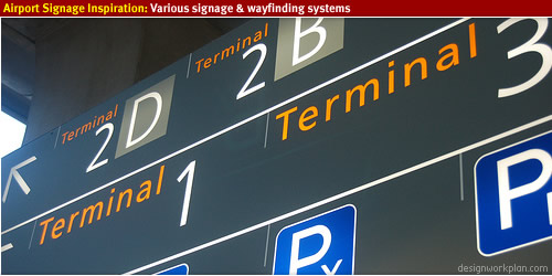
Madrid Airport
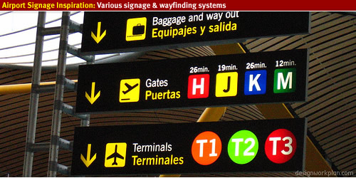
Doha, Qatar
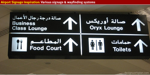
Thai airport signage
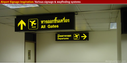
Dubai airport
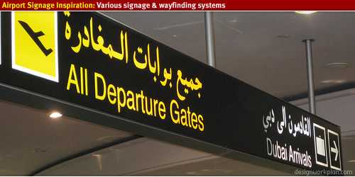
Incheon International Airport
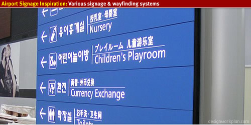
Bengaluru International Airport
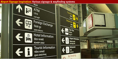
Copenhagen airport signage
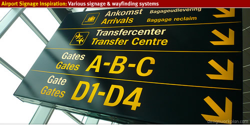
Frankfurt International Airport
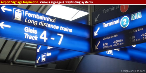
Oaxaca City Airport
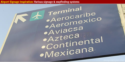
Malaysia’s KLIA airport
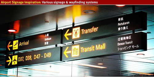
The Wayfinding Handbook 8 Apr 4:00 PM (just now)
The book describes everything you need to know to get started as graphic designer in the world of environmental graphic design. The writer David Gibson is a highly respected wayfinding designer and principal of graphic design firm Two Twelve, New York
A manual for students, teachers, professionals, and clients.
This is exactly what this book is about, easy readable and recognizable for everybody to read and learn wayfinding design. I have read this book with great pleasure and using it as a reference manual in my daily activities.
Information Design for Public Places
In the first chapter the book describes the history of wayfinding and the spectrum of projects, which you will learn about the different areas wayfinding designers work in. There are several great examples of wayfinding projects shown and Gibson takes it deeper into the structure of projects and where the wayfinding designers fits in. Every chapter features a page written by people from the industry, making this book great fun to read and you will get different perspectives on the topics.
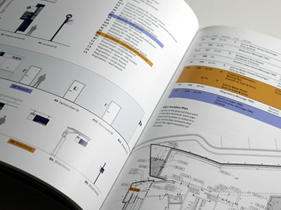
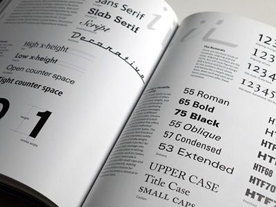
Design Process
As wayfinding designer there are many different kind of signs needed in a project, from small toilet signs to large boxed letters on the roof of the building. To enhance the wayfinding system all signs need to interact which each other in order to let them work together effectively. The book describes many different type of signs and explains about strategic planning and information graphic design. With several examples on how to document a wayfinding system this part really stands out in the book.
Wayfinding design
In the section wayfinding design, Gibson talks about typography, layout, symbols, color, materials and media. This section is a great learning experience to create signage & wayfinding design. With an very interesting page from Jonathan Hoefler on type design, legibility, purpose and wayfinding design these chapters will make you want to create wayfinding design!
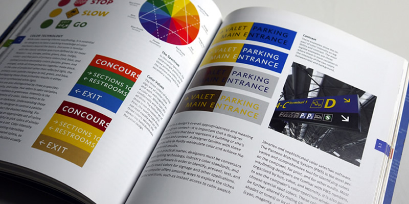
Practical tips
The last section of the book takes you into how wayfinding projects are initiated and what the requirements should be in order to select a wayfinding designer. I especially enjoyed the part about documentation and fabrication, one of the most essential parts of creating a good manual for a wayfinding project.
Conclusion
Personally I enjoyed reading this book very much, it is easy to read, recognizable, short stories but with an edge to keep it clean and simple. Each chapter starts with a small introduction and a line about Learn About, where you quickly see what to expect from this section in the book. As said above the different insights from other people in the industry makes this book a great reference guide into wayfinding design. What I love about this book that it is written for everybody. If you are into environmental graphic design, signage/wayfinding than this is the book for you!
The Wayfinding Handbook is a complete guide to the discipline, from planning and design to practical considerations, such as setting up teams and managing projects.
Information
- Publisher: A Princeton Architectural Press publication
- Language: English
- ISBN 9781568987699
- In print (publication date 3/1/2009)
%3C/li%3E%3C/ul%3E%3C/div%3E%0A%20%20%20%20%20%20%20%20%3Cdiv%3E%0A%20%20%20%20%20%20%20%20%20%3Ch3%3EBuy%20The%20Wayfinding%20Handbook%3C/h3%3E%0A%20%20%20%20%20%20%20%20%20%3Cp%3EGet%20started%20in%20wayfinding%20and%20read%20the%20handboek.%3C/p%3E%0A%20%20%20%20%20%20%20%20%20%3Ca%20href%3D%22https://amzn.to/3qYIaPO%22%20role%3D%22button%22%3EBuy%20at%20Amazon%3C/a%3E%0A%20%20%20%20%20%20%20%20%20%3C/div%3E%3C/div%3E%0A%20%20%20%20%20%20%20%20%20%3C/section%3E)
What is a Wayfinding Strategy? 7 Apr 4:00 PM (just now)
Wayfinding strategy approach
The basic principle of a wayfinding strategy is to create a legible environment, to find destinations and to exclude random seeking. A wayfinding strategy helps to create areas, environments, buildings to be easy to navigate places for people and to have a seamless journey experience.
Within the wayfinding strategy there are three (3) main wayfinding tasks defined;
- Naive Search
Where the user has no exact knowledge of the whereabouts of the destination’s location. - Primed Search
Where the user knows the destination’s location. - Exploration
Any wayfinding task in which there is no set destination.
Wayfinding tasks
Each area, environment requires different approach to wayfinding. Depending on the required wayfinding a task a strategy can be chosen for people to understand their surroundings. For instance in Airports the tasks can be different than wondering in the park. Below you will find examples of wayfinding tasks that can be applied in a wayfinding strategy.
- Route following
- Inference
- Aiming
- Map reading
- Technology
Discover each of these strategies to create legible environments and focus on delivering end-user information.
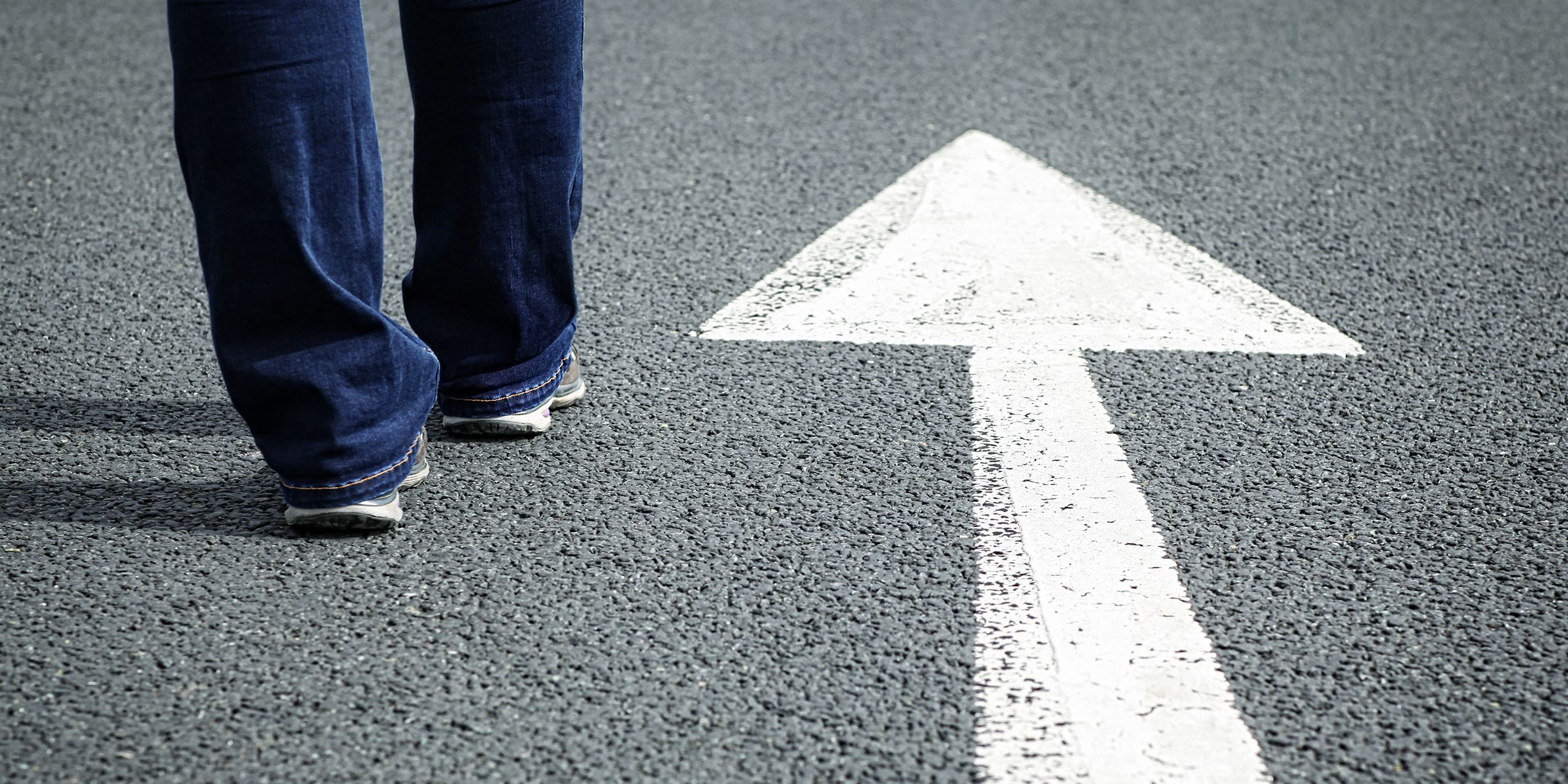
Route following
Route Following is a strategy to describe a way in which the observer is using signs with arrows to go from one place to another. The target of location is known, but a direct path towards it is unknown. Along the route, information is displayed to inform the observer towards the target. The signs are working together to create a network of connections between locations. The consistency in terminology- and hierarchy of information as well as marking decision points is important for Route Following to be an effective way of directing people from one place to another.
Route following can be applied for instance in areas to point towards an entrance, exit. A situation where a directive wayfinding task is required to guide towards a destination.
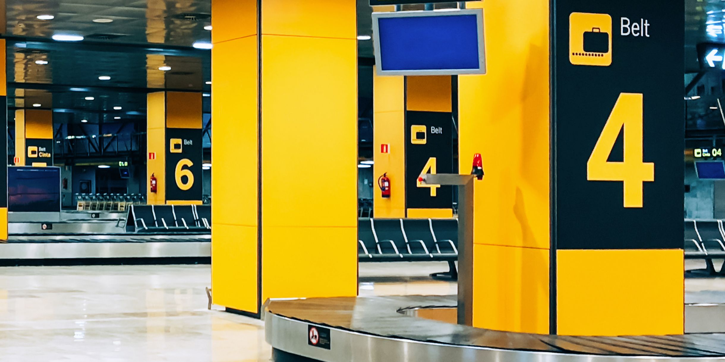
Inference
Inference is a wayfinding strategy that involves systematic searching, the understanding of a direction by reading numerical and alphabetical information in sequences. This methodology is based on creating an environment in a logical, understandable order. Combined with conventional cultural patterns Inference is a logical approach to create a legible environment build on expectations.
Inference can be applied in areas for instance at Airports, Railway stations or Stadiums. Upfront information such as "Your flight departs from Gate H3" is required as wayfinding taks, to follow a logical approach "H1, H2, H3, etc".

Aiming
Object (aiming) wayfinding strategy is divided into two categories, direct- and indirect visual contact with the target. In a direct visual contact, the observer has a visual reference of the target and chooses the desired path towards it. In an indirect visual contact, the observer chooses to follow logical steps to find a place where visual contact can be made, then follows the desired path towards the target.
Aiming as wayfinding taks can be applied in for instance cities or wide spread areas, where you can see landmarks and make your way towards the destination.

Map reading
Map Reading is a strategy to inform the observer about their surroundings, e.g. "You are Here". Based upon the understanding of the map in relation to the environment the observer makes a choice of navigation. Map Reading is usually supported by a compass rose to have a better understanding of direction. Techniques such as; to display maps in a heads-up direction can empathize a greater understanding between the map and the environment.
Map reading as a wayfinding task can be applied in cities, for example as in the Legible London mapping system. A heads-up map shows destinations, paths, safe routes and landmarks within a certain walking distance. A quick and easy way to navigate unknown areas, locate destinations and serendipity (to explore previous unknown destinations).
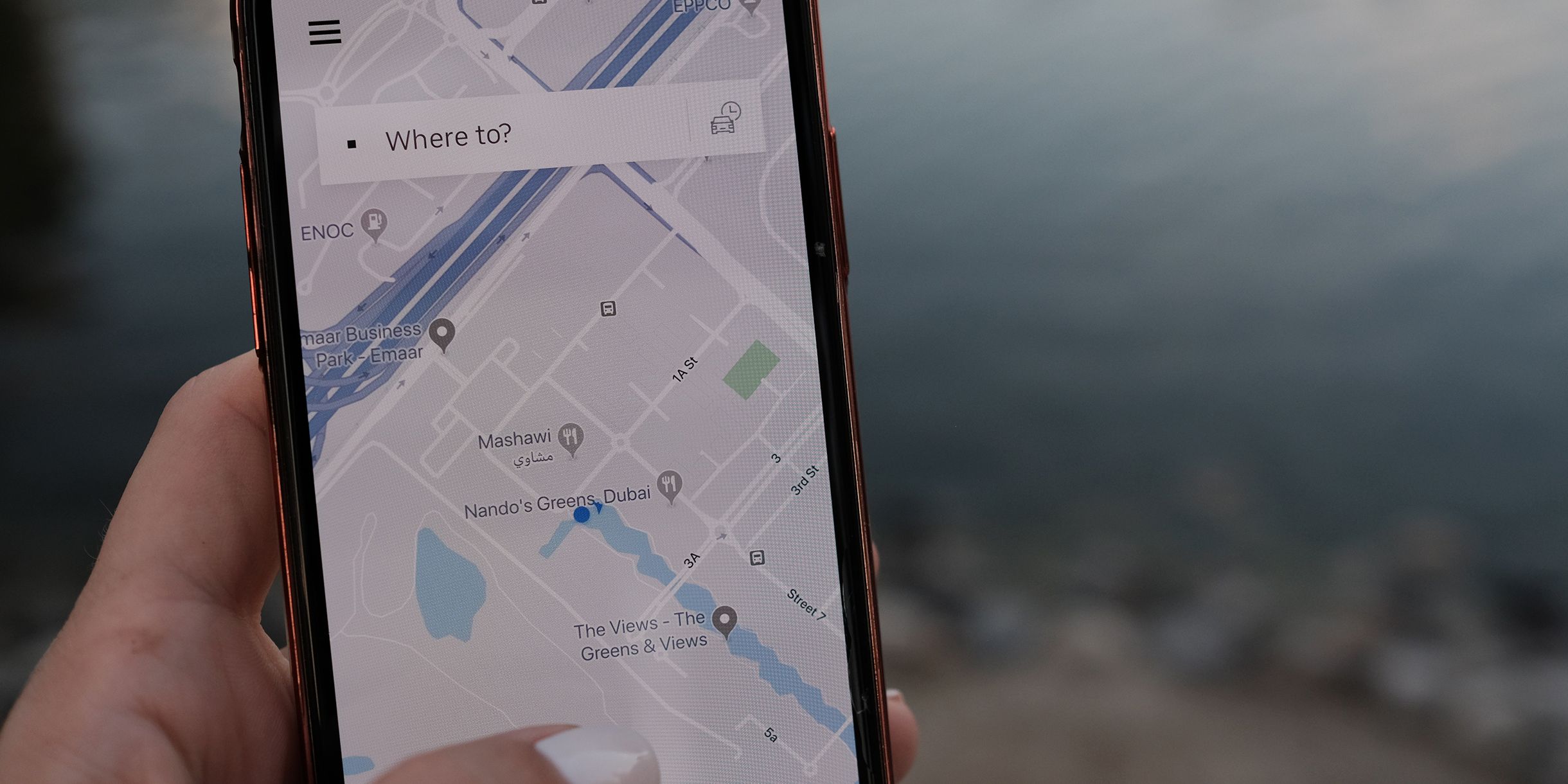
Technology
Technology driven strategies are usually hand-held devices or digital kiosks where input from the observer leads to orientation and navigational information. With the use of technology, dynamic information can be displayed to the observer and could be mixed with personal preference and social learning. Meaning technology has the ability to show narrow casted information, leaving out the overflow of information for the user.
The role of technology in wayfinding is set to show tailored information to the user. The phone navigational options for wayfinding usually works best open areas such as cities to locate and path towards a destination. The usage of mobile phones in buildings seems a more difficult taks, as there are lesser options for distinctiveness and technology difficulties.
Main takeaways
A wayfinding strategy is tailored to the required tasks in an environment and focused at the user. Different areas, buildings, transportation hubs, etc required their own approach in wayfinding.
- What is the required wayfinding task?
- What kind of area, environment, building?
Try different approaches while developing a wayfinding strategy and user-test scenarios to create a seamless journey experience.
Frequently Asked Questions (FAQ)
What is a Wayfinding Strategy?
Orientation & Identity 7 Apr 4:00 PM (just now)
Orientation & Identity
Wayfinding, signage design is still a young profession, balancing on the edge of two and three dimensional design. Wayfinding often is described as spatial problem solving and designers are multidisciplinary, with a psychological look into showing the way.
The book Orientation & Identity has 17 different projects discussed and show the potential for clients, urban planners, entrepreneurs and politicians. Each project is described from designer and client point of reference, giving a great insight on how the projects came together. This heavy weighted book shows a great in-depth insight in the field of architecture, environmental graphic design and wayfinding.
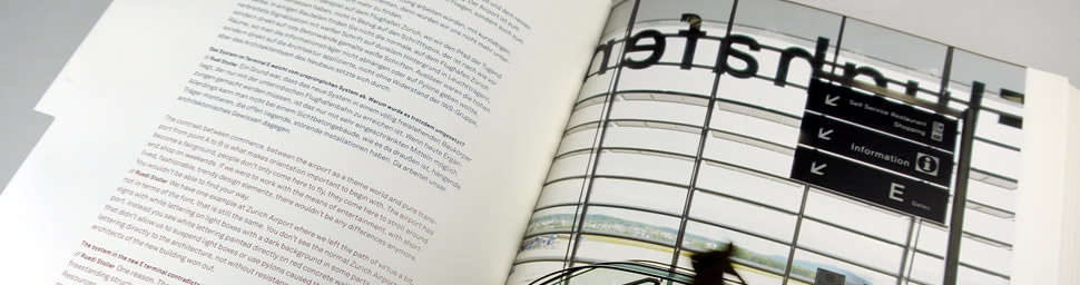
About Orientation & Identity
The first few chapters give an insight on identity and orientation standard, the philosophy and architecture. The wide range of interviews include, city-wayfinding, airport signage, Dutch road signs, museum design and corporate wayfinding in Europe. The book is written in both German and English, at first you need to adjust a bit to find the reading language of choice, after a few moments I was used reading the bottom of the pages.
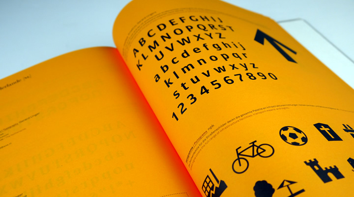
The case studies starts off with a introduction of the topic followed by the people behind the projects, with full background details you will get a good feeling of who participated in the project. The interviews start by asking who participated and why projects are initiated, then the story following the discussion during the project. A great insight on how they made specific choices to come to a solution for the project.
The pages are filled with full color (detailed) photos of projects accompanied by sketches and / or 2D images of the wayfinding systems.
Projects included in the book:
- Legible London, London; City wayfinding
- Dialogmuseum, Frankfurt; Museum wayfinding
- Effenaar, Eindhoven; Environmental identity
- Messe, Stuttgart; Identity and wayfinding
- College wayfinding
- Dutch road signage, Holland; Typography Road signs and wayfinding
- Zürich Airport, Zürich; signage design and wayfinding strategy
- Lower Austrian Clinics, Niederösterreich; Hospital wayfinding systems
- and much much more
As the true value of the book is the various insights on the people involved to get a great perspective on how the projects emerged.
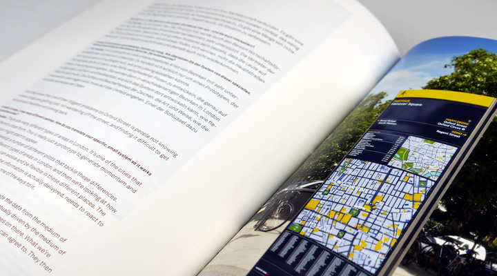
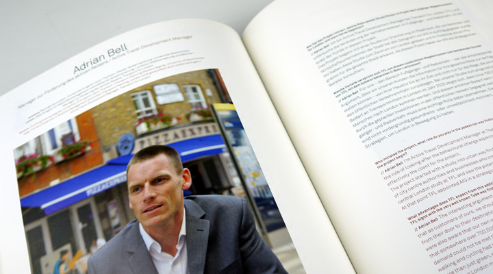
Conclusion
I personally enjoyed reading Orientation & Identity for various reasons; the focus of projects are European, that makes this book very relevant for EU countries and stands out to the many US wayfinding / signage books. Secondly the in-depth interviews with various stakeholders, architects and designers behind a project makes it interesting to get a peek inside a project. Lastly the book also provides in technical details, at the end some projects are displayed with typefaces details, construction drawings and iconography.
The language separation is not disturbing but could have been done better in my opinion and the weight of the book does not make it comfortable holding it for a longer period of time. Overall, if you are looking for the stories behind large-scale wayfinding and signage projects in Europe, this is the book for you.
Availability
The book is worldwide available via amazon.
Information
- Publisher: Springer Science + Business Media
- Language: English
- ISBN: 978-3-211-79189-9
- Hardcover: 480 pages
Buy Orientation & Identity
This great book containing interviews is available at amazon.
Buy at Amazon
%20photos%20of%20projects%20accompanied%20by%20sketches%20and%20/%20or%202D%20images%20of%20the%20wayfinding%20systems.%3C/p%3E%0A%3Cp%3EProjects%20included%20in%20the%20book:%3C/p%3E%0A%3Cul%3E%0A%3Cli%3ELegible%20London,%20London;%20City%20wayfinding%3C/li%3E%0A%3Cli%3EDialogmuseum,%20Frankfurt;%20Museum%20wayfinding%3C/li%3E%0A%3Cli%3EEffenaar,%20Eindhoven;%20Environmental%20identity%3C/li%3E%0A%3Cli%3EMesse,%20Stuttgart;%20Identity%20and%20wayfinding%3C/li%3E%0A%3Cli%3ECollege%20wayfinding%3C/li%3E%0A%3Cli%3EDutch%20road%20signage,%20Holland;%20Typography%20Road%20signs%20and%20wayfinding%3C/li%3E%0A%3Cli%3EZ%C3%BCrich%20Airport,%20Z%C3%BCrich;%20signage%20design%20and%20wayfinding%20strategy%3C/li%3E%0A%3Cli%3ELower%20Austrian%20Clinics,%20Nieder%C3%B6sterreich;%20Hospital%20wayfinding%20systems%3C/li%3E%0A%3Cli%3Eand%20much%20much%20more%3C/li%3E%0A%3C/ul%3E%0A%3Cp%3EAs%20the%20true%20value%20of%20the%20book%20is%20the%20various%20insights%20on%20the%20people%20involved%20to%20get%20a%20great%20perspective%20on%20how%20the%20projects%20emerged.%3C/p%3E%0A%3Cdiv%3E%3Cdiv%3E%3Cfigure%3E%3Cimg%20alt%3D%22%22%20src%3D%22http://www.designworkplan.com/wp-content/orientation-identity-006.jpg%22%20/%3E%3C/figure%3E%3C/div%3E%3Cdiv%3E%3Cfigure%3E%3Cimg%20alt%3D%22%22%20src%3D%22http://www.designworkplan.com/wp-content/orientation-identity-005.jpg%22%20/%3E%3C/figure%3E%3C/div%3E%3C/div%3E%0A%3Ch3%3EConclusion%3C/h3%3E%0A%3Cp%3EI%20personally%20enjoyed%20reading%20Orientation%20%26amp;%20Identity%20for%20various%20reasons;%20the%20focus%20of%20projects%20are%20European,%20that%20makes%20this%20book%20very%20relevant%20for%20EU%20countries%20and%20stands%20out%20to%20the%20many%20US%20wayfinding%20/%20signage%20books.%20Secondly%20the%20in-depth%20interviews%20with%20various%20stakeholders,%20architects%20and%20designers%20behind%20a%20project%20makes%20it%20interesting%20to%20get%20a%20peek%20inside%20a%20project.%20Lastly%20the%20book%20also%20provides%20in%20technical%20details,%20at%20the%20end%20some%20projects%20are%20displayed%20with%20typefaces%20details,%20construction%20drawings%20and%20iconography.%3C/p%3E%0A%3Cp%3EThe%20language%20separation%20is%20not%20disturbing%20but%20could%20have%20been%20done%20better%20in%20my%20opinion%20and%20the%20weight%20of%20the%20book%20does%20not%20make%20it%20comfortable%20holding%20it%20for%20a%20longer%20period%20of%20time.%20Overall,%20if%20you%20are%20looking%20for%20the%20stories%20behind%20large-scale%20wayfinding%20and%20signage%20projects%20in%20Europe,%20this%20is%20the%20book%20for%20you.%3C/p%3E%0A%3Ch3%3EAvailability%3C/h3%3E%0A%3Cp%3EThe%20book%20is%20worldwide%20available%20via%20amazon.%3C/p%3E%0A%3Csection%3E%0A%20%20%20%20%20%20%20%20%3Cdiv%3E%0A%20%20%20%20%20%20%20%20%3Cdiv%3E%3Ch3%3EInformation%3C/h3%3E%3Cul%3E%3Cli%3EPublisher:%20Springer%20Science%20+%20Business%20Media%3C/li%3E%3Cli%3ELanguage:%20English%3C/li%3E%3Cli%3EISBN:%20978-3-211-79189-9%3C/li%3E%3Cli%3EHardcover:%20480%20pages%3C/li%3E%3C/ul%3E%3C/div%3E%0A%20%20%20%20%20%20%20%20%3Cdiv%3E%0A%20%20%20%20%20%20%20%20%20%3Ch3%3EBuy%20Orientation%20%26%20Identity%3C/h3%3E%0A%20%20%20%20%20%20%20%20%20%3Cp%3EThis%20great%20book%20containing%20interviews%20is%20available%20at%20amazon.%3C/p%3E%0A%20%20%20%20%20%20%20%20%20%3Ca%20href%3D%22https://amzn.to/382RmK8%22%20role%3D%22button%22%3EBuy%20at%20Amazon%3C/a%3E%0A%20%20%20%20%20%20%20%20%20%3C/div%3E%3C/div%3E%0A%20%20%20%20%20%20%20%20%20%3C/section%3E)
Early wayfinding maps 31 Mar 4:00 PM (yesterday, 4:00 pm)
A unique ancient map of the Mesopotamian world. Babylonian, about 700-500 BC. Image courtesy of The British Museum.
Early wayfinding map
Early map creating represents a significant step forward in the intellectual development of knowledge for the human race. The information and maps were used as tools and could be passed on from one generation to another. Early maps are not geographical correct, but maps to capture the observers spatial knowledge of a space as a cognitive map. These maps contained the characteristics of that particular space and that could be remembered by humans, such as paths, landmarks, nodes, mountains, sea and areas.
One of the oldest maps of the Mesopotamian World dates back to around 500-700 BC. This is a unique ancient carved tablet that contains a cuneiform inscription (early written expression) and Babylon is drawn in the middle. Also, other places are mentioned such as Assyria and Elam. Around the centre is a circular waterway described as 'Salt-Sea' and the outer rim of the sea is surrounded with about eight regions. The regions contained marked signs or are labeled with names as 'Region' or 'Island', interestingly the distances are marked between the regions.
Over time maps became increasingly accurate and a universal tool for communication. Regardless of language or culture maps are mostly easy to understand by most people. By the use of scientific tools such as a compass rose, maps would improve as navigation tool. The compass rose was invented around the same time as the Polynesian explorers went on their Voyages. But made it appearances not earlier that the 11th century on maps and charts for a sense of orientation and direction.
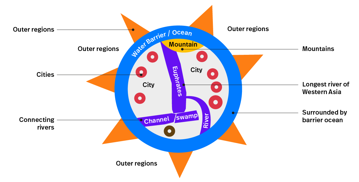
The knowledge of aiming
The Babylonian Map shows a clear image of where destinations are located. Although the reading of the tablet is illegible, we can clearly make out the direction of destinations. If you would follow the euphrates towards the mountains other destinations will become able to locate. Similar to the Pythagorean Theorem, if you know two elements you can hypotenuse the third element. In this case identifying two locations makes the observer able to set a path to the desired location.
Landmark wayfinding
The usage of landmarks to navigate originates from the tablet and is still used today for orientation and navigational purposes. As we browse through history landmark maps are commonly used to indicate destinations and have a reference of landmark buildings.
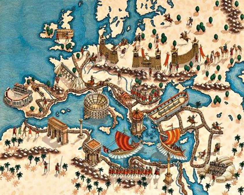
Example of the Roman Empire a landmark map, an abstract map of Europe showing cities, Middle Sea, Middle East and parts of Middle Europe. The landmarks are placed on top of the map as a 3D landmark. This map dates from the high days of the Roman Empire. Image taken from Erroma.
The Image of the City (Kevin A. Lynch)
Kevin Lynch published the book The Image of the City (1960) and described a way for people to mentally map and understand their environments in a logical and predictable way. In his book he describes a the concept of mental maps, a sketch map by a average person about an environment from memory. Within the mental maps he discovered five common elements to indicate whereabouts, destinations and paths. Similar to the early maps.
- Pathways, streets, sidewalks, trails, and other channels in which people travel;
- Edges, perceived boundaries such as walls, buildings, and shorelines;
- Districts, which represent relatively large sections of the city distinguished by some identity or character;
- Nodes, focal points, intersections, decision points or gateways
- Landmarks, memorable/identifiable objects or places which serve as external reference points.
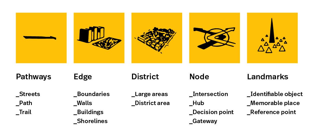
People who move through the city engage in way-finding. They need to be able to recognize and organize urban elements into a coherent pattern. ~Kevin Lynch
Main takeaways
A mental map is one of the most important human elements to 'read' an (un)familiar environments. In order to orientate and navigate we tend to use references from our surroundings and interpret elements to choose the desired path.
A mental map is the human imagination of reality, a map that is different for everyone. According to the mental map we can estimate where other places are places and how we can go. This is our association with the environment, perception and appreciation of this environment.
%20and%20Babylon%20is%20drawn%20in%20the%20middle.%20Also,%20other%20places%20are%20mentioned%20such%20as%20Assyria%20and%20Elam.%20Around%20the%20centre%20is%20a%20circular%20waterway%20described%20as%20'Salt-Sea'%20and%20the%20outer%20rim%20of%20the%20sea%20is%20surrounded%20with%20about%20eight%20regions.%20The%20regions%20contained%20marked%20signs%20or%20are%20labeled%20with%20names%20as%20'Region'%20or%20'Island',%20interestingly%20the%20distances%20are%20marked%20between%20the%20regions.%20%3C/p%3E%0A%3Cp%3EOver%20time%20maps%20became%20increasingly%20accurate%20and%20a%20universal%20tool%20for%20communication.%20Regardless%20of%20language%20or%20culture%20maps%20are%20mostly%20easy%20to%20understand%20by%20most%20people.%20By%20the%20use%20of%20scientific%20tools%20such%20as%20a%20compass%20rose,%20maps%20would%20improve%20as%20navigation%20tool.%20The%20compass%20rose%20was%20invented%20around%20the%20same%20time%20as%20the%20Polynesian%20explorers%20went%20on%20their%20Voyages.%20But%20made%20it%20appearances%20not%20earlier%20that%20the%2011th%20century%20on%20maps%20and%20charts%20for%20a%20sense%20of%20orientation%20and%20direction.%3C/p%3E%0A%3Cfigure%3E%3Cimg%20alt%3D%22Explanation%20of%20the%20Babylonian%20Map%20as%20wayfinding%20tool%22%20src%3D%22https://www.designworkplan.com/media/pages/read/early-wayfinding-maps/2a6d1a3db3-1722357553/babylonian-map-wayfinding-explained-01.png%22%20/%3E%3C/figure%3E%0A%3Ch2%3EThe%20knowledge%20of%20aiming%3C/h2%3E%0A%3Cp%3EThe%20Babylonian%20Map%20shows%20a%20clear%20image%20of%20where%20destinations%20are%20located.%20Although%20the%20reading%20of%20the%20tablet%20is%20illegible,%20we%20can%20clearly%20make%20out%20the%20direction%20of%20destinations.%20If%20you%20would%20follow%20the%20euphrates%20towards%20the%20mountains%20other%20destinations%20will%20become%20able%20to%20locate.%20Similar%20to%20the%20Pythagorean%20Theorem,%20if%20you%20know%20two%20elements%20you%20can%20hypotenuse%20the%20third%20element.%20In%20this%20case%20identifying%20two%20locations%20makes%20the%20observer%20able%20to%20set%20a%20path%20to%20the%20desired%20location.%3C/p%3E%0A%3Ch3%3ELandmark%20wayfinding%3C/h3%3E%0A%3Cp%3EThe%20usage%20of%20landmarks%20to%20navigate%20originates%20from%20the%20tablet%20and%20is%20still%20used%20today%20for%20orientation%20and%20navigational%20purposes.%20As%20we%20browse%20through%20history%20landmark%20maps%20are%20commonly%20used%20to%20indicate%20destinations%20and%20have%20a%20reference%20of%20landmark%20buildings.%20%20%3C/p%3E%0A%3Cfigure%3E%3Cimg%20alt%3D%22%22%20src%3D%22https://www.designworkplan.com/media/pages/read/early-wayfinding-maps/b06fd9e911-1722357552/ancient-roman-landmark-map.jpeg%22%20/%3E%3C/figure%3E%0A%3Cp%3EExample%20of%20the%20Roman%20Empire%20a%20landmark%20map,%20an%20abstract%20map%20of%20Europe%20showing%20cities,%20Middle%20Sea,%20Middle%20East%20and%20parts%20of%20Middle%20Europe.%20The%20landmarks%20are%20placed%20on%20top%20of%20the%20map%20as%20a%203D%20landmark.%20This%20map%20dates%20from%20the%20high%20days%20of%20the%20Roman%20Empire.%20%20Image%20taken%20from%20%3Ca%20href%3D%22https://sites.google.com/site/mbgizarte/02-aintzinaroa%22%3EErroma%3C/a%3E.%3C/p%3E%0A%3Ch2%3EThe%20Image%20of%20the%20City%20(Kevin%20A.%20Lynch)%3C/h2%3E%0A%3Cp%3EKevin%20Lynch%20published%20the%20book%20The%20Image%20of%20the%20City%20(1960)%20and%20described%20a%20way%20for%20people%20to%20mentally%20map%20and%20understand%20their%20environments%20in%20a%20logical%20and%20predictable%20way.%20In%20his%20book%20he%20describes%20a%20the%20concept%20of%20mental%20maps,%20a%20sketch%20map%20by%20a%20average%20person%20about%20an%20environment%20from%20memory.%20Within%20the%20mental%20maps%20he%20discovered%20five%20common%20elements%20to%20indicate%20whereabouts,%20destinations%20and%20paths.%20Similar%20to%20the%20early%20maps.%3C/p%3E%0A%3Cul%3E%0A%3Cli%3EPathways,%20streets,%20sidewalks,%20trails,%20and%20other%20channels%20in%20which%20people%20travel;%3C/li%3E%0A%3Cli%3EEdges,%20perceived%20boundaries%20such%20as%20walls,%20buildings,%20and%20shorelines;%3C/li%3E%0A%3Cli%3EDistricts,%20which%20represent%20relatively%20large%20sections%20of%20the%20city%20distinguished%20by%20some%20identity%20or%20character;%3C/li%3E%0A%3Cli%3ENodes,%20focal%20points,%20intersections,%20decision%20points%20or%20gateways%3C/li%3E%0A%3Cli%3ELandmarks,%20memorable/identifiable%20objects%20or%20places%20which%20serve%20as%20external%20reference%20points.%3C/li%3E%0A%3C/ul%3E%0A%3Cfigure%3E%3Cimg%20alt%3D%22Kevin%20Lynch%20The%20Image%20of%20the%20City%22%20src%3D%22https://www.designworkplan.com/media/pages/read/early-wayfinding-maps/d1e16cbb40-1722357553/image-of-the-city-kevin-lynch-01.png%22%20/%3E%3C/figure%3E%0A%3Cblockquote%3E%0A%3Cp%3EPeople%20who%20move%20through%20the%20city%20engage%20in%20way-finding.%20They%20need%20to%20be%20able%20to%20recognize%20and%20organize%20urban%20elements%20into%20a%20coherent%20pattern.%20~Kevin%20Lynch%3C/p%3E%0A%3C/blockquote%3E%0A%3Ch2%3EMain%20takeaways%3C/h2%3E%0A%3Cp%3EA%20mental%20map%20is%20one%20of%20the%20most%20important%20human%20elements%20to%20'read'%20an%20(un)familiar%20environments.%20In%20order%20to%20orientate%20and%20navigate%20we%20tend%20to%20use%20references%20from%20our%20surroundings%20and%20interpret%20elements%20to%20choose%20the%20desired%20path.%3C/p%3E%0A%3Cp%3EA%20mental%20map%20is%20the%20human%20imagination%20of%20reality,%20a%20map%20that%20is%20different%20for%20everyone.%20According%20to%20the%20mental%20map%20we%20can%20estimate%20where%20other%20places%20are%20places%20and%20how%20we%20can%20go.%20This%20is%20our%20association%20with%20the%20environment,%20perception%20and%20appreciation%20of%20this%20environment.%3C/p%3E)
Essential Design Principles for Hospital Wayfinding [2023] 24 Mar 4:00 PM (8 days ago)
Wayfinding
Finding your way in a hospital setting can be tricky. The stress of finding a department or destination in a (unfamiliar) building can a challenging experience.
What is there was a way to make finding your way in a hospital easier? This is where design discipline wayfinding comes into play and has the potential to improve the patient experience.
Wayfinding is a multidisciplinary design field that combines principles of cognitive psychology and human behavior for a better understanding of the surroundings.
For hospitals, wayfinding aims to address the following critical issues:
- How can we make it improve wayfinding for patients?
- Which design principles can assist to enhance the visitors experience?
- How can we create an accessible environment for all users, including people with disabilities?
In this article we will explore the importance of wayfinding principles in hospitals. The challenges we face along the way and the innovative solutions that will improve the way patients navigate healthcare settings.
By exploring the role of both traditional and digital wayfinding tools, we will highlight the potential of well-designed wayfinding to improve wayfinding in hospitals. The goal is an improved patient experience and ultimately to contribute to reduced stress when visiting a hospital.
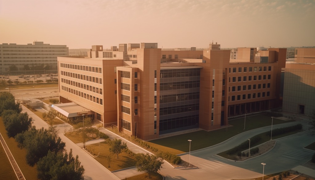
The challenges of hospital signage
Orienting and navigating a hospital environment can be challenging for patients, visitors and even medical staff. With wayfinding research we can look through the 'eyes' of the users and understand the bottlenecks and success factors of effective wayfinding.
In this chapter we explore the main challenges of signage and take a closer look at why these problems can arise.
A. Complexity of buildings
Signage 'shows' people the way in buildings and environments. A hospital building is usually a large building with several floors, wings and departments. A hospital can have more than 100 different departments, from Emergency Department, Intensive Care Unit (ICU), Surgery, Internal Medicine to Orthopedics, Radiology and Oncology. This can include many subspecialties.
A hospital usually consists of many departments and specialists, located throughout the hospital building, connected by squares and corridors.
Why can a hospital building have a complicated or confusing layout?
- Due to expansion and renovations, buildings can be adapted over time. Expansion of wings and/or, for example, an attached building can lead to a confusing layout.
- Due to functional requirements of departments, part of the hospital may not be accessible. As a result, to reach a certain department, you can get there via a detour.
How does (building) complexity affect patients and visitors?
- A complicated layout brings increased stress. Can I find the department? Am I on time?
- Difficulty finding departments. Where is department xx? How do I get to the department?
Why are hospital environments naturally stressful?
- Due to health problems and emotional nature, a hospital can be experienced as stressful. What do I have? Can the doctor help me?
- Due to time-bound appointments and procedures in a hospital. Am I on time? Where is...?
How does this stress affect signage?
- Due to increased stress, people (usually) have a reduced ability to process information. Where should I look?
- Due to an increased reliance on intuitive references. How does the signage work?
What are the unique signage challenges that different users face?
- Patients, visitors are not familiar with the layout of the building. Where's what?
- Patients, visitors have cognitive or physical limitations. May have difficulty processing the information.
- Non-native speakers and/or have difficulty reading the signage.
Why is it important to consider user needs when designing signage?
- Ensuring accessibility and inclusiveness principles, design-for-all concept.
- Reduce the risk of disorientation
- On time for an appointment
- Consistent information provision towards a patient and visitor gives peace of mind in orienting and navigating in an (unfamiliar) environment.
Why can it be difficult to maintain consistency in hospital signage systems?
- Due to the variety of systems and information provision around patient information.
- Information such as on the website, call letter, reception desk, ticket, referral letter and signage must be consistent for a clear picture towards the patient, visitor.
By examining these challenges in wayfinding research, we understand the user and thereby identify bottlenecks and success factors.
Wayfinding strategy for hospitals
In this chapter we discuss different ways of referring that can help improve orientation and navigation in the hospital. By implementing these strategies, hospitals become more user-friendly and accessible, reducing the stress associated with navigating healthcare facilities.
- Well-thought-out signage
This includes clear, concise, and easy-to-understand signage at key decision points, such as at entrances, hallways, elevators, stairways, and wards. Ensure consistency in design, colors and typography for clear communication.
Example: A hospital can create a wing layout for different departments such as A, B, C, D, etc. making it easier for users to track their destination.
- Landmarks and Visual Recognition Points:
Including landmarks and visual identifiers in the hospital environment can aid orientation and make it easier for users to remember the route.
Example: Placing distinctive artwork, architectural features or color schemes as landmarks in the hospital.
- Digital Wayfinding:
Digital wayfinding, such as interactive kiosks, mobile apps and touchscreens, can provide real-time information and personalized directions to help users navigate the hospital more easily.
Example: Digital screens in the hospital for displaying relevant information for users. Where am I? Where can I find department xx? And how do I get there?
- Staff training and support:
Ensuring that medical staff and employees are well aware of the signage system and tone-of-voice towards patients and visitors.
Example: A hospital could offer training sessions to employees to familiarize them with the signage and teach them how to effectively help visitors navigate the hospital.
- Inclusive Design and Accessibility:
Hospitals should be accessible to everyone, including people with reduced mobility, the visually impaired or the hearing impaired.
Ensure that (digital) signage takes these groups into account by using clear, high-contrast fonts, tactile elements, Braille and audio signals where appropriate.
Example: Tactile markings on the floor or braille signs assist to the help the visually impaired to navigate the building and find the right department.
By implementing these signage strategies and addressing bottlenecks and success factors, healthcare facilities can significantly improve the user experience of patients, visitors and staff. This leads to less stress, increased satisfaction and ultimately better healthcare outcomes.
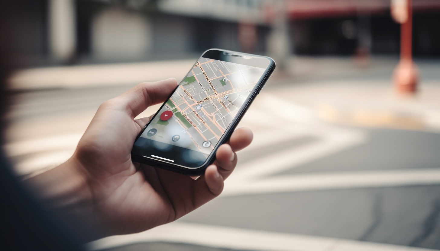
Digital wayfinding in hospitals
Digitization in signage is important for improving the overall user experience in a hospital. Digital tools provide real-time information, personalized routes and additional resources to assist patients and visitors in navigating complex hospital environments.
In this chapter we discuss examples and use cases for digital wayfinding.
- Real Time Information:
Digital signage can provide real-time information and updates about, for example, waiting times, routes and where you are in a hospital.
Example: Digital information signs can display the current waiting times for departments and/or other hospital services.
- Integration with Social Media and Online Communication:
A social media integration platform to assist patients and visitors plan their visit, receive (route) information and share feedback.
Example: A hospital can implement a (AI) chatbot to assist users for navigating questions, ask for directions, and for instance scheduling appointments.
- Digital Screens:
Interactive screens can provide patients with real-time information about their destination, directions and additional services such as finding a nearby restroom or coffee corner.
Example: A hospital can place interactive screens or a kiosk at the entrance and install it on every floor, where visitors can receive personalized route information.
- Mobile Information :
Show relevant information on digitale signage screens, such as routes and destinations in the hospital. Think about including a "you are here" on a map and/or use directory signs for an overview of departments.
Example: A hospital can display the information in a mobile environment, which is linked to the hospital's website.
- Augmented Reality (AR) Signage:
AR technology could overlay digital information in the real environment, such as arrows and text, using a smartphone's camera.
Example: An overlay that guides users using digital cues that overlap with the real environment.
The implementation of digital signage in hospitals creates an integrated patient experience and approach. The starting point is to use technology for a more personalized route and real-time updates, resulting in an improved user experience.
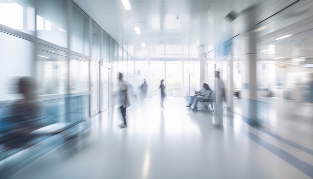
Wayfinding scenarios
In this chapter we discuss different scenarios for referring users in a hospital building. A new or existing hospital building usually has an entrance, exit, atrium, floors, corridors and wards. Destinations in a hospital can be 'coded' by using a wayfinding strategy. By means of a reference key it is possible to easily reach destinations. Below are a few examples:
- Route numbers
Organizing the hospital with route numbers. This means that each destination gets a route number. Patients, visitors use the route number to reach a destination. Route numbers can be ascending or linked to, for example, a floor.
Example: Route 142, where 1 stands for floor 1 and 42 is the sequential number. This way you can always find where you are in a hospital.
- Wing layout
With wing layouts, lift points such as elevators or stairs are classified with a name or letters. For example A, B, C, D, etc. With wing layouts, the letters are usually followed by a number, which stands for the floor.
Example: C2, where C stands for the wing and 3 for the floor. An addition of a number can indicate even further specifications, such as C2-12. Where, for example, 12 is the waiting area on wing C floor 2.
- User-friendly (digital) additions
This scenario adds tactile and auditory information to wayfinding scenarios for reaching foreign speaking people or for people who have difficulty walking or have reduced vision capacity.
Testing the wayfinding scenarios is important to gain feedback from users. A scenario is building, process and user-related. Implementing a clear and concise wayfinding scenario improves an intuitive way finding destinations in a hospital.
| Main Takeaway | Explanation |
|---|---|
| Importance of wayfinding principles | An integrated approach in wayfinding contributes to the improvement of routing and hospital experience. |
| Challenges in hospital signage | Hospitals face challenges due to the (complex) layout, time-sensitive and emotional nature of visits, and various user needs. |
| Wayfinding strategy | An effective wayfinding strategy includes clear signage, landmarks, digital tools, and staff training focused on the (end) user. |
| Digital wayfinding solutions | Digital wayfinding solutions, such as real-time information, integration with social media, digital screens, mobile apps, and AR, can enhance the overall user experience. |
| Wayfinding scenarios | Different wayfinding scenarios, such as route numbers, wing layouts, and user-friendly digital additions, can be deployed to improve the patient journey in hospitals. |
Conclusion
A wayfinding design strategy plays an important role in improving the user experience in a hospital.
Implementing a well-thought-out wayfinding strategy and scenarios, users can orientate and navigate more easily. The starting point is to improve the user experience, which contributes to a positive image of the hospital.
The roll-out of both fixed and digital wayfinding tools, such as signage and digital displays, can help provide an integrated approach and experience tailored to users' requirements and needs.
In conclusion, a wayfinding design and strategy are indispensable for creating an accessible, safe and user-friendly environment in hospitals. It is vital that hospitals and wayfinding design studios work together to implement effective solutions that help patients, visitors and staff navigate and feel comfortable in these complex environments.
Let's work together
More on hospital wayfinding, contact us →
FAQ
Why is wayfinding important in hospitals?
What is a wayfinding design?
What is a wayfinding strategy?
How does wayfinding work in hospitals?
What are some challenges in implementing wayfinding in hospitals?
Who is wayfinding for?
The voyage begins 23 Mar 4:00 PM (9 days ago)
- Where are you?
- Where are you heading?
The human mind observes and stores the journey as a mind-map. Distances, locations and time may be remembered differently than as they appear to be in reality. Signs, landmarks and directions are interpreted as signals and helps to guide along the way.
We use our personal knowledge, look at inference for common patterns and use previous experiences to find destinations. This article explores a history of navigation and view a on the general understanding of ways in which we all tend to navigate in terra incognita.
Early wayfinding polynesian navigators
Between 500 - 700 BC explorers began sailing the sea and started their travels towards finding new land. Sea is not as big as a barrier if you know where you are heading to and able to find your way back… Interesting enough early sea explorers didn't have maps, compasses, clocks or sextents to navigate. The new land was yet to discover and no information on how to get there, or return home, was available.
The discovery of the Polynesian islands by, from origin, Asian inhabitants tells a story on how they found those islands in the middle of the South Pacific. Voyages would take up to months and they sailed over 2000 km to discover new land, but how did they navigate? And how can we learn from their knowledge in the ancient way of getting around?
The Polynesians traveled over vast expanses of open ocean across the Pacific. In order to locate directions they memorized at various times of day and year the important facts of their surroundings. The traditional Polynesian navigation methods included memorizing the motion of stars; rise and set of the sun on the horizon; the direction, size and speed of ocean waves; gathering of clouds that cluster at specific locations; direction of winds and the following of wildlife of the ocean such as birds and fish.
Understanding how these explorers used their senses and ways of memorizing their surroundings can help us understanding how to design effective wayfinding systems today and tomorrow.
The traditional navigation by the Polynesian is also called non-instrument navigation — which means finding your way without the usage of modern tools. Instead, looking at the characteristic patterns in the surroundings they could build a mental map and used that to navigate. Those 'fingerprints' on the open ocean could well be referenced as todays 'landmarks'. History describes how the navigators kept a mental log of their journey, maintaining a sense of distance from where they started along their way. The structure that the navigators used in ancient history is similar as we apply in wayfinding strategy today.
- Planning, what is the strategy?
- Setting the course, which way to go?
- Holding the course, how far we need to travel?
- Finding land, are we there yet?
- Returning home, which way to head back?
Although the traditional Polynesian ways to navigate is almost extinct. The wayfinders of Polynesia traveled over one fifth of the surface of the planet and largest culture sphere in human history.
Navigation is not about you, or your mind, or what you can do. It's not about the sun and stars. It's really about everything. Shortly Bertelman, navigator
Holistic approach to wayfinding
Important steps in developing a wayfinding strategy is to look beyond a specific environment, space or building. Wayfinding doesn't start or stop at specific places. A wayfinding system comprises communications that may involve multiple media to help people navigate an environment. This emphasizes the importance of the whole and the interdependence of its parts, also referred as the Holistic Approach.
The Holistic Approach defines a wayfinding process that is researched and analyzed for the needs of the user. The objectives may include virtual and physical communication tools such as websites, signs, information systems, organizational goals, increasing customer satisfaction, placemaking or media support. Overall goal of the Holistic Approach includes to provide a better user-experience. Taking time to research the objectives will ensure the resulting wayfinding system goals are managed for optimal results. The boundaries between the abstract digital world and the real physical world starts to blur and the way that we experience wayfinding is starting to change.
Key takeaway
Wayfinding could well be put into a wider objective, today we live in a global economy and as a result we should re-think how we communicate. Wayfinding can act as stepping stone to connect people, movement and places efficiently. Taking wayfinding beyond 'signs with arrows' and an integrated communication system will emerge.
The concept is relative simple — show the right message at the right time. Make use of integrated communication systems to allow the user to have seamless journeys and engaging discoveries.
References
- Dragons, Memory & Navigating the Globe Using Only Your Wits Link

The current state of Design Conferences 14 Mar 4:00 PM (18 days ago)
Opinion: Sander Baumann
Every design organization faces a similar issue in 2020/2021. Physical events and conferences are restricted due the corona pandemic. Basically every organization from small to large have transformed into virtual events.
Larger design conferences such as The Next Web did a 2-day live event on Hopin. Hopin is a virtual venue with multiple interactive areas that are optimized for connecting and engaging. You can join different rooms and stages depending on your interests. Other platforms such as Creative Mornings went all in on virtual events.
The events in our wayfinding community also transformed to virtual events. From podcasts, Zoom chats to full day virtual conferences.
The purpose of conferences (pre-corona)
Over the years I had the pleasure of going places for design conferences. Either as participant or a speaker, I went to conferences about typography, technology, wayfinding or design in general.
Conferences bring together the curious like-minded designers in one place. The conferences usually have a mix of speakers, workshops and meetups on small and large stages. In my opinion a unique experience to meet people at conferences which let to business and friendships.
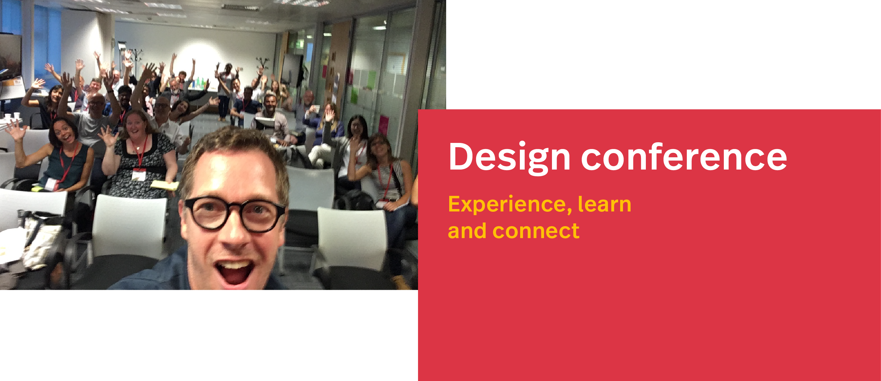
The psychology of going to conferences (pre-corona)
When looking at the experience when going to a conference you enter a mind-set focused on maximizing time and effort out of a conference. When you make the choice going to a physical conference this usually results in creating free time of enjoy a conference. Ranging from 1 to multiple days of physical conferences allows you to connect to peers, have time to reflect on things you heard or learned during these times.
In my opinion physical conferences offer the opportunity to really connect to like-minded people to get new insights or perspectives on the multidisciplinary fields of design.
The now: Virtual events and conferences
Over the last years I have attended anything from virtual meetups to online talks and one day virtual conferences. Also tried many of the available platforms, such as Zoom, Teams, Meetup, Hopin, etc.
Without leaving the house or studio I was able to enjoy the conferences in a virtual way. Although at the start of the pandemic this was a great way to connect to peers and to share thoughts, ideas and reconnect again. Over time I have noticed a lower attention span during the virtual conferences. Even with Hopin, I caught myself being distracted and started doing other things again.
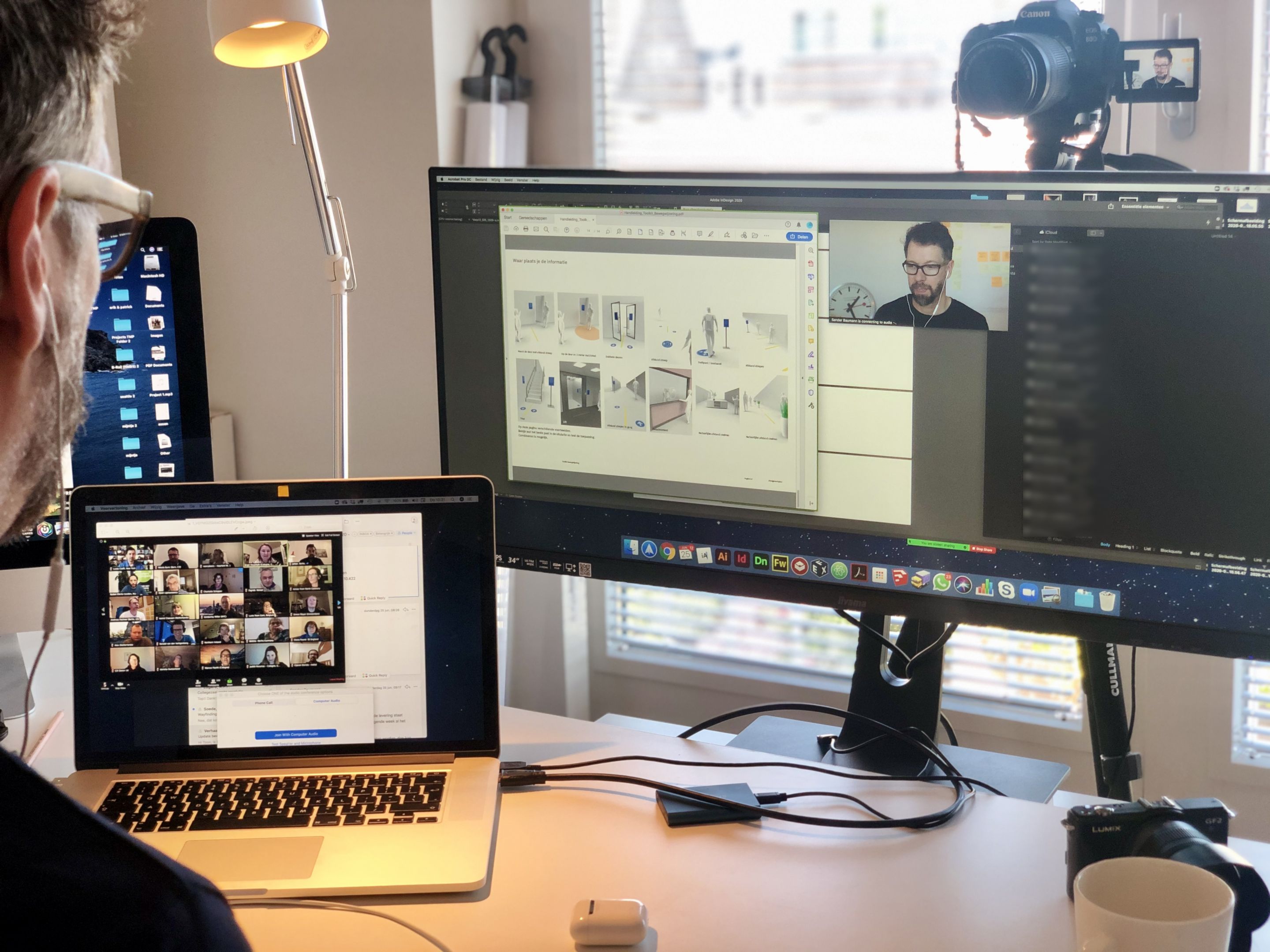
Attention span
During the challenging covid times the (wayfinding) design industry also changed and shifted a bit more towards digital services. Regarding the time spend on physical conferences vs. the time spend on virtual conferences I noticed that virtual conferences does not really excite me in the same way as physical events.
The virtual events are squeezed into the tight schedule and I seem to jump from working with clients to conferences in an instance. This let me to think about how I perceive the information and what my key motivation would be for attending either virtual or physical events.
Main takeaway
Virtual events/conferences are here to stay. I believe a hybrid mix of physical and virtual events will push forward in our design community. On the one hand, virtual events are convenient to keep up with peers in the network. On the other hand meeting in person makes the memory.
The road to a physical conference and spending time with peers in a venue is in my opinion a great way to absorb information in a lively ambiance where you can be free to enjoy content and people.
For future physical conferences, I can imagine it to be more an experiential experience. A mix of meeting in person and connecting digitally would make the best out of both worlds. Physical conferences would take place lets say once a year and periodically supported with virtual events.
Support your design organization
If you want to learn more about wayfinding, information design, typography and design in general. Please take a look at the following design organizations as they have regularly virtual talks/events at the moment.
- SDS Sign Design Society, the have monthly virtual talks.
- IIID The International Institute for Information Design have virtual drinks and talks
- SEGD Society for Experiental Graphic Design organizes virtual talks, summits, conferences and more
- BNO Beroepsorganisatie Nederlandse Ontwerpers have virtual talks usually only in Dutch
- Creative Mornings have virtual breakfast meetups around the world
- Aiga American Institute of Graphic Arts have virtual talks and conferences
The future is bright and I look forward meeting you soon at an upcoming virtual or physical event.
%3C/h2%3E%0A%3Cp%3EOver%20the%20years%20I%20had%20the%20pleasure%20of%20going%20places%20for%20design%20conferences.%20Either%20as%20participant%20or%20a%20speaker,%20I%20went%20to%20conferences%20about%20typography,%20technology,%20wayfinding%20or%20design%20in%20general.%3C/p%3E%0A%3Cp%3EConferences%20bring%20together%20the%20curious%20like-minded%20designers%20in%20one%20place.%20The%20conferences%20usually%20have%20a%20mix%20of%20speakers,%20workshops%20and%20meetups%20on%20small%20and%20large%20stages.%20In%20my%20opinion%20a%20unique%20experience%20to%20meet%20people%20at%20conferences%20which%20let%20to%20business%20and%20friendships.%20%3C/p%3E%0A%3Cfigure%3E%3Cimg%20alt%3D%22Designer%20conferences%20to%20learn,%20experience%20and%20connect%20with%20peers%22%20src%3D%22https://www.designworkplan.com/media/pages/read/the-current-state-of-design-conferences/9562db57ef-1722356877/design-conference-fun.png%22%20/%3E%3C/figure%3E%0A%3Ch3%3EThe%20psychology%20of%20going%20to%20conferences%20(pre-corona)%3C/h3%3E%0A%3Cp%3EWhen%20looking%20at%20the%20experience%20when%20going%20to%20a%20conference%20you%20enter%20a%20mind-set%20focused%20on%20maximizing%20time%20and%20effort%20out%20of%20a%20conference.%20When%20you%20make%20the%20choice%20going%20to%20a%20physical%20conference%20this%20usually%20results%20in%20creating%20free%20time%20of%20enjoy%20a%20conference.%20Ranging%20from%201%20to%20multiple%20days%20of%20physical%20conferences%20allows%20you%20to%20connect%20to%20peers,%20have%20time%20to%20reflect%20on%20things%20you%20heard%20or%20learned%20during%20these%20times.%3C/p%3E%0A%3Cp%3EIn%20my%20opinion%20physical%20conferences%20offer%20the%20opportunity%20to%20really%20connect%20to%20like-minded%20people%20to%20get%20new%20insights%20or%20perspectives%20on%20the%20multidisciplinary%20fields%20of%20design.%3C/p%3E%0A%3Ch2%3EThe%20now:%20Virtual%20events%20and%20conferences%3C/h2%3E%0A%3Cp%3EOver%20the%20last%20years%20I%20have%20attended%20anything%20from%20virtual%20meetups%20to%20online%20talks%20and%20one%20day%20virtual%20conferences.%20Also%20tried%20many%20of%20the%20available%20platforms,%20such%20as%20Zoom,%20Teams,%20Meetup,%20Hopin,%20etc.%20%3C/p%3E%0A%3Cp%3EWithout%20leaving%20the%20house%20or%20studio%20I%20was%20able%20to%20enjoy%20the%20conferences%20in%20a%20virtual%20way.%20Although%20at%20the%20start%20of%20the%20pandemic%20this%20was%20a%20great%20way%20to%20connect%20to%20peers%20and%20to%20share%20thoughts,%20ideas%20and%20reconnect%20again.%20Over%20time%20I%20have%20noticed%20a%20lower%20attention%20span%20during%20the%20virtual%20conferences.%20Even%20with%20Hopin,%20I%20caught%20myself%20being%20distracted%20and%20started%20doing%20other%20things%20again.%3C/p%3E%0A%3Cfigure%3E%3Cimg%20alt%3D%22Sander%20Baumann%20working%20from%20the%20home%20studio%22%20src%3D%22https://www.designworkplan.com/media/pages/read/the-current-state-of-design-conferences/ed2294f975-1722356873/sanderbaumann-work-from-home.jpg%22%20/%3E%3C/figure%3E%0A%3Ch3%3EAttention%20span%3C/h3%3E%0A%3Cp%3EDuring%20the%20challenging%20covid%20times%20the%20(wayfinding)%20design%20industry%20also%20changed%20and%20shifted%20a%20bit%20more%20towards%20digital%20services.%20Regarding%20the%20time%20spend%20on%20physical%20conferences%20vs.%20the%20time%20spend%20on%20virtual%20conferences%20I%20noticed%20that%20virtual%20conferences%20does%20not%20really%20excite%20me%20in%20the%20same%20way%20as%20physical%20events.%3C/p%3E%0A%3Cp%3EThe%20virtual%20events%20are%20squeezed%20into%20the%20tight%20schedule%20and%20I%20seem%20to%20jump%20from%20working%20with%20clients%20to%20conferences%20in%20an%20instance.%20This%20let%20me%20to%20think%20about%20how%20I%20perceive%20the%20information%20and%20what%20my%20key%20motivation%20would%20be%20for%20attending%20either%20virtual%20or%20physical%20events.%3C/p%3E%0A%3Ch2%3EMain%20takeaway%3C/h2%3E%0A%3Cp%3EVirtual%20events/conferences%20are%20here%20to%20stay.%20I%20believe%20a%20hybrid%20mix%20of%20physical%20and%20virtual%20events%20will%20push%20forward%20in%20our%20design%20community.%20On%20the%20one%20hand,%20virtual%20events%20are%20convenient%20to%20keep%20up%20with%20peers%20in%20the%20network.%20On%20the%20other%20hand%20meeting%20in%20person%20makes%20the%20memory.%20%3C/p%3E%0A%3Cp%3EThe%20road%20to%20a%20physical%20conference%20and%20spending%20time%20with%20peers%20in%20a%20venue%20is%20in%20my%20opinion%20a%20great%20way%20to%20absorb%20information%20in%20a%20lively%20%20ambiance%20where%20you%20can%20be%20free%20to%20enjoy%20content%20and%20people.%20%3C/p%3E%0A%3Cp%3EFor%20future%20physical%20conferences,%20I%20can%20imagine%20it%20to%20be%20more%20an%20experiential%20experience.%20A%20mix%20of%20meeting%20in%20person%20and%20connecting%20digitally%20would%20make%20the%20best%20out%20of%20both%20worlds.%20Physical%20conferences%20would%20take%20place%20lets%20say%20once%20a%20year%20and%20periodically%20supported%20with%20virtual%20events.%20%3C/p%3E%0A%3Ch3%3ESupport%20your%20design%20organization%3C/h3%3E%0A%3Cp%3EIf%20you%20want%20to%20learn%20more%20about%20wayfinding,%20information%20design,%20typography%20and%20design%20in%20general.%20Please%20take%20a%20look%20at%20the%20following%20design%20organizations%20as%20they%20have%20regularly%20virtual%20talks/events%20at%20the%20moment.%20%3C/p%3E%0A%3Cul%3E%0A%3Cli%3ESDS%20%3Ca%20href%3D%22https://www.signdesignsociety.co.uk/%22%3ESign%20Design%20Society%3C/a%3E,%20the%20have%20monthly%20virtual%20talks.%20%3C/li%3E%0A%3Cli%3EIIID%20%3Ca%20href%3D%22https://www.iiid.net/%22%3EThe%20International%20Institute%20for%20Information%20Design%3C/a%3E%20have%20virtual%20drinks%20and%20talks%20%3C/li%3E%0A%3Cli%3ESEGD%20%3Ca%20href%3D%22https://segd.org/%22%3ESociety%20for%20Experiental%20Graphic%20Design%3C/a%3E%20organizes%20virtual%20talks,%20summits,%20conferences%20and%20more%3C/li%3E%0A%3Cli%3EBNO%20%3Ca%20href%3D%22https://www.bno.nl/%22%3EBeroepsorganisatie%20Nederlandse%20Ontwerpers%3C/a%3E%20have%20virtual%20talks%20usually%20only%20in%20Dutch%3C/li%3E%0A%3Cli%3E%3Ca%20href%3D%22https://creativemornings.com/%22%3ECreative%20Mornings%3C/a%3E%20have%20virtual%20breakfast%20meetups%20around%20the%20world%3C/li%3E%0A%3Cli%3EAiga%20%3Ca%20href%3D%22https://www.aiga.org/%22%3EAmerican%20Institute%20of%20Graphic%20Arts%3C/a%3E%20have%20virtual%20talks%20and%20conferences%20%3C/li%3E%0A%3C/ul%3E%0A%3Cp%3EThe%20future%20is%20bright%20and%20I%20look%20forward%20meeting%20you%20soon%20at%20an%20upcoming%20virtual%20or%20physical%20event.%3C/p%3E)
Website tracking & addressing your privacy 28 Jan 3:00 PM (2 months ago)
On our website designworkplan we used Google Analytics for collecting visitors data. When we started the blog way back in 2008 it was a good way to find out which content viewers of our website liked and disliked. A user-friendly dashboard to find out important metrics related to viewers of the website.
Google Analytics gave us insights on popular pages and were people visited our website from. This allowed us to target those audiences more and as a result we gained traction to our (design) website. Our content evolves around design, typography and wayfinding. Wayfinding is a design niche that focusses at connecting people to information and environments.
If you want to learn more about wayfinding, please read our page Introduction to Wayfinding.
Over time Google Analytics grew in complexity to an extend we have a hard time understanding the metrics shown in the dashboards.
Google Analytics back to the future
In the beginning Google Analytics was plain and simple, the right fit for our design content. As a content creator we are interested in how visitors perceive information on our website. Information about popular pages, demographics and referral sources are meaningful for establishing an understanding of what visitors are looking for.
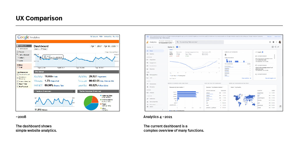
Privacy and data collection
Over time we realized Google used our collected data for their benefits. Although Google says to “never” sell any personal information. The collective gathered information through Google Analytics is an immense source of valuable information about browser behaviour online. Not only it provides information on topics people are interested in, it also gives information about reading time, bounce rates and related information people are interested in. Maybe Google doesn’t use the information gathered from our website, but sure it can create a broader sense of what people in general are interested in.
As Google remains to control most of the internet search queries and related internet services such as advertising. Google can combine Analytics and Adwords to maximize their profit ratio. In other words, we believe as Google has a tremendous amount of information from the Analytics part of their database. The Adwords part of Google will benefit from this information, as they are familiar with what people search for and what related information people would be interested in.
Our most popular posts on the blog
Over the years we have published many articles on the blog. Via our visitors data tracking we could see these are our most popular posts:
- A arrow symbol collection, with over 1M (Million) downloads! 56 Free Arrow Symbols & Icons
- The guide into color contrast for sign and wayfinding design. Signs and color contrast
- A free collection of 50 common used symbol signs. Symbol Sign Collection
Our series about typography did very well over the last years, including the following articles:
- An example collection of typeface usages with Arial. Arial is everywhere
- Another collection with FF Meta typeface examples FF Meta is everywhere
Our book series are popular with the following reviews:
- A comprehensive book about wayfinding by David Gibson. The Wayfinding Handbook
- The industry standard for learning about wayfinding by Per Mollerup. Wayfinding > Wayshowing
Over the years we have continued our writing, consider looking at our blog to learn more about wayfinding.
Seamless reading experience
We are wayfinding and information designers. Our core services evolve around information, people and places. Connecting information at the right time and place. As we are browsing the internet, the reading experiences are mostly dreadful. Pop-ups, reminders, boxes, ads, etc.
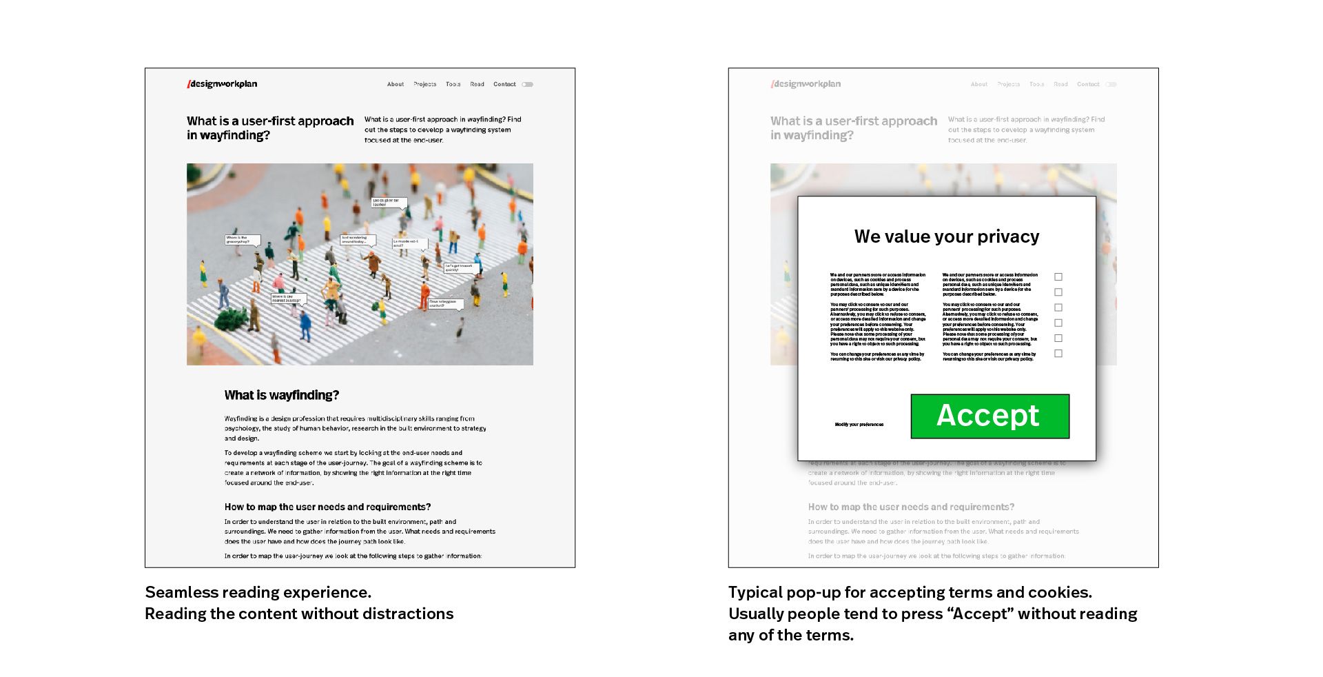
At our website we want people to enjoy our content, without having to read privacy policies and forcing visitors to click "Accept" buttons. We want to create a seamless reading experience without distractions.
The brilliant website How I Experience Web Today is a fantastic example of most browsing experiences today. So familiar, yet so disappointing experiences.
According to research the average internet user spends ~3 hours online every day, visiting anywhere from 5 up-tp 100 website each day. Imagine the time lost for accepting all those cookies each and every day.
Recently it came to our attention that Google Analytics is in conflicts with European regulations and is not fully GDPR complaint. In relationship to the cookie, accept privacy terms and UX issues it got us to rethink the analytics part of our website.
From past to present
As we want to comply to European guidelines regarding data collection and to create a seamless reading experience, we started to seek an alternative for Google Analytics.
As also found Google Analytics was found illegal in an Austrian court decision. The details of that decision can be found here
From here our search began looking for an alternative way to collect visitors data at our website. We have tried other different analytics services, which include:
- Matomo analytics, a self hosted analytics service. Comes with many features and is free to use. We have found installing the software and dashboard somewhat complicated to use.
- Statscounter, great alternative. The dashboard has a good UX design and the service has many features to track visitors behaviour. Statscounter is an anonymous web tracking service which is good to become GDPR compliant. The paid version starts at $19,- per month.
- Fathom, a very user friendly interface, cookie-free and GDPR proof with anonymous web tracking. Starting at $14,- per month. ($140,- p/y)
Our research was plain simple, trying out the services as mentioned above for ~14 days. The experiment gave us insights on what we wanted to see in our analytics, useful metrics, ease of use, GDPR free. As running websites is NOT our daily focus, we found out our needs are UX and ease of use based. Meaning a single dashboard solution, main metrics and great UX design. In our quest for the Google Analytics alternative we landed at Fathom Analytics.
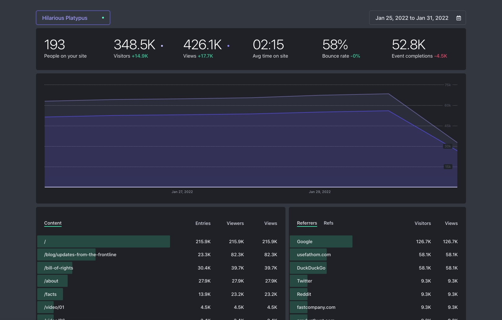
Use Fathom Analytics
Our basic requirements are formulated as following:
- GDPR Proof and anonymous pageview tracking
- Fast loading script, by-passing ad blockers and no cookies
- Easy to use dashboard, in one overview
- Information about pages, average time on site/page and traffic sources
- Information about devices, browsers and countries
- Possibility to track specific actions or events on webpages (easy funnel)
- Track multiple websites in one dashboard/account
As we deploy multiple websites, a single dashboard solution is ideal to gain overview insights on performance.
Reading experience & privacy
Our website and content creation is focussed on providing niche information for design, typography and wayfinding. In our opinion Google Analytics has become a complex platform with too many functionalities. We understand that professional website creators and builders could use Google Analytics to its full potential. We simply want to put out great content and gather information about the visitors to our website.
Our goal is provide a visitor to our website a seamless reading experience and enjoying our content without annoying pop-ups or related privacy issues.
From now on forward we have disabled Google Analytics from our websites and are fully compliant with European regulation around collecting information from visitors on our website.
Fathom is a paid service which collects anonymous data from visitors on our websites. We are using a $140,- yearly plan for collecting visitors data from our websites.
Full disclosure
We work as a designers for Google Offices, where we develop and create wayfinding solutions for their visitors and employees. We respect Google for their vision and the way how they organize their workplaces, people and environments. At our website (designworkplan) we have chosen to use fathom for reasons stated in this article. We are not paid or sponsored by usefathom. If you want to support us, please use our affiliate link below.
Final thoughts
This post is different from our usual design content, we wanted to be fully transparant in the way how we collect visitors data from our websites. Consider thinking about the way you collect visitors data at your website(s).
If you are planning to use Fathom, consider using our referral link (highly appreciated) Use Fathom referral code CCPSXY
Frequently Asked Questions (FAQ)
What is GDPR?
Rotis is everywhere 1 Jan 3:00 PM (3 months ago)
Typeface Rotis Serif
Available in four font families from sans to serif, Rotis typeface can be found everywhere around you. Unfortunally Olt Aicher died in a traffic accident in 1991. Linotype currently owns the Rotis Font Family, where all of the font variations can be bought.
Rotis® gives an impression of both strength and generosity and all four versions can be used interchangeably with one another. Rotis® is suitable for book/text, documentation/business reports, business correspondence, magazines, newspapers, posters, advertiments, multimedia, corporate design.
Linotype
During our holiday in the beautiful German Steigerwald (near Nürnberg and Bamberg) I came across the Rotis Font Family quite often, this is a photo showcase collection of the Font Familiy Rotis Sans.
Boek
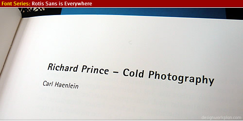
Street Signs
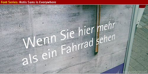
Cafe Signage
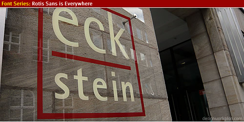
1000 Jahre Bamberg
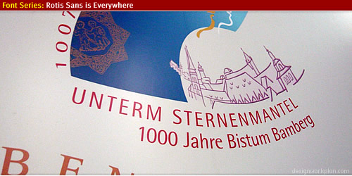
Museum Nürnberg
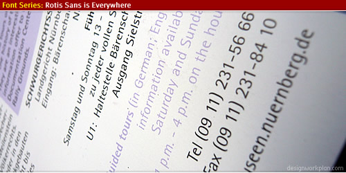
Shopping
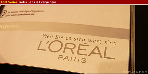
Escape route plan
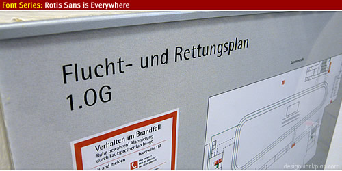
Bookstore
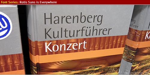
Door Signage
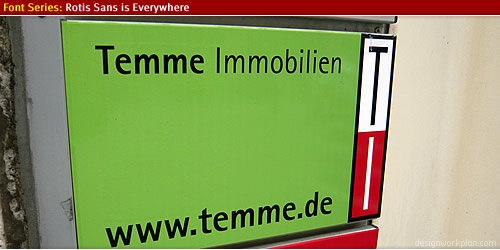
Museum Gerolzhofen
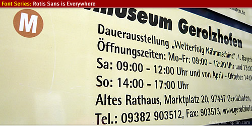
Arte Caffe
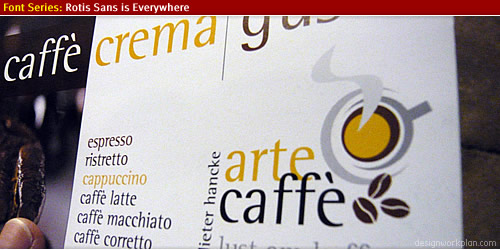
Kind of noodles
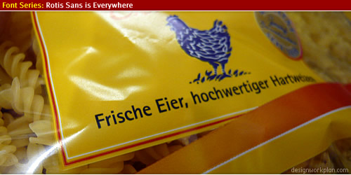
Rotling Wine
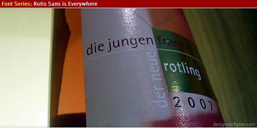
Steigerwald walk
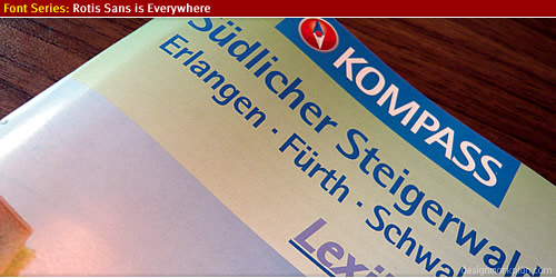
Shoppingbag
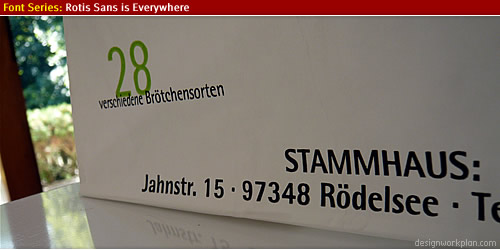
(wrapper)
Where to get Rotis?
The font package is available in four type families, via Linotype:
Personally I like Rotis Sans Serif Font Family (2nd on the list above) the best, it has a very distinctive look and feel with a high legibilty for usage in many fields of visual communication.
More information about Olt Aicher
There is much written about Olt Aicher who was not only a font designer but also a graphic designer who had a big part in designing the Münich Olympic Games in 1972.
- Information about Olt Aicher at Wikipedia.
- Great article about Olt Aicher at Underconsideration.
- Work from Olt Aicher at a huge flickr pool to be found here.
- The graphic design work he created for the Münich Olympic Games at this website.
- Other interesting and informative article about the type Rotis, here at manic.com.
(/wrapper)