(Not) Powerless 14 Apr 2:00 AM (23 hours ago)
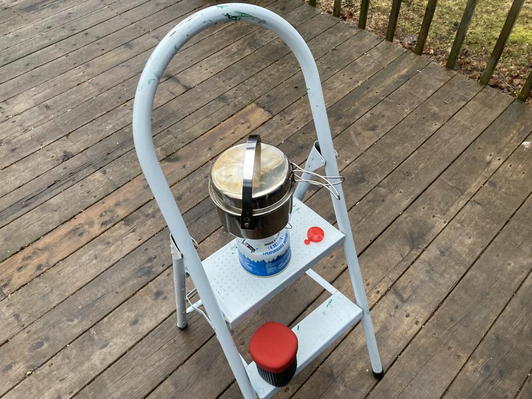
We woke up to a house without power—turns out that a section of our street lost power at 4:00 a.m.—and thus without coffee.
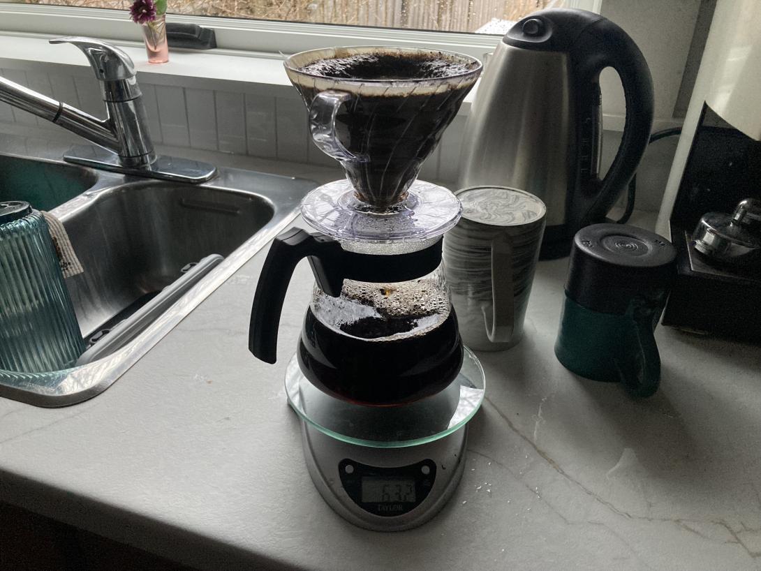
Fortunately Hurricane Fiona prepared us for this, and the emergency backup coffee system deployed.
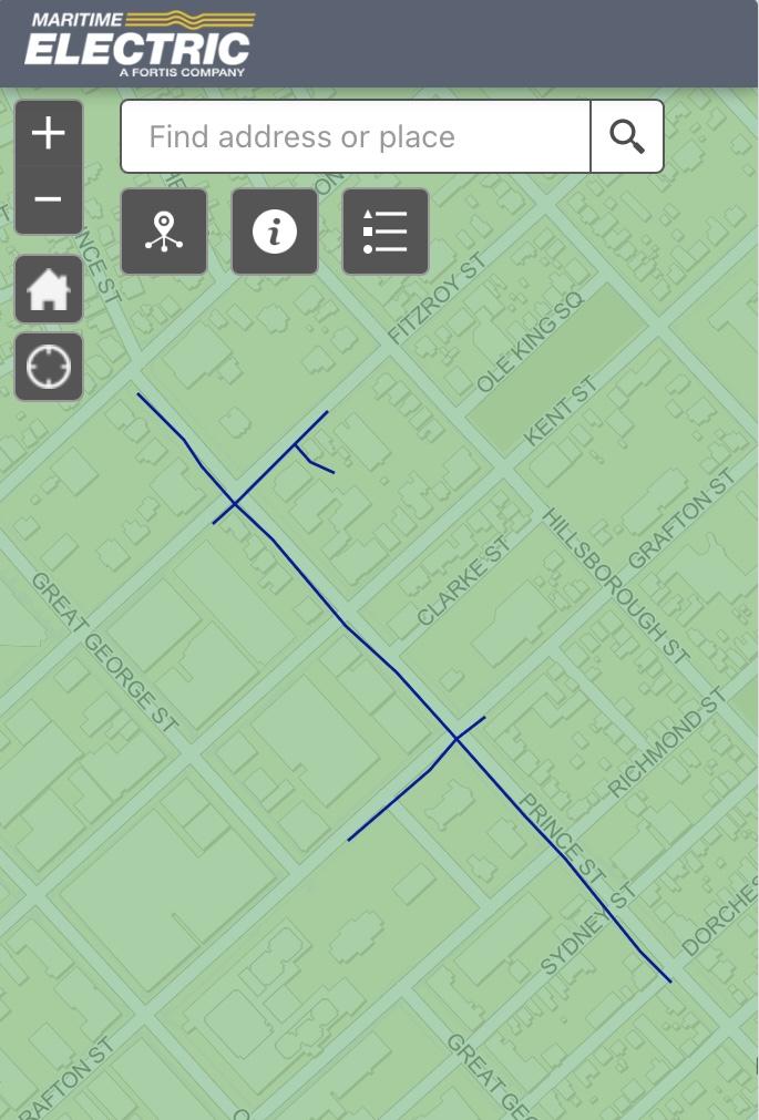
As we were drinking coffee, we noticed Maritime Electric workers replacing a transformer on a nearby pole:
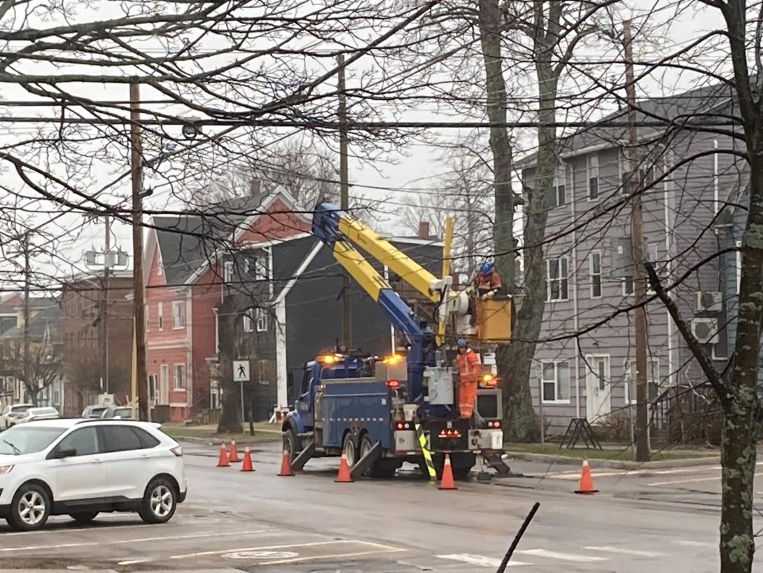
This explains the big bang we heard while we were asleep.
I happened to have my head out the window just before 8:00 when the line worker flipped the transformer on with a long orange pole: the power came on instantly. It was like watching God’s lightswitch.


This isn't an email newsletter, but... 9 Apr 11:12 AM (5 days ago)
Subscribe to this blog by email…
Enter your email:
From a recent People & Blogs with Matt Webb:
Given your experience, if you were to start a blog today, would you do anything differently?
If I were to start a blog today, I would start an email newsletter. And that would be a mistake.
I agree.
Although I published a tiny email newsletter for 6 years, and it was helpful in innumerable ways, my instrument is the blog, not the newsletter.
And yet I realize that not everyone (relatively speaking, let’s be honest, very few) have a toolchain set up to read blogs by RSS, as god intended.
And so, as a service to the travelling public, I’ve long supported subscribing to this blog by email, via a daily digest received on days when there are posts.
I originally did that using Feedburner, then MailChimp, and now, starting a few weeks ago, Buttondown.
The switch to Buttondown was triggered by MailChimp just, one, day breaking down and giving up, with no clear path to a diagnosis. I’d been reading the blog of Buttondown’s founder for awhile, and liked the cut of his jib, so I exported my 100-odd subscribers from MailChimp, imported them into Buttondown, and setup an RSS-to-Email pipeline. It was pretty painless.
Things haven’t been all rosy since then: after a day of successful operation, my Buttondown digest stopped sending, with items piling up in the queue. Support was friendly, but the path to a solution was slower than I would have liked. They worked hard to repair our relationship—harder, I imagine, than my $9/month fee warrants—and things seem to be working fine now (although there was a mysterious empty email that went out a few days ago that I’m waiting to hear about from support).
This is all to say: if you want to read the blog, but prefer the convenience of receiving it by email, feel free.
Subscribe to this blog by email…
Enter your email:
Leo McGarry-like Walk-in Privileges 7 Apr 1:50 PM (7 days ago)
In the season 7 episode of Billions, Original Sin, political consultant Bradford Luke walks into (billionaire and possible presidential candidate) Mike Prince’s office:
Prince: How do you have Leo McGarry-like walk in privileges before you’ve even taken the job?
Luke: Walk with a true sense of purpose. No one ever stops you.
The Leo McGarry reference is, of course, to The West Wing—another fictional universe—where Leo McGarry was President Bartlett’s Chief of Staff, and often walked in with exactly the same demeanour:
I love the fiction-to-fiction reference; Billions is rife with pop culture references, to an often absurd extend, but this one I love.
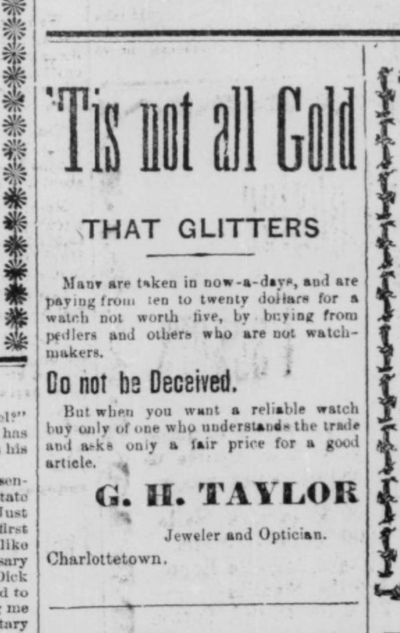
Annals of Charlottetown Retail 3 Apr 11:49 AM (11 days ago)
One of Charlottetown’s oldest businesses is set to close shortly. Taylor’s Jewellers, in Confederation Court Mall, has this sign up in its windows:
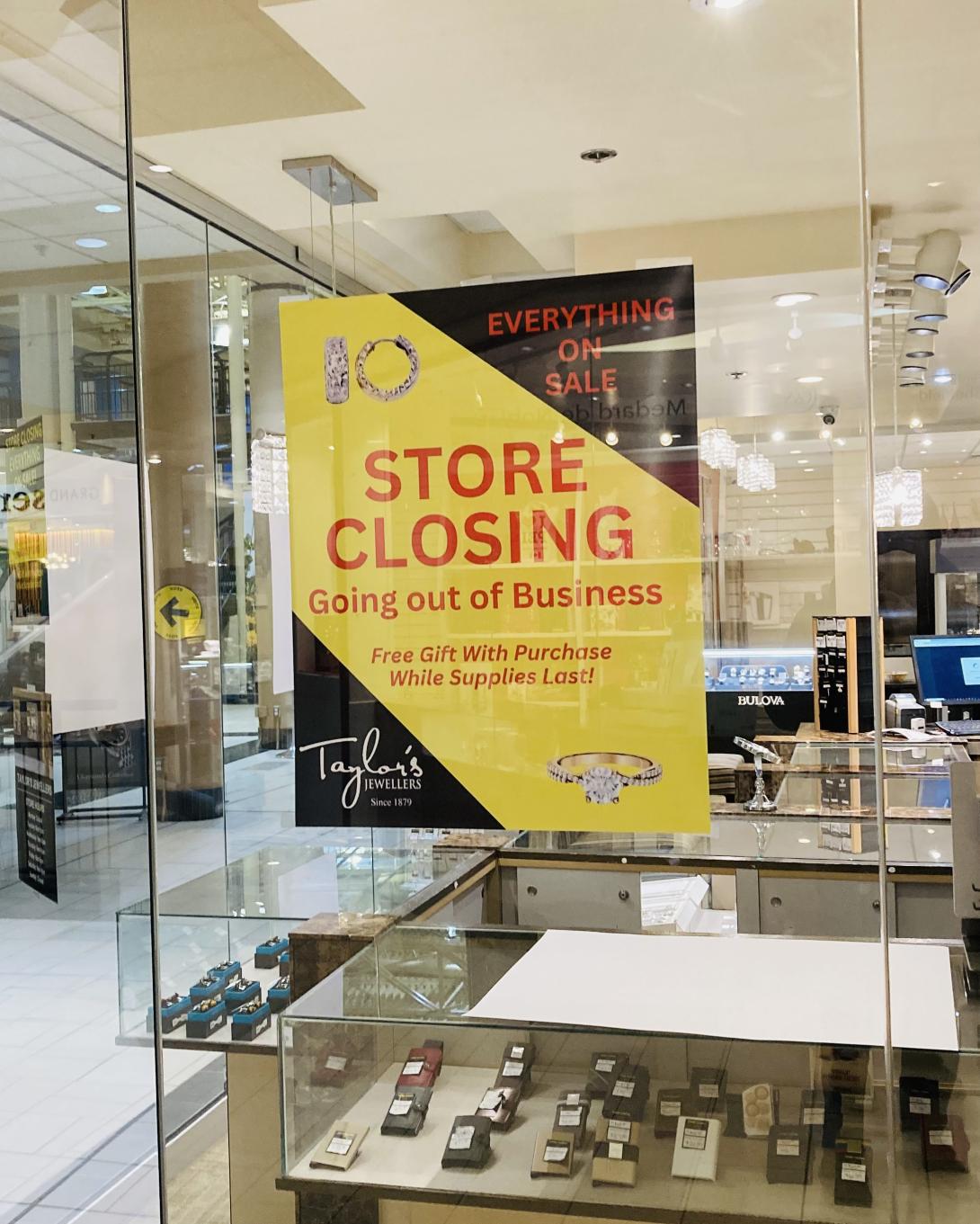
The business was founded in 1879, 146 years ago:
In 1879, jeweller, J.F. MacKay would sell his stock to G.H. Taylor. Taylor, who had recently arrived in Prince Edward Island from England, took over the building at 119-121 Grafton Street and divided it into two sections. Taylor operated a jewellery store from the eastern section and W.R. Boreham ran a shoe store from the western section. Taylor’s Jewellers would remain in the building for over 100 years. The business would move further into the Confederation Court Mall in the 1990s and continues to sell jewelry to this day.
Here’s an ad from the March 1, 1898 Guardian for the business:
Posted earlier today on their Facebook page:
It is with a heavy heart that we announce our store will be closing its doors for the final time on May 15th.
After being part of this community since 1879, it’s hard to say goodbye.
We want to extend a heartfelt thank you to all our loyal customers who have supported us through the years. Your patronage has meant the world to us, and we’re truly grateful for the memories we’ve shared.
As we prepare for this next chapter, we’ll be offering special discounts and deals, so please stop by before we close. We hope to see you one last time.
Thank you for being part of our journey.
Meanwhile, just a hundred feet away, Blank Canvas, our local art supplies shop, is set to relocate from the corner of Prince and Water into the space in the mall last occupied by a party supply store, in the hallway that leads to Great George Street:
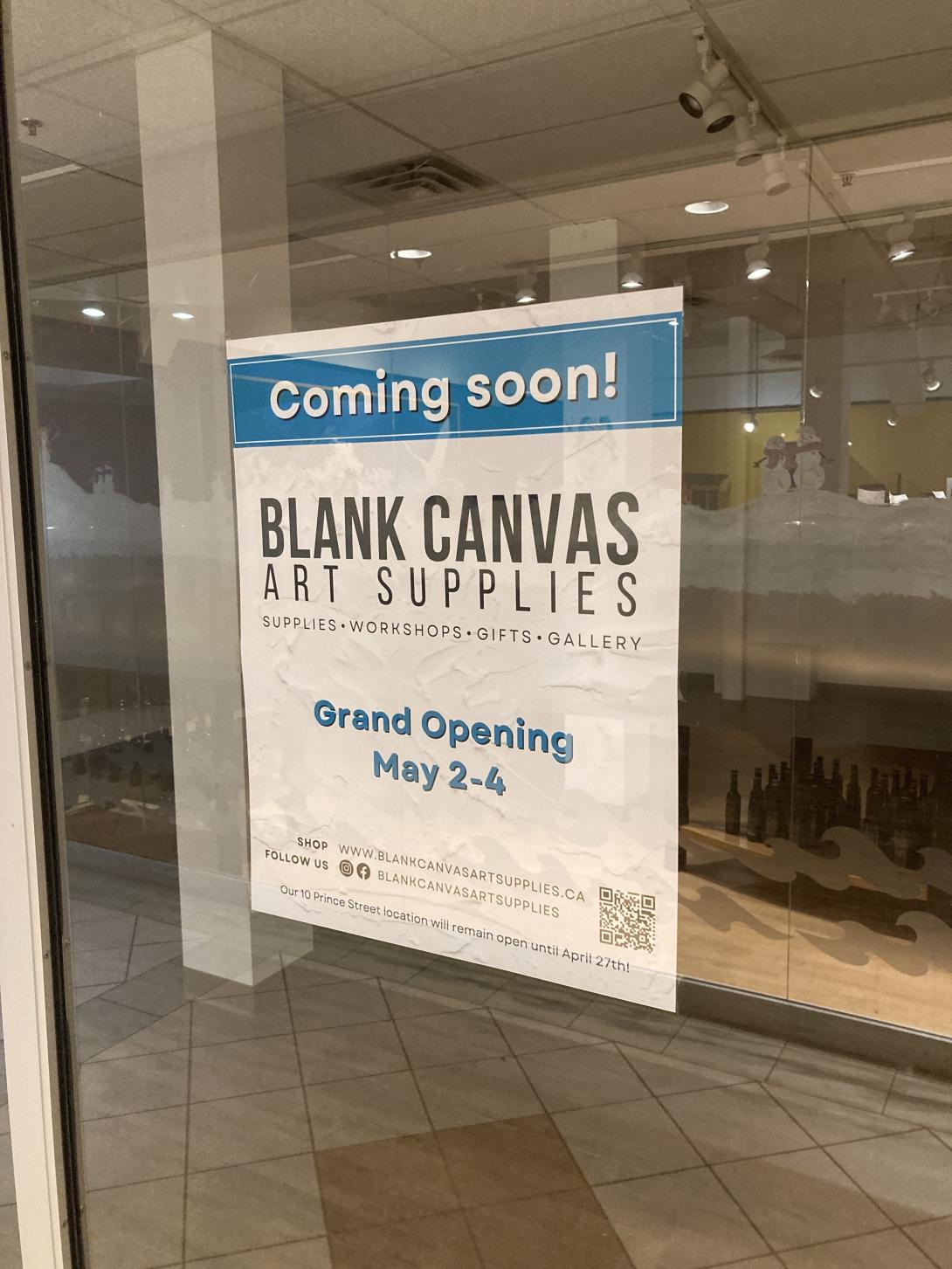
We’re regular customers at the shop; it’s so lovely to have a well-stocked shop like hers in the neighbourhood. It’s heartening that she’s found a secure new space, and it’s great for us that it’s still in the neighbourhood (40 m and one minutes walk farther from the current location, but we’re not complaining).
I get back up again 2 Apr 10:47 AM (12 days ago)
It is a CrossFit tradition to do burpees on your birthday, one for every year you’ve lived.
I got out of this last year, but today, working out with Lisa in Matt Cormier’s garage, it somehow came to pass that burpees-in-great-number were already on the docket, before my Saturday birthday was revealed to Matt.
So we did burpees-in-great-number, a 7 minute AMRAP. Both Lisa and I completed 64.
Mine were of various styles, relative to the reference burpee Matt performed, but I fell down, and got back up again, by whatever method, 64 times.
And I’m only turning 59!
Jeremy Strong on Prince Edward Island 31 Mar 2:12 PM (14 days ago)
From a New Yorker profile of actor Jeremy Strong by Michael Schulman:
As it turned out, “The Ballad of Jack and Rose” would change his life. The film, directed by Rebecca Miller, starred Miller’s husband, Daniel Day-Lewis, as an aging hippie living on an abandoned commune. Strong got himself hired as Day-Lewis’s assistant for the shoot, on Prince Edward Island. Day-Lewis was already legendary for his immersion techniques: staying in character between takes, building his own canoe for “The Last of the Mohicans.” He arrived in Canada early and helped the crew construct the commune houses, since his character would have built them. (After he botched a window installation, the crew assigned him a dining-room table.) During the shoot, Day-Lewis lived in his own cottage, away from his family. Since his character wastes away from a heart ailment in the course of the film, he starved himself, eating a meagre vegan diet, and became so emaciated that Miller was alarmed.
The Ballad of Jack and Rose was filmed in Rock Barra, PEI in 2003.
So are you harvesting in the hours of the day in which you're dedicating yourself? 31 Mar 4:07 AM (14 days ago)
From a conversation between Rick Rubin of the poet David Whyte on Rubin’s Tetragrammaton podcast:
And then the last step I call harvest, and that’s the ability to bring in the harvest of everything you’ve been working towards.
Both in the sense of, it might be harvesting a profit, but harvest in the sense of when you’ve produced a piece, it’s making sure it gets out in the world, and that you’re there with it when it’s out. So that’s another kind of harvest. Then there’s the celebration which is associated with harvest.
So many places you’ve just achieved something really marvelous together, and a split second later the next day you’re on to something else. There’s no celebration, there’s no saying, let’s go out to dinner, let’s look at what we’ve done, let’s slap each other on the back, let’s just go out on the river on a boat for a day, and just say we did that, and we’re quite remarkable, and let’s just give it a rest for a moment before we turn our face enthusiastically to the next sowing. Then the real corollary of harvest though is, are you harvesting in the hours of the day in which you’re working, or are you working in a dynamic of conditionality?”
“I’ll get to my happiness when I’ve done this project. I’ll do what I really want when the kids are through school, when the house is paid off, when I’m in a better relationship, when I’ve got this amount of money in the bank, when I’m retired, and the ultimate conditionality is I’ll get to it when I’m dead. When all the responsibilities have gone.
So are you harvesting in the hours of the day in which you’re dedicating yourself? Because it’s not a passive process to work. You’re shaping an identity.
It’s like practicing. You think of most people in what we call ordinary jobs. There are no real ordinary jobs, but you’re working eight, nine, if you’re in leadership, 10, 11 hours a day.
Imagine if you practiced a musical instrument for eight, nine, 10 or 11 hours a day. Wouldn’t matter if you had any musical proclivity at all. You would become incredibly good at the clarinet, at the piano, at the saxophone.
So you’re becoming incredibly good at whoever you’re practicing at being in the hours of the day. So Harvest asks you to say, by the way I am in my every day, who am I practicing at becoming? Do I actually want to become that person?
(via SIX at 6).
Kathleen Edwards Covers The Logical Song 29 Mar 11:03 AM (16 days ago)
The Logical Song was the lead single on Supertramp’s 1979 album Breakfast in America.
The only large-scale stadium rock show I’ve ever been to was Supertramp’s 1979 appearance at Exhibition Stadium in Toronto; I went with my friends Steve, Sam, and Tom. The Logical Song was on the bill.
Kathleen Edwards recorded a cover of the song for her new album Covers that’s rather compelling.
(Another worthwhile track from the Edwards’ new album is her cover of Paul Westerberg’s Only Lie Worth Telling).
Sketches of Tracadie 29 Mar 9:40 AM (16 days ago)
Earlier this month Harry Holman posted A Whale of a Tale, an account of the 1857 discovery of a whale carcass in Tracadie Harbour, first published in The Islander:
At the present time a novel spectacle, an enormous Whale – 75 feet in length – is to be seen at the entrance of Tracadie harbor, it being one of the largest animals of which we have any certain information. The carcass was found floating at sea, and towed into the harbor on Monday the 3rd inst., and has become an interesting object. During the last ten days it has been visited by an immense concourse of people from every section of the Island, anxious to have the opportunity of seeing one of these mighty monsters of the deep, so rarely thrown upon our shores.
Harry included this sketch of the whale by Caroline Louisa Daly, Stranded Whale at Tracadie Harbour:
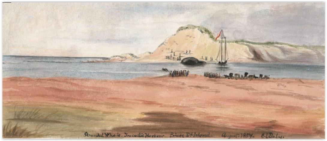
I immediately recognized Tracadie from my own early-COVID trip there in 2020, where I quickly sketched this:
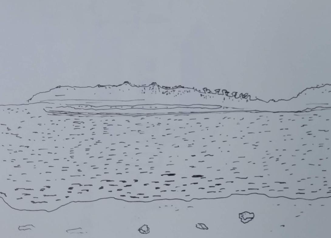
Tracadie Harbour has evolved considerably, especially over the 168 years since the whale ended up there, and yet the feel of the place is much the same.
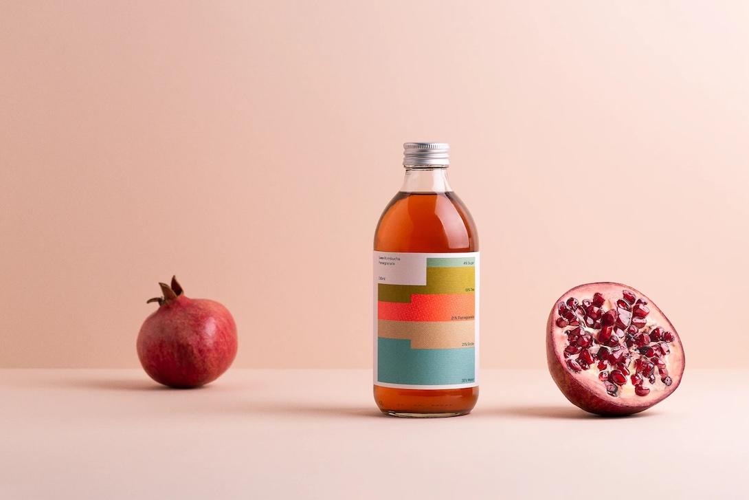
Swee 29 Mar 9:15 AM (16 days ago)
The label of each Swee kombucha bottle is an infographic showing its ingredients. Brilliant. Via 10+1 Things.
Heath MacQuarrie, The MacLean Method, and Victoria School 28 Mar 12:45 PM (17 days ago)
Lisa and I have been taking weekly theater courses, with the estimable Becca Griffin, at the old schoolhouse in Victoria. It’s fun, and enlivening, and we’ve chosen a scene to work up that’s going to stretch us.
While we were there last night, I found myself looking at the display of artifacts from the building’s past. Among them was this, awarding Heath MacQuarrie an “Advanced Certificate” in The MacLean Method of Writing in 1943:
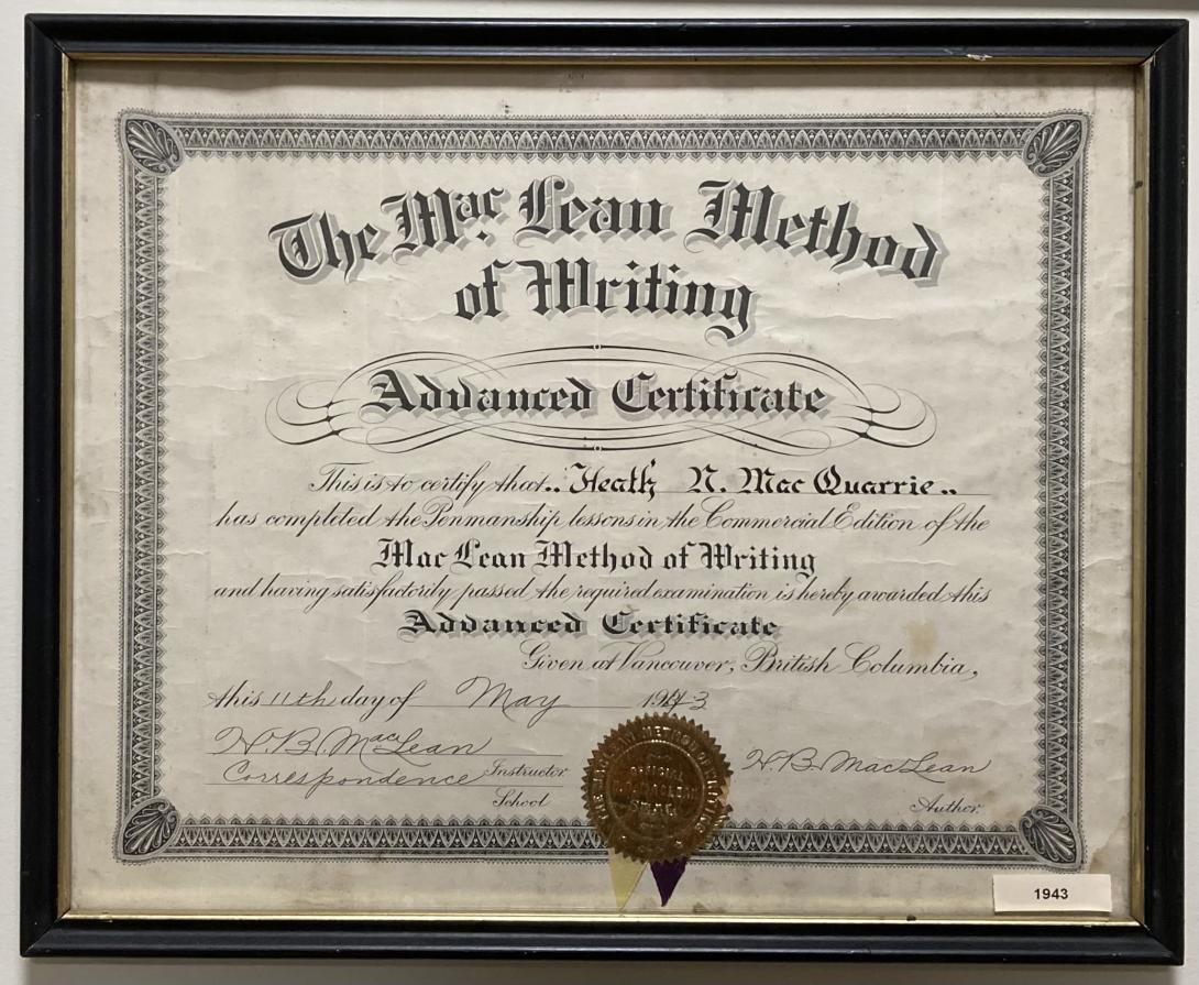
To the uninitiated, this certificate might be regarded as a benign piece of history, but instead it’s a piece in a much larger jigsaw puzzle of Island history.
H.B. MacLean, signatory of MacQuarrie’s certificate, and the MacLean of The MacLean Method of Handwriting, taught at the selfsame Victoria School in 1905.
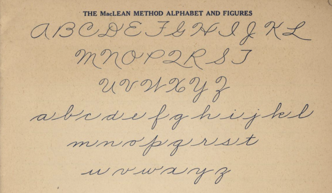
He later developed the eponymous method of teaching handwriting, in Victoria, BC starting in the 1920s:
Developed in Victoria by educator H. B. MacLean between 1921 and 1964, the MacLean method was used across Canada as the official handwriting method in schools, particularly in the Maritimes, parts of Quebec, Manitoba, and BC.
Here’s an example from the MacLean materials:
As an aside, here’s my maternal grandmother’s recipe for gingerbread, in her own hand, likely written in the 1930s:
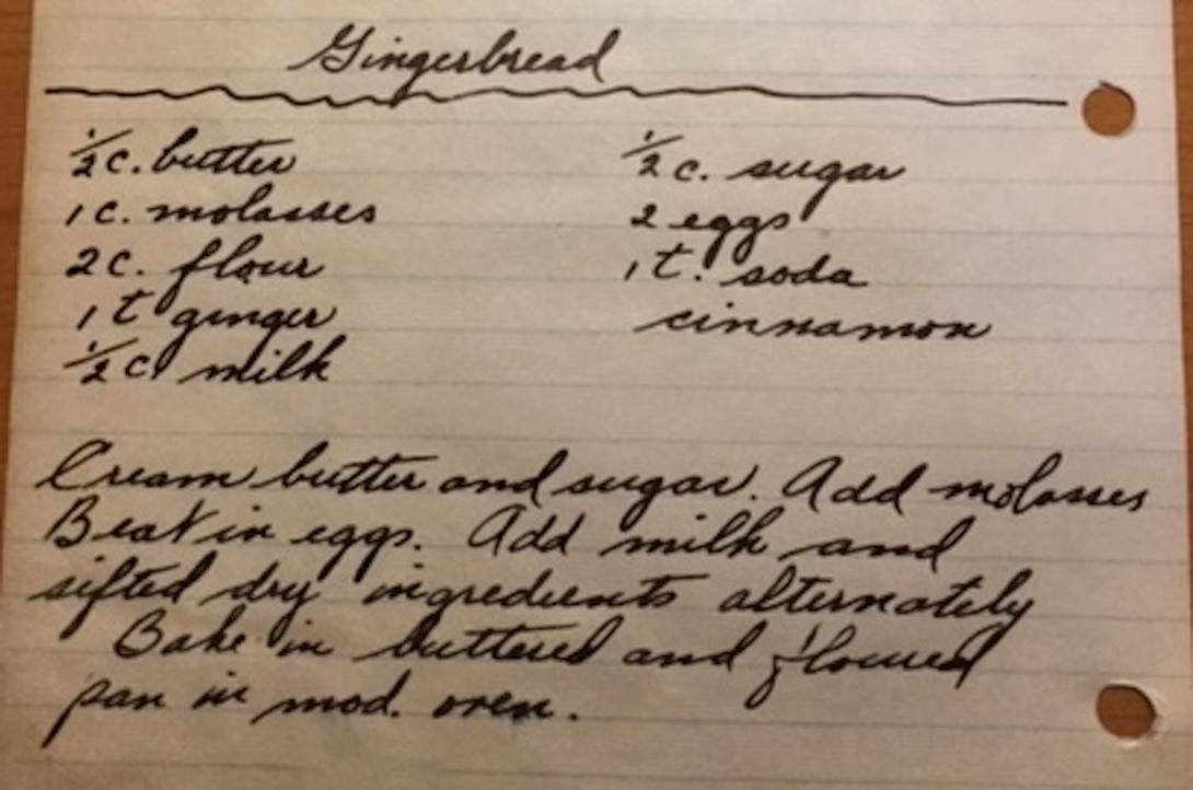
I asked my friend Ian Scott, a keen student of writing in general and the MacLean Method in particular, his opinion on whether there were signs of the Method in her writing, and he replied:
There is clearly the influence of HB MacLean to be seen in your grandmother’s handwriting. She clearly had developed a personal style, but some exact MacLean template letters in both her capitals and lower case letters. Her capital P and G would have gotten top marks from MacLean.
An additional aside from Ian, who’s nothing if not a polymath, on H.B. MacLean:
His great aunt was Ann “Nancy” Bovyer who married Henry Smith, the brother of the architect Isaac Smith and a partner in their construction firm. The Smith-Bovyer family eventually joined the groups who sailed away to New Zealand on the Prince Edward in 1859.
That is of interest to me, in particular, because for the last 25 years, I’ve lived in the Smith-Bovyer family home, built by them in 1827.
MacQuarrie, meanwhile, born in 1919 in Victoria, was a student at the Victoria School as a child, later returning as its principal from 1940-1942. As he relates in his autobiography, Red Tory Blues, the fall after he attained his Advanced Certificate in The MacLean Method, MacQuarrie headed west:
Among the many efforts to get overseas in some capacity was an appeal to the YMCA International Service. This wasn’t successful but I did get an offer to join the staff of the YMCA in Winnipeg. In the early fall of 1943, I moved to Winnipeg to take up duties with the YMCA and to enrol at United College. My four years in Winnipeg in 1943-7 were happy. I learned a great deal as a staff member of the YMCA. My time at United College was rich and rewarding. A liberal arts college with a gifted faculty it also brought me enduring friendship . I was class president of both third- and fourth-year classes. I served a period as prime minister of the student model parliament - one of my ‘ministers’ was Sterling Lyon, later premier of Manitoba. And best of all I met Isabel Stewart.
Heath married Isabel Stewart 6 years later, 1949, and the couple remained in Manitoba until 1955, when his political ambitions began to stir:
So, as the year 1955 wore on, I found myself thinking more and more of getting into full political harness. There were possible opportunities on the provincial or federal scene in Manitoba, where I was now teaching. In my native Queens, the Progressive Conservatives would be finding a new standard-bearer for the next election. Nothing was certain by any means, but I had the feeling that it would be easier to gain a nomination in the West, but getting elected there might be harder.
They returned to MacQuarrie’s native Victoria and, in 1957, he was elected to Member of Parliament for Queens. He served that riding—and in later years in the new Hillsborough riding—as MP for 22 years, until 1979 when he was appointed to the Senate, where he served for a further 15 years.
MacQuarrie’s appreciation for penmanship could perhaps be ascribed, in part, to having been schooled in one of the stops on H.B. MacLean’s educational journey. There are signs later in life, as well; in his autobiography he writes about Island politician John Myers:
I did get to know John Myers much better. In my years at Prince of Wales College 1933-5, he was helpful to me in my information seeking on current events, my favourite part of the school program. I remember his kindness in copying out longhand the names and full titles of all the cabinet ministers. In all my years in the House of Commons, I never had writing paper of the quality of the three or four vellum sheets which Mr Myers used. I can also say that I never filled a sheet with the splendid copperplate penmanship which he displayed. Sharp of tongue and mind always, he told me that the minister with the most initials behind his name was the one with the fewest brains in his head.
Along with Ian, and my friend Andrea Ledwell, we’ve been simmering the notion of a Wikipedia entry for H.B. MacLean. Coming across MacQuarrie’s certificate in the Victoria School prompts me to revisit that project, with hopes that soon he might be more recognized for his contributions to handwriting, penmanship, and Canada. Stay tuned.
Weight Contrast Coincidence in Federal Election Signs 25 Mar 8:34 AM (20 days ago)
One of the biggest influences on my typographic sensibilities was the title sequence from the 1980s TV drama thirtysomething:

The all-lower-case, and the “weight contrast,” in the title card—a bold thirty contrasted with a light something—seemed fresh and new and entirely of the time.
Here’s what Carl Dair wrote about weight contrast in A Typographic Quest 5: Contrast (emphasis mine):
The weight of a letter may be described as the ratio between the black impression of the inked letter and the white background of the paper. Increasing the thickness of the strokes of a letter to make a type face darker was an innovation of the nineteenth century. None of the original designers of the classical roman letters ever contemplated a “bold” version of their letters. However, the eye-directing emphasis provided by bold versions of the standard types are commonly used as subheads throughout text. But beyond the mere bold weights, many types have extremely black versions, and in the contemporary sans serif faces, as many as six different weights of letters have been produced. These variations in weight provide the designer with a wide range of effective contrasts to achieve emphasis for a single word, to bring out a heading to dominate the text, or to create a focal point to draw the attention. Not only types of varying weight, but other typographic material such as rules, spots, squares, etc. can be called into service to provide a heavy area for a powerful point of visual attraction or emphasis.
I noticed a typographic coincidence this morning, presumably an unintentional one: the signs for candidates Sean Casey (Liberal) and Natalie Jameson (Conservative) are remarkably similar, and both use weight contrast in the rendering of the first and last name of the respective candidate:
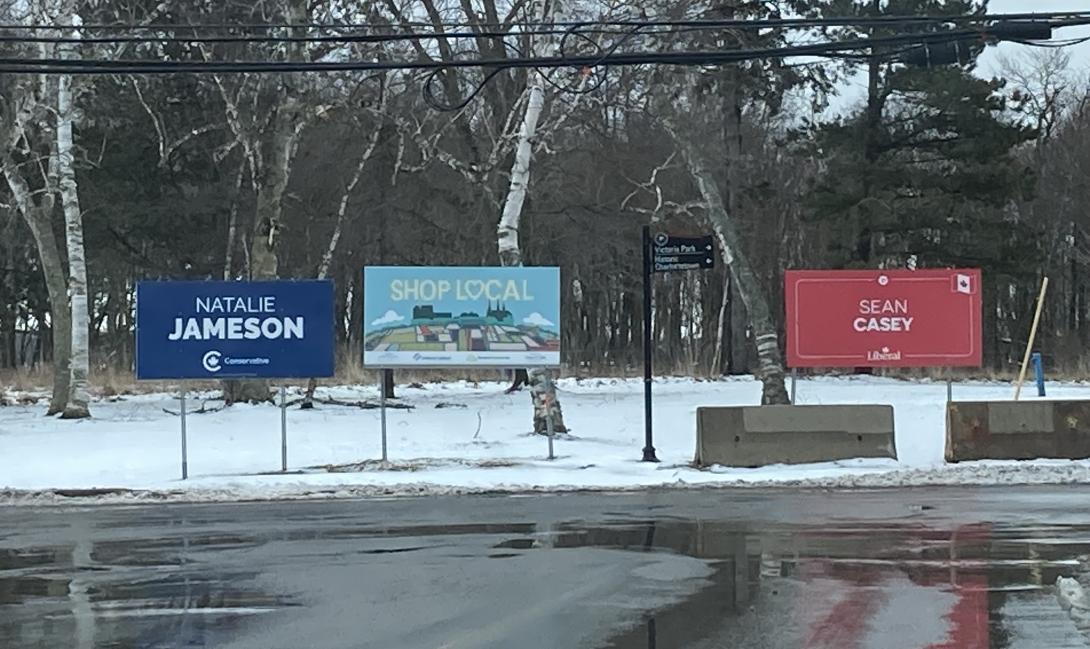
The typography and layout of the Jameson sign are clearly stronger: the type is larger, the bolder is bolder. The type on the Casey sign is lost in a sea of red, and the eye is distracted by the Canadian flag in the top right corner.
Forever is a Feeling 22 Mar 5:13 AM (23 days ago)
Lucy Dacus has a new album dropping on March 28, 2025. You can listen to select tracks on her Bandcamp page. I particularly like Ankles.
See also The Subversive Love Songs of Lucy Dacus, a New Yorker profile by Amanda Petrusich.
See also Love, Loss and Parenting, an interview with Petrusich on Anderson Cooper’s All There Is podcast.
See also Talking About Grief with Anderson Cooper, a New Yorker profile of Cooper by Petrusich.
Furiously Curious 20 Mar 8:55 AM (25 days ago)
New from the print shop today is a broadside I’ve been working on for the last month:
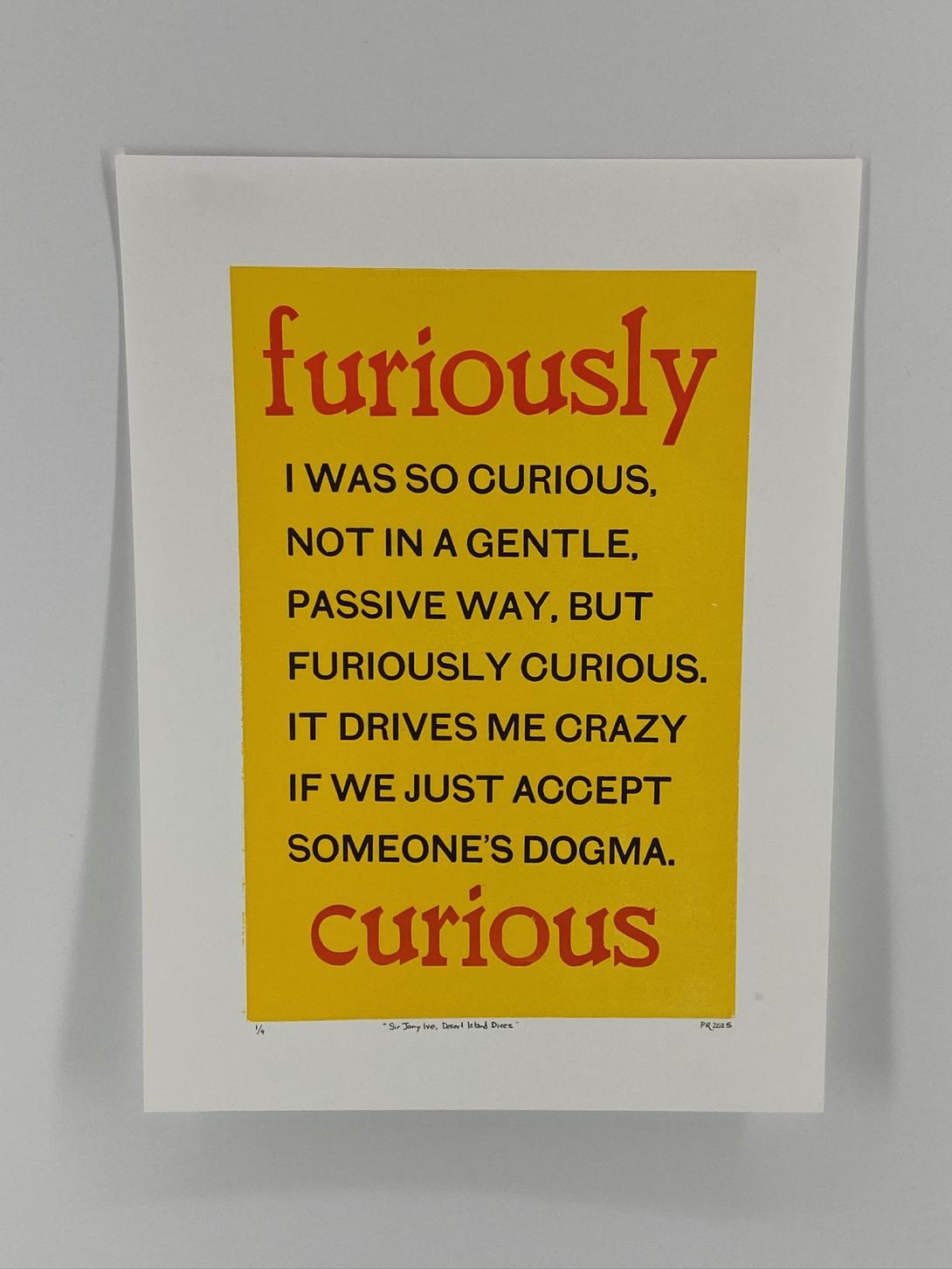
The words are Sir Jony Ive’s, from BBC Radio 4’s Desert Island Discs (you can hear them at 3:50 in the episode):
I was so curious, not in a gentle, passive way, but furiously curious. It drives me crazy if we just accept someone’s dogma.
I just absolutely loved the feeling of that level of curiosity, and felt a drive to capture the words in print.
My original thought was that they could become a This Box is for Good box, to the point where I mocked one up:
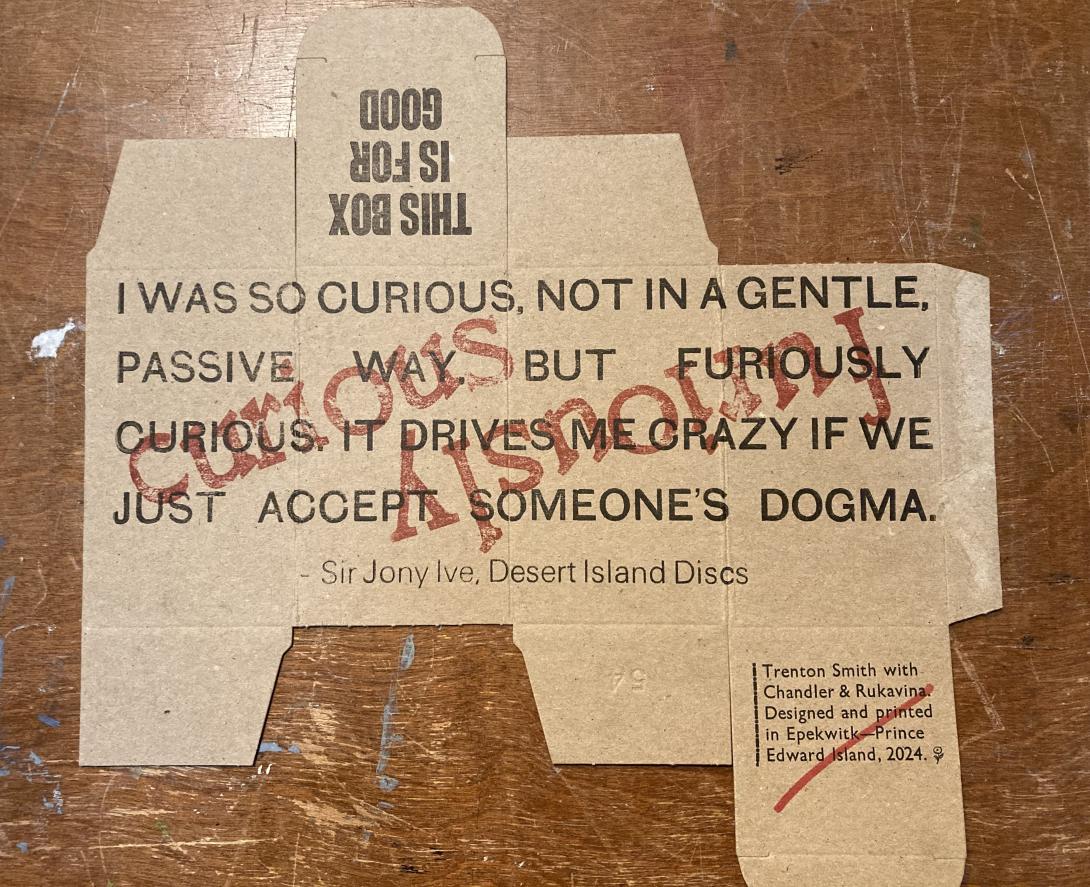
I realized, assembling the mockup into a box, that it didn’t really work: reading around a box isn’t natural, and the impact of the words was diminished rather than amplified. So, instead, I pivoted to printing a broadside.
I experimented with many different arrangements of type; the breakthrough came when Lisa suggested encasing the words inside a solid-coloured rectangle. Once I mocked that up, it all fell together for me visually.
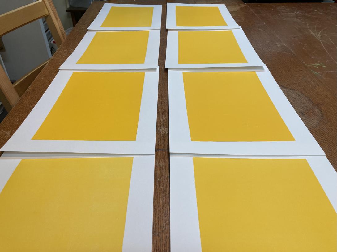
I printed the yellow rectangle on our etching press, using an uncarved piece of Japanese vinyl. My yellow-loving heart sang when I saw the result it was possible to achieve with the press, something that would be very difficult to replicate on the letterpress:
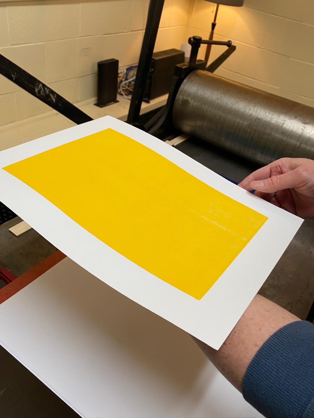
After fiddling with the packing on the press, I was able to produce a solid set of eight:
For the body type, I chose a battered old font of a sans serif typeface that I purchased from Atelier Domino in Montreal years ago. It’s got some quirkiness, including a wonky S, and a very chunky comma:
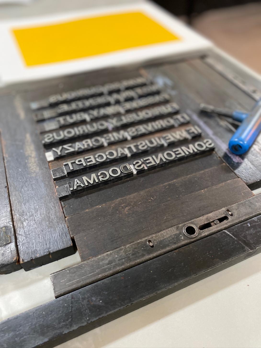
The “furiously” and the “curious” are set in a wooden typeface that I purchased from Letterpress Things in 2022; it has its own jaunty quirkiness, and I think the two typefaces are a good match.
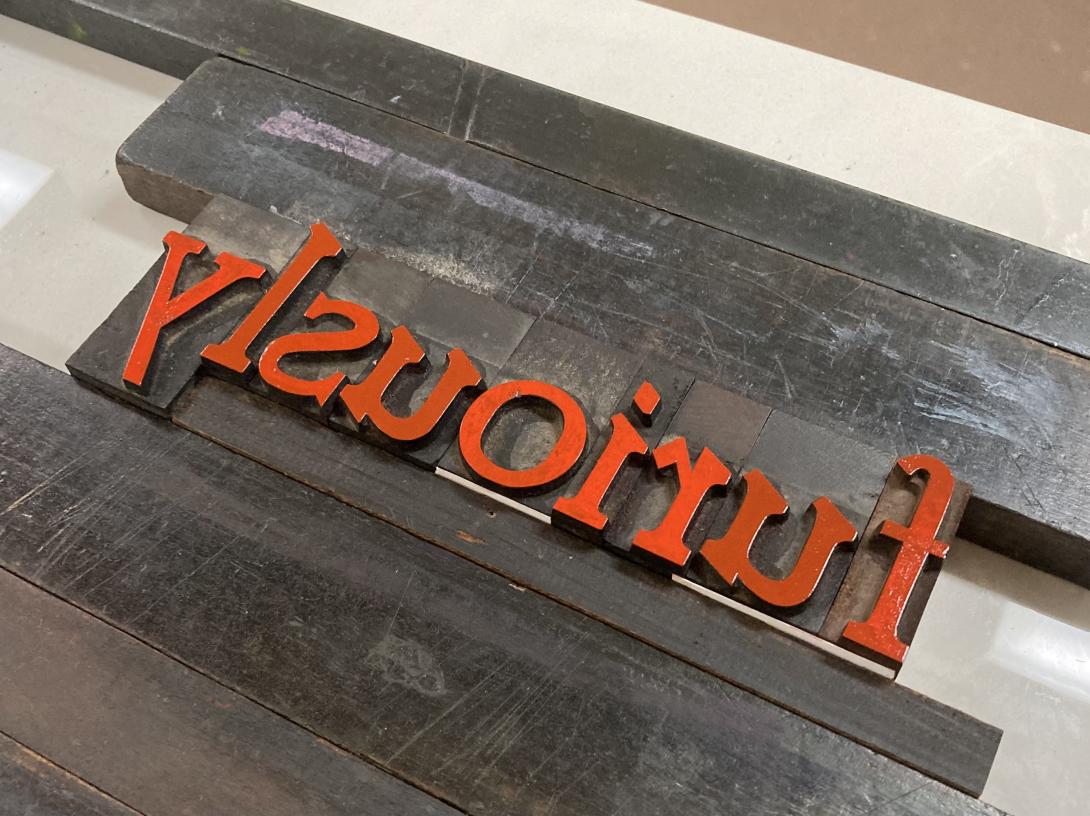
The ink, in both cases, is from the Dutch company Van Son. The red is actually florescent pink, from a tiny sampler I purchased a few years ago, when I decided I needed to print in more than just black and red. When it’s printed over the yellow background it appears more red than pink.
By the time I experimented with layout, packing, and other elements of makeready, the project emerged as a limited edition of 4 prints. I put them on sale in the Queen Square Press shop today.
We are what we buy 17 Mar 8:15 AM (28 days ago)
I’m a regular customer as The Gallery: it’s the closest coffee shop to our house, the coffee and food are good, and the staff are friendly.
The Gallery uses Square as its point of sale terminal. They use it more vigorously that most restaurants, in that they use the “scan this QR code to order from the table,” which is a feature I use to good effect on grumpy mornings when even interactions with friendly staff would be too much.
The restaurant also uses Square to power its customer loyalty program, and, through receiving an SMS notification about my points, I discovered that I have a “Square Profile,” which has recorded every single merchant I’ve been a customer of with a Square payment system.
Many of these businesses are long-gone, and, comparing archived emailed receipts to businesses, it looks like the trail goes back to 2017.
Here’s the entire list, 112 businesses in all, in reverse chronological order by the date of last payment (simply cut-and-pasted from the Square Profile page, under “Preferences and Settings > Receipt Settings”:
- Fritz Foods Inc.
- Foxy Fox Coffee House
- Farmers Fresh Inc.
- Receiver Coffee Company
- The Kettle Black PEI
- Deus Ex Macina
- Ducks Aren’t Real
- The 5th Wave Espresso & Tea Bar
- Gallant Island Food Inc.
- Helen’s Pastry Co
- Advantage Delivery
- PEI Crafts Council Inc
- Indigenous PEI
- Airport Coffee House Ltd
- Buns from home
- Wenever Pastry Inc
- 10713490 Canada Limited
- Confederation Centre of the Arts
- Budleys Restaurant
- Soika
- Oh Hey PEI
- Rick’s Fish and Chips
- Farmacy + Fermentary
- Knead a Brake
- Blackbush
- Truckin’ Roll Ice Cream Ltd
- W.B. Burke & Son Ltd
- Tide & Tales Bistro Inc
- Icy Scoops
- MARRAM Marketing & Productions
- The Naufrage Snack Shack
- Julio’s Seafood Market
- Dreadnaught Eatery
- Island Lavender Distillery
- Tabali Grillz
- Grams Diner & Bakery
- Weird Harbour Espresso Bar
- Red Island Cider
- Bookmark Charlottetown
- Bar Vela Pizzeria & Mercato
- Seven’s Pinballorama
- JMK Fishmart
- Charlottetown Cheese Company
- Lake View Glamping Inc.
- La Factrie (727256 NB Inc.)
- Clover Food Lab
- North End Creamery
- Parker and Sons Coffee Roasting
- Aesop’s Tables
- Cranewood on Main
- Pappy’s BBQ Joint
- Kimchi&sushi
- Micro Espresso Café
- 1010 Delivery
- Coffee Plus
- Caledonia House
- Voluntary Resource Council
- Alex Bevan-Baker Pottery
- MacFarlane’s
- Pretzel, Pint & Pickle
- Lost & Found
- G&L Investments Ltd
- Tastee Bites
- Los Nopales
- Red Bandana Inc
- LUCKY BAKERY
- Habitat for Humanity Restore
- Seaside Fun Foods
- The Knot
- Souris Thai Food
- Cottage Life Boutique
- Venture Stables
- Bao Shack
- P.E.I. Arts Guild Inc.
- C & B Corner Cafe
- Dal’s Potato Bar
- Cloggeroo the Island Folk Festival
- The Dodo
- Seaside Books
- Tamarack: Twigs & Teas
- The Recovery Studio
- Green Eye Designs PEI
- Chatime PEI
- The Funky Robot - Etched Wallet Art
- AJ’s Kitchen and Catering
- Dave’s Lobster
- KZ SQUARE
- Trish juice Burlington
- Vintage Coffee Roasters
- The Old General
- Stir It Up Vegan Cafe and Market
- Sailor Bup’s Barbershop
- rachel’s ginger beer
- Sarah Bellum’s Bakery + Workshop
- Nuvrei Inc
- Boke Bowl
- Lugano coffee express
- Deadstock Coffee and Sneaker Gallery LLC
- Seattle Bagel Bakery LLC
- Pondercast
- Keene Cinemas 6
- La Sazon de Mexico
- Fancy’s Coffee Counter
- Terry’s Berries
- Pure Kitchen Catering
- Stacey Leunes
- The Walrus Foundation
- Fruition
- breadworks
- The Humble Barber
- The Galley By Chef Norman
- Paddles
If there was any doubt that payment processors like Square are actually in the customer profiling business as much as the collecting-money business, here’s what ChatGPT returned when I gave that list to it, with the prompt “Take this list of businesses, and infer from their names some basic customer profiling information about me, who’s been a customer of all of them.”:
You’re someone who values local, high-quality, and independent businesses, with a strong appreciation for good food, arts, and culture. You have quirky and eclectic tastes, enjoy unique experiences, and support small businesses, sustainability, and social initiatives. You likely enjoy traveling, exploring new flavors, and seeking out interesting places wherever you go.
Yes, that’s me in a nutshell.
We are what we buy.
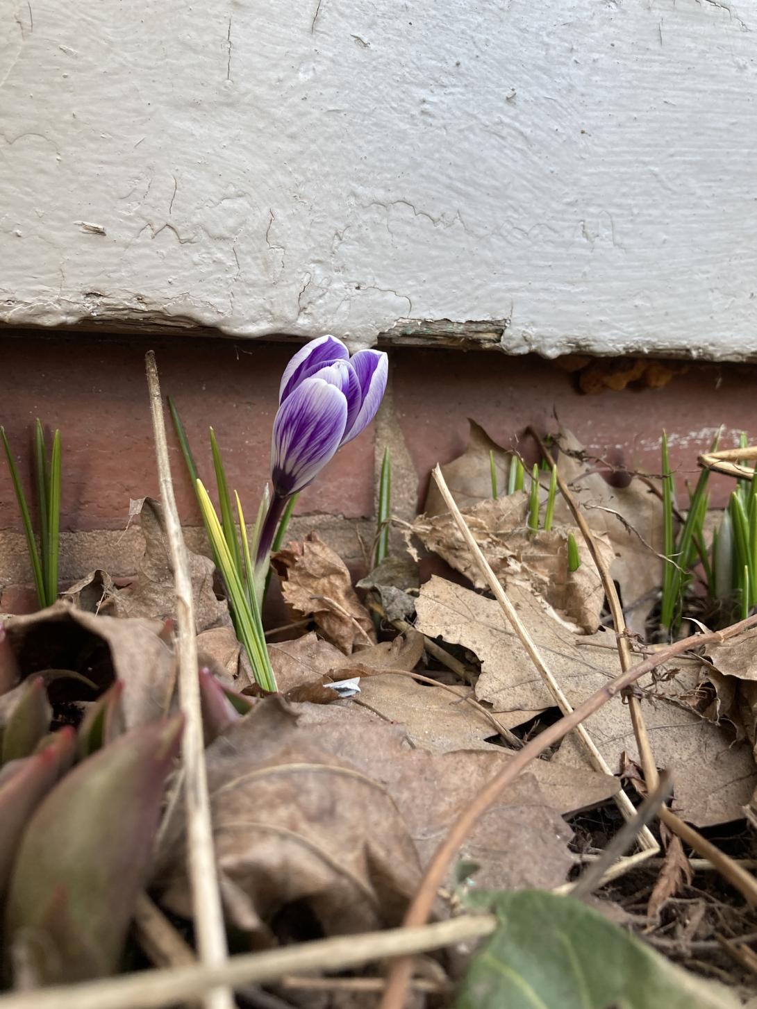
The 2025 Crocuses 16 Mar 7:37 AM (29 days ago)
The first crocuses of the year appeared in the front garden at 100 Prince Street on Friday, March 14.
See also 2020 (March 24), 2021 (March 12), 2022 (March 18), 2023 (March 20) and 2024 (March 14).
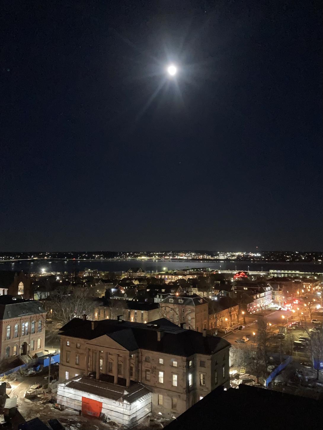
Moon Over Province House 12 Mar 4:17 PM (last month)
The Moon was almost full tonight—97%—and the sky was crystal clear, so we went on an evening photo walk, looking for views of St. Dunstan’s Basilica to feed Lisa’s series of relief prints from different angles.
Along the way I captured this view of Province House in under the Moon, one of those rare times my old iPhone SE rose to the occasion and performed well in low light.
What is the best song in the world? 10 Mar 2:12 PM (last month)
Five years ago I wrote about covers that were better than the original. I thought of that post when I found my way to the cover of Joni Mitchell’s Both Sides Now by Swedish singer-songwriter The Tallest Man on Earth.
From his introduction:
When the best song in the world has already been written, why do I write?
Well, it gives me some freedom, doesn’t it, to just be in my little place, and write basically the same song over and over, like they’re just verses of this one really long one I’m trying to figure it out.
Like this is the cliff from my 2010 song Little River, and, as you can see, it’s still here, because songs don’t really make cliffs go away. So I’ll probably write about it again.
But what is the best song in the world? It’s Both Sides Now, by Joni Mitchell.
Is his cover better than the original? I don’t know. But what a lovely cover it is.
(I found my way to The Tallest Man on Earth via Patrick Bunston, musician in his own right, and an extraordinary barista to boot).
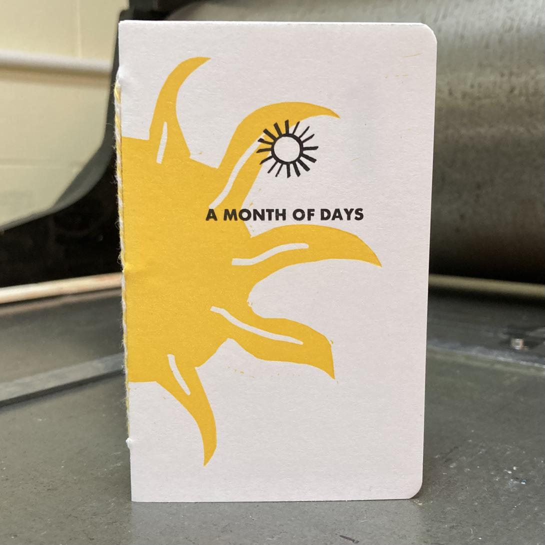
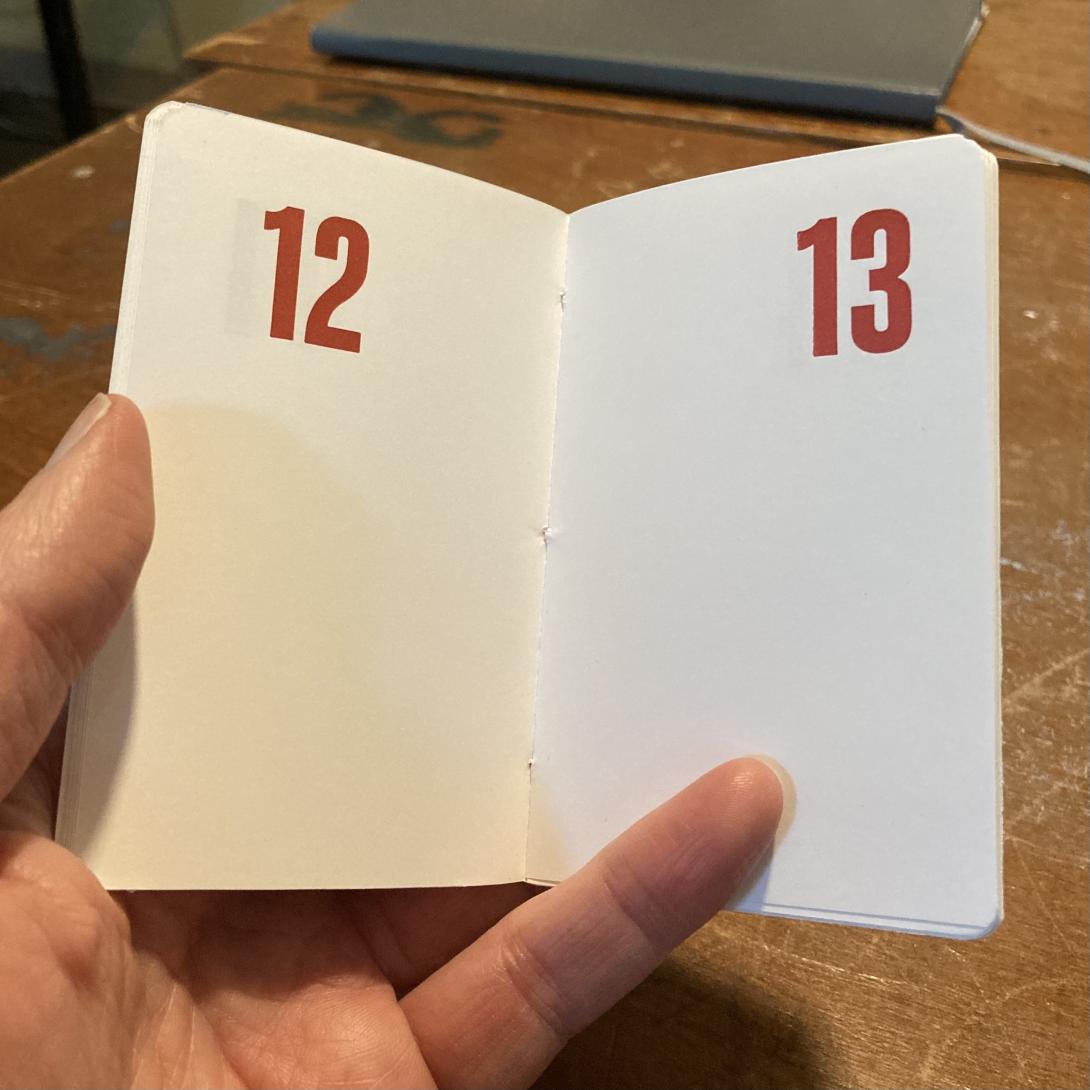
A Month of Days 6 Mar 8:17 AM (last month)
This is A Month of Days, a project I’ve been working on for the last month:
It’s the simplest of all date books: a page per day, numbered in the corner in big bold red Akzidenz Grotesk:
The books are simple; the printing, assembly, and binding were simple steps too, there were just a lot of them.
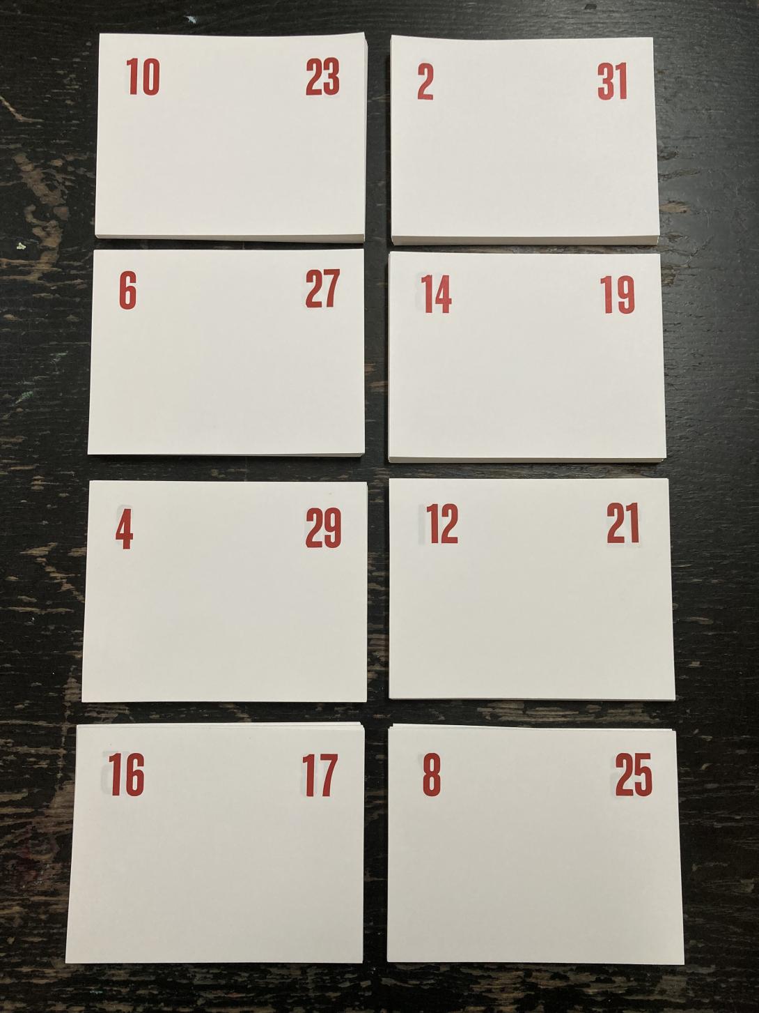
I first had to figure out how to print the numbers on the pages in a way that I could cut and fold larger pages down into signatures that would be paged in the right order.
I made a couple of mock-ups before I got everything sorted, and then set out to set the type for each spread of pages:
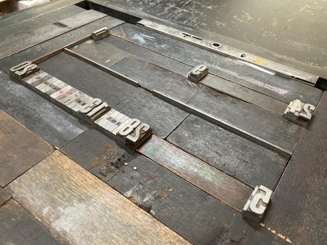
From there it was a lot of printing, setting new numbers for a new spread, and cutting down pages into signatures, a process that resulted in this collection:
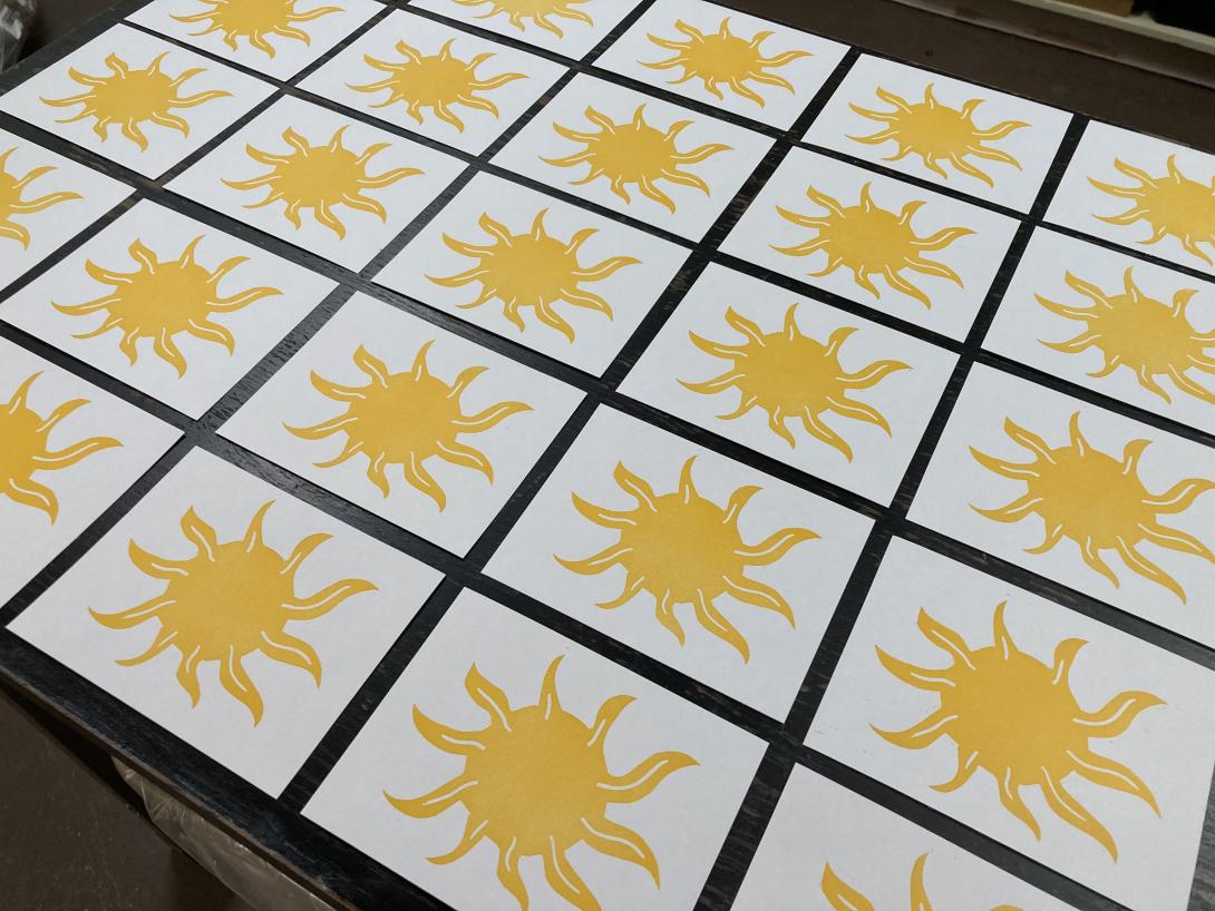
With the pages printed, I set out to design and print a cover. We’ve recently come into the loan of an etching press, and I was keen to try it out, so I carved a lino block of an abstract sun:
I chose a rich Akua Diarylide Yellow ink for the printing, and ran the block through the press on notebook-sized pieces of card stock, to produce:
When the suns had dried, I used the letterpress to print the “fronts” and “backs” of each cover:
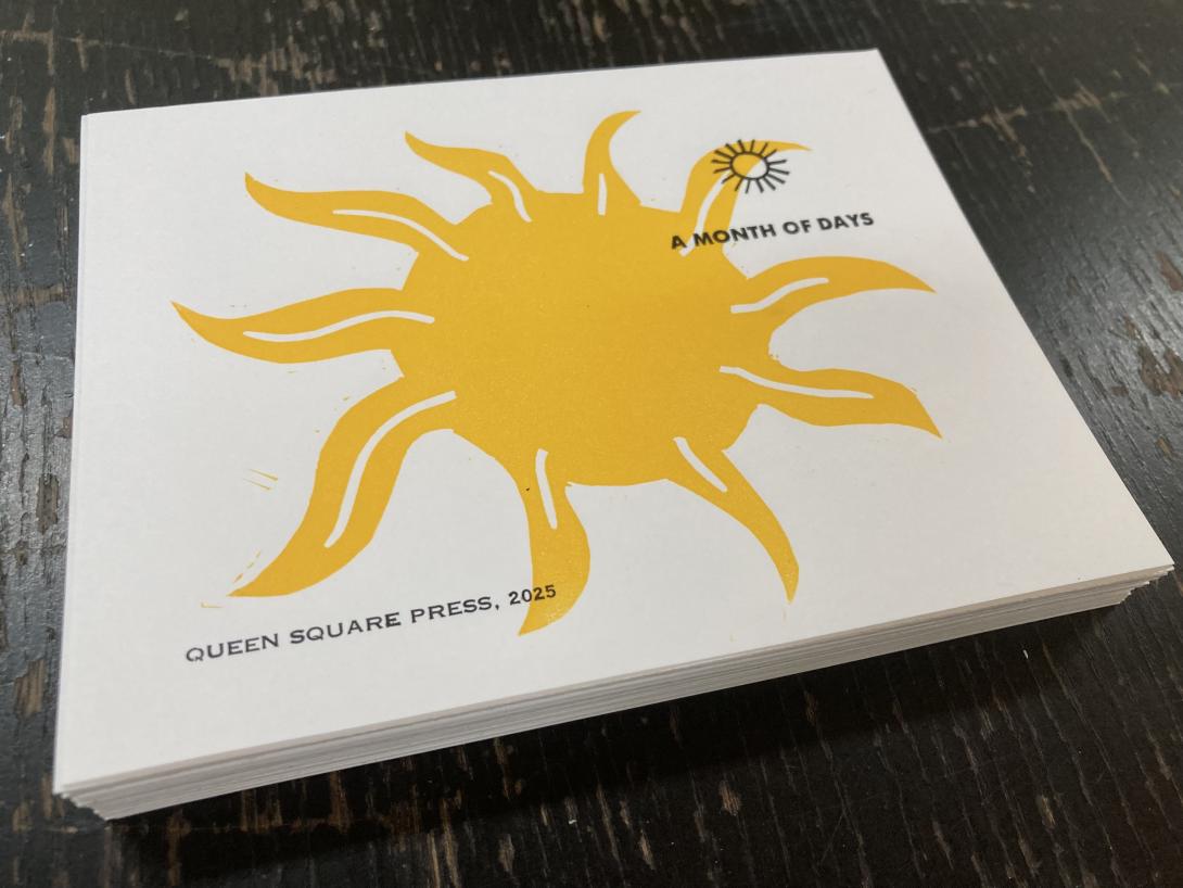
The “A Month of Days” in all caps is from a font of a tiny perfect sans-serif typeface that I acquired somewhere along the way. Above it is an ornament is by Johannes Troyer, circa 1953, cast from the original matrices by Skyline Type Foundry.
On the back is the credit “Queen Square Press, 2025” set in very tiny and fiddly 6 point Spartan, from a font I inherited from Prince County Hospital many years ago.
With the pages and covers printed and dried, all that was left was the assembly: the cover, and each page, got scored and folded, collated into a “book,” and then punch, with an awl, in three places along the spine. I then bound the books together with a simple pamphlet stitch, using bakers twine, and put them overnight in the nipping press to settle.
The final step was to trim the edges, and round the corners:
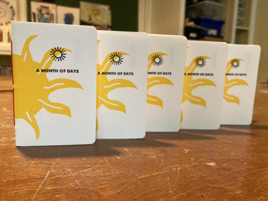
I’ve made a limited edition of 50 notebooks, and they’re available for sale on our online shop now.
A Day Trip to Sackville 3 Mar 1:36 PM (last month)
When you live on an island, sometimes, in the dead of winter, you need to GET OFF THE ISLAND. It doesn’t really matter where. Just OFF.
So today, with a rare day free from other commitments, Lisa and I took a day trip to Sackville, New Brunswick, the place that’s close enough to us that both qualifies as being off the Island, and “someplace.”
It was a lovely day trip.
We had lunch at Ducks aren’t Real (née The Black Duck), a restaurant I’ve visited many times that has never looked better, with a delightful new solarium at the back (with promise of a garden patio in the summer), a broader menu, and everything grounded in the solid performance that the space has always brought.
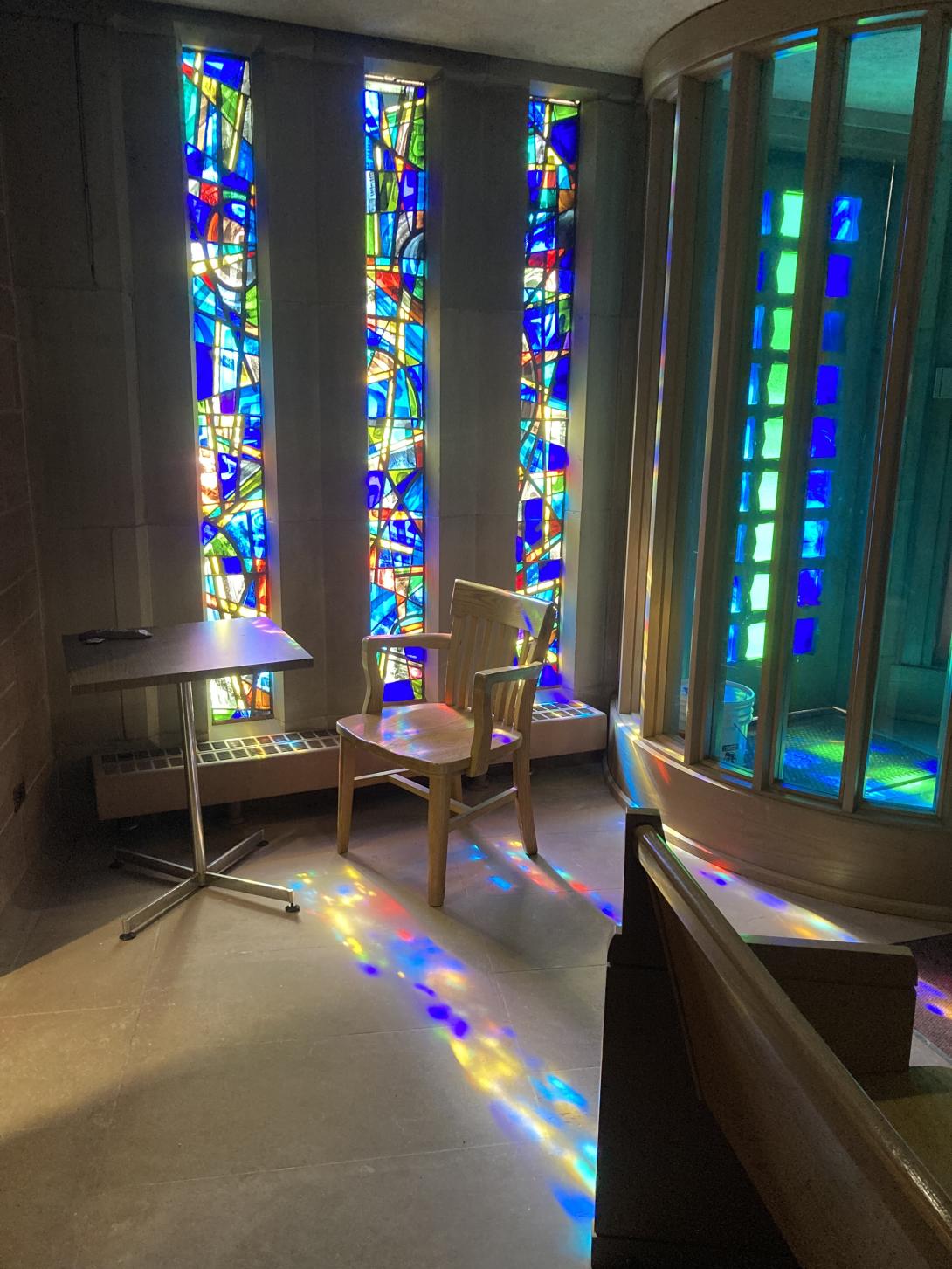
After lunch we went up the hill to Mount Allison University. We took a swing through the chapel—one of my favourite sacred spaces.
Next we walked next door and toured the Owens Art Gallery. The gallery highlight was the exhibition Hidden Blackness: Edward Mitchell Bannister (1828-1901):
Hidden Blackness is the first major exhibition of Edward Mitchell Bannister’s work ever presented in Canada—124 years after the artist’s death. Born in Saint Andrews, New Brunswick, Bannister was a self-taught, nineteenth-century, African American/Canadian painter of the Barbizon school known for pastoral landscapes and seascapes.
My favourite of Bannister’s works was River Scene (which can only really be done justice to when standing in front of it in the flesh):
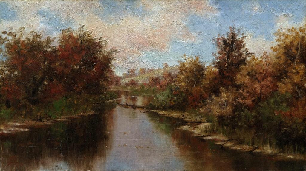
Edward Mitchell Bannister, River Scene, 1885
Art Gallery of Nova Scotia, Halifax.
Photograph by RAW Photography.
From the gallery we walked across campus to the Purdy Crawford Centre for the Arts, where the collegial and generous Erik Edson had agreed to give us an impromptu tour of the printmaking shops with very late notice. What a wonder: the building is interesting and spacious, the printmaking shop well-equipped and, a salve for for we basement printmaking dwellers, filled with light:
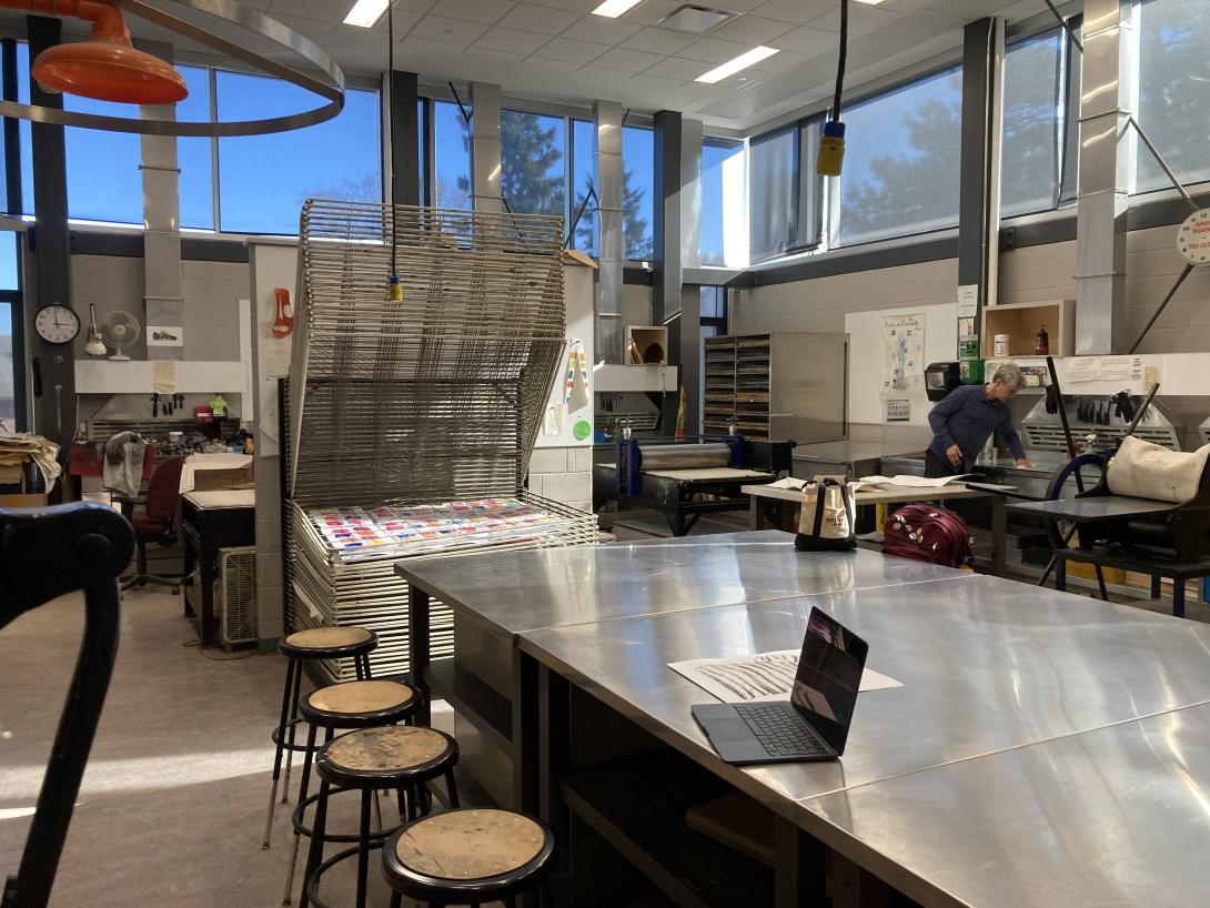
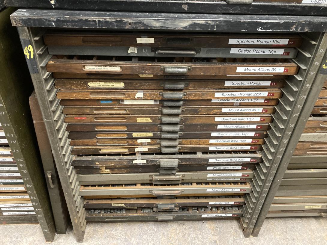
There’s a tiny letterpress shop shoehorned into a hallway, with a generous collection of type:
We said goodbye to Erik just as his 3:00 p.m. printmaking students started to arrive.
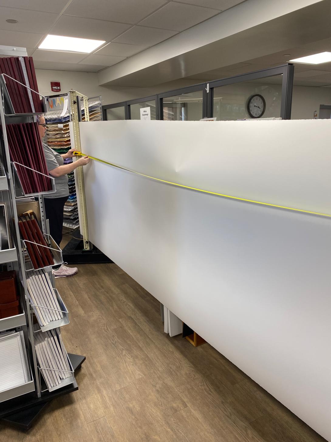
Erik suggested we stop by the Mount Allison bookstore on our way off campus, as they sell paper that might be attractive to us. He was right. They sell 50 inch Legion Stonehenge paper, well-suited for printmaking, for $4.99 a foot. We bought a 15 foot long strip:
Paper in hand, we made a beeline for the car, as we needed to charge it before heading home.
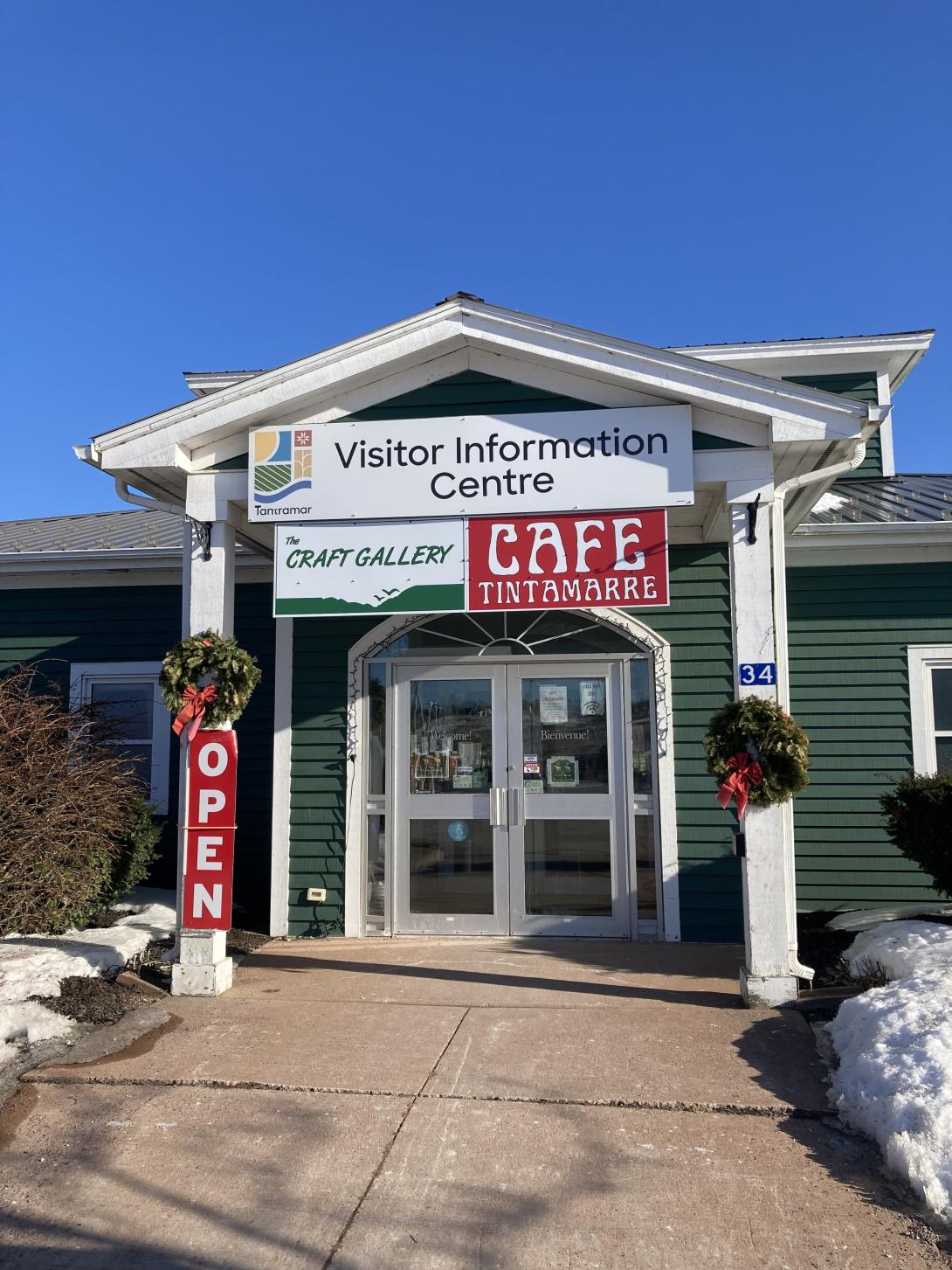
We found a level 3 EV charger in front of the Visitor Information Centre, and were very happy to find that inside there was Café Tintamarre, a new venture from the couple who operate the Deus Ex Macina coffee truck at the Sackville Farmers Market (where Olivia and I had very good coffee back in 2023).
We left Sackville at 4:15, charged again (winter battery life!) in Borden-Carleton, and pulled into the driveway at home at exactly 6:00.
We left the Island. It was much fun: new things! new people! new ideas!