Review of Mac Mail to Outlook Transfer by GlexSoft 14 Jan 2024 10:47 AM (last year)
Cross-platform data migration, unlike standard data conversion, typically involves two steps – physically moving the source files from one system to another and converting them into the destination format. This is the case when converting Apple Mail to Outlook, a popular email client on the Mac OS platform, to Microsoft Outlook®.
What is Mac Mail to Outlook Transfer tool?
Mac Mail to Outlook Transfer is a comprehensive tool for converting Apple Mail to Outlook that only requires the user to manually move the source MBOX and EMLX files from the Mac OS system to the destination PC. The rest of the process, including data extraction, conversion, formatting, and saving, is fully automated. Mac Mail to Outlook Transfer tool simplifies Apple Mail conversion and email migration, making it a manageable, reliable, and risk-free task for anyone.
System Requirements:
– Operating System: Microsoft Windows® Vista or higher
– Microsoft Office: Microsoft Outlook® 2003-2021 (standalone)
– Outlook Account: At least one Outlook profile (email account) should be configured
– Source files: *.mbox; *.emlx
– Hard Drive Space: 48 MB minimum
– Available Memory: 4 GB for 32-bit and 8 GB or more for 64-bit operating systems
– Processor: Pentium IV 2 GHz or faster
– Display: Color display, set to at least 1024 X 768 resolution
Apple Mail email format
Mac Mail uses the MBOX and EMLX formats for storing messages and attachments, making direct Mac Mail to Outlook email import impossible. This makes Apple Mail to Outlook conversion a complex task. However, Apple Mail to Outlook Converter simplifies this process, making it fast, intuitive, and accessible to a wide range of users, from IT professionals to beginners with basic computer skills.
Mac Mail to Outlook Transfer provides a comprehensive solution for transferring data from Mac Mail to MS Outlook. Once the files containing Apple Mail messages have been copied to the destination PC, it only takes a few mouse clicks to complete the export of Apple Mail to MS Outlook. This compact and efficient software was designed with user-friendliness in mind, catering to the needs of regular people who need to switch to another OS or access their emails on a PC. Unlike many competing solutions, this program requires no additional downloads or training and works right “out of the box”.
How to Transfer Mac Mail Messages to Outlook:
- Export Mac Mail folders into mailbox files (optionally) and copy them to the Windows PC.
- Run the Mac Mail to Outlook Transfer application.
- Select the Source Folder where Mac Mail *.mbox or *.emls files are located.
- Scan the source folder to get the full list of Mac Mail folders.
- Click the Save PST button to run the conversion to Outlook PST file.
Capabilities of Mac Mail to Outlook Transfer:
Due to the differences in email storage formats used by Mac Mail and Outlook, there is no direct way to migrate Apple Mail to Microsoft’s email client. Fortunately, the Apple Mail to Outlook converter tool automates most of the migration process, requiring the user to only manually transfer the source storage files to the destination.
Review of Mac mail to Outlook Transfer tool
As the digital age continues to evolve, the need for efficient and reliable email migration tools has become more critical than ever. One such tool that has been making waves in the tech industry is the “Mac Mail to Outlook Transfer” by GlexSoft. This software promises to provide a seamless transition from Mac Mail to Outlook, a feature that many users have been yearning for. In this review, we will delve into the features, pros, and cons of this software, providing an in-depth analysis of its performance.
The “Mac Mail to Outlook Transfer” software is designed to convert Mac Mail messages into a format that can be imported directly into Outlook on Windows or Mac. The software is built with an intuitive interface that makes it easy for users to navigate and operate, even without any technical expertise. It supports all versions of Outlook, from 2002 to the latest 2019 version, and can handle Mac Mail databases of any size.
- One of the most significant advantages of the “Mac Mail to Outlook Transfer” is its speed. The software is incredibly fast, converting and transferring large volumes of emails in a short time. This feature is particularly beneficial for businesses and individuals who handle a large number of emails daily.
- Another notable feature is the software’s accuracy. The “Mac Mail to Outlook Transfer” ensures that all your emails, including attachments, are transferred without any loss of data. It maintains the original structure of your folders and subfolders, ensuring that your emails remain organized just as they were in Mac Mail.
The Mac Mail to Outlook Transfer utility also comes with a built-in automatic detection feature. This feature automatically locates the Mac Mail database on your computer, saving you the hassle of searching for it manually. This feature is a significant time-saver, especially for users who are not tech-savvy.
- Despite its many advantages, the “Mac Mail to Outlook Transfer” is not without its flaws. One of the main drawbacks is the lack of a free trial version. While GlexSoft offers a demo version, it only allows you to convert 10 emails per folder. This limitation makes it difficult for potential users to fully test the software before purchasing it.
- Another downside is the software’s price. Compared to other email migration tools in the market, the “Mac Mail to Outlook Transfer” is relatively expensive. While its features and performance may justify the price for some, it may be a deterrent for others, especially those on a tight budget.
In conclusion, the “Mac Mail to Outlook Transfer” by GlexSoft is a robust and efficient tool for migrating emails from Mac Mail to Outlook. Its speed, accuracy, and user-friendly interface make it a worthwhile investment for businesses and individuals alike. However, its high price and lack of a comprehensive user guide may be a turn-off for some potential users.
Despite these drawbacks, the “Mac Mail to Outlook Transfer” stands out as a reliable and efficient tool in the realm of email migration. Its pros significantly outweigh its cons, making it a software worth considering for those seeking a seamless transition from Mac Mail to Outlook.
As the digital landscape continues to evolve, tools like the “Mac Mail to Outlook Transfer” will continue to play a crucial role in ensuring smooth and efficient communication. It is, therefore, essential for users to weigh the pros and cons carefully before deciding on the best email migration tool for their needs.
The post Review of Mac Mail to Outlook Transfer by GlexSoft first appeared on Technology news, reviews of software, applications, devices, and IT stuff around the world.


Six tools to repair damaged Word documents 15 Dec 2021 9:57 AM (3 years ago)
If damaged Word document can no longer be opened even after the first emergency measures, you will get the specialized help in the preceding article. Following six tools are promising to rescue the contents, including document formatting, images, tables, footnotes and directories.
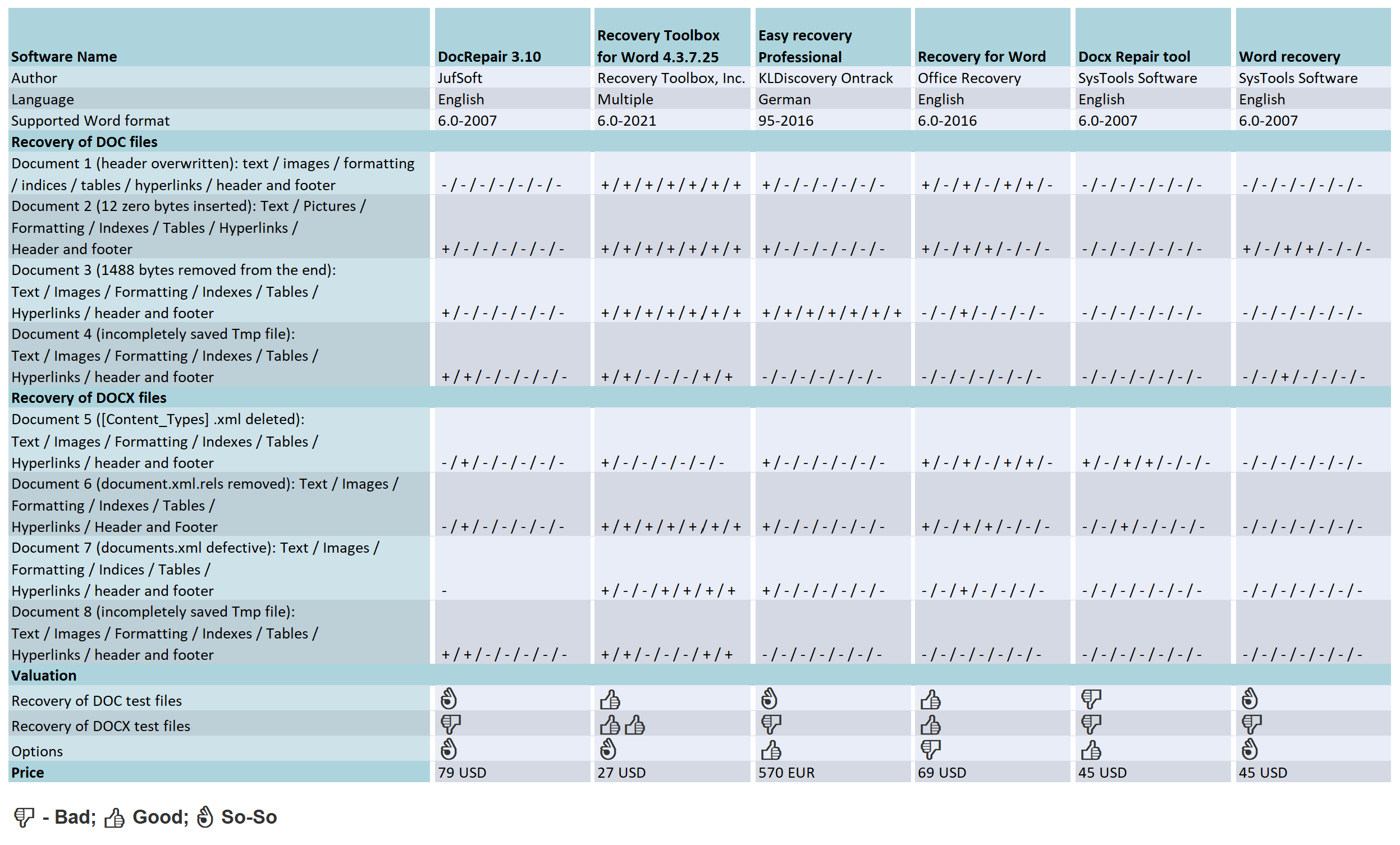
The complex binary structure of Word documents brings at a certain point own rescue attempts to fall. That’s why external tool providers are scenting the morning air. Our test shows what their special programs are capable of, which put the recovery talents of the following programs to the put to the test: DocRepair from Jufsoft, Recovery Toolbox for Word from Recovery Toolbox, EasyRecovery Professional from Kroll Ontrack, Recovery for Word from Recoveronix and the Systools products Docx Repair and Word Recovery. With the exception of Easy Recovery Professional, all programs programs require that the documents to be repaired are available as file and must exist. If you have deleted a Word file by mistake or formatted the memory card a classic data recovery program can track down lost data on the hard disk or other media and recover it, often even if the file system is no longer intact. This category also includes the program EasyRecovery which also belongs to this category, but with additional functions to also repair Word and other MS Office files.
All tools support the XML file format of Word 2007 with the extension DOCX for macro-free and DOCM for macro-containing documents. With the exception of Docx Repair all tested programs also understand the binary DOC format of earlier Word versions. With prices between 27 US Dollar and 570 Euro they are not exactly cheap. On the manufacturer’s pages test versions, which usually only cover the first page of a document, but at least show whether they can heal the specific document at all.
In order to examine the capabilities of the five of the five tools, we have three more complex documents of the same content in DOC and DOCX format with typical, but differently defects of varying severity. The manipulations performed with a hex editor manipulations on the DOC files looked as follows:
- Test document 1: Overwriting the header that identifies the file as a Word document (less serious)
- Test document 2: Insertion of 12 null bytes starting from byte position 54 (severe)
- Test document 3: Removal of 1488 bytes at the end of the file (severe)
Such defects occur in practice, for example, due to faulty file systems or unsuccessful removal of a macro virus, but also suddenly during work in Word. Unlike the binary DOC format, the (packed) document structure of DOCX files in the form of XML files is easy to recognize. Here, each file and each folder has a precisely defined function, which made the targeted reproduction of structural defects on three other test documents much easier:
- (see a note below)
- Test document 5: File [Content_Types].xml deleted, which virtually forms the table of contents of the XML structure (severe).
- Test document 6: File document.xml.rels removed. This contains references to embedded images, objects and so on (less serious).
- Test document 7: documents.xml file containing the actual document content, but mangled by removing some closing tags (severe).
Beyond file manipulation, we twice interrupted the saving process of a very long DOC and DOCX file to a USB stick by pulling it off prematurely. The temporary files left behind were test documents 4 and 8, which could not be opened by Word just as little as the other six.
The text program at least managed to almost completely restore test document 6 with the help of its own repair function – only the images were missing. The contents of the other documents could not be recovered completely, i.e. including the layout, even with the help of the own measures from the previous article.
The tested tools all have a simply structured English-language interface, on which there is not much to set or prepare. The user selects the damaged document, presses a button and after a certain waiting time, which the program needs for the analysis, receives a preview of the expected results. Mostly it is limited to the unformatted document text, a formatted display with images is afforded only by Docx Repair. In the rest of the cases, it is necessary to start the recovery and take a look at the newly created document to be able to judge the real extent of the recovery.
In all the programs tested, this process with an 18 MByte large Word document with around 800 pages took between 10 and 15 minutes. Even though none of the tested programs tampered with the original, it is recommended to always work with a copy of the document to rule out further damage, for example due to a power failure.
DocRepair
DocRepair has a clear interface designed as a wizard, which guides the user through the recovery process in four steps. Its course can be influenced in the second step by means of three checkboxes. By activating the first one, the user informs the program that the defective document is not an English document, which is probably not the case. Presumably – the help is limited to only six sentences is intended to serve the correct interpretation of umlauts. It is probably more important to check the second box, otherwise the tool will not attempt to recover images. The third checkbox puts DocRepair into “Salvage content retrieval mode”, which supposedly retrieves more content, but also more character garbage from the broken file.
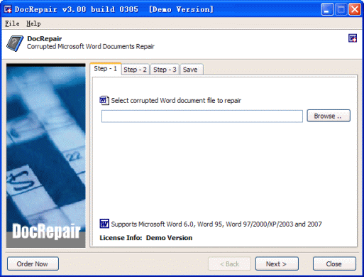
However, switching on the “Afterburner” hardly improved these mediocre results. In the case of test document 1, DocRepair only brought to light character garbage, and in test documents 2 and 3, only unformatted text. In the case of test document 4, but scattered it over many “islands” in a sea of character garbage. Even poorer was the result with DOCX files. DocRepair was able to recover text and images from document 8, but for documents 5 and 6 it was only enough for the images. The analysis of test document 7 kept DocRepair so busy that the tool could only be freed from its rigidity by means of the Task Manager to free the tool from its rigidity.
Recovery Toolbox for Word
The interface of Recovery Toolbox for Word has the charm of a dialog box: it consists of a text field for specifying the damaged file and two buttons. When clicking on Analyze, the user is confronted with the superfluous question whether he really wants to start the process. :) After the analysis, the recovery result can be exported from the preview directly to Word in a newly created document or saved as plain text. The fact that Recovery Toolbox for Word offers a text file as an output option is no coincidence.
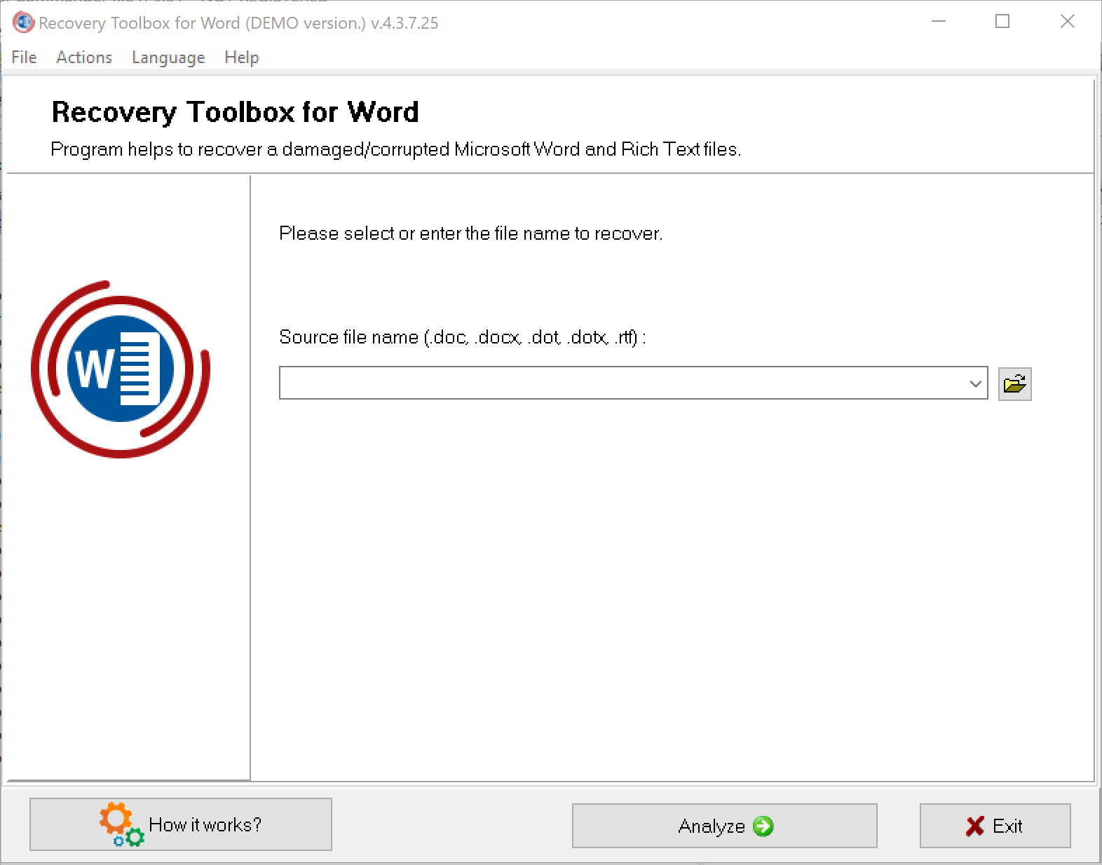
However direct output to Word brings all formatting to life. It succeeded in the case of test documents 1 to 3. During the analysis of test document 4 the program took 15 minutes to complete but the program was able to recover the text completely. With DOCX files (test documents 5 to 8), Recovery Toolbox was able to repair everything and returned completed document in all cases. All other formatting, images, functional text elements were also recovered.
EasyRecovery Professional
Apart from a few non-localized function names, EasyRecovery Professional is the only program in the test with has a German-language user interface. In contrast to the other tools, the 570 Euro program not only masters the repair of defective Word and other Office documents, it can also be used to analyze and fix hard disk problems, recover deleted files, and rescue damaged ZIP archives and e-mail data files from Outlook and Outlook Express. A graphical tab on the left side of the program window allows the user to switch between the different functional areas. The operation of the Word document repair function (Word Repair) is limited to three simple steps: select the damaged Word file, specify the destination folder for the recovered document and click “Next”.
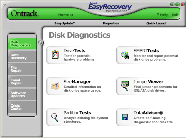
The EasyRecovery does the rest on its own. It informs you about the progress in a status window and finally opens the recovered document in Word. In the destination folder, you will always find an additional document with the file name “_SAL” for Salvation. In this document EasyRecovery stores only the plain text, as far as it could recover it from the defective document. EasyRecovery was able to completely recover test document 3, including text, all images, formatting, indexes, tables, hyperlinks, and header and footer contents.
From the other DOC files, the program was only able to recover the text of the first paragraph. In the case of DOCX files, the tool also limited itself to the pure document text, but recovered it completely. EasyRecovery could not do anything with the incompletely saved test documents 4 and 8. Although the tool could be persuaded to open the the TMP files and reported on the performed recovery actions in a status window. However, the two resulting documents were empty.
Recovery for Word
Three graphical buttons adorn the interface of Recovery for Word. Clicking on Recover brings up a file dialog, which on our test computers only offered the mysterious file type “Web site is located on %s”. Word documents could only be selected by entering “*.*”. During the repair work, only a percentage bar and a less informative text display inform about the progress of the repair work, at the end of which there is only a short final report and a link to open the generated document. Recovery for Word achieved acceptable results when recovering test documents 1 to 3. In all cases, the text was preserved as completely as all pages and paragraph formatting, the table of contents, the keyword index and the table.
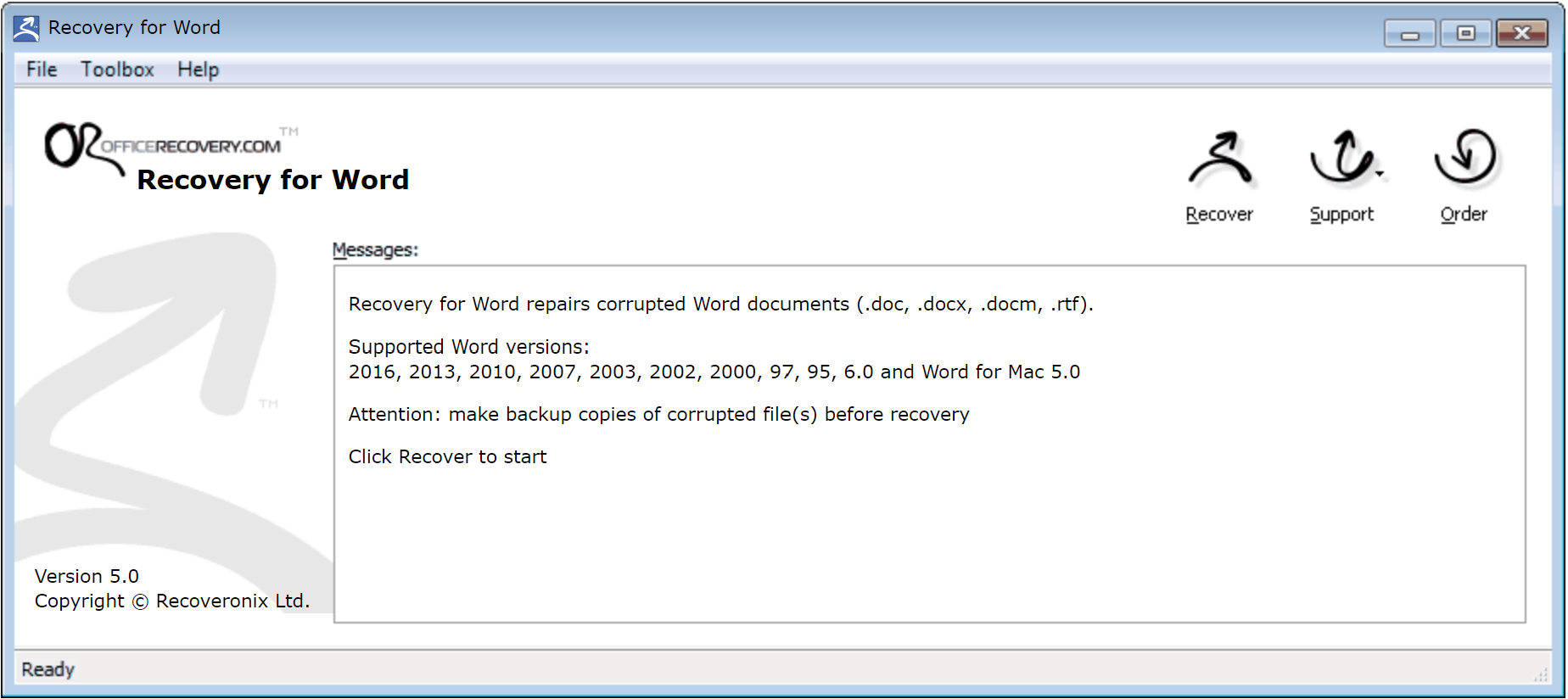
There were significant deviations from the original in character formatting (font and colors). The hyperlinks basically worked, but all pointed to the same jump target in the document. A footer mistakenly reappeared as a header, displacing its original content. The images, however, were all missing. When analyzing and repairing the defective DOCX files (test documents 5 to 7), Recovery for Word also achieved acceptable repair performance.
With the exception of umlauts, the text was complete in all cases, including character and paragraph formatting, footnotes, headers and footers, table, table of contents and index. The page layout did not match the original. Hyperlinks were only partially preserved, and only in test document 5. The program could not recover images in any case.
The program coped much worse with incomplete temporary files (test documents 4 and 8) than with DOC and DOCX files. We stopped the test after 60 minutes, during which the progress bar had not moved a millimeter.
SysTools Docx Repair
The interface of SysTools Docx Repair makes a tidy impression. The user clicks on the Browse button and selects the defective file. The file dialog only offers a filter for DOCX files, but entering “*.tmp” in the file field also makes temporary files selectable, which the program processes without any problems. A click on “Recover” brings up a small window that shows the progress of the analysis and repair work and wants to be confirmed with the OK button. After examining the preview, which always includes only the first document page, the user can specify via radio button whether he wants to save the result in a new DOCX document or as an RTF file. In the test, SysTools Docx Repair predominantly achieved very good results. For example, in the case of test document 5, the program managed a complete recovery, which included the entire text, all formatting, images and functional text elements. The generated DOCX file did not differ in any respect from the underlying original.
Document 8 was missing only the headers and footers, while Document 6 was missing the images. Finally, test document 7 certified severe damage, and program stopped without any feedback. A small flaw: Word 2007 initially refused to open the DOCX files created by Docx Repair in all cases. The automatically activated repair function of the text program was able to restore the allegedly unreadable documents back into shape but all other formatting, images, functional text elements – fell by the wayside.
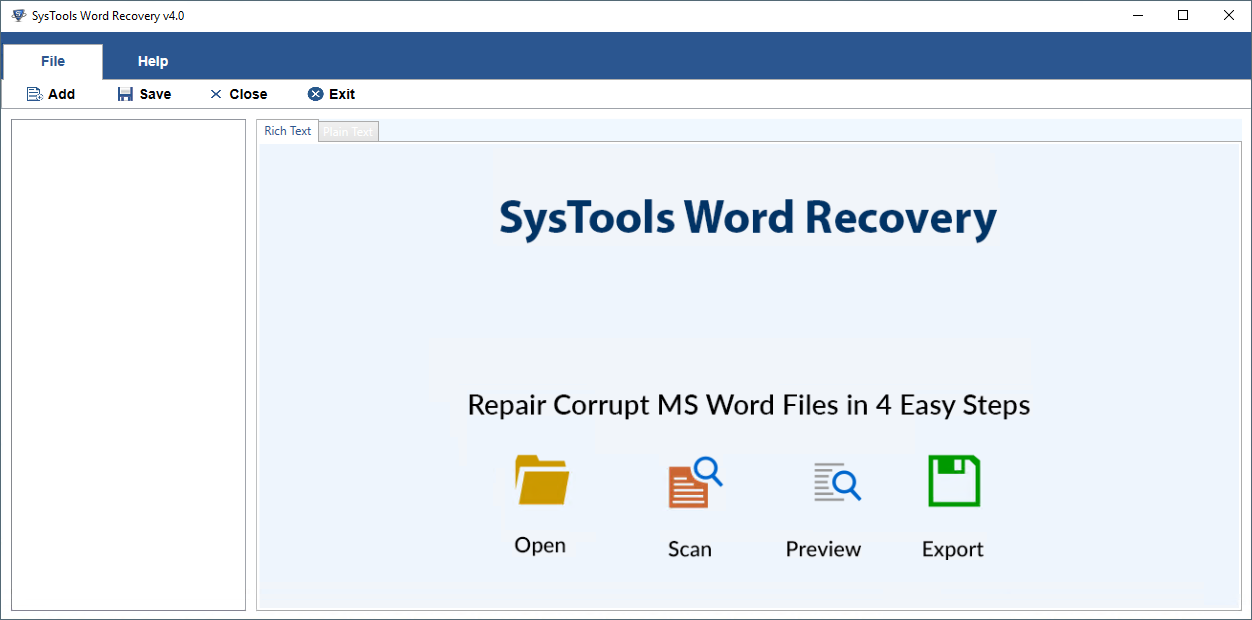
SysTools Word Recovery
At first glance, you might confuse SysTools Word Recovery with DocRepair: The icons and also the wizard-like interfaces are almost identical. Differences only become apparent in “Step 2” of the recovery process, where you have to decide whether you want to recover all content and formatting (Quick Recovery), only images (Image Recovery) or only the bare essentials from particularly badly damaged Word documents (Salvage Recovery).
The full-bodied promise, however, the program could not come close to fulfilling the full promise of being able to recover text, images, diagrams including formatting. For example, it only recovered text from the first test document, but without umlauts and other special characters and here were missing two of four chapters.. In documents 2 and 3, the text was complete, but all formatting fell by the wayside, as did the images, which even the Image Recovery mode could not bring to light. When accessing the TMP files (test documents 4 and 8), the tool crashed in all modes. In the case of DOCX files 5 to 7, SysTools Word Recovery always hung up without leaving a usable result. It is hard to understand why the image recovery mode is not available for DOCX files of all things, especially since it would require only a small amount of programming.
Conclusion
If all attempts at manual repair have failed, there are really only two of the tested tools that can be considered for computer-assisted rescue attempts on Word documents:
Recovery Toolbox for Word and DocRepair. Both strive for a holistic recovery that includes all content and formatting if possible, while SysTools Docx Repair, Recovery for Word and EasyRecovery do much less and are mostly content with the plain text, which the user has to restore to its original form with a lot of effort. Recovery Toolbox for Word combines very good operation with the best overall recovery performance. DocRepair can only be used for defective documents in the Open XML format. Those who want to repair a defective DOC file will reach for Recovery Toolbox for Word, which still shows acceptable performance even for OpenXML documents.
The post Six tools to repair damaged Word documents first appeared on Technology news, reviews of software, applications, devices, and IT stuff around the world.
Apple’s iBooks Author licensing terms 29 Feb 2020 12:56 AM (5 years ago)
I’m surprised by the fuss about Apple’s iBooks Author licensing terms. The terms prevent you from selling your iBooks Author-created works outside of the iBooks Store (although they can be distributed for free). You can still export and repurpose the content therein, but you can’t sell the complete, packaged layout file created by iBooks Author in another store.
This seems perfectly reasonable to me, for three reasons.
1) It’s called iBooks Author
The clue’s in the name. It creates iBooks for iBooks. Not generic ePubs for general distribution; specific iBooks for iBooks.
2) The files won’t work elsewhere anyway
The ePub-based output of iBooks Author uses custom CSS and object elements to create the advanced functionality needed for Apple’s textbook format. This shouldn’t be a surprise; Apple has gone over and beyond what’s possible with the current ePub standard in order to make this kind of functionality possible in iBooks. As a result, the output of iBooks Author won’t work in other ePub readers anyway. This isn’t bad; it’s just a choice you as an author need to make – whether to create a lowest-common-denominator reflowable-text ePub, or to develop a fully-functional textbook for a fixed-spec platform.
3) It’s free
Apple have spent many hours creating a free and fully-featured authoring tool to support their store. You don’t have to pay for it. It’s free. Why should they then support competing stores (who could perhaps reverse-engineer and support their ePub extensions), who haven’t paid to create and support the tool?
Apple provide a comparative tool for us iOS developers, called Xcode. This is the free development tool used to create iOS and Mac apps. Our Xcode-authored iOS apps don’t run on other platforms, and even if they could, I would fully expect Apple to prevent us from selling them in competing stores. That’s entirely reasonable in return for free tools and a profitable store ecosystem in which we can sell our work.
The post Apple’s iBooks Author licensing terms first appeared on Technology news, reviews of software, applications, devices, and IT stuff around the world.
Ignored keypresses when typing on iPad 20 Feb 2020 11:51 PM (5 years ago)
The iPad has a reputation for being difficult to type on. It’s generally accepted that the iPad is okay for short emails and notes, but is not suited to longer documents. The anecdotal consensus seems to be that an on-screen keyboard, with no tactile feedback, leads to more errors than a physical keyboard with real keys. Based on my research today, I’m not sure that this is the case. Instead, it may be a bug in the iPad’s keyboard software that is causing some of the typing errors.
I’ve never learnt to type properly – I use at most three fingers – but I can get around a physical keyboard pretty quickly. As an interface designer, I’m intrigued to see whether an on-screen keyboard really can be a valid alternative to a physical one. As a result, I’ve studied the iPad’s keyboard in quite a bit of detail.
The more I’ve looked into it, the more I’ve suspected that my typing may not be at fault for some of the mistakes in my iPad documents. To test this theory, I positioned my iPhone 4S (the best video camera I own) over an iPad 2 (supported by a folded Smart Screen), and filmed myself typing some sample text into a Pages document. I decided that Pages, as the de facto (and Apple-created) word processor for iPad, would be a good test of using the device for long-form writing.
Here’s the video of my typing, played back at 12.5% of the original speed so that you can see the individual keys being pressed. I’ve used the on-screen keyboard’s highlighting of pressed keys (fading to a darker grey and back again) to ascertain which keys I have successfully pressed, and in which order. I deliberately used a piece of text I don’t know well, to avoid familiarity; the pauses in the video come from me reading each block of text from the screen of my Mac. (The video is 12 minutes long, and is quite dull to watch in its entirety; it’s included here primarily to illustrate the examples below.)
Here’s what I’m trying to type:
Of the causes which have induced me to print this volume I have little to say; my own opinion is, that it will ultimately do some service to science, and without that belief I would not have undertaken so thankless a task. That it is too true not to make enemies, is an opinion in which I concur with several of my friends, although I should hope that which I have written will not give just reason for the permanence of such feelings.
…and here’s what I end up with on the iPad (with differences from the original text highlighted in red):
Of the causes which have induced me to print this volume image little to say; my own opinions, that t will ultimately do some service to science, and without thatbelef I would not ave undertaken so tankless a task. That it’s tod rue nt to Maeenemies, is anopinionin which I concur with several of y friends, although I should le that what iave written will nt give just reason fr the permanence of such feelings.
Clearly this is lot of of errors. The first error occurs just after typing this volume. On the iPad keyboard, I correctly type i [space] have. There’s very little time between pressing h and a, but long enough for the framerate of the iPhone video camera to detect them as being pressed in the correct order.
After I type the letter i, the following space is ignored, as is the letter h. Is this because the iPad is expecting me to select or dismiss an autocorrect overlay for the lowercase i? Or is it because the keypresses are missed by Pages? In either case, Pages doesn’t start processing my keystrokes again until the letter a. It then correctly detects the v, the e and the subsequent space, causing it to display iave; this is autocorrected to imageafter the ending space is pressed. This is despite the fact that I typed all of the letters correctly, apart from using a lowercase i.
The second error is a genuine typing mistake, as I fail to hit the space bar between opinion and is. The autocorrect suggestion of opinions is a sensible one.
The third error seems to be another ignored keypress. I’m typing that it will, and from the video recording, I press all of the keys in the correct order. However, the keypress of the letter i in it is ignored, despite the fact that the keyboard shows it turning grey, leaving me with that t. Likewise after the second l in will, I definitely press space, and the keyboard notes this by turning the spacebar grey, but doesn’t register a space in the document on screen, leaving me with willultimately.
To its credit, the iPad then autocorrects willultimately to will ultimately without showing a suggestion overlay. Nonetheless, it shouldn’t have needed correcting in the first place.
Another error – during my typing of the word science, my correct keypress of the letter i is ignored, resulting in scence being displayed on screen. Again it’s autocorrected, and ends up as science.
More letters are missed; the i from belief is ignored, and the word isn’t autocorrected, leaving me with belef. The o from not is ignored too, leaving me with nt. (We’ll skip over my slightly embarrassing inability to type the word several – I get it right in the end.)
Yet more characters are missed in the second half of the text. Here’s the final output text, showing my errors in green; missed-letter errors (not subsequently autocorrected) in red; and missed-letter errors (subsequently corrected by autocorrect) in blue.
Of the causes which have induced me to print this volume image little to say; my own opinions, that t will ultimately do some service to science, and without thatbelef I would not ave undertaken so tankless a task. That it’s tod rue nt to Maeenemies, is anopinionin which I concur with several of y friends, although I should le that what iave written will nt give just reason fr the permanence ofsuch feelings.
Out of a 435-character text, 30 keypresses were ignored – nearly 7% of the characters in the text. And out of 17 errors in the final text (after autocorrect had helped out), only three were my fault – about my usual error rate on a physical keyboard. (I made five mistakes when typing the same text in Pages on an 11” MacBook Air.)
So it turns out I can type on an iPad – but maybe the iPad isn’t processing all of my keystrokes. If it did, the iPad would be my default typing device on the move.
Update 1: following a few questions on Twitter, I’ve run the same test in other apps (Notes and Mail), and the missing characters problem seems to occur there too. This suggests there might be a lower-level text input issue, rather than a Pages-specific issue. I’ve also tried using a physical Bluetooth keyboard; this didn’t trigger missing characters, suggesting that the issue might be specific to text input from the on-screen keyboard only.
Update 2: a few people have asked if this problem might be specific to my iPad 2. I’ve tried the same test on two iPad 1 devices (albeit without the benefit of slowed-down video analysis), and seen very similar behaviour. Although this isn’t conclusive, it leads me to believe that the problem isn’t specific to my device.
If you’ve found this article interesting, please do feel free to follow me on Twitter, where I post regularly about iOS app design and development.
Bill Gates predicts the future in 2005 16 Feb 2020 11:47 PM (5 years ago)
One of our clients came across this yesterday: Bill Gates predicting the future, in a 2005 edition of The Guardian.
“You’ll be able to use the camera to take a picture of a sign in a foreign country and software will send it up to a server and bring it back to your phone fully translated.”
“If you’re in a store and you’re buying a product, you take a photo of the bar code and immediately you’ll be told what a fair price would be and what other products you might consider.”
“…they’ll spend a mere $400 or so buying that tablet device, and the material they hook up to will all be on the wireless internet with animations, timelines and links to deep information. But they’ll be spending less than they would have on text books and have a dramatically better experience.”
“You’ll be walking around in downtown London and be able to see the shops, the stores… not in the flat, 2D interface that we have on the web today, but in a virtual reality walkthrough.”
Having called Word Lens, Red Laser, the iPad and Google Street View, he goes on to predict that Microsoft and News Corp will be the people to make it happen. Ah well – can’t be right all the time.
The post Bill Gates predicts the future in 2005 first appeared on Technology news, reviews of software, applications, devices, and IT stuff around the world.
Why ++[[]][+[]]+[+[]] evaluates to “10″ in JavaScript 10 Feb 2020 2:40 AM (5 years ago)
This comes from a popular question on Stack Overflow. Given the popularity of the question, the fact that it is now closed and the fact that the highest-ranked answer there is a little imprecise, I’ve decided to write up an explanation here.
I should warn you now that I’m going to make reference to the ECMAScript specification to explain this. It shouldn’t get too painful though. I’m using version 3 rather than the more recent version 5 of the spec for two reasons: first, it’s still the baseline for what is supported in mainstream browsers, and second, there’s a handy HTML version on the web that lets me link to the relevant sections. So, with that out of the way, onto the code.
The expression ++[[]][+[]]+[+[]] may initially look rather imposing and obscure, but is actually relatively easy break down into separate expressions. Below I’ve simply added parentheses for clarity; I can assure you they change nothing, but if you want to verify that then feel free to read up about the grouping operator. So, the expression can be more clearly written as
(++[[]][+[]]) + ([+[]])
Breaking this down,we can simplify by observing that +[] evaluates to 0. To satisfy yourself why this is true, check out the unary + operator and follow the slightly tortuous trail which ends up with ToPrimitive converting the empty array into an empty string, which is then finally converted to 0 by ToNumber. We can now substitute 0 for each instance of +[]:
(++[[]][0]) + [0]
Now we’re getting somewhere. So what about that ++[[]][0]? Well, that’s a combination of the prefix increment operator (++), an array literal defining an array with single element that is itself an empty array ([[]]) and a property accessor ([0]) called on the array defined by the array literal.
So, we can simplify [[]][0] to just [] and we have ++[], right? In fact, this is not the case: evaluating ++[] throws an error, which may initially seem confusing. However, a little thought about the nature of ++ makes this clear: it’s used to increment a variable (e.g. ++i) or an object property (e.g. ++obj.count). Not only does it evaluate to a value, it also stores that value somewhere. In the case of ++[], it has nowhere to put the new value (whatever it may be) because there is no reference to an object property or variable to update. In spec terms, this is covered by the internal PutValue operation, which is called by the prefix increment operator.
So then, what does ++[[]][0] do? Well, by similar logic as +[], the empty array that is the value of property 0 in the outer array is converted to 0 and this value is incremented by 1 to give us a final value of 1. The value of property 0 in the outer array is updated to 1 and the whole expression evaluates to 1.
This leaves us with
1 + [0]
… which is a relatively simple use of the addition operator. Both operands are first converted to primitives and if either primitive value is a string, string concatenation is performed, otherwise numeric addition is performed. [0] converts to “0″, so string concatenation is used, producing “10″.
As a final aside, something that may not be immediately apparent is that overriding either one of the toString() or valueOf() methods of Array.prototype will change the result of the expression, because both are checked and used if present when converting an object into a primitive value. For example, the following
Array.prototype.toString = function() {
return “foo”;
};
++[[]][+[]]+[+[]]
… produces “NaNfoo”. Why this happens is left as an exercise for the reader…
The post Why ++[[]][+[]]+[+[]] evaluates to “10″ in JavaScript first appeared on Technology news, reviews of software, applications, devices, and IT stuff around the world.
A good idea for an app 3 Feb 2020 9:36 AM (5 years ago)
I run an app development company. Hardly a day goes by without someone telling me they’ve had “a good idea for an app” – usually just before asking me to develop it for them.
The problem is, very few apps are about a single ‘good idea’. As Rob Corradi puts it:
Ribrob on Twitter: Apps are the new novel, everyone has an idea for one, but most people don’t do anything about it…
He’s right. However, I’d go a step further:
Daveaddey on Twitter: @Ribrob Except most would-be authors don’t ask us to write their novel for them.
So what makes for a good app?
A good app
I’ve talked in the past about the types of apps that suit mobile devices, and the kinds of ideas that may seem good, but aren’t commercially viable. You should always assess the viability of an idea before starting an app project, to weed out ideas that aren’t going to be profitable, no matter how much you might wish otherwise. However, this filtering process doesn’t mean that the ideas that do pass the test will turn into successful apps – it just helps to get rid of the ideas that definitely won’t.
There are many things that can make for a successful app:
Unique technology (Shazam, Word Lens)
Exclusivity of content (Rightmove, IMDb)
Timely access to an existing service (Facebook, Twitter)
Innovative concept (Sleep Cycle, Talking Carl)
Great game design (Angry Birds, Plants vs Zombies)
Beautiful interactivity (Three Little Pigs, The Waste Land)
Excellent UI design (Reeder, Flipboard)
All of these apps could be considered a ‘good idea’, in that they are fun or useful to have on a mobile device. However, they aren’t apps where the idea itself is the reason the app is a success.
It’s useful to separate these apps into three distinct types:
Those based on good subjects
Unique technology
Exclusivity of content
Timely access to an existing service
Those based on good concepts
Innovative concept
Those based on good implementation
Great game design
Beautiful interactivity
Excellent UI design
These three types are important when deciding if you have a potentially successful app. Let’s take a look at each in more detail.
A good subject
It’s important to separate out good ideas for apps from good subjects for apps. If your idea is to make an app based on somebody else’s data, then you don’t have a good idea for an app – you’ve just identified a good subject.
Many of the ‘good ideas’ I hear – including the ones where people ask me to sign an NDA – fall into this category. Most are doomed from the off, because the person with the idea doesn’t own the rights to the subject. Occasionally this can lead to a creative partnership with the subject’s owner, but usually the owner is already aware of how useful their content could be on a mobile device, and isn’t looking to sign over a portion of their app revenue to someone else who’s spotted this fact.
A good concept
There are surprisingly few apps where a single idea – or rather, an innovative concept – is the thing that makes them great. Here are three:
Sleep Cycle. The principle behind this app – using the accelerometer to wake you up when you are most likely to feel refreshed – is a great piece of lateral thinking.
Talking Carl. The genius idea here is that the on-screen character repeats a child’s words in a funny voice – resulting in a feedback loop of laughter and repeated laughter that can keep a child entertained for hours.
Air Display. This turns an iPad into an additional screen for a Mac. Given that many people own and carry both devices, it’s a neat way to make the devices better than the sum of their parts.
The trouble with good concepts is that most of them have already been thought of. It’s also easy for more than one person to have the same idea, and to spend months developing similar products in isolation. Having an innovative concept is (in itself) a risky strategy for success.
A good implementation
No matter how good your concept or how appropriate your subject, your app still needs to be well implemented. As John Gruber put it in 2008:
Figure out the absolute least you need to do to implement the idea, do just that, and then polish the hell out of the experience.
He’s right. To prove it, here are the concepts behind some of the top-selling apps of all time. If someone pitched these to you on concept alone, would you invest in them?
A game where you throw birds at pigs
A book about the periodic table
A game where you tap along to music
You’ll probably recognise Angry Birds, The Elements and Tap Tap Revenge. The success of these apps doesn’t come from a single idea – it comes from months of design and development spent creating a polished and engaging end product. This requires skill, experience and patience from a wide range of complementary disciplines. It’s expensive, and it doesn’t always lead to a successful product, however good the original idea might be.
Good ideas
In fact, developing a great app is about having lots and lots of good ideas, all the way throughout development. The killer idea that makes a good app great often happens a couple of weeks before launch – and only because there’s a foundation of great ideas already in place.
Here’s an example. We created an app for British publisher Faber and Faber, as a tie-in for their Missing DoSAC Files book. The print version of the book is a dossier of top secret documents left on a train by Malcolm Tucker, the lead character from BBC political satire The Thick Of It.
The app incarnation of the book began with a brilliantly simple idea, suggested by developer Henry Cooke. His idea was this: what if Malcolm had lost his iPhone – and you found it? (This is a good idea in itself, and led to a very nice app title – Malcolm Tucker: The Missing Phone.)
What made this very good idea into a really good app was the ongoing ideas generation and refinement from the entire team involved in the app’s development. The project only succeeded because of Henry’s continued creative development, Rob Corradi’s design input, my production role, Alyson Fielding’s story consultancy, a willing publisher in Henry Volans, and the direct involvement of series creator Armando Iannucci and his writing team. Malcolm Tucker became the first app to be nominated for a BAFTA; this wouldn’t have happened if even one of these people hadn’t been involved.
Crucially, the project had a killer idea with three weeks to go until launch. Henry’s storytelling engine had enabled Alyson to test and refine the app’s storyline, but after extensive testing, the story wasn’t proving satisfying enough. Alyson’s idea – to expand the story to include emails as well as voicemails – could only have come at this point in this project, and made all the difference. It was a small idea, but a crucial one.
I’ve singled out Henry and Alyson for two particular moments of inspiration. One of the nicest things about this project was that it was often hard to say exactly who had a particular idea, because the ideas came from creative discussions when solving particular problems. This collaborative approach is so often the reason behind an app’s success.
So will you develop my idea into an app?
If you own the rights to a great subject for an app, then you’re in a good starting position. Craft (and graft) will be needed to convert your subject matter into a great app, but you’re bringing something of value. Don’t expect a developer to take on all of the financial risk – but if your subject matter is juicy enough, they may agree a revenue-share to bring it to market.
If you’ve come up with a good concept for an app, don’t expect a developer to get too excited, or to sign an NDA. Developers don’t struggle to come up with ideas for apps – their main problem is deciding which ideas to devote their time and energy to. That’s not to say your concept isn’t a good one, but your challenge will be in convincing a developer to choose your concept as the one they implement. This almost certainly means you’ll need to take on some of the financial risk for the project.
As for good implementation – well, that’s what developers do best. If you trust a good developer to do a good job, you’ll be well on the way to creating a great app.
The post A good idea for an app first appeared on Technology news, reviews of software, applications, devices, and IT stuff around the world.
Our Choice: “The Next Generation of Digital Books” 27 Jan 2020 9:15 AM (5 years ago)
Publishing has had many saviours in recent years. Apple, Amazon and Google have all been touted as potential messiahs by an industry desperate to work out its role in an uncharted digital world.
Big technology companies haven’t been the only saviours. Small independent producers such as Touch Press.com and Inkling.com have experimented with the boundaries between books and apps, with interesting results.
Today sees another entry into the Future of Publishing, launched with considerable fanfare by Al Gore and Push Pop Press. Our Choice, the sequel to 2006’s An Inconvenient Truth, claims it will “change the way we read books, and quite possibly change the world.”
Content overview
Much of Our Choice is to be commended. Its display of chapter headings and page overviews is beautifully crafted. I’d prefer a single-finger swipe to load a specific page – pinching the pages is a little clunky, especially on an iPhone – but as a way of displaying an overview of the content, the two-layered approach works very well. And the ability to start reading while the rest of the book downloads is so well implemented, you probably won’t even notice it’s happening.

Page layout
The layout of individual pages has several nice touches. My favourite is the way photos and videos break out of the horizontal page boundary, giving them immediate affordance for interactivity. Showing photos on a world map is a very neat touch, although an oppportunity is missed by not showing an explorable overall map for all photos in the book. Continuing to play videos inline is also a neat touch.
I’m not sure about showing the previous and next pages at the sides of the page – this distracts from the current page’s readability, and (with two exceptions) there will alwaysbe a previous and next page, so no extra information is given by their inclusion. Much better would be to give a visual indication of overall progress through the chapter or book; right now there’s no progress indication at all.

Interactivity
Beyond photos and movies, the interactive page elements provide much of the innovation in Our Choice. They are, however, something of a mixed bag. Some, such as the “Solar Power Density” map, are superbly executed. Others suffer from positioning important information behind the user’s finger. This leads to a strange finger dance as you try and reveal the detail, while also reading the text it discloses. (The image below shows this problem – the blue oval indicates where my sausagey finger was positioned when the screenshot was taken.)

In addition, many of the interactive elements only show details whilst a finger is held down. This can make animations and details less comfortable to read.
Typography
Where the app disappoints is in its use of typography. Starting with orphan and widow control, the first page of the iPad edition has a widowed line that no book publisher would allow:

The same page on iPhone has an easily-avoided orphan:

Given that the overall text size cannot be adjusted – a problem in itself for visually-impaired users – basic widow / orphan control would make a big difference to text readability in the app.
The app uses a carded approach for page progression, which in many ways is preferable to free-scrolling when laying out so many competing elements. However, one of the responsibilities of a carded approach – indeed, one of the main reasons for using it – is to ensure that your content’s layout is tailored to fit each card’s available space, for the best reading experience possible. The app doesn’t take this approach, resulting in some awkward pagination choices.
This problem is exacerbated on iPhone, where most pages contain the end of the previous paragraph, and the start of the next – despite the fact that nearly all paragraphs are approximately one screen in length. There’s an ideal opportunity here to make each ‘page’ a self-contained paragraph or chunk of content, but sadly it hasn’t been taken.

The app’s use of full-screen images further complicates this problem. The full-screen images are fine in themselves, but the way text is formatted and paginated causes them to break the reader’s flow mid-sentence.
Take this example from the app’s introduction. The last paragraph on this page finishes: “and move on to address their…”

You then page forward to a stunning photo of Pakistan flooding. Quite possibly you tap the map icon to view this photo on a map.

You then swipe to the next page to continue reading, only to find the last word of the previous paragraph at the top of the new page (“…implications.”):

Another example of how layout can disrupt the flow of the text. This example splits the word “limitations” in two, starting with “limi-”

…followed by four full-screen photos…

…followed by “tations”.

There are other problems. The use of hard-justified text, and aggressive hyphenation, makes the body text hard to read, especially on iPhone:

There are issues with kerning too, especially on the pullout font for inserts. All of these issues mean that the text reading experience is something of a disappointment when compared to the interactive elements of the app.
One final note: the iPhone version of the app contains 125 pages of credits, but the URLs are neither copyable nor openable in Safari. This is a shame, and an opportunity missed for reading further on the subject.

Summary
The natural form for digital content is still being discovered. Experiments such as Our Choice are essential to drive forward this understanding, and to define the standards for publishing on these new devices. Our Choice makes for a richer digital publishing world, and the authoring tools behind it will win friends with publishers and authors looking for cost-effective ways to bring content to iDevices. But until typography gets the attention it deserves, and can be made to integrate seamlessly alongside interactivity, Our Choiceremains a step removed from the digital publishing ideal.
With thanks to Alyson Fielding for additional thoughts and comments.
The post Our Choice: “The Next Generation of Digital Books” first appeared on Technology news, reviews of software, applications, devices, and IT stuff around the world.
My Commute 20 Jan 2020 9:04 AM (5 years ago)
Yesterday I attended the NESTA / Rewired State Make It Local hack day. Myself and five other developers were challenged to create something useful with local data in six hours. My contribution was “My Commute”, a travel planning web site for your daily commute to work.
The idea for My Commute was inspired by Paul Hammond’s excellent Minimuni, which is a great way to find your next San Francisco Muni to work… if you happen to live in Paul Hammond’s house. I wanted to make something similar available to anyone in a given area, based initially on the transport data opened up by Transport f0r Greater Manchester.
This proved to be a bit too much to achieve in six hours, but I made a good start – specifically in showing how the journey options and walking routes could be visualised. Here are a couple of screenshots of the day’s work in action, as viewed on a laptop and on a mobile device. Click on the screenshots to see a full-size version.


(The prototype site is held together by a few too many pieces of string and Sellotape to make it publicly available to play with, but I’ll try and hack it more into shape if time permits.)
The idea is pretty simple: click to set your work location, click to set your home location, and the system will work out the best trains and metros for you to catch right now, based on walking times (from the Google Maps API) to nearby stations, and scheduled times of departure. It will also give you an idea of how soon you’ll need to leave to catch a given service. It updates in real time, to show the best options for right now.
One of the key principles is that it considers all transport options, and all nearby stops. Not every journey will be from a stop just down the road, but often a slightly longer walk can lead to a quicker overall journey, especially in larger cities.
There are plenty of things missing from this hack:
- I didn’t have time to get Manchester’s bus stops into the list of departure points (there are a lot of them, and the data mangling was a step too far for a one-day hack). This would have improved the number of journey options considerably.
- More importantly, the system isn’t yet using actual travel data. Manchester have made all of their bus timetables available in CIF format, but there wasn’t time to get this into a queryable format.
- Even if I had, the data would have been scheduled data, not real-time data. Making real-time data feeds available (assuming the data exists) would make the system more useful. You can still deduce likely arrival time from the scheduled timetable (as in this live bus map from a previous Rewired State event), but it doesn’t take into account any late-running services.
- The journey time from the recommended stop to your actual destination isn’t yet taken in to account when calculating the best option for you to take.
- The walking time is based on Google’s best estimate, and doesn’t provide alternatives for cycling or taking the car at the start or end of your journey.
Still: it’s a start! Thanks to NESTA and Rewired State for the opportunity to put it together.
The post My Commute first appeared on Technology news, reviews of software, applications, devices, and IT stuff around the world.
Apps that work 12 Jan 2020 10:51 PM (5 years ago)
What do I mean by “apps that work”? Well, the most successful apps – those that really work for users, those that are used time and time again – are apps that make the best of what a mobile device can do.
To make apps that really work, we need to answer three questions:
- Do we need an app?
- Will an app achieve what we want?
- If so, how can we do it well?
Do we need an app?
Fourteen years ago, I ran the production team for a fledgling web agency. Back then, clients would approach us saying “We need a web site”. What they meant was, “everyone else is getting a web site, we want one too”. Fast forward fourteen years, and the same thing is happening – but this time, it’s “We need an app”. As with web sites, there’s a question to answer first:
Do we need an app?
Certain types of content and functionality lend themselves to apps, certain types don’t. For this reason, we have three criteria that we apply to any app idea, to help decide if an app is the appropriate way to go.
1) Dead Time
Dead time is the time you spend commuting on the train, or travelling on the tube, or waiting for a friend, or faffing around when there’s nothing on TV. These are all chunks of time where your options for keeping yourself entertained are restricted by circumstance.
Because your iPhone or iPad is the device you always have with you, it’s ideal for filling dead time. Good examples of dead time fillers include:
- Angry Birds, with its short, self-contained, multi-try levels
- Comics, which means there’s always a comic there when you have time to read it
- The Guardian, with its offline news download feature
- Instapaper, which saves interesting articles for when you have ten minutes to read them
We applied the Dead Time criteria when Faber & Faber approached us to create an iPhone and iPad app for QI. Faber and QI have published several traditional books, which are perfect content for dipping in and out of, and are great for filling dead time. However, they’re quite heavy. They’re also large.
We looked at how people use their mobile devices when they have this dead time – and particularly how long they have available. Typically they have between 5 and 20 minutes of time to fill. So, we took all of the content from the books, and split it up into short, focussed chunks, each of which is the right length for filling dead time.

To reinforce this, we showed the books in our virtual library at different sizes – the smallest, thinnest books take 5 minutes to read, the chunkiest books take 20 minutes. By chunking up the content, and making the content fit the way people already use the device, users are more likely to return to the app next time they have some time to kill.
2) We Know Where You Live
Location awareness has become something of a buzzword for apps of late. There’s a temptation to use location in your app just because it’s available on the device.
Don’t.
But if location awareness can genuinely improve how users access your content, it can be a great way to make your app work more effectively.
Good examples include:
- London Travel Deluxe, which provides travel information appropriate for your current location
- The Good Pub Guide, for finding a decent pub anywhere in the UK
- Nosey Parker, for finding a car park by location, cost and capacity
- Rightmove, for finding and visiting houses for sale near to where you want to live
Another good example is Next Train Home, a feature we created for our UK Train Timesapp. Like many of the best ideas, Next Train Home was conceived in a pub, when a friend of mine said “This app needs to have one big button that will get me home, from wherever I am in the UK”. (He called it the “Have I got time for another pint?” button.)
The theory goes: we know where you live, or specifically, we know your home station. And in most cases, we know roughly where you are right now. Now, “roughly” turns out to be quite important, but with a bit of cleverness behind the scenes, we can work out your nearest train station in the vast majority of cases. It may be complex behind the scenes, but to the user, they have one large button that gets them home, wherever they are. In this case, location makes a big difference to how effective the app can be.
3) The App That’s Always There
This covers a wide range of apps, but all of them have one thing in common – they are there when you need them. People take their phones everywhere. For certain types of apps, this immediate, instant-on availability is at the heart of what makes them effective.
Good examples include:
- Guitar Toolkit, which means I no longer carry a chord book with me, and always have a guitar tuner to hand
- IMDb, for when I’m watching a film and think “ooo, what was he in?”
- Momento, the diary that’s actually with you when you have something to write and the time to write it down
- Hipstamatic, for taking beautiful, styled photos at the exact moment you find something worth capturing
If your content or services are useful wherever you are, or when you least expect to need them, then they probably lend themselves to a mobile app.
Once you’ve established that what you want to do lends itself to what apps and mobile devices do well, the next question is:
Will an app achieve what we want?
There are several reasons why you might want to create an app. The most obvious one is:
“I want to make money”
…whether through directly selling the app, or through advertising or in-app purchasing.
If your aim is to make money, then start by asking yourself:
- what do you have to sell?
- do you have a brand that people already recognise and trust?
- do you have content or functionality that no-one else has?
- if not, do you have the skills to do it better than anyone else?
If you want to make money from your app, but don’t have something that’s the best of its type, or the only one of its type, then it will be hard to convince people to part with their money to buy it.
There’s an extra question if you’re considering developing a game to make money:
- Are you existing and experienced games developers / level designers?
If not, there are plenty of people out there who are, and they’ll almost certainly design a better game than you will.
Reason number two:
“I want to build a new brand or community”
…by which I mean “one that doesn’t already exist”.
This time, I’m asking questions as a user:
- what’s in it for me?
- I don’t already know or trust you – what’s the reason for me to invest my time in your app?
- what do you have to offer that no-one else is doing better?
- is it going to be free?
In this case, I’m not giving up my money – I’m giving up my time. If you want my time, you’d better have something I’ll come to value pretty quickly.
Reason number three:
“I want to promote something”
This could be a sporting event, a band, a fashion label, or a real-world book launch. If this is your reason, ask yourself:
- what do you have that you can give away for free?
- more specifically, what do you have that you can give away for free, that people actually want?
Your app won’t be downloaded just because it’s free – there has to be something in it for me as a user.
There’s also a fourth reason, which we hear a lot:
“I’ve got a great idea for an app”
The problem is, everyone has a great idea for an app. Most people, when they find out what I do for a living, immediately tell me about their great idea for an app. Many of these genuinely are good ideas for apps – but very few of them are ideas that will actually make any money.
I’ll elaborate. The Sunday Times recently ran an article inviting readers to “Step right up and join the app gold rush”. It explained how “new software could make designers of us all.”

Let’s see if that claim holds up to analysis.
The article talked about a lady who had her own eureka moment. Her idea was to create an app showing pubs and bars in London, near to your current location, which have a late license.
Now, this ticks two of our boxes from earlier on: “we know where you live”, and “the app that’s always there”. It does indeed sound like a great idea for an app. However, as we read on:
- The app took three months of research and planning
- This included building a database of 350 late-night drinking establishments (which by my reckoning is four a night)
- The lady in question is not a developer herself, so she approached a company to build the app for her
- The app took a whole four days to develop and build
- It cost in the low four figures to develop
- The app has been downloaded a couple of thousand times, at a price of £2.39
If we make some assumptions about the numbers:
£2.39 x 2,000 = £4,780
Not too shabby. However: app sales are a 70/30 split with Apple, so it’s not really £2.39 per copy. And in the UK, once you take VAT into account, it’s not even 70/30 – it’s more like 60/40. For every copy she sells, our developer actually only gets £1.45.
Let’s try the maths again at the new rate:
£1.45 x 2,000 = £2,900
If we take off the cost of development (which was in the low four figures), this app is hardly part of a gold rush, especially if it took three months of research and planning to get started.
Like many of the “good ideas” we hear, this idea is just too niche to ever really take off. It’s only of use to iPhone users, based in London, who drink in bars late at night, who are aware that there’s an app to help them. It’s a good idea, and it’s suited to the device – but it’s not an idea that’s going to lead to an app gold rush for this particular developer.
So by now, hopefully you know that your idea fits what apps are good at, and suits what want to achieve. The final question is:
How do we do it well?
Actually, I’d change this round:
If you’re going to do it: do it well
The default approach to building an app is to develop a native app for each platform you target. So, you’d develop a native iPhone app in Objective-C for iOS; a native Android app in Java; and so on. The downside to this is that you’re effectively building the same app lots of times.
There is a temptation to develop your app for multiple platforms in one go. There are plenty of toolkits to enable you to do this, but all of them suffer from the same problem – an iPhone isn’t an Android phone, which isn’t a Windows phone, which isn’t a Blackberry. I don’t mean the development language you use – I mean the fundamental way each device works. Every OS has its own approach, and its own peculiar idiosyncracies.
To put it more succinctly:
If you try and develop once for every platform, you’ll end up with a rubbish app for every platform.
To put this in perspective – if you build an app that doesn’t work the way people expect, you’re going to end up with a lot of one-star reviews next to your company name. We’ve seen big-name brands launch apps, and then pull them a month later, because they were actually doing more harm than good to the company’s brand. If your app says “we didn’t take the time to do this properly”, it effectively says “we’re not bothered about our customers”. It’s better not to do it at all than to do it badly.
So: the approach we recommend is to develop a native app for one platform, and then to expand on to other platforms based on the success of the first. The choice of your first platform will differ based on your audience, but as a development company, we find this usually means iOS first, followed by whichever secondary platform best fits the target audience.
Why iOS first? For us, it’s three things:
- It’s the most consistent platform in terms of what you can do – all iOS devices do the essential things we need in a consistent way
- Because it’s been around longer than other platforms, and has a larger developer community, it’s better supported and has a larger range of experience to learn from
- Perhaps most importantly, it’s the one platform where users actually buy apps. Okay, they expect to pay 59p for them, but they still expect to pay. For us as developers, the single biggest thing Apple have got right about the App Store is the payment approach. I don’t even have to enter my credit card details, so the actual payment method is disconnected from the purchase. I’m spending iTunes money, not real money. This makes all the difference when asking users to purchase an app.
So our advice is: if you’re going to build apps, build native apps, and do it well. To make this easier, there’s one final rule you should always remember when developing apps that work:
Keep it focussed
Do a few things, and do them extremely well. For version 1 of our UK Train Times app, we deliberately left out a whole bunch of stuff – fares, tickets, station information – to keep the app focussed on doing its core task (providing real-time train information) really, really well. We wanted the app to be useable with one hand when you’re running to catch a train. Keeping your app focussed not only makes it quicker to develop, it also makes for a better app experience.
Summary
If you want an app that really works for users, before you even think about starting development, make sure you’ve asked:
- Do we need an app?
- Will an app achieve what we want?
- How can we do it well?
This doesn’t guarantee that your app will be a success – this still isn’t the gold rush some would claim – but it means you’ll be doing it for the right reasons, and your app idea will have the best chance possible.
Best of luck with making apps that work!
This is a transcript of a presentation I gave at Planet Of The Apps 2010. It’s based on my experience as MD of Agant, creators of UK Train Times and upcoming apps for QI and The Thick Of It.
The post Apps that work first appeared on Technology news, reviews of software, applications, devices, and IT stuff around the world.