Art Monsters: Die neue Lust am Buch 17 Nov 2023 8:08 AM (last year)
Ich lese wieder!
“Ach nee”, mag man da denken, “wirste ja auch für bezahlt!” Aber nein, ich meine natürlich das lustvolle Lesen, das freiwillige, das, wofür ich nicht bezahlt oder beauftragt werde, das Lesen aus Spaß an der Freude, das immer nur noch Lust auf mehr macht.
Über Literary Hub bin ich auf Art Monsters: Unruly Bodies in Feminist Art gestoßen von Lauren Elkin (und zwar auf die hier bei Goodreads verlinkte Ausgabe mit dem Foto der verrenkt stehenden amazonenhaften Frau, nicht die Ausgabe mit dem bunten Cover), und ich habe mich festgebissen, habe herumgestöbert, am Ende 8 andere eBooks gekauft und bin jetzt ein paar Euro ärmer. (Macht nüscht.)
Es ist nämlich so (und es ist mir auch ein wenig peinlich): Während meines Studiums habe ich irgendwann nur noch solche Werke und Sekundärliteratur gelesen, die zu lesen mir aufgetragen wurde. Das war so viel, dass es allein schon kaum schaffbar war, daneben blieb dann kein Raum mehr für weitere Lektüre, irgendwann war ich des zwanghaften Interpretierens des Gelesenen überdrüssig, dann kam das Ende des Studiums, dann der Beginn des Arbeitens an und mit Text und somit das völlige Erliegen jeglichen Lesespaßes. Zumal: Wenn erstmal die Freiheit beim Bearbeiten dazukommt und die Macht über die Texte anderer — die ich ehrlich hoffe nie ausgenutzt zu haben –, wenn zum bloßen Lesen auch das Verstehen um die Entstehung von Texten hinzukommt, dann kann das auch mal zu viel werden. Und ja: Ich gewöhnte mich daran, holperige Stellen streichen und umformulieren zu können, sodass ich immer unduldsamer geworden bin, was Seltsamkeiten in Texten angeht.
Also war Schluss mit Lesen aus und mit Freude; für Jahre ging das so.
Das ist jetzt vorbei. Ich erinnere mich an ein zaghaftes Wiederaufflammen im vorletzten Jahr, als die merkwürdige Corona-Zeit plötzlich wieder Zeit ließ zum ungestraften Zuhausebleiben, als plötzlich Lesen wieder Luft hatte bei mir, als ich wieder Luft hatte, und so begann ich etwas wieder zu tun, was für jemanden, der Ausgleich von der Arbeit des Lesens sucht, eigentlich völlig bescheuert ist: Ich las wieder als Hobby, zum Genuss, mit Freude und aus Spaß.
Tja, und so lasse ich mich derzeit von Buch zu Buch treiben, kaufe hier, lade dort, sammle ein, notiere Tipps, markiere, mache Listen, finde Cover cool oder egal, lese fast jede Woche ein neues Buch, lese fast 20 Dinge gleichzeitig, bin glücklich und angeregt, verliebe mich in jemanden beinahe schon wegen unserer fast zwillingshaften Büchervorlieben (unerwidert natürlich, aber so ist es auch gut, weil melancholisch, und Träume können wenigstens nicht enttäuscht werden) und komme von einem Gedanken auf zwei nächste auf zweiundvierzig und noch viele mehr.
Und vom Lesen komme ich ins Schreiben und Träumen und fliege in Gedanken und auch nachts im Schlaf so weit hinaus wie tief hinein, es ist alles gleichzeitig und spannend und lässt vergessen, wie ausweglos und schlimm gerade vieles ist.
Lesen. Herrlich. Fantastisch. Wichtig.
Was hat das mit dem Titelbild zu tun auf Art Monsters, mit der verdreht dastehenden Gestalt, die so konzentriert wie kraftvoll — ja, was eigentlich? — arbeitet? eine Collage presst? Immerhin steht sie an einem Schreibtisch, ein Bein angewinkelt, den Fuß (mit Stiefel! Lederstiefel!! schwarz!!!) _auf_ dem Stuhl.
Wer so arbeitet, so mit etwas beschäftigt ist wie die Person auf dem Cover, der:die ist nicht brav, ist nicht verfügbar. Und wer liest, sich gedanklich nicht einsperren lässt, sich nicht verblöden lässt vom Fernsehen und dem, was direkt jetzt stattfindet, wer sich nicht lähmen lässt vom Alltag und dem Fortgang, dem Fortgehen des Lebens, die:der ist frei, kann träumen, kann vielleicht sogar etwas verändern. Kann leben.


Zu früh gefreut, zu schnell gelacht 10 Oct 2023 11:42 AM (last year)
Zwei, drei Tage, und meine Welt sieht ganz anders aus. Sind es die Nachrichten (Israel), ist es die ausbleibende Antwort? Mir ist kalt und elend, eisige Wellen überlaufen mich, und nur die Arbeit lenkt ab und verhindert, dass ich mich ins Bett stehle oder vom Balkon. (Vielleicht/hoffentlich bin ich einfach nur krank, wer weiß?)
Es fordern jetzt einige (so etwa der von mir schon lange für seine immer so intelligenten Texte bewunderte Murat Kayman in dem Post Die Zukunft der Muslime in Deutschland), dass andere sich äußern mögen zum Terror, und ich verstehe die Forderung, grundsätzlich jedenfalls. Aber: Wenn man jetzt von jedem Muslim, jeder Muslima, jedem muslimischen Verband in auch nur ansatzweise herausgehobener Stellung fordert, dass sich geäußert werden muss, sind wir dann nicht schon in einem ganz grauenvollen Misstrauen gefangen? (Ich weiß, ich weiß, es gibt Anlässe für diese Forderung, denn die Angesprochenen [mit denen ich, Disclosure, teilweise bereits zusammengearbeitet habe] haben sich offenbar so geäußert, dass man misstrauisch werden könnte/konnte, dennoch …)
Selbst arbeite ich weiter und denke beim Lektorieren eines Textes (ausgerechnet zum Thema Muslimischer Antisemitismus, erhalten am 6.10., Abgabe nächste Woche, der Autor ist Muslim und selbst gefragter Kommentator zu dem Thema), wie sich dort die mit denen bekriegen, während der schlimme Teil der Verwandtschaft und Bekanntschaft sich freut, dass es auf beiden Seiten so viele Opfer gibt. Man kann nämlich (Wie kann man nur?) aus einer noch anderen Perspektive sowohl antimuslimische als auch antisemitische Gefühle pflegen — und einfach alle hassen.
So wird das nichts mit dem lockeren Wiedereinstieg ins Bloggen, merke ich gerade. Aber vielleicht hilft ja Technik, denn Tech-Kram und Influencer-mäßige Empfehlungen sind immer gern genommen. Hier lässt sich das Ganze sogar mit Bewältigungsmechanismen und Seelenhygiene verbinden, denn das unten abgebildete Boox Nova Air 2 (euroshop.boox.com/…), mein liebstes neues shiny device, das hier vor einigen Wochen einzog, hilft mir sehr, mit vielem umzugehen, über das hier daheim kein Reden ist.
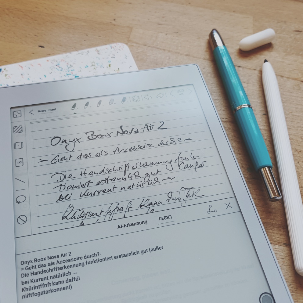
Kurz zur Erklärung: Es handelt sich dabei um ein E-Ink-Gerät, sowas kennen die meisten wahrscheinlich vom Kindle, also ein primär als E-Book-Lesegerät gedachtes 7,8-Zoll-Teil, das eine raue Oberfläche hat, auf der man prima schreiben kann (mit dem weißen Stift im Bild, der türkisfarbene Füller ist nur Deko) und somit eine Art digitales Notizbuch mit vielen nützlichen Funktionen wie Handschrifterkennung und internen Verlinkungen hat. Dort also schreibe ich derzeit viel hinein, wenn der Platz im Kalender voll ist und ich mich für keinen der immer noch zahlreichen Füller entscheiden kann. Das ist vor allem unterwegs sehr praktisch, denn das Tablet ist etwa so groß und schwer wie eine A5-Kladde, der Akku hält ewig, und alle meine E-Books und PDFs sind auch dabei.
Was würde man erwarten von einem Post im Oktober? Romantische Herbstbilder, ein wenig rührselige Heimeligkeit, langsam an Weihnachten denken (also, die Streber zumindest). Stattdessen hier Herzschmerz, Nachrichten, bei denen man dankbar sein kann, dass die Bilder entweder verpixelt sind oder gleich ganz weggelassen werden, lähmende Traurigkeit. Und ich schrieb noch neulich in eine Mail, ich ließe mich nicht unterkriegen, ich sei ja ein Sonnenscheinchen. Ha, so ein Blödsinn!
Hello World! 8 Oct 2023 12:56 PM (last year)
Guckt einer?
Ich hatte ja mal ein Blog*, aber das ist lange her, und es endete nicht schön. Dann hatte ich einen kuscheligen Instagram-Account, aber auch dort ist es nicht mehr so nett, seit auch Kunden über mich stolpern und sich Beruf und Privates vermischt. Das tut es ohnehin, aber irgendwie … nee, das passt da nicht.
Jetzt also wieder hier.
Was ist passiert in den letzten Jahren? – Eigentlich nicht viel. Älter bin ich natürlich, dünner (ein wenig), reicher (also, wenn man nur die Zahlen nimmt, es bleibt trotzdem erschreckend wenig übrig, aber es reicht), und ich habe Sachen geschafft. Hey! Zwar habe ich nicht die große wichtige Arbeit geschrieben, dafür ein paar Bücher, die Spaß gemacht haben und meine sind. Ansonsten bearbeite ich jetzt die Texte anderer, die mir dafür reichlich Vertrauen entgegenbringen. (Ich nehme das sehr ernst. Wirklich!)
Und ich schaue in den Himmel vom neuen Schreibtisch aus, immer den Himmel, Richtung Nordwesten. Nach rechts hin, auf 2 Uhr, blinkt der Fernsehturm, von links rattern die Züge, und wenn der Regio vorbeidonnert, dann brummt das Haus. “Bass, Bass, wir brauchen Bass! — Was geht’n, Alder!?”, denkt dann das Kind der 90er, und ich grinse und bin glücklich.
*So sah das aus: web.archive.org/web/20141002025051/http://www.julieparadise.de/2014/07/28/soldier/
Diamine Inkvent Calendar 2019/Blue Edition 2020 preparation and explanation 1 Jul 2020 1:38 PM (4 years ago)
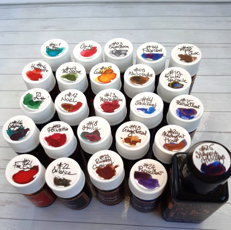
An advent calendar with ink!? Strange to think that this had not been done before, right? I mean, you could get the weirdest things put behind 24 little doors or into boxes and sell it for a ridiculous amount of money … Well, 2019 marked the first year of an ink calendar by a well-known brand such as Diamine. Do not think or ask about the price, as cost was prohibitive once considered the money-per-ml-ratio. So, I did not calculate but only checked my poor bank account to empty it even more. I speculated that the fun, the event-character of this whole experience would be worth it, and, heck, yeah, it was.
A kind of challenge evolved and many people on Instagram and in blogs participated in showing one ink per day. Kelli on mountainofink.com prepared an overview beforehand that I used (admittedly, kind of cheating) to plan which inks would go into what pens. December was a very busy month for me so I was relieved to be able to plan without really opening all my doors before they were due. I started out with an ink a day but soon came to realise that I would not even be in Germany on some days so I had to prepare things 4-5 days ahead. Still, it did not become a chore or too much pressure; having fresh ink every day and sometimes travel with the pens and use them all was as great as was the interaction on Instagram. You may find my posts with the hashtag #diamineinkvent or #diamineinkventcalendar on my Instagram account.
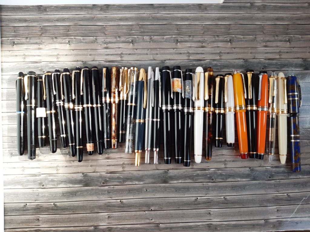
As you may have seen, I used many many pens for that, all the little bottles were assembled and a lightfastness test revealed interesting — yet foreseeable — weaknesses: Both greens faded badly, the blues mostly lost their shine and became much more grey, the reds held up well enough. I might add a pic once I got to photograph the test from June.
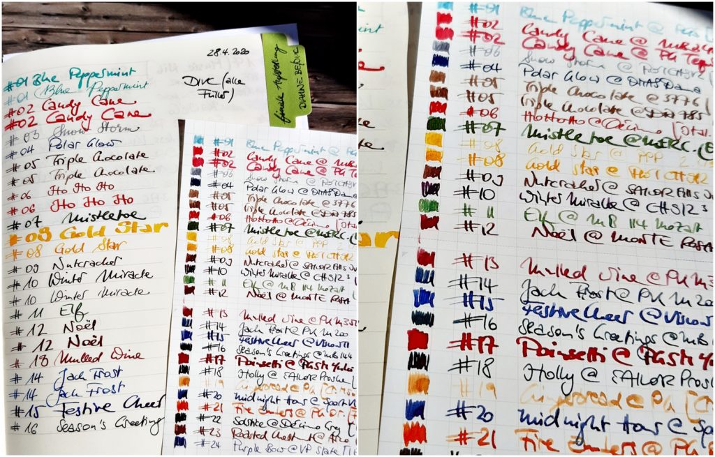
Why did I revisit these inks in April? I was asked to participate in a group review (I badly failed to submit everything in time as my blog was not finished early enough and the plague called Covid-19 basically turns everything upside-down since mid-March …) but I did manage to write at least a page with every pen and participate in the #30inks30days challenge in the German Penexchange forum, also cross-posting my pictures on Instagram and the Fountain Pen Network site.
Today marks the beginning of a new challenge on Penexchange, the #50shadesofbluechallenge. There is an “official” list for everyone to participate with a certain ink every day, where members of the forum could sign up for as a kind of “patron” for this ink to make sure every day is covered, but I have my own list of surprise list of 50 blue inks (nothing exotic) that I will post here and on their respective pages in the forum. Some of the inks on the list will be “hosted” by me, and some of the other inks I do have and will participate. We’ll see how far I get, as I also want to post these with the hashtag from above on my Instagram.
I have inked up about 20 pens already, so all days up to July 19 should be covered …
Diamine Inkvent Calendar 2019/Blue Edition 2020 #25 Happy Holidays 1 Jul 2020 1:03 PM (4 years ago)
The grand finale and a bonus for Germans, as advent calendars here end on the 24th of December, when we celebrate Holy Night (Heiligabend). Sure, December 25th is the first “true” Christmas Holiday”, but … the day before that marks the end of the time _before_ Christmas.
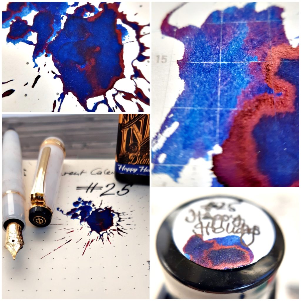
Happy Holidays is a beautiful, dark version of a royal blue, a colour suited for everyday writing and yet festive and special. I really like it and, since it was the only ink that did not come in a small 7 ml bottle but in a standard 30 ml bottle that Diamine uses for its regular inks, I have plenty left to give this one also more chances in other nibs.
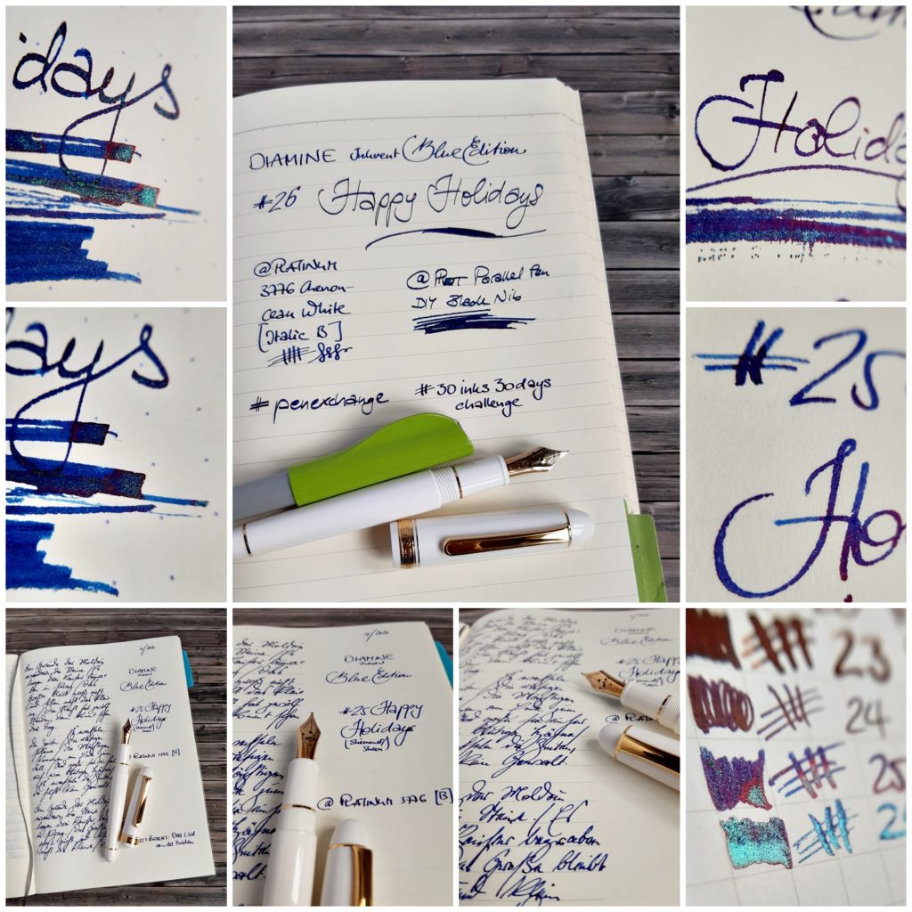
In December it was used in a Sailor Pro Gear Slim Shikiori Yukitsubaki HF nib and showed zero glitter. None! Compare that to the huge glitterfest it started in a modified Pilot Parallel Pen where I cut off parts of the nib to make a sort of blade nib. No glitter visible in the Platinum 3776 Chenonceau White B, though. Strange …
Diamine Inkvent Calendar 2019/Blue Edition 2020 #24 Purple Bow 1 Jul 2020 12:43 PM (4 years ago)
Blurple. This is what inks are called that are in-between blue & purple. Purple Bow, ink no. 24 in Diamine’s Inkvent Calendar, is such a blurple ink.
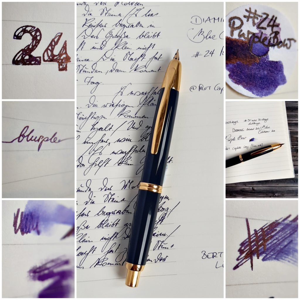
It is a nice ink, well behaved, supposedly a standard ink but I found it to have quite some sheen and be pretty saturated. It was used in a Pilot Parallel Pen 2.4 mm and a Pilot Capless F.
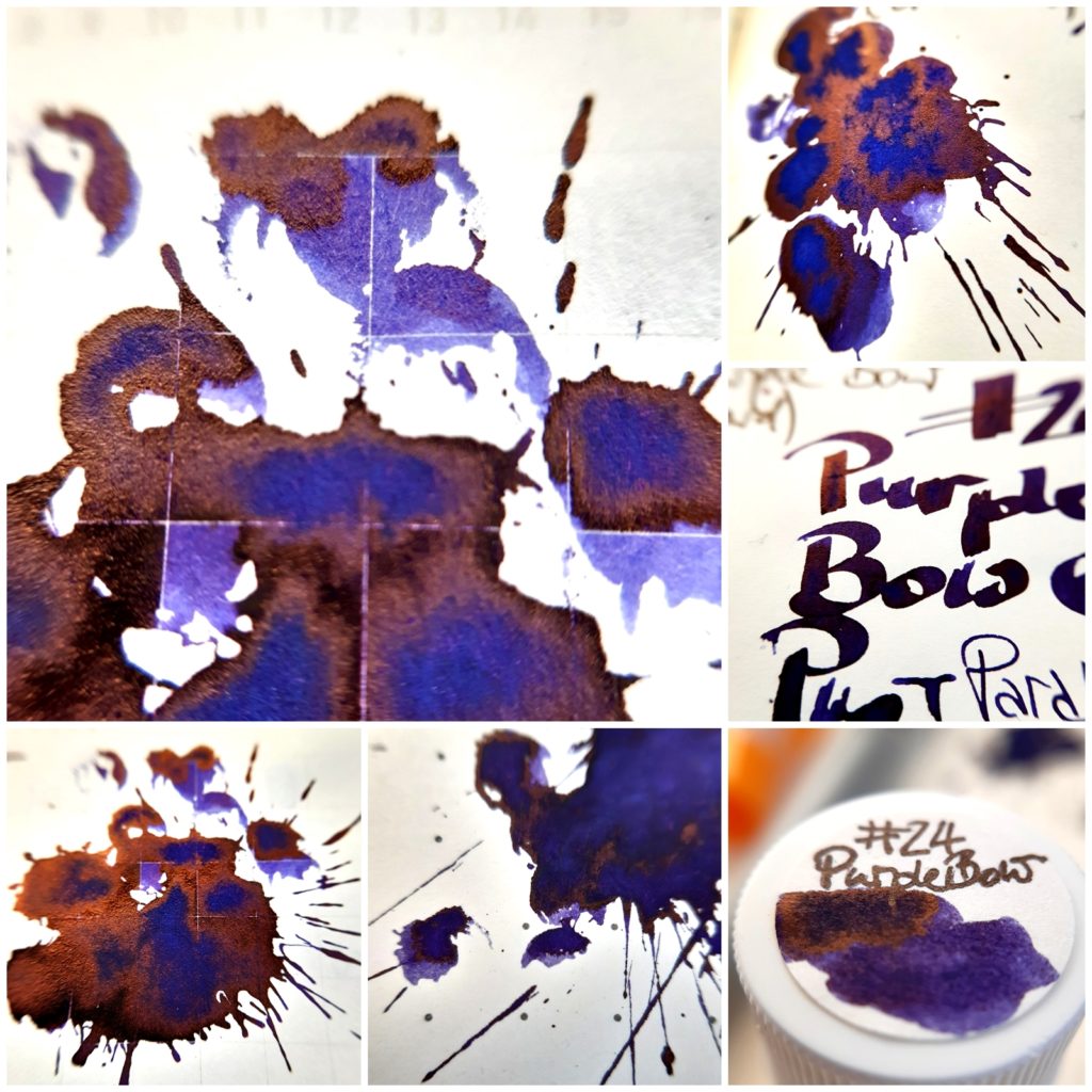
I am sure I did not give this ink the chance — i.e.: the pen & nib — it might deserve & need to shine, so I’ll probably have to revisit it at some point in the future to see whether I like it more in wider nibs.
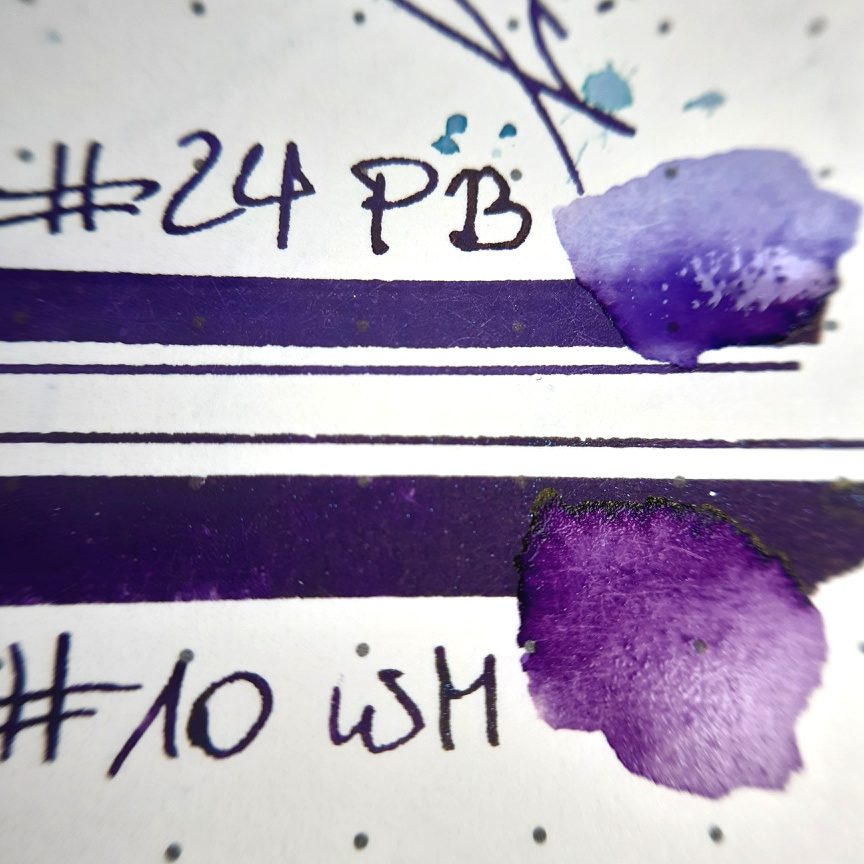
Ink no. 10, Winter Miracle, is quite close, like #24 plus glitter, but compared directly you might see e hint of a difference, at least when water is added to show what lies underneath the dark saturation.
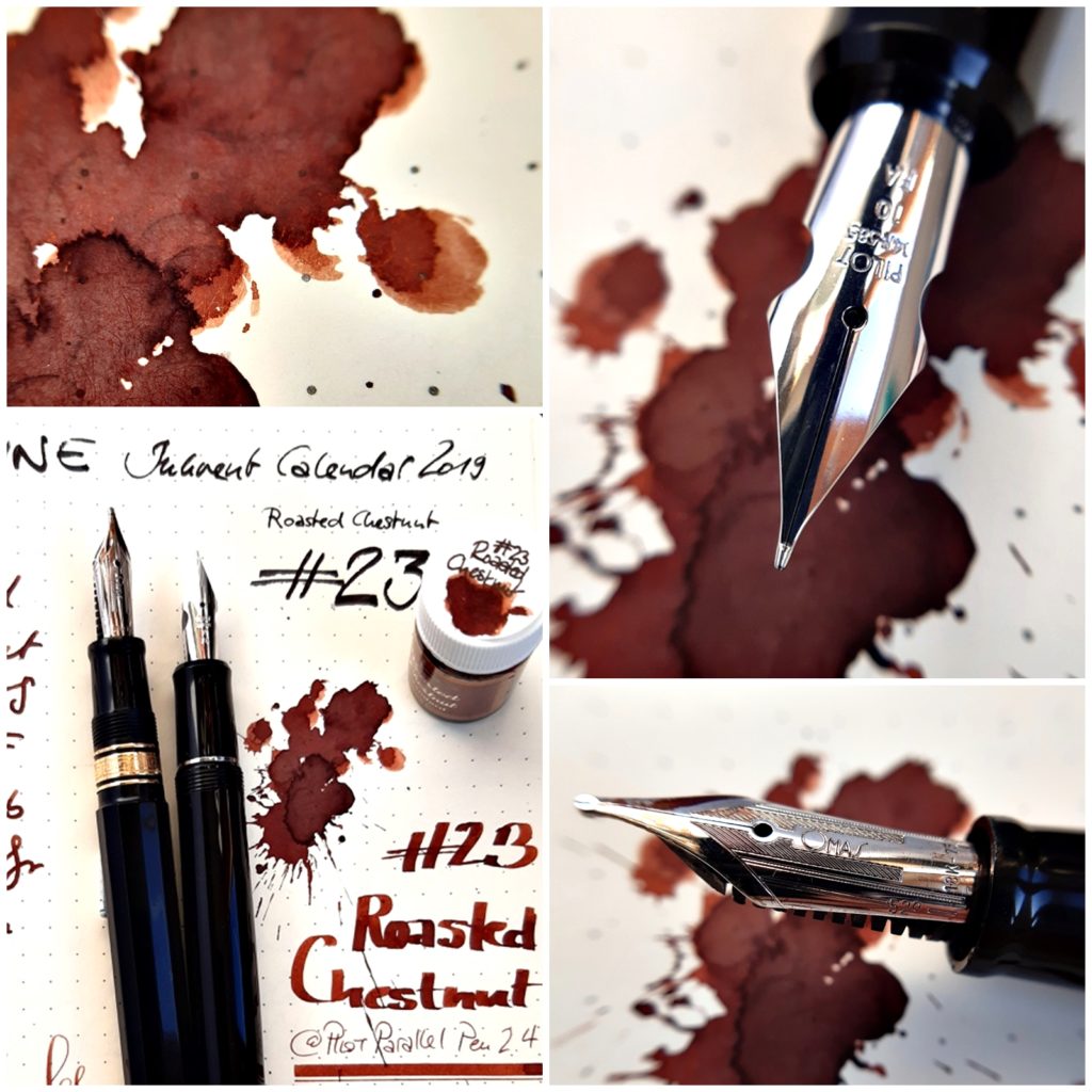
Diamine Inkvent Calendar 2019/Blue Edition 2020 #23 Roasted Chestnut 1 Jul 2020 12:30 PM (4 years ago)
Diamine seemed to mainly serve certain groups of colours with this calendar: Blues were strong, reds and browns. Roasted Chestnut was the last of the browns, so a little comparison might be useful. The picture below shows on the right #05 Triple Chocolate, #09 Nutcracker, #19 Gingerbread and #23 Roasted Chestnut.
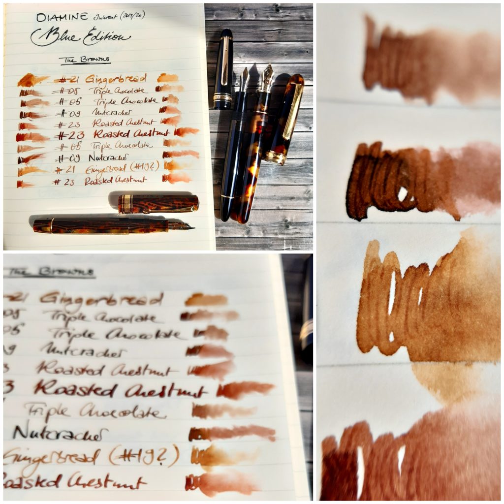
In December I used a Pilot Custom Heritage 912 FA, a Pilot Parallel Pen 3.8 mm and an OMAS Milord (Paragon? #notmypen) with a 52° nib.
This year I put this ink in various pens & nib widths:
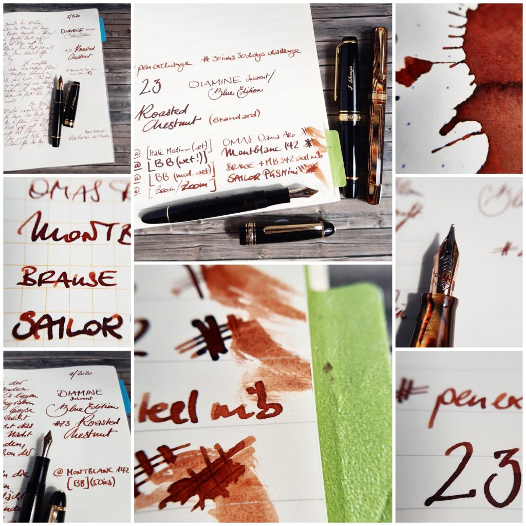
A small OMAS Dama Arco Bronze Celluloid IM, a Brause BB, a Sailor Pro Gear Slim Mini Zoom, a vintage Montblanc 142 BB and a Platinum Century 3776 Tortoise Celluloid B.
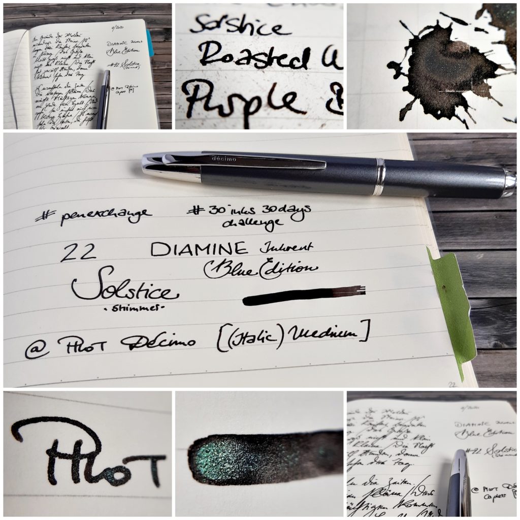
Diamine Inkvent Calendar 2019/Blue Edition 2020 #22 Solstice 1 Jul 2020 12:17 PM (4 years ago)
Winter Solstice fell on the 22nd in 2019, so this ink fit perfectly. The black is not the blackest of all blacks, but the silvery greenish shimmer sets it apart from other shimmering inks. It also fit perfectly into my Pilot Custom Heritage 912 FA, of which I have three.*
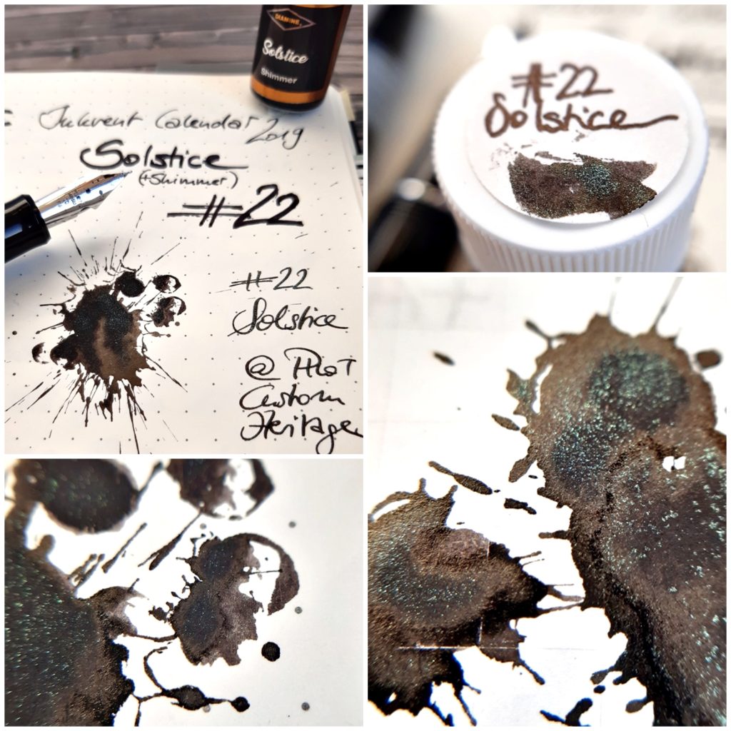
In April I used this ink in a Pilot Capless (later a Décimo) with a medium italic nib, where it sat for weeks (+ refills) and behaved like any other ink. Shimmer inks are not the monster cloggers they are deemed by many; in a modern pen these are pretty reliable and not dangerous at all. Use them (preferably in broad nibs) and have as much fun as you can!
*All perform well, but all are different. If you spot a little superscript number next to the 912 or the FA: This indicates which of the three pens is used:
— #1 was bought new, it writes a pretty fine line and is reliable all the time.
— #2 was a friend’s and badly abused. I bent the tines back into shape, but it did not feel right so I stubbed the tip a little. It now feels and behaves like a noodly soft vintage nib.
— #3 was swapped, as I did not like my Pilot Custom Heritage 743 FA. The tines were in bad shape, but after bending everything back in place it now writes pretty wet and reliable — in my hand.
Why am I writing this? To tell you to not give up on these FA nibs if they do not write as expected. Two of mine were really badly bent, and now they are all fantastic writers. Gold nibs are much more pliable than you might think!
Diamine Inkvent Calendar 2019/Blue Edition 2020 #21 Fire Embers 1 Jul 2020 12:02 PM (4 years ago)
Fire Embers is my favourite of all the inks in this Inkvent Calendar/Blue Edition.
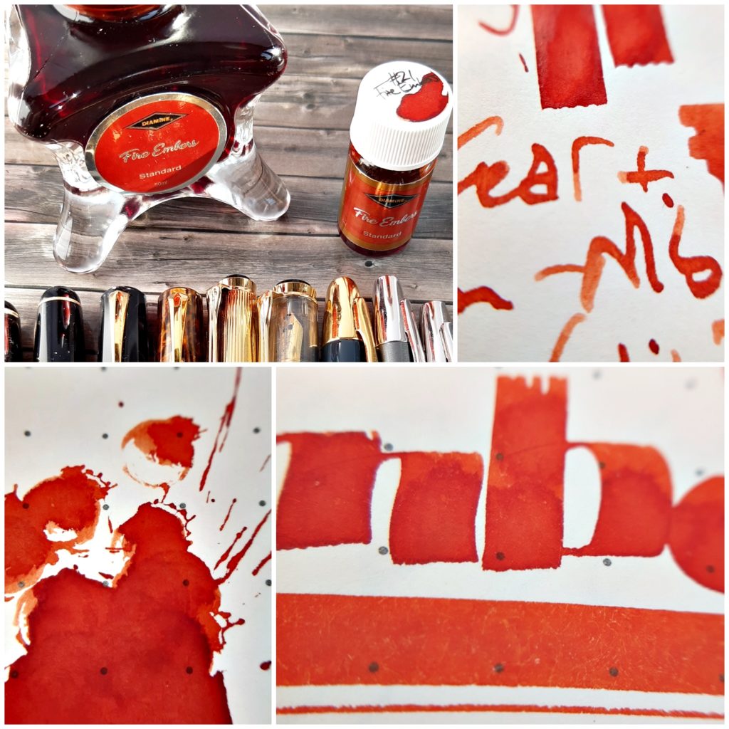
It is a fiery orange, but with a hint of autumn, bright, but not garish, light without being shallow. It was the first ink that I got a bottle of and might not be the last, but this I had to have.
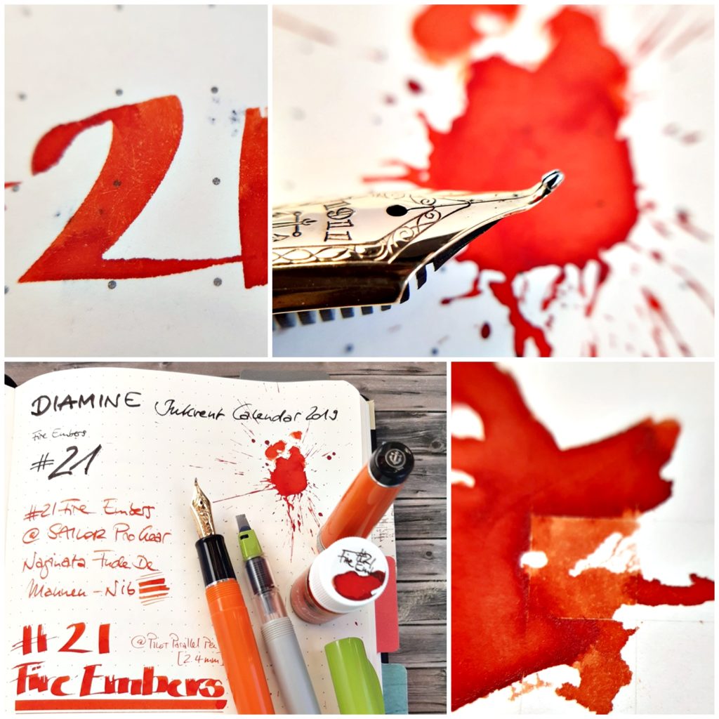
It worked perfectly in every pen I put it in: A Sailor Pro Gear Orange with a Naginata Fude nib (#notmypen), a Pilot Parallel Pen 3,8 mm, a vintage Mercedes 95 OBB, a Monte Rosa 042 [Montblanc 342 steel] IM and a Brause pen with a custom fit Montblanc steel BB nib.
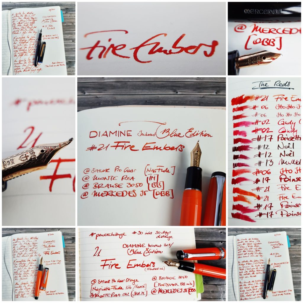
In the third pic you can see a very brief comparison between all the reds in this Calendar/Edition.
By the way: The closest match to a similar ink seems to be Graf von Faber-Castell Burned Orange.
Diamine Inkvent Calendar 2019/Blue Edition 2020 #20 Midnight Hour 1 Jul 2020 11:45 AM (4 years ago)
Another sheener:

Diamine has been producing highly saturated sheening inks for quite a while and so it was not too surprising that this kind of ink also found its way into the Inkvent Calendar.
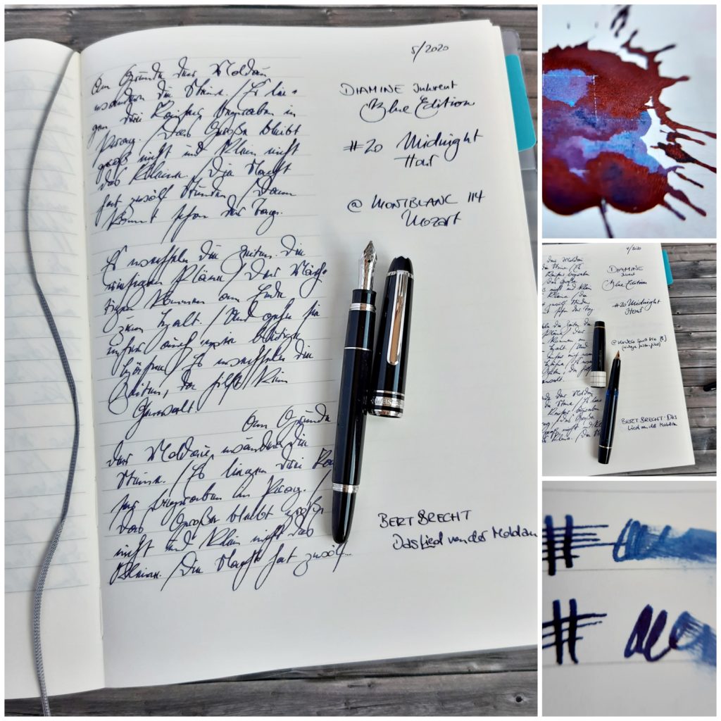
This one, Midnight Hour, is one of the more well behaved, a deep blue(-black) that I really liked in the three pens it was filled into: An small OMAS Dama Grey Celluloid F, a vintage Kaweco Sport V16 (pistonfill) B and a small Montblanc 114 Mozart IM.