Exploring the New Deep Edge Systems Website 14 Apr 7:23 AM (3 days ago)
Meet Deep Edge Systems
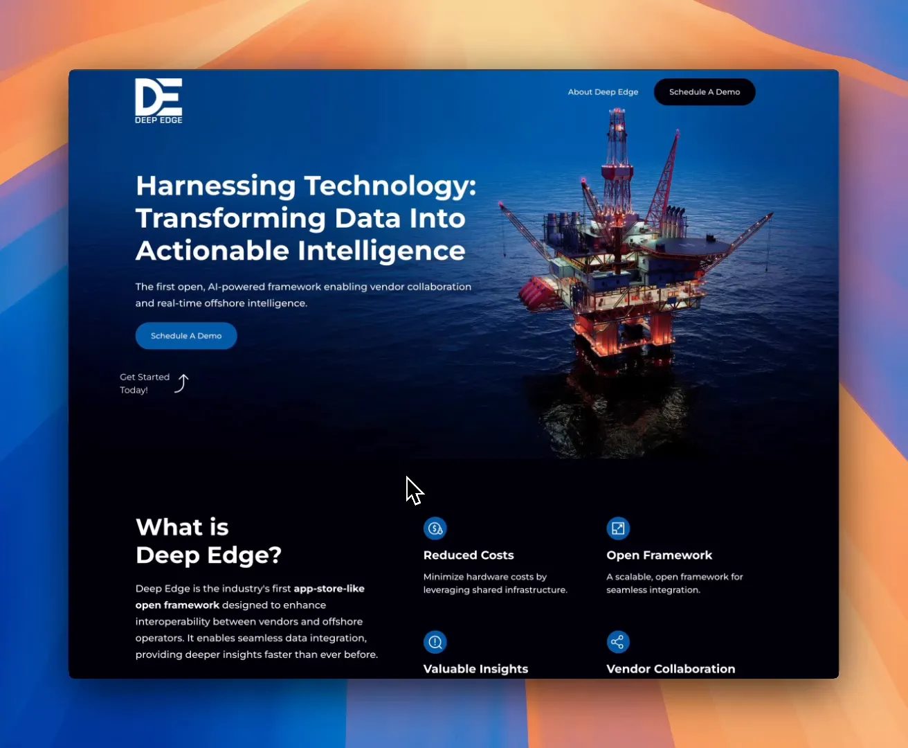
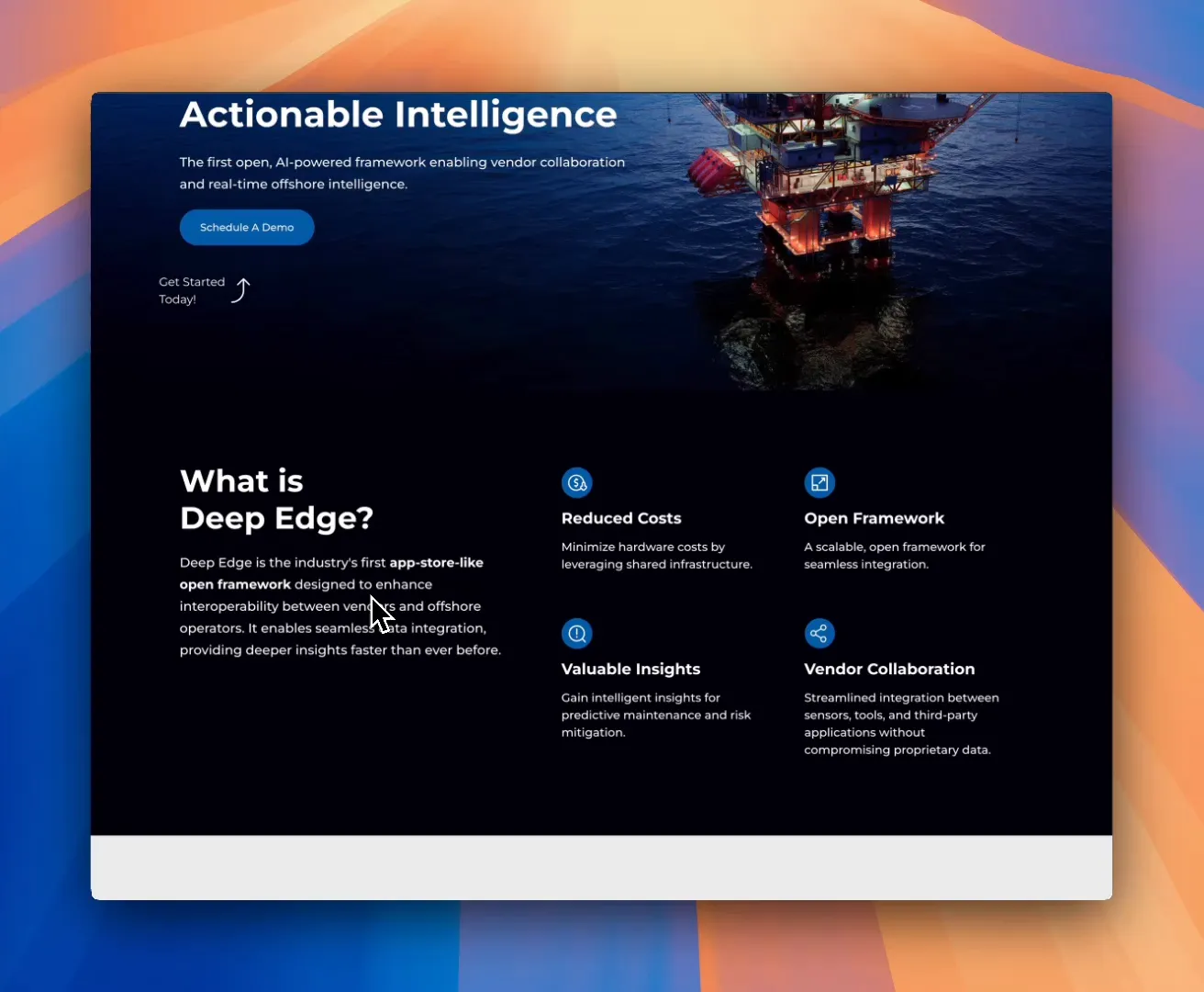
Deep Edge Systems is taking a bold step in reshaping offshore operations. Their newly launched website introduces the first app-store-style open framework specifically designed to improve interoperability between vendors and offshore operators. The idea? Eliminate silos, streamline data sharing, and unlock faster, deeper insights across complex environments.
A Unique Vision for Collaboration
At the core of Deep Edge’s mission is better connection — not just between people, but between systems. Their platform is engineered to unify fragmented technologies in the offshore space, making it easier for teams to collaborate and for data to flow. The end result? Smarter decisions, made faster.
Website Design: Simple, Efficient, Focused
The site follows the same principles that drive the product — lean, purposeful, and easy to navigate. From the very first screen, visitors are met with a confident headline and a layout designed to get straight to the point. No fluff. No filler.

Visual Appeal
Sleek visuals, a dark color palette, and sharp typography give the site a modern, tech-forward feel. The minimalist aesthetic keeps distractions at bay, putting full focus on what matters: the message.
Content Breakdown: What Deep Edge Offers
Scrolling down, the value proposition is laid out clearly. Deep Edge enhances interoperability — and they’ve smartly likened their system to an “app store” to help make this highly technical concept more digestible. It’s a quick, clear explanation that doesn’t get bogged down in jargon.

Key Benefits Highlighted
Three key benefits are front and center: Seamless Data Integration Faster Access Deeper Insights
Each is represented with clean visuals and brief descriptions. The card-style layout makes it easy for even busy executives to get the message at a glance.

Target Audience: Who This Is For
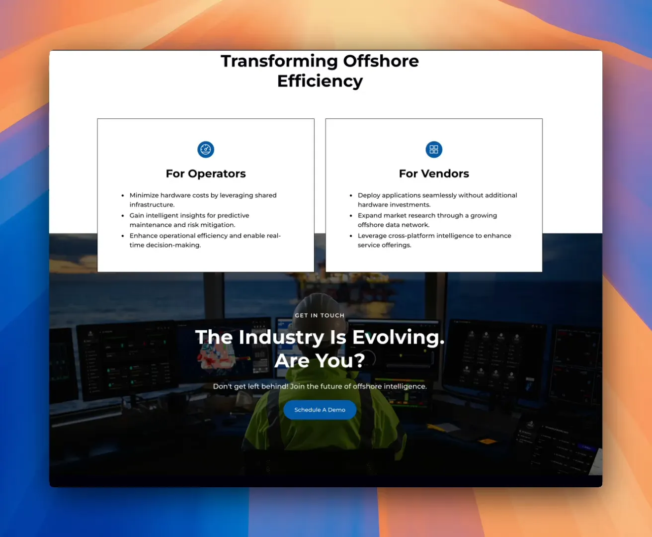
Rather than trying to appeal to everyone, the site zeroes in on its core audience — offshore operators, solution vendors, and technology partners. It’s a strategic choice that reinforces clarity over quantity and guides the right users toward action.

Call to Action: Let’s Talk
The final section makes it easy to connect. With a simple “Schedule a Demo” message and low-friction form, potential clients can quickly take the next step. Whether they’re exploring a partnership or ready to dive deeper, the barrier to entry is refreshingly low.
Content Strategy: Less is More
Every decision here reflects intentional restraint. Deep Edge didn’t want a sprawling website — they wanted something that reflected the speed and precision of their product. It’s a one-page site done right: focused, functional, and ready to evolve alongside their platform.

Conclusion: A Confident Launch
The new Deep Edge website isn’t trying to be flashy — it’s trying to be effective. And in that, it succeeds. It reflects the client’s vision with clarity and confidence, and we’re proud to have been a part of bringing it to life.
 Explore the site at deepedgesystems.com
The post Exploring the New Deep Edge Systems Website appeared first on MPC Studios Inc..


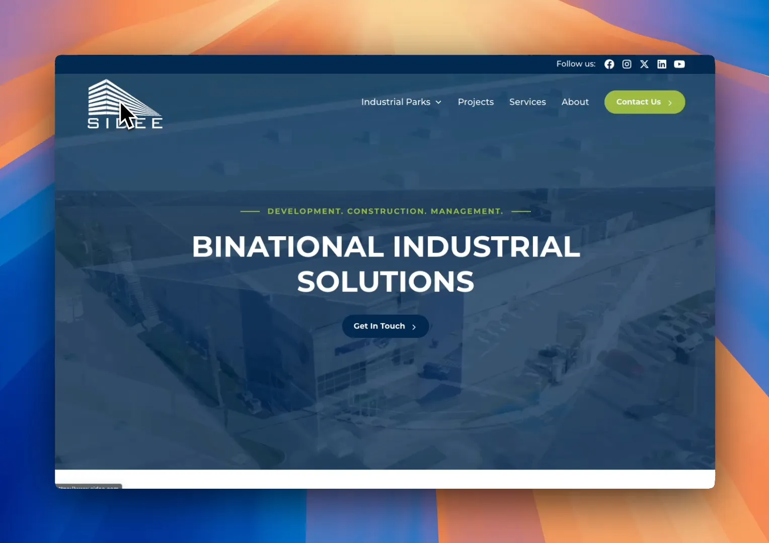
Unveiling the New SIDEE Website: A Gateway to Industrial Real Estate 19 Mar 6:35 AM (29 days ago)
For many businesses today, a website is their most crucial tool for attracting new customers. In some instances, one new customer can be worth millions. That’s why having a polished and professional website is vital. Let’s dive into the features and design elements of the new SIDEE website, which stands as a testament to their industry leadership and expertise.
First Impressions Matter
The moment you arrive on the SIDEE home page, you are greeted by a design that exudes confidence and credibility. The layout is not just a random arrangement of elements; it’s clean, modern, and inviting. Bold typography, high-quality videos in the hero section, and a well-balanced use of space all work together to create an immediate impact.
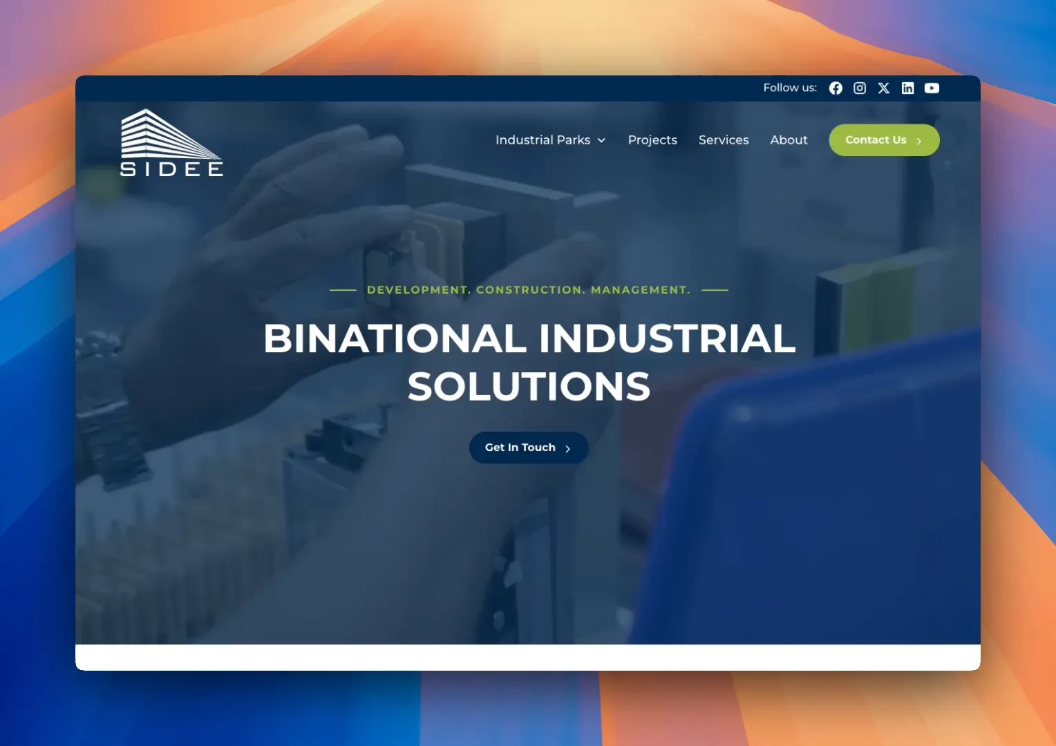
We aimed for the website to feel structured and intuitive. The goal was to ensure that visitors could quickly grasp who SIDEE is and what they offer. A simple and clear top navigation section provides direct access to essential information, making the user experience seamless.
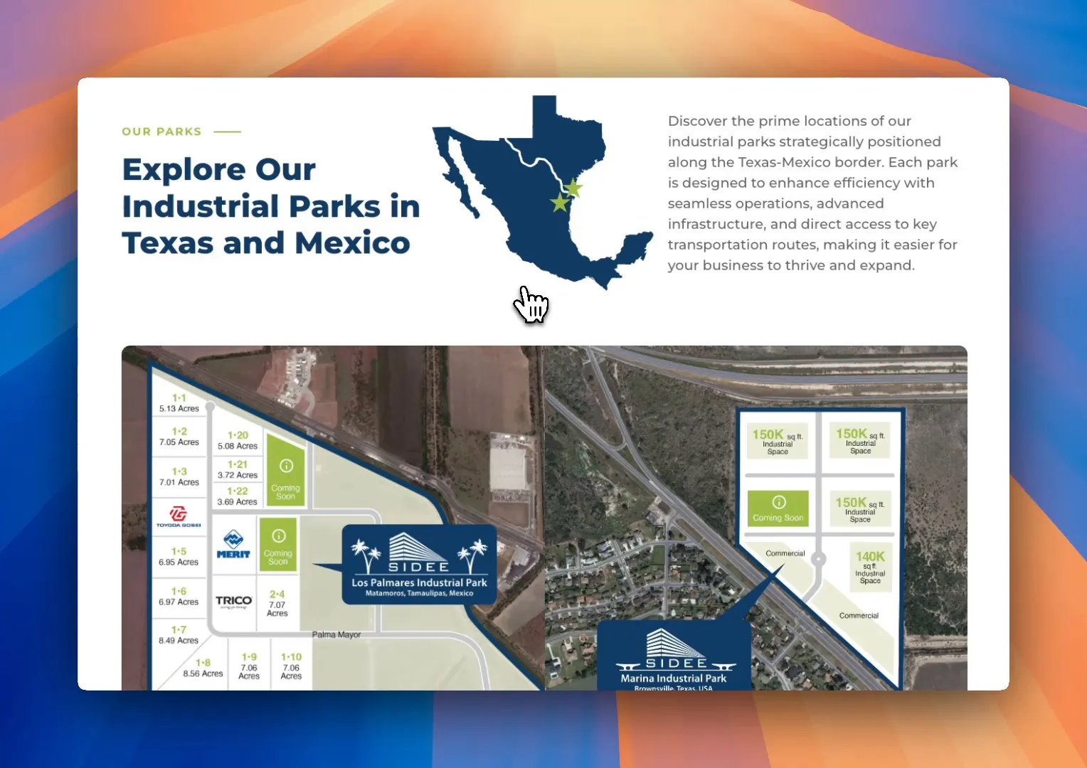
Showcasing Key Locations
SIDEE operates two significant industrial parks along the Texas-Mexico border: Los Palmares Industrial Park in Matamoros, Mexico, and Marina Industrial Park in Brownsville, Texas. Rather than simply listing these locations, we designed the page to visually showcase them. Each industrial park is highlighted with clear descriptions, strategic benefits, and high-quality imagery. This approach allows businesses to easily evaluate the available spaces.
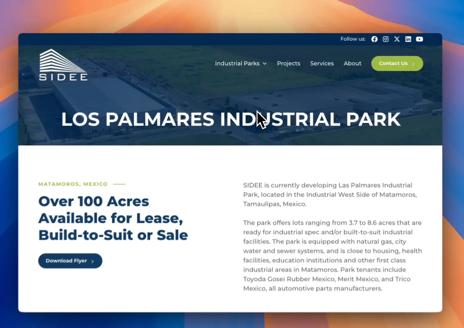
A key focus was to make the information digestible. Instead of overwhelming visitors with lengthy paragraphs, we structured the content into scannable sections. These sections highlight location advantages, accessibility to transportation hubs, and the essential services available. It’s all about making the information accessible and easy to understand.
Building Trust Through Expertise
When it comes to industrial real estate, showcasing expertise is crucial. The section dedicated to projects emphasizes SIDEE’s credibility. The company has developed significant industrial facilities for global corporations, and this is highlighted in a way that builds trust with potential clients.
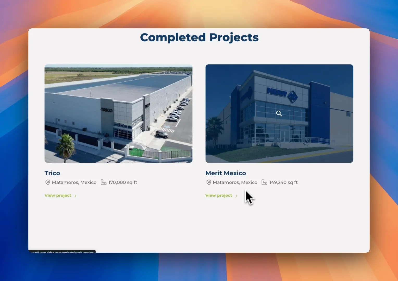
Each project is presented with a clear, structured layout that includes the company name, location, and facility size at a glance. For instance, Trico boasts a 170,000 square foot facility in Matamoros, while Merit Mexico features a 149,000 square foot facility. This isn’t just a generic portfolio; it tells a story and illustrates real results from real projects that have a tangible impact.
Engagement Made Easy
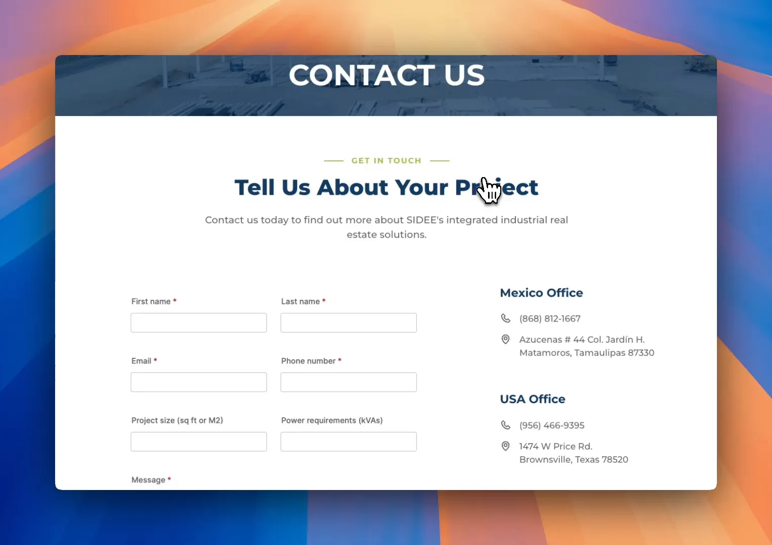
The contact page is designed for ease of engagement. Visitors are immediately presented with clear location details for both the Mexican and U.S. offices, complete with phone numbers and a direct contact form. We ensured that this form is user-friendly, with no unnecessary fields—just a straightforward way to reach out.
Performance Meets Aesthetic
While aesthetics are important, the SIDEE website is designed to perform exceptionally well. Built on the Webflow platform, it loads incredibly fast. We implemented SEO best practices to ensure the site ranks well for a variety of industrial real estate searches in key markets.
Moreover, it’s mobile-optimized, meaning that every single page is fully responsive. This ensures a seamless user experience, whether visitors are browsing on desktop or mobile devices. The new website is also future-proof; it’s highly scalable and can grow and evolve as SIDEE expands its offerings.
Strategic Design for Business Goals
Every aspect of the website—from the design and layout to the navigation—was built with strategy and purpose. We are incredibly proud of how this project came together. It exemplifies how MPC Studios helps businesses create websites that are not just visually appealing but also effective in achieving their business goals.
If you are in search of a website that elevates your brand and drives real results, let’s talk. The SIDEE website is more than just a digital presence; it’s a powerful tool for business growth.
The post Unveiling the New SIDEE Website: A Gateway to Industrial Real Estate appeared first on MPC Studios Inc..
Transforming Health Care in the Rio Grande Valley: The Valley Baptist Legacy Foundation’s Impact 6 Feb 6:39 AM (2 months ago)
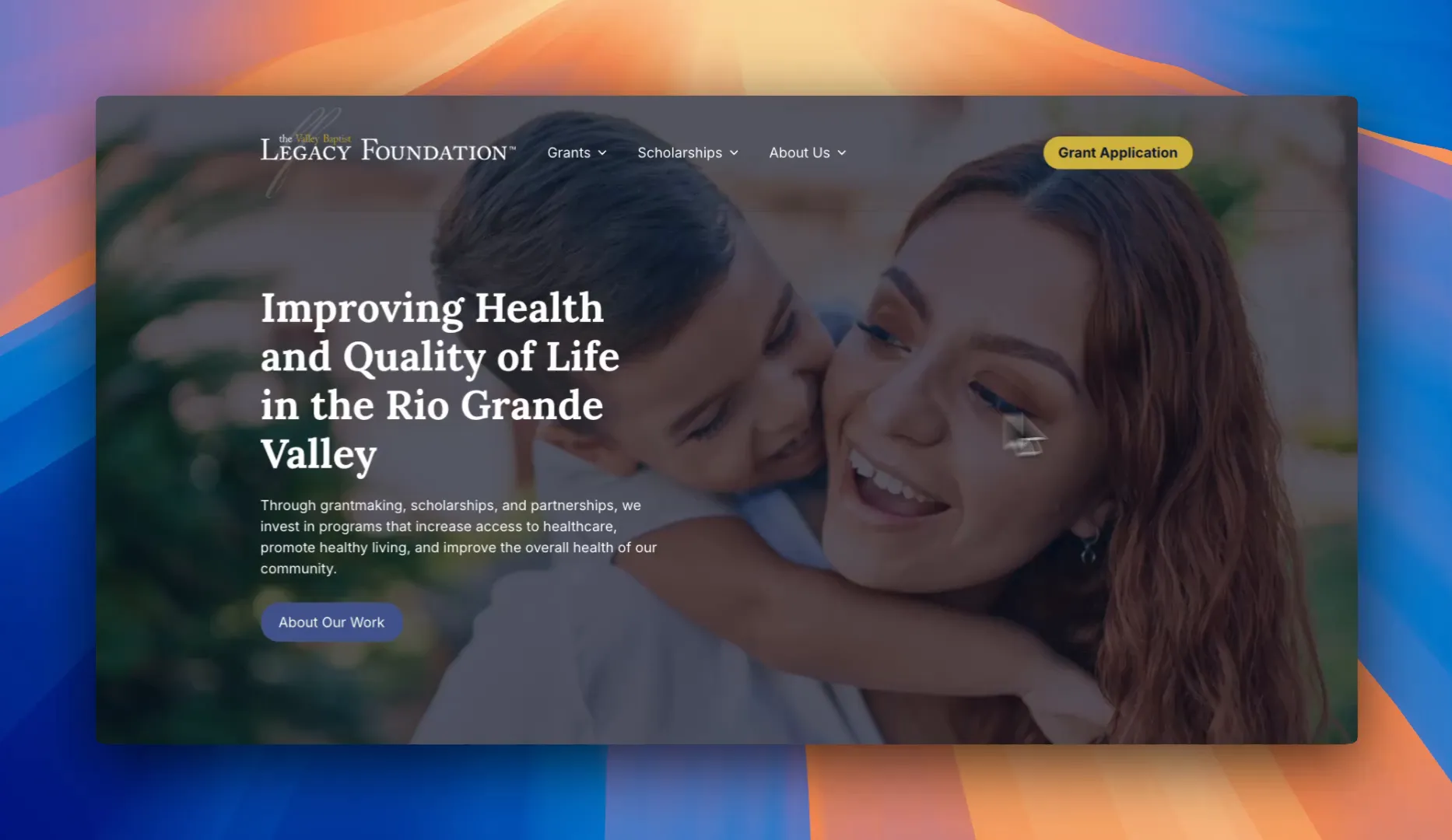
The Valley Baptist Legacy Foundation (VBLF) is making a real impact in South Texas, investing an astounding two hundred million dollars in health care grants. This initiative is about real-life transformations in communities across the Rio Grande Valley.
The Role of the Valley Baptist Legacy Foundation
The VBLF stands as one of the most significant forces in enhancing health care access and quality in the region. Their efforts target pressing issues like obesity, diabetes, mental health, and aging care. By investing in programs that address these challenges, the foundation is helping to foster healthier communities and improve overall quality of life.
One critical tool that is used to help achieve this is their newly designed website, created by MPC Studios, which serves to connect grant seekers to funding opportunities. This platform not only showcases the impact of past initiatives but also acts as a trusted resource for organizations dedicated to improving health care in the region.
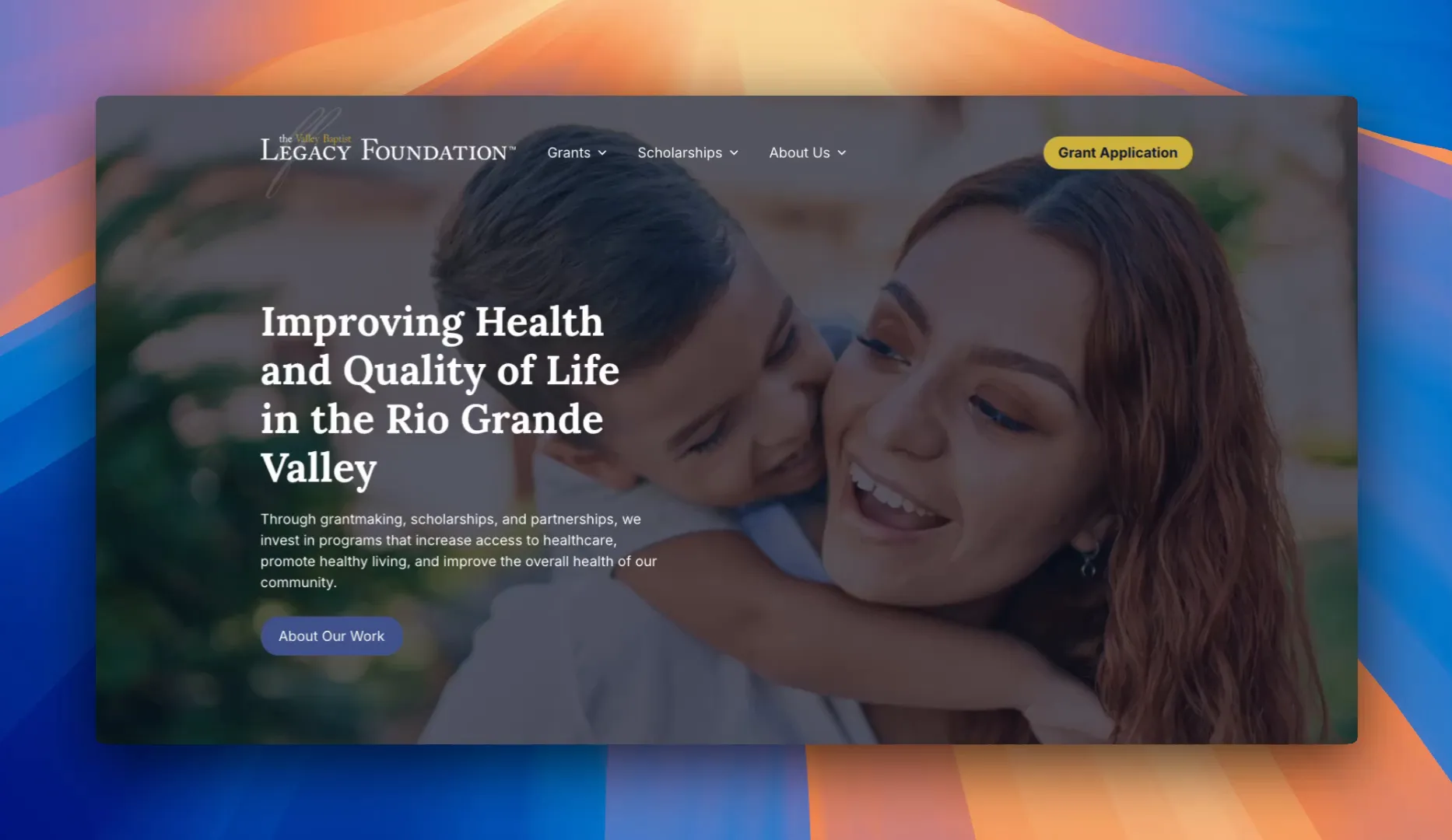
A Walkthrough of the Website
As soon as you land on the homepage, you’ll notice the immediate sense of trust and credibility. The design is clean and professional, perfectly reflecting the foundation’s mission and community focus. The strong blue and white color scheme evokes calmness and clarity, creating an inviting atmosphere for visitors.
High-quality images and concise content keep users engaged, while straightforward navigation ensures that organizations and individuals can easily find grants, scholarships, resources, and contact information. Whether someone is looking to apply for funding or learn more about VBLF’s impact, they can find what they need quickly and efficiently.
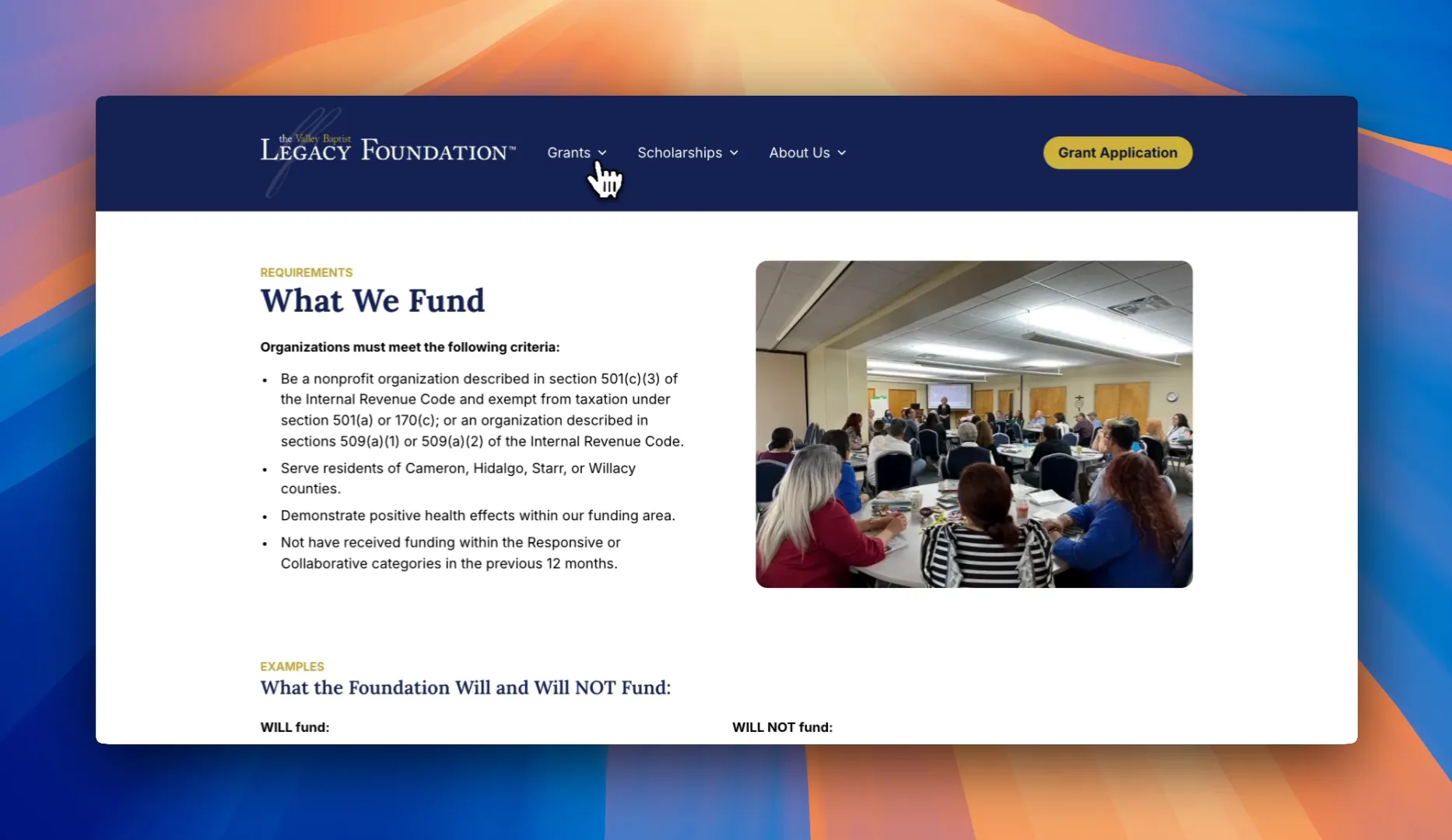 Funding Opportunities Made Easy
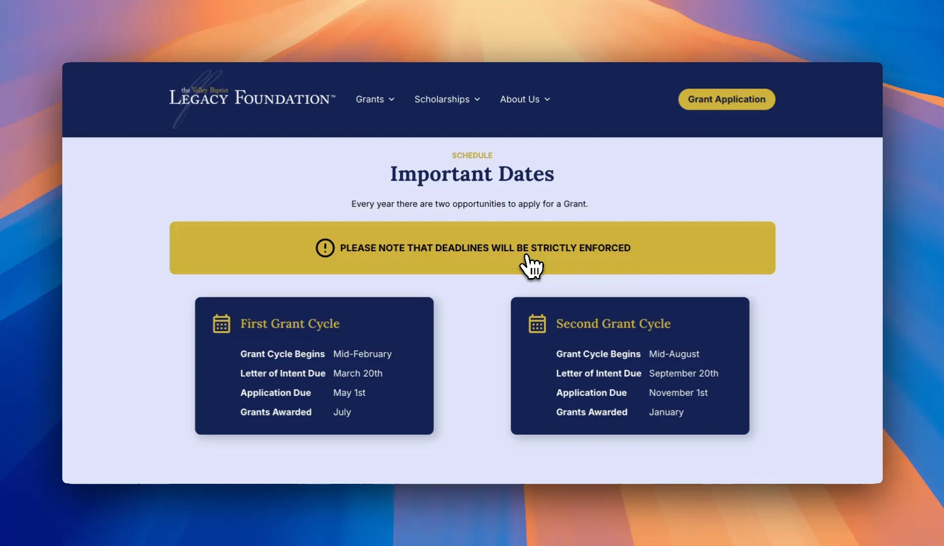
At its core, the Valley Baptist Legacy Foundation is dedicated to funding programs that enhance health care in the Rio Grande Valley. The website simplifies the process for organizations to learn about available grants and how to apply. Key information is laid out clearly, from eligibility requirements to a structured, step-by-step application process.
Applying for funding should be straightforward, and the VBLF website accomplishes just that. Instead of being bogged down by endless paperwork, applicants are guided through a structured application process, making it easier than ever to submit necessary details correctly and efficiently.
Real Stories, Real Impact
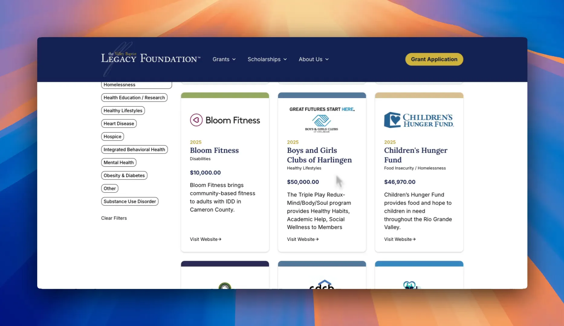
This section of the website is where numbers turn into real stories. The grants provided are not just financial support; they fund projects that actively change lives across the Rio Grande Valley. Visitors can explore the organizations that have received funding and learn about the initiatives VBLF has helped make possible.
For instance, the Boys and Girls Club of Harlingen received fifty thousand dollars for their Triple Play program, which promotes healthy habits, academic support, and social wellness for children. Meanwhile, the Children’s Hunger Fund was awarded nearly forty-seven thousand dollars to provide food and hope to children in need throughout the valley. These stories illustrate the profound impact the VBLF is making and inspire other organizations to apply for funding to expand their own work.
Investing in Future Health Care Providers
Beyond grants, the Valley Baptist Legacy Foundation is also focused on investing in the future of health care by providing scholarships for students pursuing careers in medicine, nursing, and other health-related fields. The website outlines available scholarships, eligibility requirements, and application details, making it easier for aspiring health care providers to access these opportunities.
 These scholarships are vital for building the next generation of health care professionals right here in the Rio Grande Valley. By supporting students, VBLF is not just addressing current health care issues but also preparing for a healthier future.
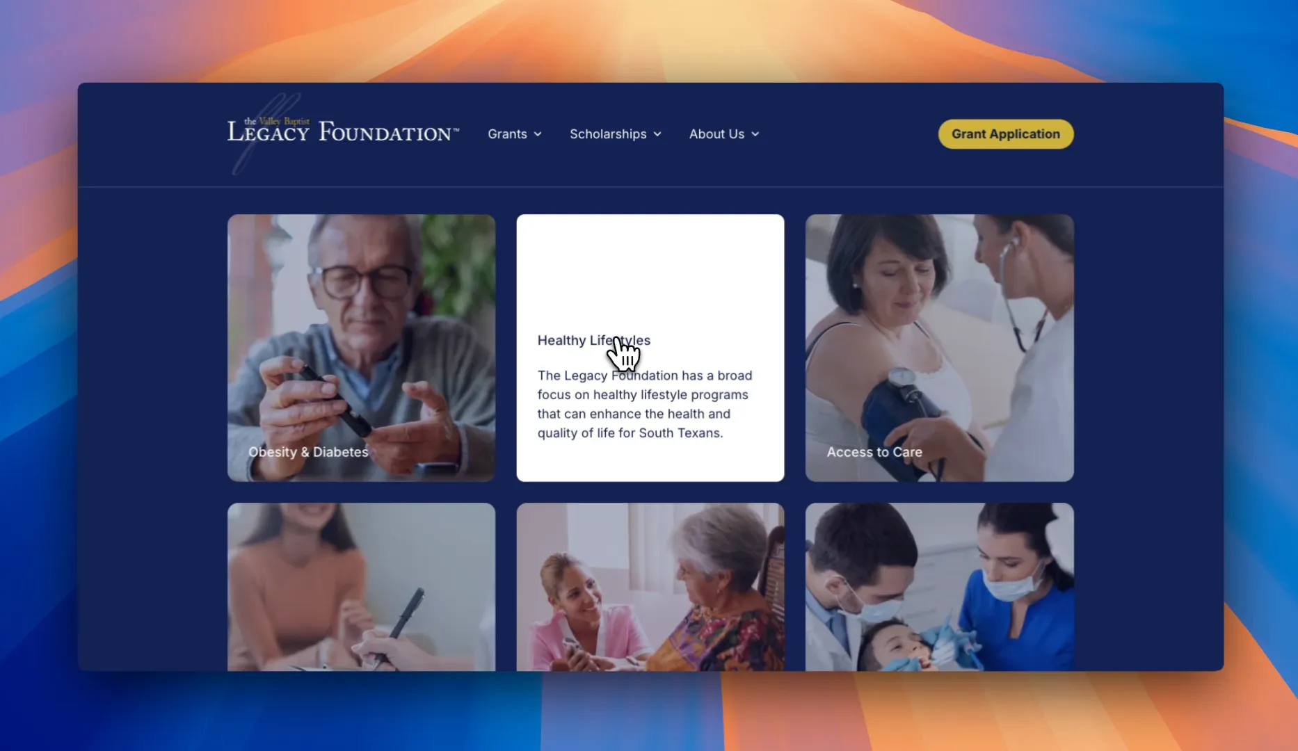
Key Areas of Focus
The available grants from the Valley Baptist Legacy Foundation focus on six key areas:
- Obesity and diabetes prevention
- Healthy lifestyles and wellness
- Access to care and insurance coverage
- Dental health and behavioral services
- Aging in place and senior health care
- Dental health and preventative care
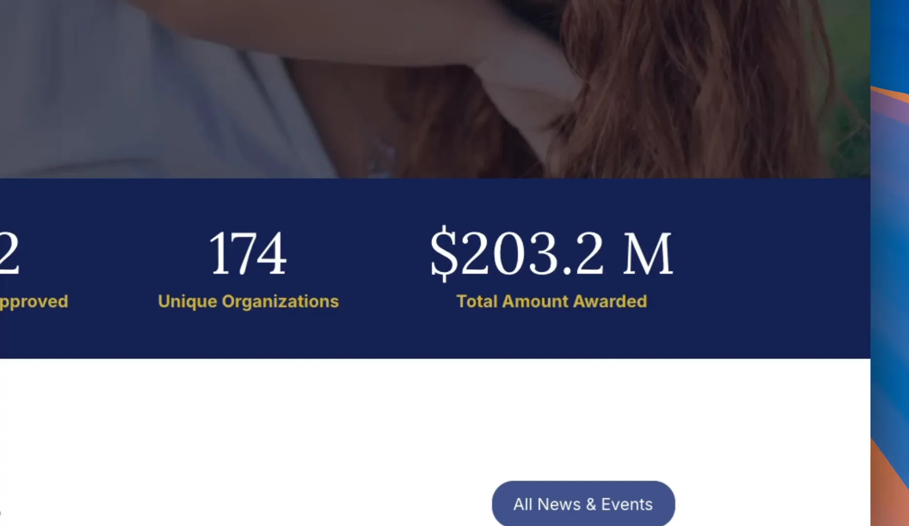
 The website provides all the necessary information for applicants, ensuring they understand the eligibility requirements and the step-by-step application process. With over two hundred million dollars in grants already awarded, the VBLF is genuinely changing lives, and the website plays a crucial role in that mission.
Building a Better Tomorrow
We’re incredibly proud of the website we’ve built for this project. It’s a shining example of how MPC Studios creates websites that not only look great but also drive real impact in the community. The Valley Baptist Legacy Foundation’s website is an essential tool that connects those in need with the resources that can make a significant difference in their lives.
 If your organization needs a website that elevates your mission and can drive real impact, it’s time to reach out. Together, we can create a digital presence that not only informs but also transforms communities, making a lasting difference in health care access and quality.
The post Transforming Health Care in the Rio Grande Valley: The Valley Baptist Legacy Foundation’s Impact appeared first on MPC Studios Inc..
Transforming Dreams into Reality: A Dive into Custom Bowling Lanes 24 Jan 9:06 AM (2 months ago)
In this blog post, we’ll explore how we created a fun, user-friendly site that helps potential customers envision and realize their dream bowling lanes.
Imagine coming home to your very own bowling lane. That’s a dream that many bowling lovers share in common, and making that dream come true is easier than you might think. All American Bowling Equipment has spent over 125 years building custom bowling lanes, and we’ve designed a website that captures the craftsmanship they offer and shows just how easy it is to have your own custom bowling lane in your home or business.

First Impressions Matter
From the moment visitors land on the site, they are met with a high-end feel that sets the tone for what’s to come. The design is sleek, modern, and engaging, immediately drawing users into the world of custom bowling lanes. This is the kind of website that makes you want to explore further.
The homepage succinctly introduces the three primary service areas:
- Residential Bowling Alleys: Perfect for high-end homes, game rooms, and private entertainment spaces.
- Commercial Installations: Found in boutique hotels, bars, nightclubs, and family entertainment centers.
- Modernizations and Upgrades: Tailored for those who already own a bowling lane but wish to upgrade to the latest technology and materials.

Choosing Your Lane: Regulation vs. Duckpin
When it comes to selecting a bowling lane, the website simplifies the process by breaking it down into two main options:
- Regulation Bowling Lanes: These are the full-size, 60-foot lanes resembling those found in professional bowling alleys. Perfect for those with ample space looking for a classic experience.
- Duckpin Bowling Lanes: A compact, shorter version of the game that retains the fun gameplay while fitting into smaller spaces.
The site highlights the key differences between these options at a glance, making decision-making a breeze.

Gallery of Inspiration
One of the most exciting features of the site is the project gallery, designed to inspire visitors. Here, potential customers can explore various setups, from luxury home installations to unique commercial venues. Each project is custom-built to fit the aesthetic of the space, showcasing the versatility and craftsmanship of All American Bowling Equipment.
For anyone considering a significant investment like a custom bowling lane, trust is paramount. The website builds this trust effectively, presenting a portfolio that clearly illustrates the quality and attention to detail in each project.

Building Trust Through Design
When making a big investment, customers want to feel secure in their choice. The website fosters this trust through engaging visuals and clear, accessible information. Throughout the site, strategic calls to action are placed, such as “Ready to get started?” These prompts guide potential customers towards the next steps, making the process feel seamless.
This website does precisely what it’s intended to do: it excites visitors about the possibility of having their custom bowling lane. The combination of sleek design, easy navigation, and engaging content creates a user experience that is simple, fun, and accessible. If you’ve ever thought about incorporating a bowling lane into your home, this site makes taking that first step easier than ever.

Final Thoughts
We are incredibly proud of how this project turned out. It serves as a testament to our commitment at MPC Studios to create websites that not only look great but also work effectively. By blending aesthetics with functionality, we’ve produced a platform that resonates with potential customers and encourages them to explore their dreams of having a bowling lane.
If your business needs a website that elevates your brand and converts visitors into customers, we’re here to help. Let’s talk about how we can make your vision a reality!

The post Transforming Dreams into Reality: A Dive into Custom Bowling Lanes appeared first on MPC Studios Inc..
Welcome to the New D. Wilson Construction Website! 21 Jan 11:01 AM (2 months ago)
We are thrilled to announce the launch of the all-new D. Wilson Construction Website, crafted by the talented team at MPC Studios. This website is not just a digital presence; it’s a comprehensive platform designed to showcase the incredible work and legacy of D. Wilson Construction. Let’s take a closer look at what you can expect when you visit the site.
First Impressions Matter
As soon as you land on the homepage, you’re greeted by a stunning hero section featuring rotating imagery of D. Wilson Construction’s latest completed projects. It sets the tone for the professional and high-quality work that the company is known for.  This visual appeal is immediately engaging and invites visitors to explore further.
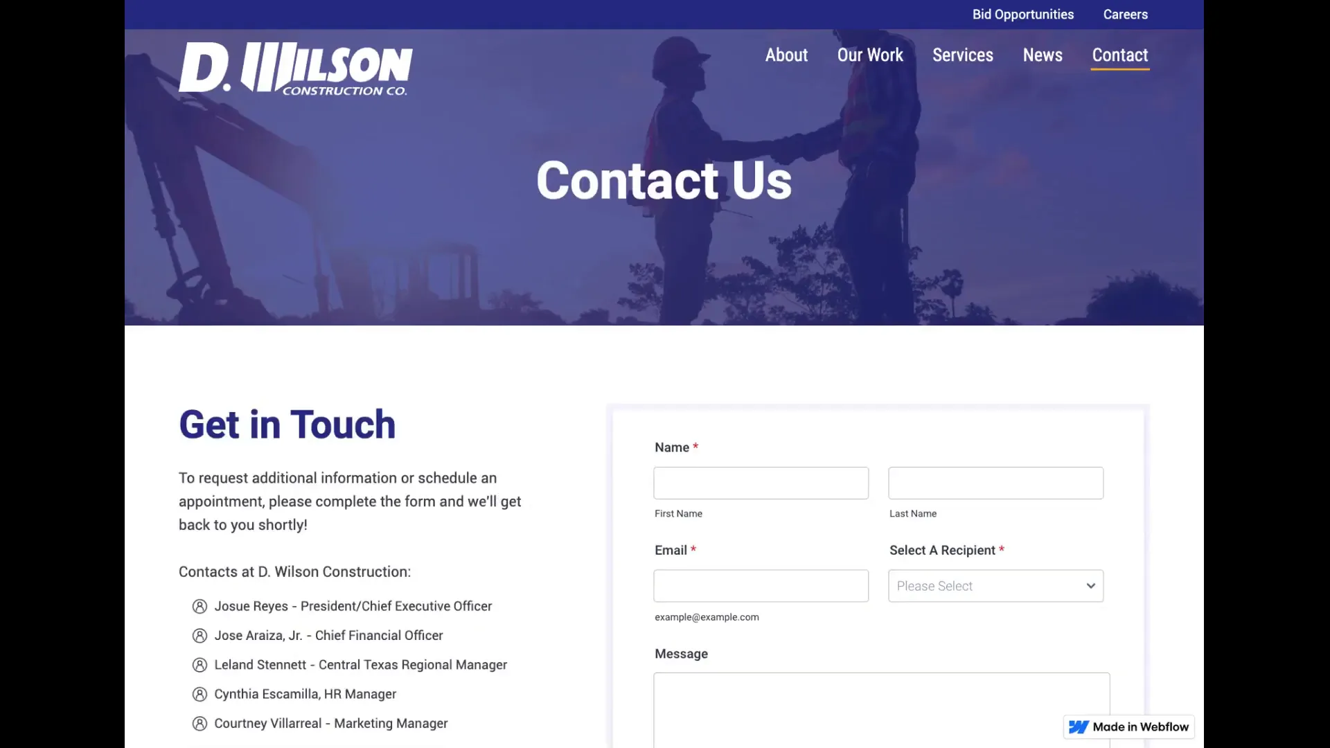
Get Started with Your Project
There’s a clear call to action encouraging you to get started with your project. This user-friendly approach ensures that potential clients know exactly how to take the next step towards their construction needs.
 Featured Projects Section
Scrolling down, you’ll find the Featured Projects section, showcasing some of the most impressive works recently completed by D. Wilson Construction. Each project featured has a dedicated page with detailed information, allowing visitors to gain insight into the scope and success of these ventures. This not only highlights the company’s capabilities but also serves as inspiration for future clients.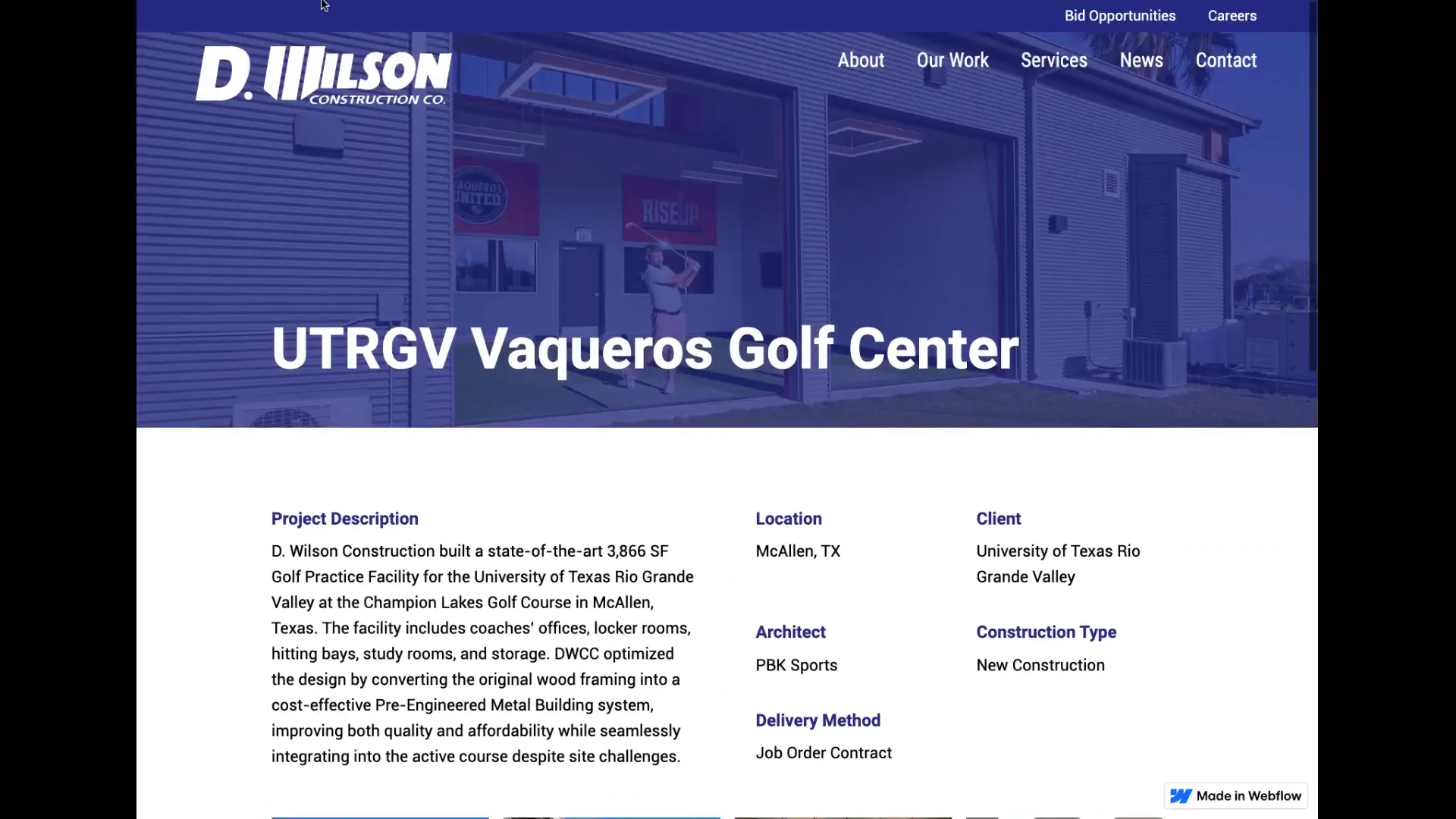
Stay Informed with the Latest News
One of the standout features of the new website is the News section. D. Wilson Construction excels at keeping clients and the community informed through regular news articles. You can filter news articles by various tags such as community projects, awards, ongoing projects, and upcoming events. This organized structure makes it easy for visitors to find relevant information. Each article is rich in content and keywords, enhancing the site’s visibility in search engine results.
About Us: A Legacy of Excellence
The About Us page is a treasure trove of information about D. Wilson Construction’s history and achievements. It starts with a professionally produced video that offers an overview of the company. This is complemented by a timeline highlighting key milestones and a brief biography of the founder, Daryl Wilson, who established the company in 1957. 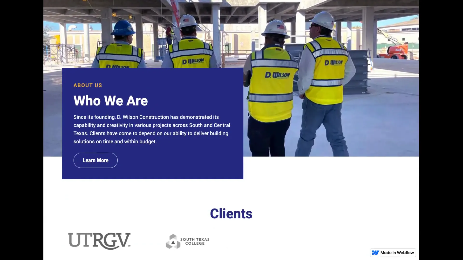 D. Wilson Construction has made its mark on several famous landmarks in South Texas, including the Basilica of Our Lady of San Juan del Valle National Shrine, which attracts over a million visitors each year.
Commitment to Education
In addition to landmark projects, D. Wilson Construction is recognized as a leading construction provider for school districts throughout South Texas. This commitment to education reflects the company’s dedication to community development and support.
Employee-Owned and Expanding
In 2005, D. Wilson Construction became employee-owned, further enhancing its commitment to quality and service. By 2010, the company expanded its operations to San Antonio, consistently earning a top 100 ranking among contractors in the Texas, Louisiana, Arkansas, Oklahoma, and Mississippi regions.
Award-Winning Credibility
As you scroll further down the Home Page, you’ll notice several logos of some of the recognized clients that D. Wilson Construction has built for over the years. This section showcases their credibility and instills confidence in potential clients looking for a reliable construction partner. 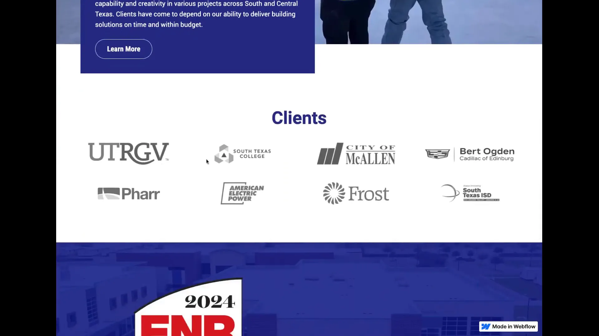 It’s a reflection of the hard work and dedication of everyone involved in the company.
Easy Navigation and Accessibility
The footer section of the website includes quick links to all primary pages, another call to action, and direct links to their social media accounts. This thoughtful design ensures that visitors can easily navigate the site and connect with D. Wilson Construction across various platforms.
Conclusion: A Great New Beginning
The D. Wilson Construction website is now live, and it’s an exciting new chapter for the company. With its user-friendly design, rich content, and beautifully showcased projects, the site stands as a true representation of what D. Wilson Construction has to offer.  We invite you to visit the site and explore all it has to offer.
For more information, don’t forget to check out The New D. Wilson Construction Website and start planning your next project with them today!
And if you’re interested in improving your website, MPC Studios can help you. Just click the calendar link below to schedule a time, and let’s talk about your project.
The post Welcome to the New D. Wilson Construction Website! appeared first on MPC Studios Inc..
Exploring the New First National Bank Website: A User-Friendly Experience 20 Dec 2024 11:50 AM (3 months ago)
The newly launched First National Bank website is designed with user experience in mind, featuring an intuitive layout and easy navigation. In this blog, we’ll explore the various components of the site, highlighting its unique features that make banking easier for customers.
Table of Contents
- Introduction to the New Website
- Account Management Features
- Finding Local Branches
- Footer Navigation and Contact Information
- Investment Services Overview
- Conclusion and Call to Action
- Frequently Asked Questions
Introduction to the New Website
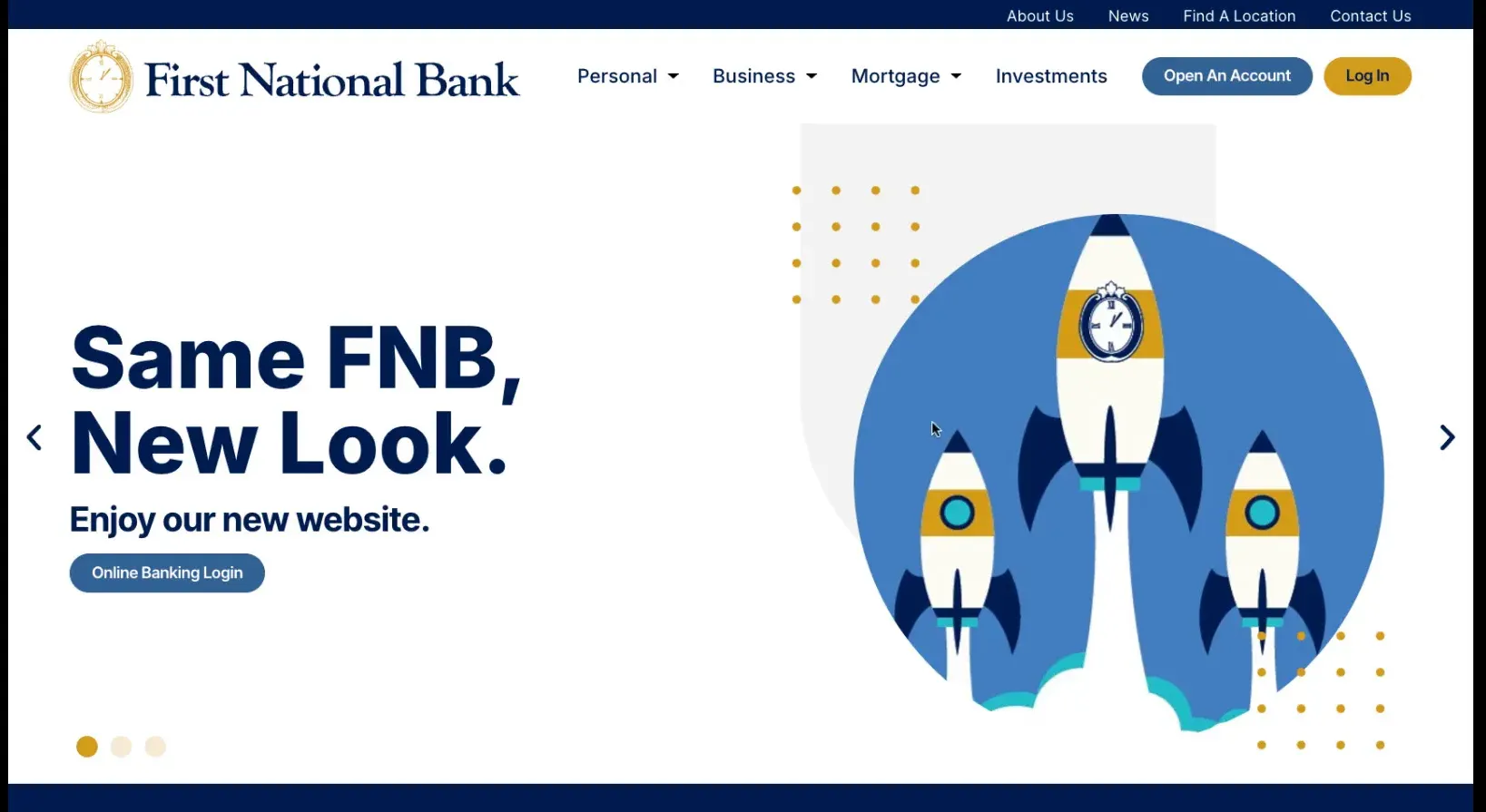
The new First National Bank website is a significant upgrade, emphasizing usability and aesthetic appeal. Designed to cater to both new and existing customers, it streamlines the banking experience. Its modern layout integrates essential banking functions while ensuring a pleasant user experience.
Dynamic Header Features
The header of the website features a dynamic rotating panel. This panel is not just visually appealing; it serves a crucial role in communication. The internal marketing team can update messages quickly, ensuring that visitors receive timely information about promotions, services, or important announcements.
Navigational Design
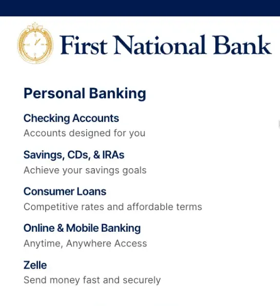
One of the standout features is the clean and logical navigation. Users can easily locate essential services without feeling overwhelmed. The site categorizes services like checking accounts, savings options, and loans in a straightforward manner.

Key Navigation Areas
- Checking Accounts
- Savings, CDs, and IRAs
- Consumer Loans
- Business Banking
These categories are prominently displayed, enabling users to click through to their desired sections with minimal hassle. The business tab, for instance, directs users to the primary areas of business banking, making it easy for entrepreneurs and business owners to find relevant information.
Common User Frustrations with Banking Websites
Many users have expressed frustration with traditional banking websites. Complex navigation and cluttered interfaces often lead to a poor user experience. The new First National Bank site addresses these issues head-on.
By simplifying navigation and focusing on user-friendly design, the site aims to eliminate common pain points. Users can now find what they need quickly, reducing the time spent searching for information.
Account and Loan Options
When exploring account options, the website provides a comprehensive overview. Users can easily access information about checking and savings accounts, along with various loan options. The clarity in presentation helps users make informed decisions.
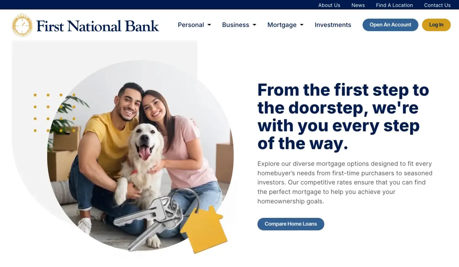
Additionally, the mortgage department has a dedicated space where users can explore home loans. This section is designed to guide potential homeowners through the options available, ensuring they find the right fit for their needs.

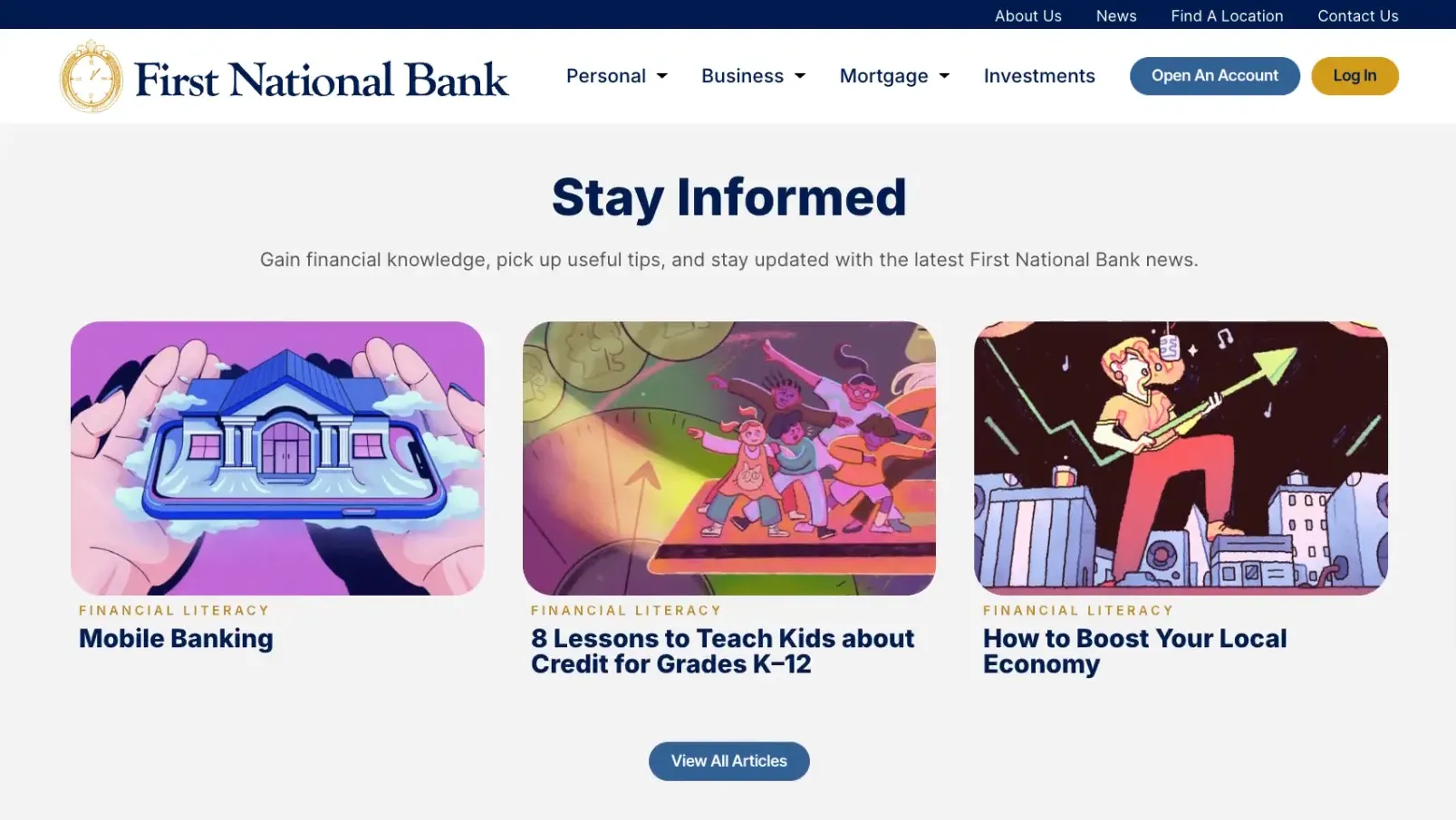
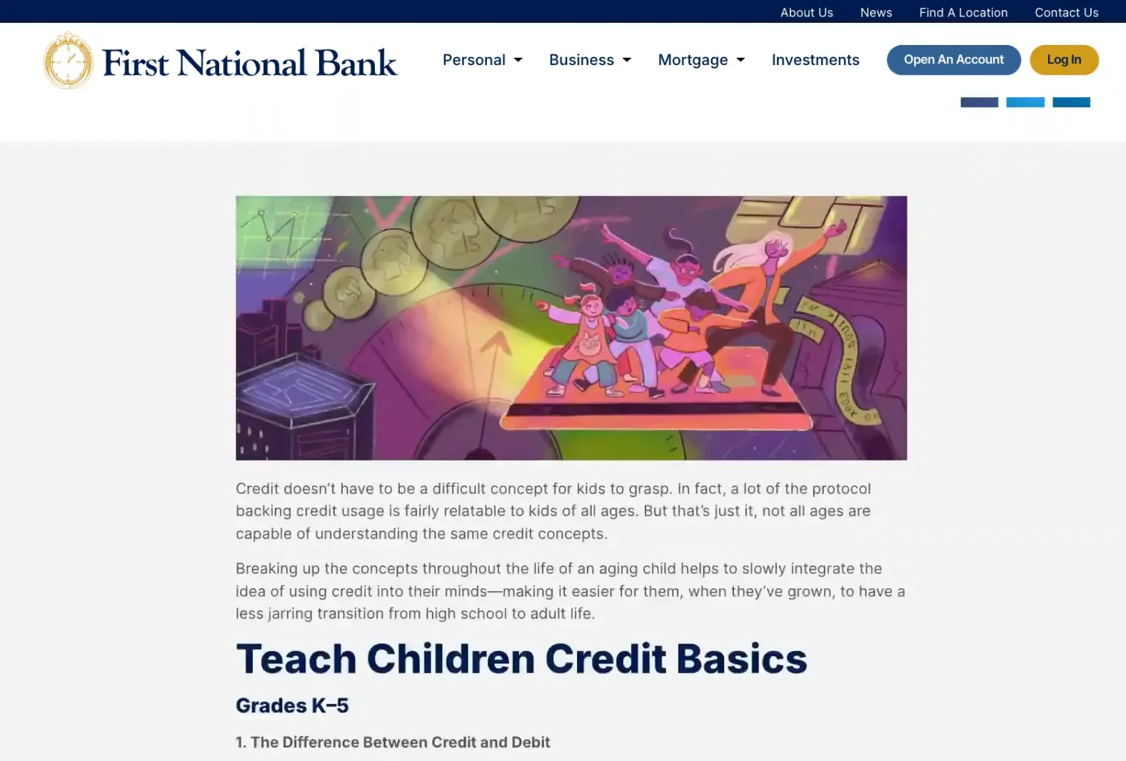
Exploring the Blog Section
The blog section of the website is robust and informative. It not only provides valuable insights but also serves an important role in search engine optimization. By including keyword-rich content, the blog enhances the website’s visibility online.
Visitors can find articles covering a variety of topics, making it a useful resource for financial education and updates. Whether users are looking for tips on saving, investment advice, or updates on banking services, the blog has something to offer.
Importance of Keyword-Rich Content
Keyword-rich content is essential for improving search engine rankings. The blog section of the website is designed with this in mind. By strategically incorporating keywords into articles, the site can attract more visitors.
Moreover, this content serves a dual purpose. It not only informs readers but also boosts the website’s authority in the banking space. The more informative and relevant the content, the higher the chances of ranking well on search engines.
Account Management Features
The new First National Bank website offers a range of account management features designed to make banking seamless and efficient. Users can easily manage their accounts through a secure online portal, ensuring that all their financial needs are met in one place.
Account holders can view balances, transaction histories, and statement downloads at their convenience. This transparency helps users track their spending and manage their finances effectively.

Secure Account Access
Security is paramount in online banking. The First National Bank website employs robust security measures and encryption protocols. These features protect sensitive user information from unauthorized access. This focus on security fosters trust and confidence in the banking experience.
Mobile Banking Capabilities
More than ever, mobile banking is essential. The First National Bank website is optimized for mobile devices, allowing users to manage their accounts on the go. Whether checking balances or transferring funds, everything can be done from a smartphone or tablet.
The responsive design ensures that users have a consistent experience across all devices, making banking more accessible than ever.
Finding Local Branches
Locating a nearby branch has never been easier. The First National Bank website includes a user-friendly branch locator tool. Simply enter your zip code or city, and the website will display a list of nearby branches along with their addresses and contact information.
This feature saves time for customers who prefer in-person banking services, ensuring they can quickly find the nearest location when needed.

Interactive Maps
The interactive maps enhance the user experience by providing directions to each branch. Customers can click on a location to view its hours of operation and services offered, making it easier to plan their visits.
This level of detail ensures that customers have all the information they need before visiting a branch, reducing frustration and enhancing satisfaction.
Footer Navigation and Contact Information
At the bottom of every page, the footer provides essential navigation links and contact information. This section is strategically designed to ensure users can easily find help when needed.
The footer includes links to customer support, routing details, and their social media channel. Such accessibility is crucial for maintaining open lines of communication between the bank and its customers.
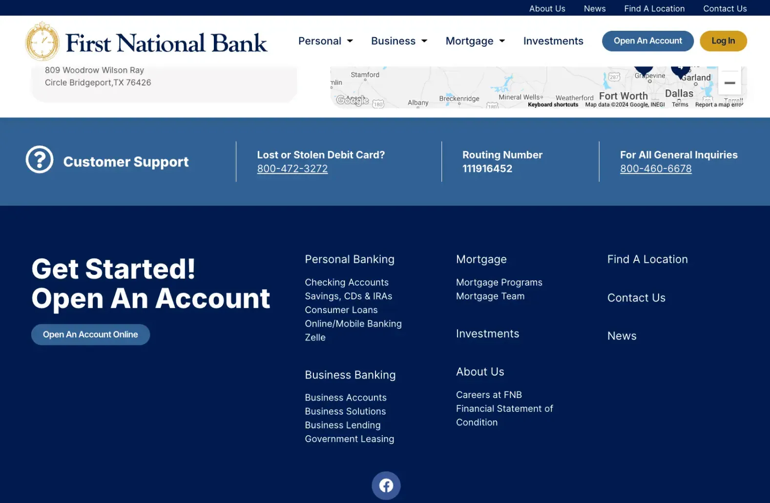
Contacting Customer Support
Should users have questions or require assistance, the website offers several contact options. Customers can reach out via phone, email, or through the online contact form. This variety ensures that everyone can choose their preferred method of communication.
Investment Services Overview
The investment services section of the First National Bank website is designed to cater to both novice and experienced investors. This comprehensive overview provides insights into various investment options available to customers.
Users can explore services tailored to meet different financial goals. This variety allows customers to create a diversified investment portfolio.

Wealth Management Team
Recognizing the importance of personalized advice, the website highlights the availability of a dedicated wealth management team. Customers can schedule consultations to discuss their financial strategies and investment choices.
This personalized approach ensures that clients receive tailored advice that aligns with their unique financial situations and goals.
Conclusion and Call to Action
In summary, the new First National Bank website is a great example of a good website design for banks. With its user-friendly design, robust security features, and comprehensive services, it truly enhances the customer experience. From managing accounts to finding local branches and exploring investment options, everything is streamlined for ease of use.
We encourage you to visit the First National Bank website and explore its features for yourself. Whether you’re looking to open a new account or seek investment advice, the resources available are designed to support your financial journey.
Frequently Asked Questions
How do I open an account online?
Opening an account online is simple. Just navigate to the “Open an Account” section, fill out the secure application form, and follow the prompts.
Can I access my account from a mobile device?
Yes, the First National Bank website is fully optimized for mobile devices, allowing you to manage your accounts anytime, anywhere.
How do I find the nearest branch?
Use the branch locator tool available on the website. Simply enter your zip code or city to find nearby branches and their details.
Is there a wealth management service available?
Yes, the bank offers a wealth management team that provides personalized investment advice tailored to your financial goals.
Who designs great looking websites for banks?
Texas based MPC Studios designs some of the best looking banking websites online. You can discuss your custom website project with them by clicking the invitation below.
The post Exploring the New First National Bank Website: A User-Friendly Experience appeared first on MPC Studios Inc..
Soaring High: Sun Valley Aviation Takes Off with a Stunning New Website 13 Dec 2024 8:12 AM (4 months ago)
We’re thrilled to announce the launch of Sun Valley Aviation’s brand-new website, a project that truly reflects their mission of excellence and commitment to service in the aviation industry. With a sleek design and user-friendly navigation, this website is a gateway for pilots, aircraft owners, and travelers to access vital information seamlessly.
Website Features That Set It Apart
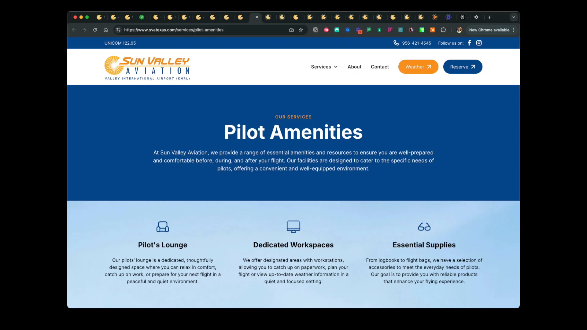
Right from the moment you land on the homepage, Sun Valley Aviation makes everything you need as a pilot easy to find.
 At the very top, you’ll see today’s aviation fuel prices updated daily, eliminating any surprises when you land.
 There are direct links to check the current weather conditions at the airport and even reserve amenities before you arrive. It’s all about giving you the critical info you need fast.
As you scroll down, you’ll find a section introducing Sun Valley Aviation, highlighting their expertise as a full-service fixed base operator serving the Rio Grande Valley, Mexico, and Latin America.
This leads seamlessly into a panel showcasing their comprehensive services with a direct link to their services page. From there, you can dive deeper into specialized offerings like aircraft maintenance, avionics, fuel services, and more, all tailored to pilots, aircraft owners, and travelers alike.
 What sets this website apart is the attention to detail in each service area. Every service, whether it’s aircraft maintenance, fuel options, flight training, or charters, has a dedicated page packed with clear, useful information.
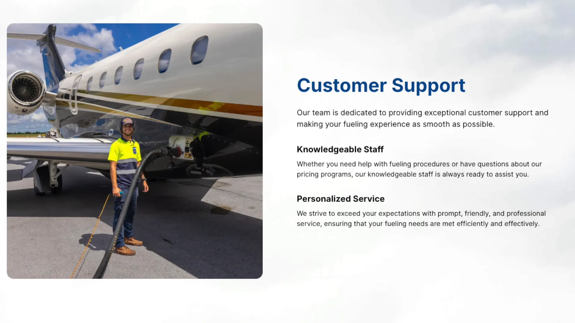 These pages aren’t just helpful for customers; they’re also designed with search engines in mind, making it easy for pilots and travelers to find what they need online. Plus, the stunning photography and thoughtful layout make each page a pleasure to navigate, whether you’re on a desktop or a mobile device.
Aircraft Charter and Management Services
Next up is the aircraft charter and management services panel, which highlights their domestic and international destinations and customized travel solutions.
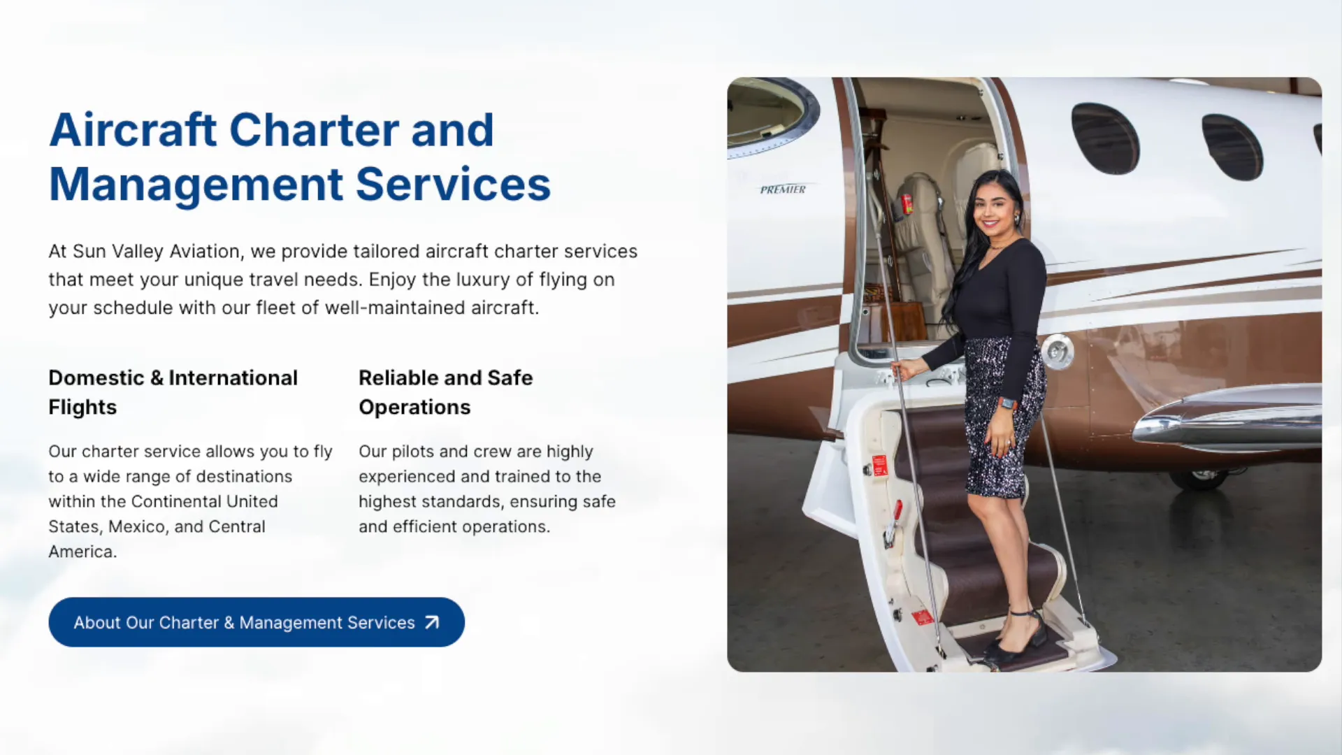 This section emphasizes reliability and safety, ensuring every flight meets the highest standards of excellence. It’s an essential resource for anyone planning private or corporate air travel.
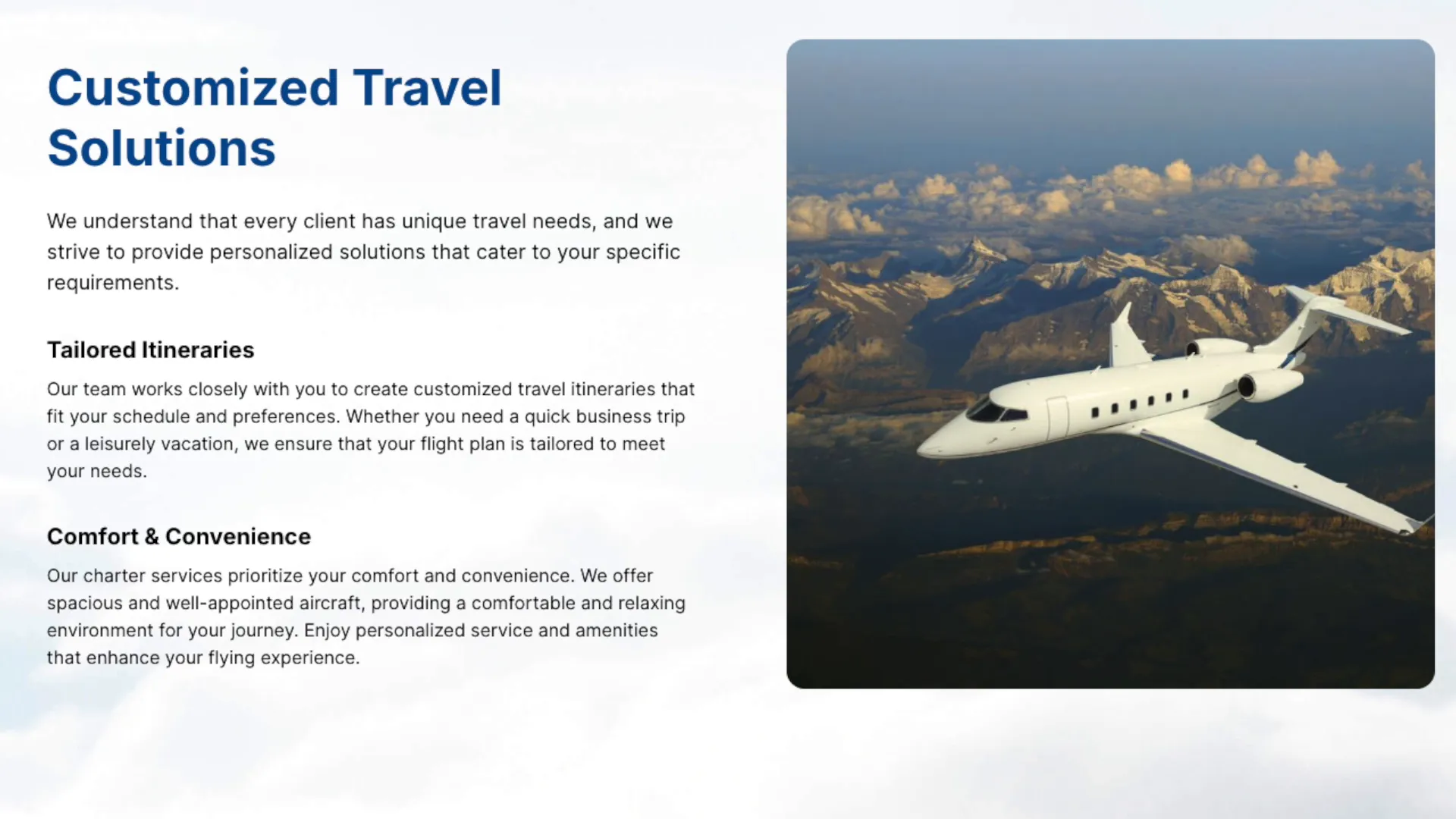
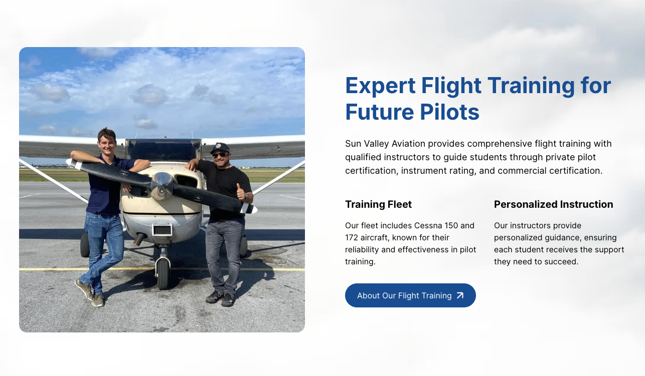
Flight Training Opportunities
Scrolling further, you’ll discover their flight training panel, which is a gateway to learning how to fly. Whether you’re dreaming of earning your private pilot’s license or advancing to commercial training, this section has all the details. You can even meet the instructors, explore the training aircraft, and find everything you need to take the next step toward becoming a pilot.
 Testimonials That Speak Volumes
One of the highlights of the homepage is the glowing testimonial section. Featuring authentic five-star reviews, this panel showcases why Sun Valley Aviation is one of the best facilities of its kind in the nation. Each review comes from real pilots and customers, emphasizing exceptional service, reliability, and an unmatched customer experience.

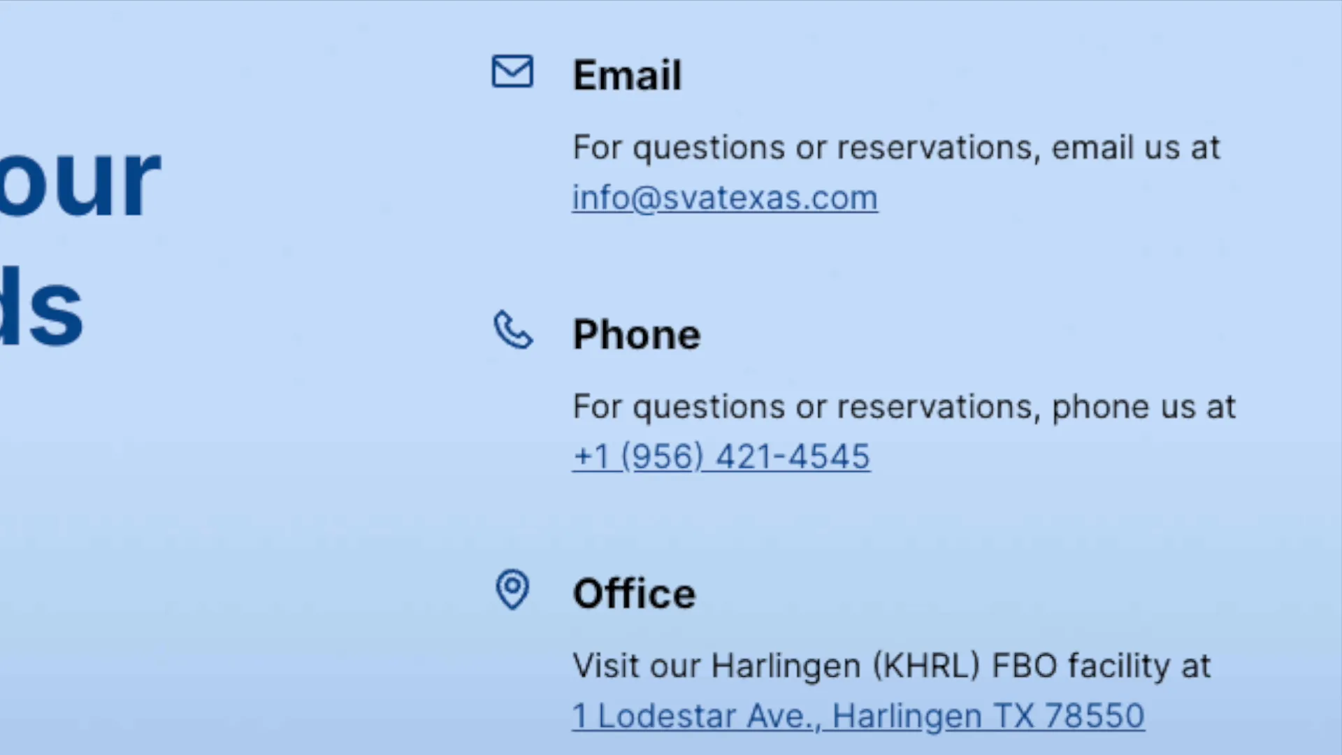
Easy Access and Contact Information
The final panel brings it all together with a call to action, making it easy to get in touch for more information. With comprehensive contact details, links to their social media channels, and quick access to their detailed service pages, Sun Valley Aviation ensures every visitor leaves with what they need.
 And don’t forget to explore it all yourself at svatexas.com.
About Sun Valley Aviation
Sun Valley Aviation is a premier fixed-base operator located in the Rio Grande Valley, dedicated to providing exceptional service to pilots and travelers alike. Their commitment to safety, reliability, and customer satisfaction sets them apart in the aviation industry. With a focus on comprehensive services that cater to every aspect of air travel, they strive to enhance the flying experience for all their clients.
MPC Studios’ Role
At MPC Studios, we pride ourselves on our collaborative approach to web development. Working closely with Sun Valley Aviation, we focused on their specific needs and goals to create a website that not only looks stunning but functions seamlessly. Our attention to detail and custom solutions ensure that every project we undertake is tailored to our client’s vision.

This project reinforces our position as the premier web development partner for businesses in Texas and beyond, showcasing our ability to deliver high-quality digital solutions that meet the evolving needs of our clients.
Call to Action
We invite you to check out the new website, celebrate the success of Sun Valley Aviation, and explore how MPC Studios can help your business succeed online. Discover the difference a well-designed website can make in enhancing your online presence and attracting more clients!
The post Soaring High: Sun Valley Aviation Takes Off with a Stunning New Website appeared first on MPC Studios Inc..
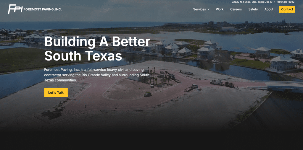
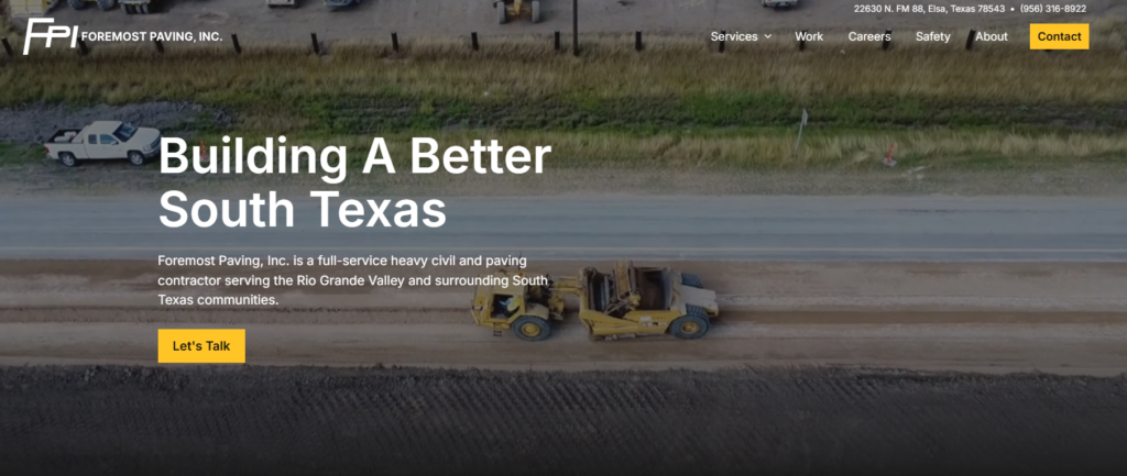
Exploring the New Foremost Paving Website 4 Dec 2024 11:50 AM (4 months ago)
The launch of the new Foremost Paving website marks a significant step forward in showcasing their services and capabilities. This blog post will take you through the various features of the website, highlighting its design, functionality, and the overall user experience.
First Impressions Matter
Upon visiting the Foremost Paving website, the first thing that captures your attention is the stunning high-resolution drone footage that fills the hero section of the homepage. This visual impact is designed to draw users in and immediately convey the essence of the company.
Clear Call to Action
The website features a clear call to action, ensuring that visitors know exactly what services are offered without any ambiguity. This straightforward approach is crucial for engaging potential clients right from the start.
Service Overview
Scrolling down the homepage reveals a clean section dedicated to Foremost Paving’s primary services. Each service is presented in a straightforward manner, and users can click on any of these services to access detailed subpages that outline the specifics.
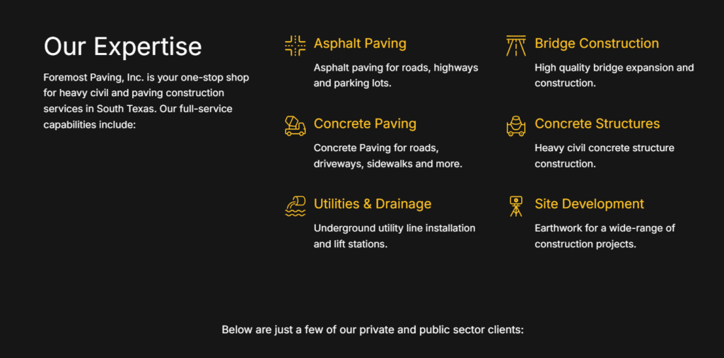
Client Recognition
One of the standout features of the Foremost Paving website is the display of key clients. This section is particularly effective because it features names that are recognized and trusted in the industry. When potential clients see familiar names, it builds instant credibility and trust in the Foremost Paving brand.
Join Our Team
The ‘Join Our Team’ section has proven to be one of the most valuable components of the site. This feature has streamlined their hiring process and saved the company thousands of hours. Foremost Paving often works on large projects that require hiring a significant number of employees, making this efficiency crucial.

Streamlined Application Process
Thanks to the website’s design, the initial job application and hiring process is now conducted entirely online. This simplicity makes it easy for applicants to find and apply for job opportunities, enhancing the overall user experience.
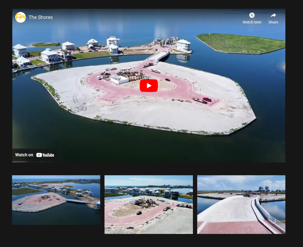
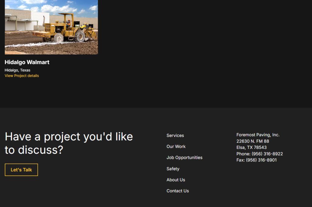
Showcase of Projects
Foremost Paving has also included a section that highlights beautiful projects they have worked on. The layout is clean and effective, utilizing a case study format for each project. This not only showcases their work but also serves as a portfolio for potential clients.
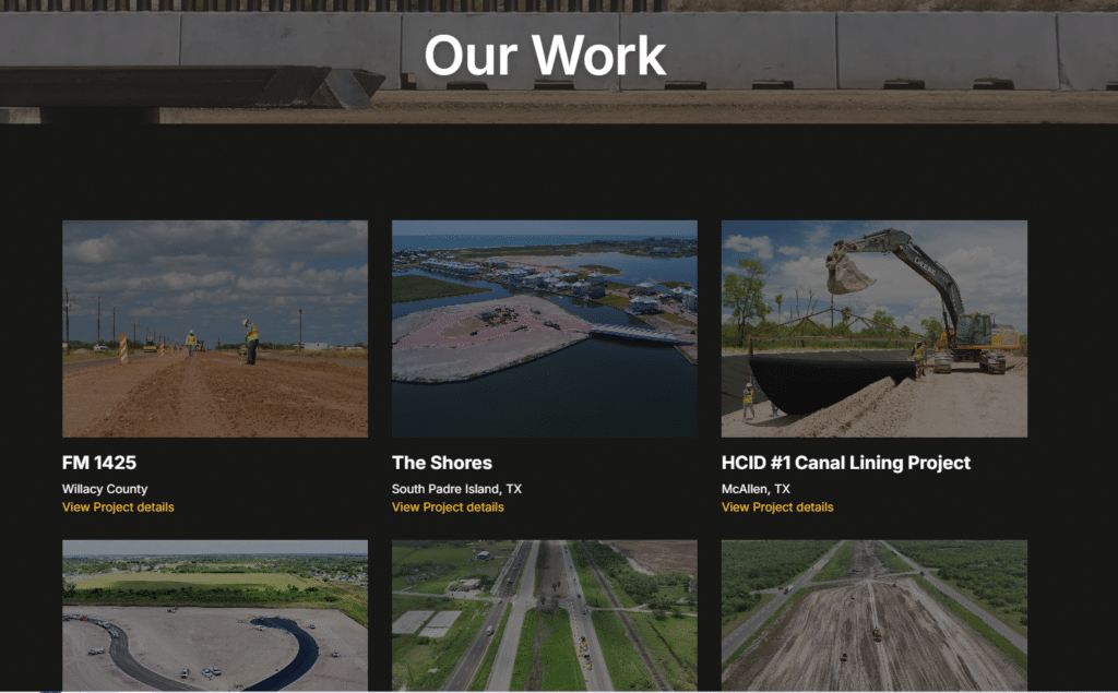
Integration with Social Media
Each project page is complemented by a YouTube video linked to their channel. This integration extends their brand’s reach and helps improve visibility in Google searches, which is essential for attracting new clients.
Technical Aspects and Platform Choice
The new website was built on Webflow, a platform known for its versatility and design capabilities. The choice of Webflow reflects a commitment to modern web design practices, ensuring the site is both aesthetically pleasing and functional.
Conclusion
The new Foremost Paving website is a well-designed, user-friendly platform that effectively showcases the company’s services and projects. With its high-quality visuals, clear navigation, and streamlined processes, it stands as a strong online presence for the brand. For anyone looking to explore paving services or interested in joining the team, the website offers a comprehensive and engaging experience.
If your business could use a similar boost in online presence, consider reaching out to MPC Studios, who have over 25 years of experience in building custom websites tailored to meet specific business needs.
Let’s Talk About Your Project
Schedule a Free Consultation
The post Exploring the New Foremost Paving Website appeared first on MPC Studios Inc..
AASF’s New Website: Built to Bring People Together 27 Nov 2024 1:54 PM (4 months ago)
When the Asian American Scholar Forum (AASF) came to us, they had a clear mission: create a website that brings their community together and gives scholars the tools they need to thrive. What they had was outdated and clunky. What they needed was a digital space that felt welcoming, worked effortlessly, and reflected their values.
We rolled up our sleeves and got to work.
The Challenge
AASF’s old site wasn’t cutting it. It was hard to navigate, felt impersonal, and didn’t reflect the energy of their work. For an organization focused on diversity and supporting scholars during critical moments, the site needed to inform, inspire, and engage visitors all at once.
How We Made It Happen
Clear Goals: We started by sitting down with AASF to understand what mattered most. Three things stood out:
- Build a space where their community could connect.
- Make resources easy to find.
- Design a site that feels simple and approachable, whether you’re a seasoned academic or a first-year student.
A Fresh, Friendly Design: We kept it clean and intuitive. No flashy distractions—a smooth, user-friendly layout guides visitors exactly where they need to go. Want to find the latest events? Easy. Need an article on advocacy? One click away.
Bringing Their Mission to Life: AASF’s work is impactful, and we wanted their website to reflect that. From showcasing their meetings at the White House to highlighting initiatives like the Pioneer Project, every element of the site tells their story and encourages connection.
What’s New?
- Community First: The site includes a space where scholars can share ideas and connect, whether they’re brainstorming research or seeking support.
- A Resource Hub: Articles, research papers, and advocacy tools are now all in one place, organized for easy browsing.
- Simple Navigation: No endless clicking or digging through menus—everything is easy to find and quick to access.
The Result
AASF’s new site connects people, empowers scholars, and strengthens their mission. It’s a hub for collaboration, learning, and action.
For us at MPC Studios, this project was about more than building a website. It was about helping AASF amplify their voice and create an online space where their community could thrive.
Why This Matters
At MPC Studios, we believe a website should solve real problems and serve as a foundation for growth. AASF needed a better way to connect with their audience, and we’re proud to have delivered a solution that does exactly that.
If your website needs a fresh approach, let’s talk. We’d love to help bring your vision to life.
The post AASF’s New Website: Built to Bring People Together appeared first on MPC Studios Inc..
New Aurora House Launch: Compassionate Care in South Texas 15 Nov 2024 11:19 AM (5 months ago)
Announcing the New Aurora House Website: A Vital Resource for South Texas
We’re honored to share the launch of the new website for Aurora House, a non-profit end-of-life facility in Weslaco, Texas. At MPC Studios, this was a particularly meaningful project, as Aurora House represents the heart of the South Texas community, providing dignified, end-of-life care to terminally ill individuals and their families. Our goal was to create a website that reflects their mission and supports the community by making it easy to find information, get involved, and explore resources.
Features of the New Aurora House Website
This redesigned website serves as a welcoming resource for anyone seeking information about end-of-life care. Every page has been crafted to ensure accessibility, clarity, and a supportive experience for all visitors.
Mission-Centered Information
Right from the homepage, the website gently introduces visitors to Aurora House’s purpose as a comfort care home, fostering understanding and trust.
Easy-to-Use Design
With a simple, soothing layout, the site makes it easy for visitors to find essential information about services, admissions, and ways to contribute.
In-Depth Service Descriptions
Aurora House’s 24-hour nursing care, emotional and spiritual support, and other critical services are described in detail to help families understand the care provided.
Volunteer and Donation Opportunities
The site features dedicated sections where community members can learn about how to support Aurora House’s work through volunteering or donations.
Patient and Family Resources
For families navigating difficult decisions, the admissions guidelines and referral processes are clearly outlined, offering support during challenging times.
Education and Community Outreach
Since 2015, Aurora House has played an active role in educating nursing students and healthcare professionals about palliative and end-of-life care. Through these programs, Aurora House helps shape the next generation of caregivers.
“I had a great experience today. I got to really learn what palliative care is and what it means. I liked that we got to speak with some of the patients and hear their experiences in life.” —STC Nursing Student
These educational efforts go beyond traditional classroom learning, providing students with hands-on experience in benevolent care and offering opportunities for personal growth.
Personal Stories That Illuminate Aurora House’s Mission
Aurora House is a place where life is celebrated and loved ones are supported in the final stages. Through the website, we hope to honor these experiences, allowing families to share their memories and gratitude for Aurora House’s compassionate care.
- Blanca’s Family: Blanca’s son, Jaime, spoke about his mother’s warmth and strength, sharing how meaningful it was to know she was surrounded by remarkable caregivers in her last year. Aurora House helped Blanca’s family make her final days filled with love and peace, honoring her joy for life.
- Mr. Isidoro’s Journey: Known for his love of family and music, Mr. Isidoro spent his final days with dignity, comforted by the care of Aurora House. His niece, Milda, expressed her gratitude, saying, “It was a miracle for him to have Aurora House care for him. The staff was caring and loving… I am grateful for the staff at Aurora House.” His faith and final wishes were respected, giving his family peace.
These stories remind us of the significance of Aurora House, not only as a care facility but as a place of connection, support, and compassion.
How You Can Help: The Aurora House Wish List
Aurora House relies on community support to continue offering the highest quality of care. The team has put together a Wishlist of items needed to sustain their work. Community members can help by donating items or gift cards to local stores like HEB, Walmart, and Home Depot. Here are a few of the items most needed:
Household Supplies
- Paper plates, plastic cups, and disposable utensils
- Laundry detergent and antibacterial hand soap
- Paper towels, garbage bags, and disinfectant wipes
Groceries
- Fresh fruits and vegetables, meats (chicken and beef)
- Coffee (regular and decaf), tea bags, and soft drinks
- Pantry staples like oatmeal, rice, and pasta
Office Supplies
- Copier paper, folders, and pens
Gift cards are a flexible way to help meet daily needs and are always appreciated. Every donation helps make a difference in the lives of patients and their families.
The full wishlist is available on the website. Each contribution, no matter how small, directly supports Aurora House’s mission of compassionate care.
Join Us in Supporting Aurora House
Aurora House’s work is made possible through the generosity and involvement of the South Texas community. If you’d like to support their mission, there are many ways to get involved:
- Visit AuroraHouse.org to explore their services and learn more about their mission.
- Volunteer to provide comfort and care to patients and families in need. There are many Volunteer Opportunities available.
- Donate to help sustain their work and support end-of-life care in our community through one of these Ways to Donate.
- Spread the Word to friends and family who may wish to support or benefit from Aurora House’s services.
Together, we can help ensure that Aurora House remains a place of compassion, comfort, and dignity for those who need it most.
The post New Aurora House Launch: Compassionate Care in South Texas appeared first on MPC Studios Inc..